shadcn.io is an independent project built on shadcn/ui
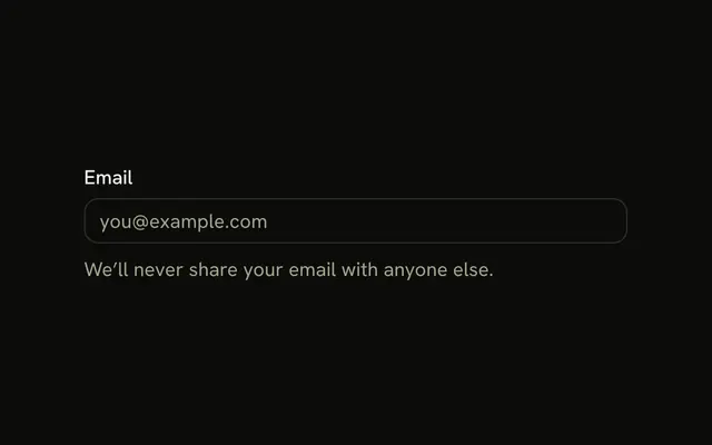
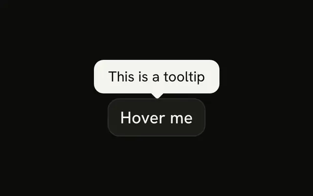
An email field with a help button at the end. The tooltip reads We'll never share your email. The button is named Help, and the icon is hidden from assistive tech.
Use it for a one-line reassurance on a sensitive field. A hover note that stays in the same parent is a Hint. In React, Ark UI does not put that sentence into the field.
Installation
Sign in to get your install command
Free with an account. It carries your token, so the CLI installs everything in one go.
Use email insteadNo credit card
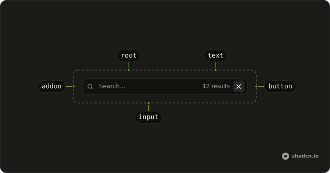
Anatomy
Usage
<InputGroup className="w-full max-w-sm bg-background">
  <InputGroupInput
    aria-label="Email address"
    placeholder="Email address"
    type="email"
  />
  <InputGroupAddon align="inline-end">
    <Tooltip>
      <TooltipTrigger asChild>
        <InputGroupButton aria-label="Help" size="icon-xs" variant="ghost">
          <HelpCircleIcon aria-hidden="true" />
        </InputGroupButton>
      </TooltipTrigger>
      <TooltipContent>
        <p>We'll never share your email</p>
      </TooltipContent>
    </Tooltip>
  </InputGroupAddon>
</InputGroup>
FAQ
How is the help button tied to the tooltip?
TooltipTrigger takes asChild, so the InputGroupButton itself is the trigger.API Reference
Input Group
Sets aria-label="Email address", placeholder="Email address", type="email", align="inline-end", aria-label="Help" and size="icon-xs". The rest is on the Input Group page.
Tooltip
Sets asChild. The rest is on the Tooltip page.