shadcn.io is an independent project built on shadcn/ui
UI library: Ark UI
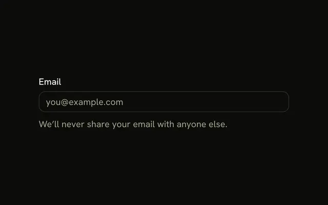
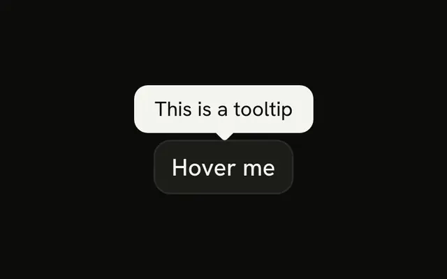
An email field with a help button at the end. The tooltip reads We'll never share your email. The button is named Help, and the icon is hidden from assistive tech.
Use it for a one-line reassurance on a sensitive field. A hover note that stays in the same parent is a Hint. In Vue, Ark UI does not put that sentence into the field.
Installation
Anatomy
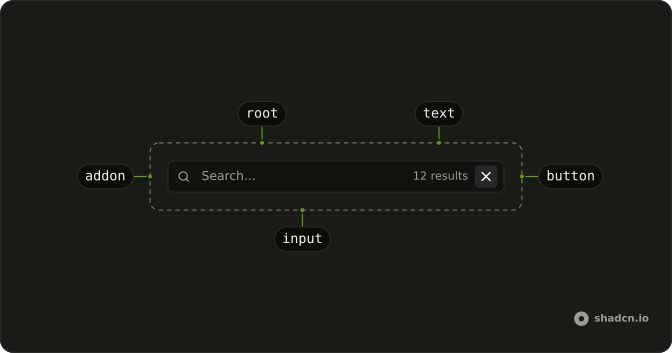
Usage
<InputGroup class="w-full max-w-sm bg-background">
  <InputGroupInput aria-label="Email address" placeholder="Email address" type="email" />
  <InputGroupAddon align="inline-end">
    <Tooltip>
      <TooltipTrigger :asChild="true">
        <InputGroupButton aria-label="Help" size="icon-xs" variant="ghost">
          <HelpCircleIcon aria-hidden="true" />
        </InputGroupButton>
      </TooltipTrigger>
      <TooltipContent><p>We'll never share your email</p></TooltipContent>
    </Tooltip>
  </InputGroupAddon>
</InputGroup>
FAQ
How is the help button tied to the tooltip?
TooltipTrigger takes asChild, so the InputGroupButton itself is the trigger.API Reference
Input Group
Sets aria-label="Email address", placeholder="Email address", type="email", align="inline-end", aria-label="Help" and size="icon-xs". The rest is on the Input Group page.
Tooltip
Sets asChild. The rest is on the Tooltip page.