shadcn.io is an independent project built on shadcn/ui
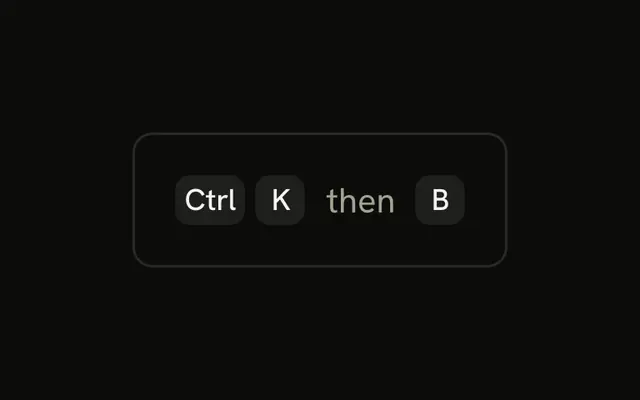
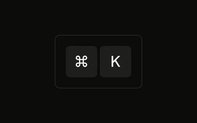
A short paragraph reads Press, then a ⌘ cap, a K cap, and the rest of the sentence. The caps are inline. They do not open a palette.
Use inline caps when you are teaching the shortcut in prose. On a control, group them. The palette itself is a Command. In React, Ark UI does not listen for the keys in the sentence.
Installation
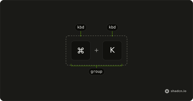
Anatomy
Usage
<div className="rounded-md border bg-background p-4">
  <p className="text-sm">
    Press <Kbd>⌘</Kbd> <Kbd>K</Kbd> to open the command palette
  </p>
</div>
FAQ
Should inline key caps match the surrounding text size?
Close to it. The Kbd's extra-small type sits well in small text like this paragraph. In larger body text, the caps read a bit smaller than the words, which is fine; if they look too small, raise their text size one step.
How should inline key caps be spaced?
Ordinary spaces in the text, as here, are enough between a word and a cap. To keep the keys of one shortcut tight together, put them in a KbdGroup instead of separating them with spaces.
When should I use separate Kbd caps instead of a KbdGroup?
A KbdGroup marks the keys as one shortcut pressed together and spaces them evenly. Separate caps in the text read as separate keys. For a chord like ⌘K, a KbdGroup inside the sentence is usually clearer.
Are inline key caps accessible?
Yes. Kbd renders a kbd element, and screen readers read its text as part of the sentence. A symbol like ⌘ may be read as a symbol name or skipped, so for important instructions add the key's name as visually hidden text.
API Reference
Kbd
No extra props in this demo. The rest is on the Kbd page.