shadcn.io is an independent project built on shadcn/ui
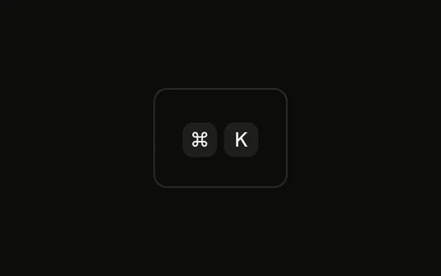
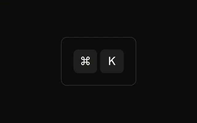
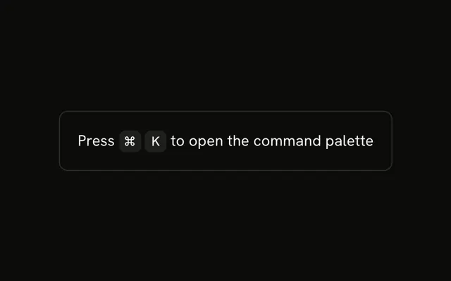
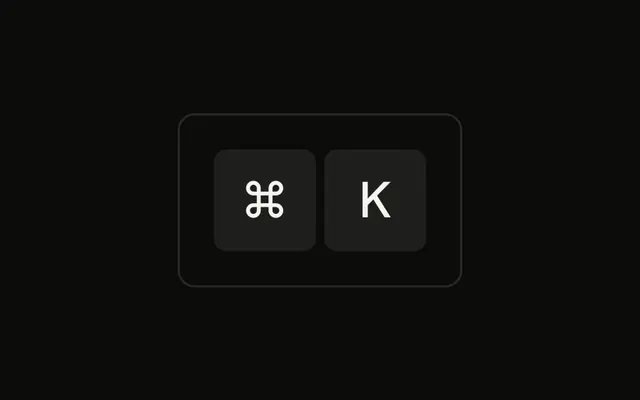
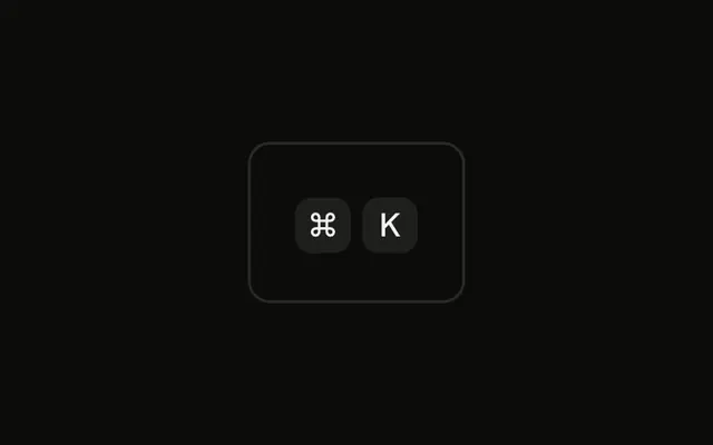
Both caps are 16 pixels tall with 10 pixel type, and they still read ⌘ and K. Pointer events stay off, so the caps are not buttons.
Use the small size in a menu item or a table cell. If the hint needs an explanation on hover, attach a Tooltip to a real control. In React, Ark UI does not listen for the keys.
Installation
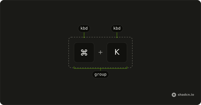
Anatomy
Usage
<div className="rounded-md border bg-background p-4">
  <KbdGroup>
    <Kbd className="h-4 min-w-4 text-[10px]">⌘</Kbd>
    <Kbd className="h-4 min-w-4 text-[10px]">K</Kbd>
  </KbdGroup>
</div>
FAQ
When should I use small key caps?
Where space is tight and the shortcut is a secondary hint: a compact tooltip, a sidebar listing many shortcuts, a status bar, a table cell. Keep the default size anywhere people need to read the shortcut to use it.
What font size works for small key caps?
10 pixels, as here, is about the smallest that stays legible for a single character. Below that, letters like K and symbols like ⌘ start to blur, especially on low-density screens.
Why h-4 and min-w-4?
h-4 sets the cap to 16 pixels tall and min-w-4 to at least 16 pixels wide, so a single character sits in a square. A longer label such as Ctrl still widens the cap to fit.
How much padding should small key caps have?
The Kbd's own small horizontal padding is enough for one character. For a word at this size, keep the padding small, such as px-1, so the cap doesn't grow taller than the text around it.
API Reference
Kbd
No extra props in this demo. The rest is on the Kbd page.