shadcn.io is an independent project built on shadcn/ui
Two titled sections each hold a pair of labeled fields, set off by a rule along the start edge. A button closes the form.
Use it for settings or sign-up that is grouped into parts. If people should see which step they are on, use Progress. In React, Ark UI does not build the real fields.
Installation
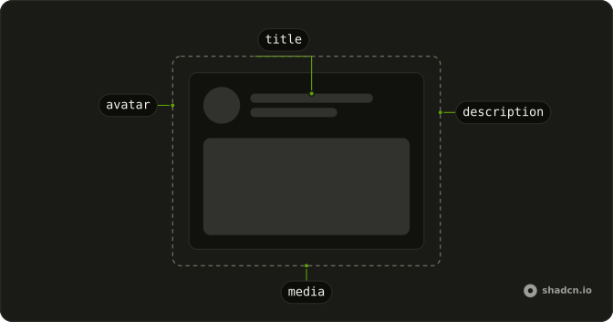
Anatomy
Usage
<div className="flex w-full max-w-lg flex-col gap-8">
  <div className="flex flex-col gap-4">
    <Skeleton className="h-5 w-40" />
    <div className="flex flex-col gap-4 border-s-2 ps-4">
      <div className="flex flex-col gap-2">
        <Skeleton className="h-4 w-20" />
        <Skeleton className="h-10 w-full" />
      </div>
      <div className="flex flex-col gap-2">
        <Skeleton className="h-4 w-24" />
        <Skeleton className="h-10 w-full" />
      </div>
    </div>
  </div>
  <div className="flex flex-col gap-4">
    <Skeleton className="h-5 w-32" />
    <div className="flex flex-col gap-4 border-s-2 ps-4">
      <div className="flex flex-col gap-2">
        <Skeleton className="h-4 w-16" />
        <Skeleton className="h-10 w-full" />
      </div>
      <div className="flex flex-col gap-2">
        <Skeleton className="h-4 w-20" />
        <Skeleton className="h-10 w-full" />
      </div>
    </div>
  </div>
  <Skeleton className="h-10 w-32" />
</div>
FAQ
How are the two sections stacked?
A max-w-lg column with gap-8. Each section is a gap-4 column: an h-5 title, then the fields. A h-10 w-32 button sits under both sections.
What is the line along the fields?
border-s-2 ps-4 on the field stack. The rule sits on the start edge, and ps-4 insets the fields. Titles are h-5 w-40 and h-5 w-32, outside that border.
What is inside a section?
Two fields, each flex flex-col gap-2. Labels are h-4 at w-20, w-24, w-16 and w-20. Every control is h-10 w-full. The sections stack those fields with gap-4.
API Reference
Skeleton
No extra props in this demo. The rest is on the Skeleton page.