shadcn.io is an independent project built on shadcn/ui
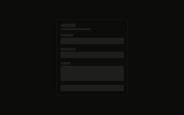
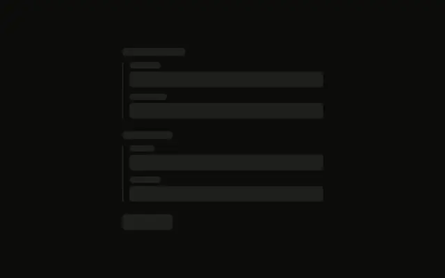
Three fields and nothing else. Each pair is a short bar for the label and a taller full-width bar for the input.
Use it inside your own form layout while the fields load, matched to the real input height. A single busy field can take a Spinner instead. In React, Ark UI does not read a value.
Installation
Anatomy
Usage
<div className="flex w-full max-w-md flex-col gap-4">
  <div className="flex flex-col gap-2">
    <Skeleton className="h-4 w-16" />
    <Skeleton className="h-10 w-full" />
  </div>
  <div className="flex flex-col gap-2">
    <Skeleton className="h-4 w-20" />
    <Skeleton className="h-10 w-full" />
  </div>
  <div className="flex flex-col gap-2">
    <Skeleton className="h-4 w-24" />
    <Skeleton className="h-10 w-full" />
  </div>
</div>
FAQ
How are the three fields stacked?
flex w-full max-w-md flex-col gap-4. Each field is its own flex flex-col gap-2.
What size is a label bar?
h-4, at w-16, then w-20, then w-24. The three widths stand in for labels of different lengths.
What size is an input bar?
h-10 w-full under each label. Match h-10 to the control you render so the stack does not jump.
Why is the gap inside a field smaller than the gap between fields?
gap-2 pairs a label with its input. gap-4 on the outer column separates the three pairs.
API Reference
Skeleton
No extra props in this demo. The rest is on the Skeleton page.