shadcn.io is an independent project built on shadcn/ui
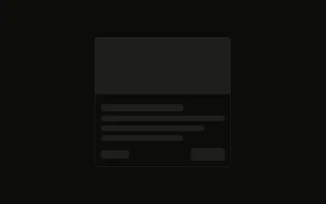
A square image sits at the start, beside a title, two lines of text, and two tags pushed to the bottom of the card.
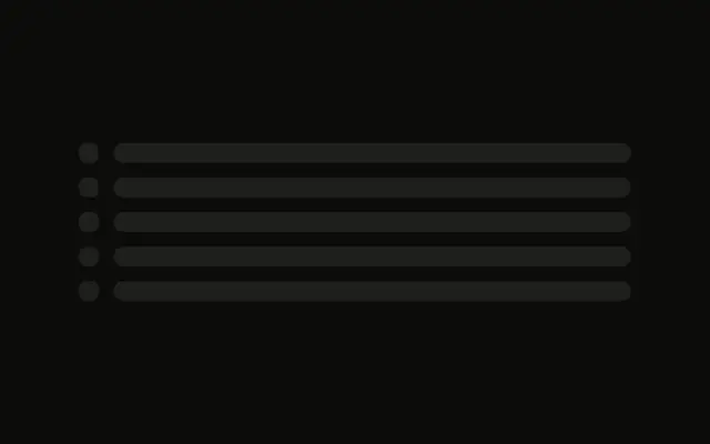
Use it for search results or playlists, where a row fits more than a stacked card. If only the image is loading, a Spinner there is enough. In React, Ark UI does not fetch the picture.
Installation
Sign in to get your install command
Free with an account. It carries your token, so the CLI installs everything in one go.
Use email insteadNo credit card
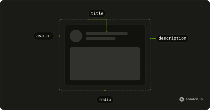
Anatomy
Usage
<div className="flex w-full max-w-lg gap-4 rounded-md border p-4">
  <Skeleton className="size-24 shrink-0" />
  <div className="flex flex-1 flex-col gap-2">
    <Skeleton className="h-5 w-3/4" />
    <Skeleton className="h-4 w-full" />
    <Skeleton className="h-4 w-5/6" />
    <div className="mt-auto flex items-center gap-2">
      <Skeleton className="h-6 w-16" />
      <Skeleton className="h-6 w-20" />
    </div>
  </div>
</div>
FAQ
How is the card split?
flex w-full max-w-lg gap-4 rounded-md border p-4. A size-24 shrink-0 image sits beside a flex-1 column with gap-2.
What is in the text column?
An h-5 w-3/4 title, then h-4 w-full and h-4 w-5/6. The shorter line reads as the end of the description.
Why is the image shrink-0?
shrink-0 keeps the size-24 block square while the text column is flex-1. The image keeps the style's default radius.
API Reference
Skeleton
No extra props in this demo. The rest is on the Skeleton page.