shadcn.io is an independent project built on shadcn/ui
UI library: Ark UI
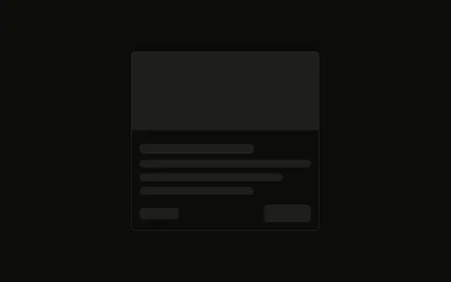
A square image sits at the start, beside a title, two lines of text, and two tags pushed to the bottom of the card.
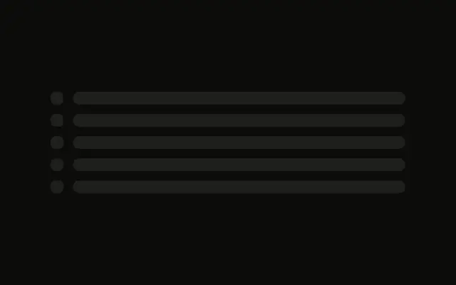
Use it for search results or playlists, where a row fits more than a stacked card. If only the image is loading, a Spinner there is enough. In Vue, Ark UI does not fetch the picture.
Installation
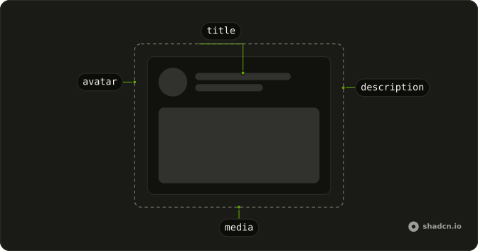
Anatomy
Usage
<div class="flex w-full max-w-lg gap-4 rounded-md border p-4">
  <Skeleton class="size-24 shrink-0" />
  <div class="flex flex-1 flex-col gap-2">
    <Skeleton class="h-5 w-3/4" />
    <Skeleton class="h-4 w-full" />
    <Skeleton class="h-4 w-5/6" />
    <div class="mt-auto flex items-center gap-2">
      <Skeleton class="h-6 w-16" />
      <Skeleton class="h-6 w-20" />
    </div>
  </div>
</div>
FAQ
How is the card split?
flex w-full max-w-lg gap-4 rounded-md border p-4. A size-24 shrink-0 image sits beside a flex-1 column with gap-2.
What is in the text column?
An h-5 w-3/4 title, then h-4 w-full and h-4 w-5/6. The shorter line reads as the end of the description.
Why is the image shrink-0?
shrink-0 keeps the size-24 block square while the text column is flex-1. The image keeps the style's default radius.
API Reference
Skeleton
No extra props in this demo. The rest is on the Skeleton page.