shadcn.io is an independent project built on shadcn/ui
Account, Billing, Notifications and Settings each show an icon before the word. Account is selected. Its panel repeats the icon in a tinted circle beside the heading and a short paragraph.
Add icons when people see the same sections often enough to recognize them. A Navigation Menu fits if each section is its own page. On React, Ark UI does not choose the icons.
Installation
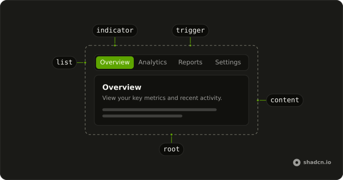
Anatomy
Usage
<Tabs className="w-full max-w-md" defaultValue="account">
  <TabsList>
    {sections.map((section) => (
      <TabsTrigger key={section.value} value={section.value}>
        <section.icon aria-hidden="true" />
        {section.label}
      </TabsTrigger>
    ))}
  </TabsList>
  {sections.map((section) => (
    <TabsContent key={section.value} value={section.value}>
      <div className="rounded-lg border bg-card p-6 text-card-foreground shadow-sm">
        <div className="mb-4 flex items-center gap-3">
          <div className="flex size-10 items-center justify-center rounded-full bg-primary/10">
            <section.icon
              aria-hidden="true"
              className="size-5 text-primary"
            />
          </div>
          <div>
            <h3 className="font-semibold text-lg">{section.label}</h3>
            <p className="text-muted-foreground text-sm">
              {section.subtitle}
            </p>
          </div>
        </div>
        <p className="text-muted-foreground text-sm">{section.description}</p>
      </div>
    </TabsContent>
  ))}
</Tabs>
FAQ
Where do the icons sit in the triggers?
Before the word. The trigger draws an unsized icon at size-4 and spaces it from the label with its own gap.
What are the four tabs?
Account, Billing, Notifications and Settings, built from a sections array. Account is the default, and the group is w-full max-w-md.
Why is the icon repeated in the panel?
It ties the panel to its tab. The panel draws the same icon at size-5 in text-primary, inside a size-10 circle with bg-primary/10.
What names the trigger for a screen reader?
The visible word. The icons have aria-hidden="true", so the trigger is announced only by its label.
API Reference
Tabs
Sets defaultValue="account" and value={section.value}. The rest is on the Tabs page.