shadcn.io is an independent project built on shadcn/ui
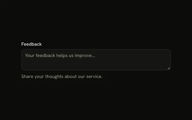
The label Bio sits above the textarea. The placeholder is Tell us about yourself. Under the field, the helper reads This will be displayed on your public profile.
Use it when the label does not say where the text goes or who will read it. An instruction people need first belongs between the label and the field. One line belongs in an Input. In React, Ark UI does not write the helper.
Installation
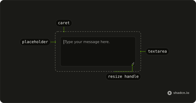
Anatomy
Usage
<Field className="max-w-md">
  <FieldLabel>Bio</FieldLabel>
  <Textarea className="bg-background" placeholder="Tell us about yourself" />
  <FieldDescription>
    This will be displayed on your public profile.
  </FieldDescription>
</Field>
FAQ
When should I add helper text to textarea fields?
When the label doesn't settle the question people will have: where the text appears, who reads it, what to include. Skip it for self-evident fields such as Message or Comment.
Should helper text go above or below the textarea?
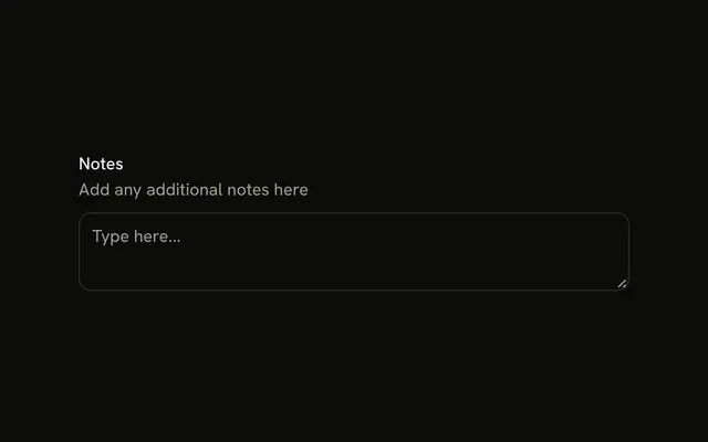
Below, as here, for short context people can read after the field. Put it between the label and the field, as the Textarea with Description example does, when it's an instruction people need before they start typing.
Why use text-muted-foreground for helper text?
FieldDescription sets the muted color and a smaller size, so the helper reads as secondary to the label and the field. The token keeps enough contrast in both themes.
How long should helper text be?
One sentence, like the one here. Longer guidance belongs on a help page linked from the description.
API Reference
Field
No extra props in this demo. The rest is on the Field page.
Textarea
Sets placeholder="Tell us about yourself". The rest is on the Textarea page.