shadcn.io is an independent project built on shadcn/ui
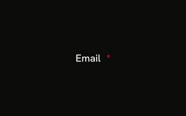
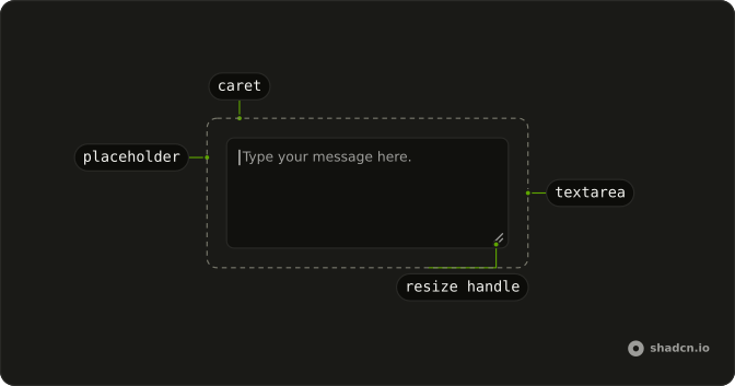
The label Message ends with a red asterisk, hidden from screen readers so it is not read twice. The placeholder is Type your message. The field is marked required.
Use it when an empty message should not submit. The browser blocks that submit. The asterisk is the visible cue. One line belongs in an Input. In React, Ark UI does not add an error message.
Installation
Anatomy
Usage
<Field className="max-w-md" required>
  <FieldLabel>
    Message
    <FieldRequiredIndicator />
  </FieldLabel>
  <Textarea className="bg-background" placeholder="Type your message..." />
</Field>
FAQ
When should I mark textarea fields as required?
Only when you can't process the form without the value: the message of a contact form, the body of a comment. Every extra required field is a reason to abandon the form, so leave the rest optional.
Is the red asterisk accessible for screen readers?
The asterisk is hidden from screen readers with aria-hidden, because the required attribute already makes them announce the field as required. The asterisk is only there for sighted users scanning the form.
Field takes required, passes it to the Textarea, and FieldRequiredIndicator renders the asterisk only while the field is required.
How do I validate required textareas on submit?
The required attribute already stops an empty submit with the browser's own message. For your own message, check the value when the form submits, mark the Field invalid and show a FieldError under the Textarea, as the Textarea with Error example does.
Can I use different colors for the required indicator?
Yes: it's a class on the asterisk, so swap text-destructive for another theme color. Red is the convention people recognize, though, and whatever you choose, use the same indicator on every required field of the form.
API Reference
Field
Sets required. The rest is on the Field page.
Textarea
Sets placeholder="Type your message...". The rest is on the Textarea page.