shadcn.io is an independent project built on shadcn/ui
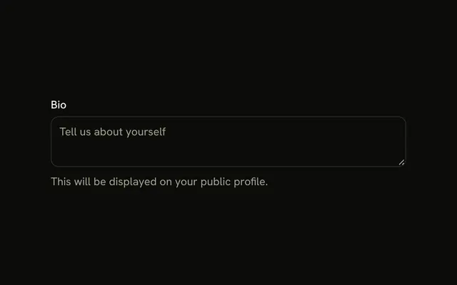
The label Description sits at the start of its row, and Optional sits at the end, in muted text. The placeholder is Add a description.
Use it when most fields are required and this one is not. Mark required fields with an asterisk when those are the rare ones. One line belongs in an Input. In React, Ark UI does not treat Optional as a validation rule.
Installation
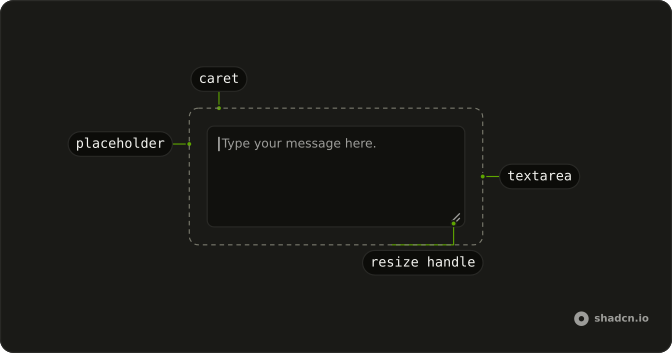
Anatomy
Usage
<Field className="max-w-md">
  <div className="flex items-center justify-between">
    <FieldLabel>Description</FieldLabel>
    <span className="text-muted-foreground text-sm">Optional</span>
  </div>
  <Textarea className="bg-background" placeholder="Add a description..." />
</Field>
FAQ
Should I mark optional fields or required fields?
Mark whichever is rarer. A sign-up form is mostly required, so mark its optional fields as here; a profile form is mostly optional, so mark its required ones with an asterisk, as the Required Textarea example does.
Why place Optional on the right side of the label?
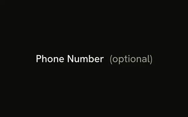
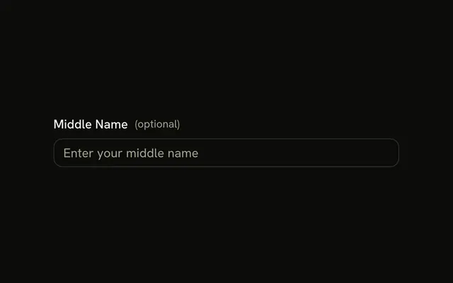
The row is flex with justify-between, which puts the hint at the end edge, apart from the label, where it's easy to find but doesn't interrupt it. The end edge is the left in a right-to-left layout. Optional in parentheses after the label works too.
What styling should I use for the optional hint?
text-muted-foreground and text-sm, as here, so it reads as secondary to the label without disappearing.
Can I use different wording instead of Optional?
Yes. Optional is the most widely understood, but a short phrase that fits your form's tone works. Use the same word on every optional field.
API Reference
Field
No extra props in this demo. The rest is on the Field page.
Textarea
Sets placeholder="Add a description...". The rest is on the Textarea page.