shadcn.io is an independent project built on shadcn/ui
package.json and index.tsx sit under Recent with a clock icon. README.md, tsconfig.json, and App.tsx follow under All Files. A rule separates the two.
Use it for file pickers and switchers, where people return to the same few files. A starred list, rather than a recent one, is the same pattern on a Combobox. In React, Base UI does not track what was opened.
Installation
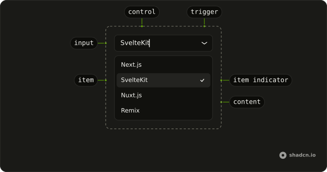
Anatomy
Usage
<Combobox items={files}>
  <ComboboxTrigger
    render={
      <Button className="w-[250px] justify-between" variant="outline" />
    }
  >
    <ComboboxValue placeholder="Select file..." />
  </ComboboxTrigger>
  <ComboboxContent>
    <ComboboxInput placeholder="Search files..." showTrigger={false} />
    <ComboboxEmpty>No file found.</ComboboxEmpty>
    <ComboboxList>
      {(group: Group, index: number) => (
        <ComboboxGroup items={group.items} key={group.value}>
          <ComboboxLabel>{group.value}</ComboboxLabel>
          <ComboboxCollection>
            {(item: Item) => (
              <ComboboxItem className="gap-2" key={item.value} value={item}>
                {group.value === "Recent" ? (
                  <ClockIcon
                    aria-hidden="true"
                    className="size-3 opacity-50"
                  />
                ) : null}
                {item.label}
              </ComboboxItem>
            )}
          </ComboboxCollection>
          {index < files.length - 1 ? <ComboboxSeparator /> : null}
        </ComboboxGroup>
      )}
{/* The rest of the file is under Installation. */}
FAQ
How are the two sections built?
Two ComboboxGroups, Recent and All Files, with a ComboboxSeparator between them.
Each group starts with a ComboboxLabel.
How is the clock drawn?
A ClockIcon at size-3 opacity-50, only in the Recent rows and hidden from screen readers.
Why aren't recent files listed twice?
All Files leaves out the recent ones, so each file has one row and one value.
Does Recent update when I pick a file?
Not in this demo: the list is fixed. Store the last few picks, newest first, and build the Recent group from them to make it live.
API Reference
Combobox
Sets items={files}, placeholder="Select file...", placeholder="Search files...", showTrigger={false}, items={group.items} and value={item}. The rest is on the Combobox page.
Button
Sets variant="outline". The rest is on the Button page.