shadcn.io is an independent project built on shadcn/ui
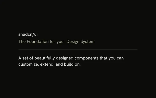
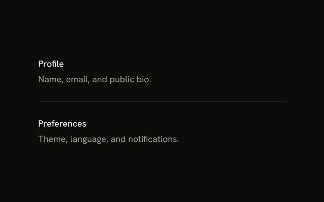
Profile details sits above a horizontal line, and Notification preferences sits below it. The gap on each side is 16 pixels.
Use this rhythm for forms and settings when you do not want a custom scale. A Card is the stronger break when the next block is a different task. In React, Base UI does not label the line.
Installation
Anatomy
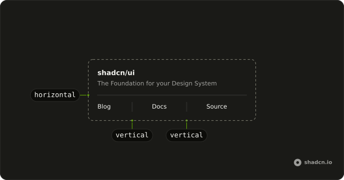
Usage
<div className="flex w-full max-w-sm flex-col gap-4">
  <p className="text-sm">Profile details</p>
  <Separator />
  <p className="text-sm">Notification preferences</p>
</div>
FAQ
Why is gap-4 the default spacing?
16 pixels sits in the middle of the Tailwind spacing scale: enough to separate sections without wasting a phone screen.
When should I leave the default?
Tighten to gap-1 or gap-2 for lists and data rows; open to gap-6 or gap-8 for large page sections. If the default feels slightly off, move one step on the scale rather than inventing a one-off value.
Should spacing stay consistent across the app?
Pick two or three steps, such as gap-2, gap-4 and gap-8, and reuse them. Many different values make a page feel accidental.
Is gap-4 right for form sections?
Yes, between groups such as Personal info and Preferences. Inside a group, the Field components already set a tighter rhythm between label and control.
API Reference
Separator
No extra props in this demo. The rest is on the Separator page.