shadcn.io is an independent project built on shadcn/ui
The button shows a calendar icon and today's date. The calendar header is a month dropdown and a year dropdown, not previous and next arrows.
Use month and year dropdowns when people jump far from this month, such as a birthday. Arrows on a Calendar are enough for dates near today. Ark UI in Solid does not know the birth year.
Installation
Anatomy
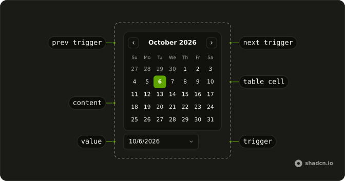
Usage
<DatePicker onValueChange={handleValueChange} positioning={positioning} value={value()}>
      <DatePickerTrigger asChild={props => <Button {...props({
      "class": "w-70 justify-start font-normal"
    })} variant="outline">
          <CalendarIcon aria-hidden="true" data-icon="inline-start" />
          <span>{date ? formatDate(date) : "Pick a date"}</span>
        </Button>} />
      <DatePickerContent>
        <CalendarViewControl class="gap-2">
          <CalendarMonthSelect class="flex-1 border" />
          <CalendarYearSelect class="border" />
        </CalendarViewControl>
        <CalendarTable>
          <CalendarWeekDays />
          <CalendarTableDays />
        </CalendarTable>
      </DatePickerContent>
    </DatePicker>
FAQ
Which parts make the header?
The month select and the year select, side by side in the view control with gap-2; the month one grows to fill the row. They're native select elements that ship with the date picker.
Do the dropdowns follow the calendar?
Yes. They read and set the month on view, so they always match the month shown. Changing one doesn't change the selected date.
Which years are in the list?
The date picker's default range around today. Set min and max on DatePicker to bound it, such as 1900 to this year for a birth date.
Can I keep the previous and next arrows?
Yes. Put the previous trigger before the selects and the next trigger after them, as the date picker's own default header does.
API Reference
Date Picker
Sets onValueChange={handleValueChange}, positioning={positioning}, value={value()}, asChild and props. The rest is on the Date Picker page.
Button
Sets props, w-70, justify-start, font-normal and variant="outline". The rest is on the Button page.
Calendar
No extra props in this demo. The rest is on the Calendar page.