shadcn.io is an independent project built on shadcn/ui
One outline row. A shield icon sits at the start, then Security Alert and New login detected from unknown device. The button says Review.
Use an icon row for an alert that needs one action, such as reviewing a new login. An Alert fits when the message is not part of a list. On Solid, Ark UI does not send the alert.
Installation
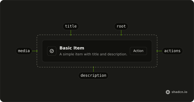
Anatomy
Usage
<div class="flex w-full max-w-lg flex-col gap-6">
    <Item class="bg-background" variant="outline">
      <ItemMedia variant="icon">
        <ShieldAlertIcon aria-hidden="true" />
      </ItemMedia>
      <ItemContent>
        <ItemTitle>Security Alert</ItemTitle>
        <ItemDescription>
          New login detected from unknown device.
        </ItemDescription>
      </ItemContent>
      <ItemActions>
        <Button size="sm" variant="outline">
          Review
        </Button>
      </ItemActions>
    </Item>
  </div>
FAQ
What does variant icon do for ItemMedia?
It sizes an icon that has no size class of its own to size-4, so icons line up from row to row without classes on each. When the row has a description, ItemMedia also moves to the top so the icon lines up with the title.
What icons work best in ItemMedia?
Simple ones that say what kind of row it is: a shield for security, a bell for a notification, a file for a document. The icon is decorative here, marked aria-hidden="true", because the title says what it means.
When should ItemMedia hold an icon and when an avatar?
An avatar when the row is about a person. An icon, as with this shield, when the row is a system event, a setting, or a file type. For a picture, set ItemMedia variant to image.
What actions suit an alert row?
One clear next step, Review here, as a small outline button. A second, quieter action such as Dismiss can sit beside it in ItemActions, which spaces its children with a small gap.
API Reference
Item
Sets variant="outline" and variant="icon". The rest is on the Item page.
Button
Sets size="sm" and variant="outline". The rest is on the Button page.