shadcn.io is an independent project built on shadcn/ui
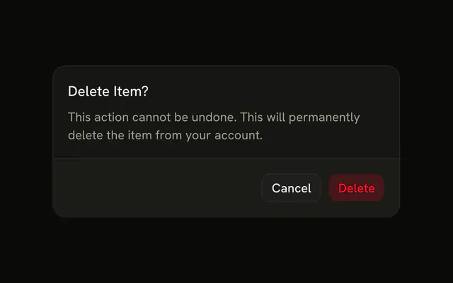
The title is Delete 24 Items, and the action repeats that count. The description says the delete would be permanent. A warning says some items may be referenced. The number is hard-coded. Nothing is deleted.
Show the real count before a bulk delete, and disable the trigger at zero. One item can use a shorter confirm. A Button can show the count before this opens. In Svelte, Ark UI does not count the selection.
Installation
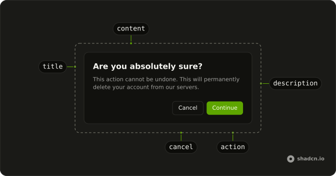
Anatomy
Usage
<AlertDialog><AlertDialogTrigger>{#snippet asChild(props)}<Button {...props()} variant="destructive">Delete Selected</Button>{/snippet}</AlertDialogTrigger><AlertDialogContent><AlertDialogHeader><AlertDialogTitle>Delete 24 Items?</AlertDialogTitle><AlertDialogDescription>You are about to permanently delete 24 selected items. This action cannot be undone and all associated data will be lost.</AlertDialogDescription></AlertDialogHeader><div class="rounded-md border border-destructive/20 bg-destructive/5 p-3 text-sm"><span class="font-medium text-destructive">Warning:</span> Some of these items may be referenced by other resources.</div><AlertDialogFooter><AlertDialogCancel>Cancel</AlertDialogCancel><AlertDialogClose>{#snippet asChild(props)}<AlertDialogAction {...props()} variant="destructive">Delete 24 Items</AlertDialogAction>{/snippet}</AlertDialogClose></AlertDialogFooter></AlertDialogContent></AlertDialog>FAQ
Where should the count appear?
Everywhere people look before confirming: the title, the description and the action label. The repetition is the safeguard against deleting more than intended.
How do I handle one item?
Pluralize from the count: Delete 1 Item?, not Delete 1 Items?. The demo's 24 is static text; build the strings from your selection.
When should a bulk delete need more confirmation?
As the count grows, so should the friction: add a checkbox or type-to-confirm for large deletions, as in Destructive with Checkbox Confirmation.
How is the warning panel styled?
A rounded-md border panel with border-destructive/20 bg-destructive/5, and the word Warning in text-destructive. Use it for knock-on effects people may not expect, like references from other resources.
API Reference
Alert Dialog
Sets props and variant="destructive". The rest is on the Alert Dialog page.
Button
Sets props and variant="destructive". The rest is on the Button page.