shadcn.io is an independent project built on shadcn/ui
The root is a home icon, named Home for screen readers, with no word beside it. A folder sits beside Components. A file sits beside Breadcrumb, the current page.
Use it when the root is a home icon and later crumbs should show folder or file. A text-only trail is enough for docs. A site menu is a Navigation Menu. In Svelte, Ark UI does not map icons to routes.
Installation
Anatomy
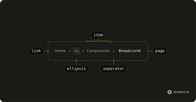
Usage
<Breadcrumb><BreadcrumbList><BreadcrumbItem><BreadcrumbLink>{#snippet asChild(props)}<a {...props({ "aria-label": "Home", href: "/" })}><HomeIcon aria-hidden="true" class="size-4" /></a>{/snippet}</BreadcrumbLink></BreadcrumbItem><BreadcrumbSeparator /><BreadcrumbItem><BreadcrumbLink class="flex items-center gap-1.5">{#snippet asChild(props)}<a {...props({ href: "/components" })}><FolderIcon aria-hidden="true" class="size-4" />Components</a>{/snippet}</BreadcrumbLink></BreadcrumbItem><BreadcrumbSeparator /><BreadcrumbItem><BreadcrumbPage class="flex items-center gap-1.5"><FileTextIcon aria-hidden="true" class="size-4" />Breadcrumb</BreadcrumbPage></BreadcrumbItem></BreadcrumbList></Breadcrumb>FAQ
How are the icons paired with the text?
Components has a FolderIcon and the current page a FileTextIcon, both size-4. The link and the page take flex items-center gap-1.5, so icon and word sit on one line.
Do the icons need labels?
No. The words beside them already name each crumb, so the icons are hidden from assistive tech. Only the home link, which has no word, carries aria-label.
How is the home icon named?
The link to / holds only a HomeIcon at size-4, hidden from assistive tech, so the link carries aria-label="Home". Screen readers announce it as the Home link.
Which separator sits between the crumbs?
An empty BreadcrumbSeparator renders a chevron, hidden from assistive tech.
API Reference
Breadcrumb
No extra props in this demo. The rest is on the Breadcrumb page.


