shadcn.io is an independent project built on shadcn/ui
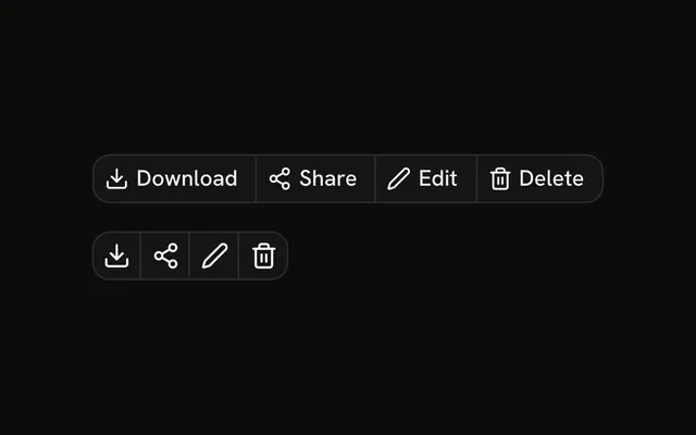
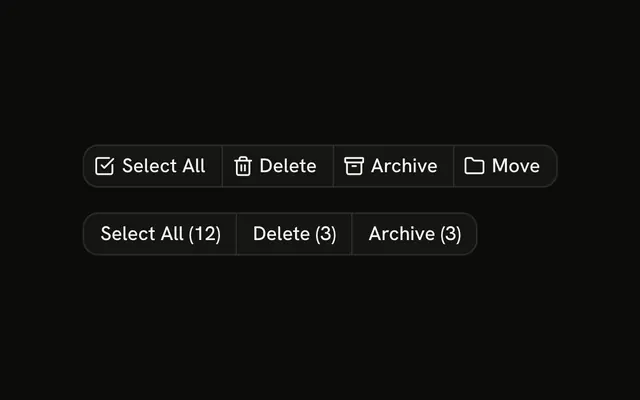
Actions under a comment. The first row is ghost: Reply, Edit, Delete, and Report, each with an icon. The second row is icon-only and outline, and it drops Report. None of the buttons do anything, and the rows do not share state.
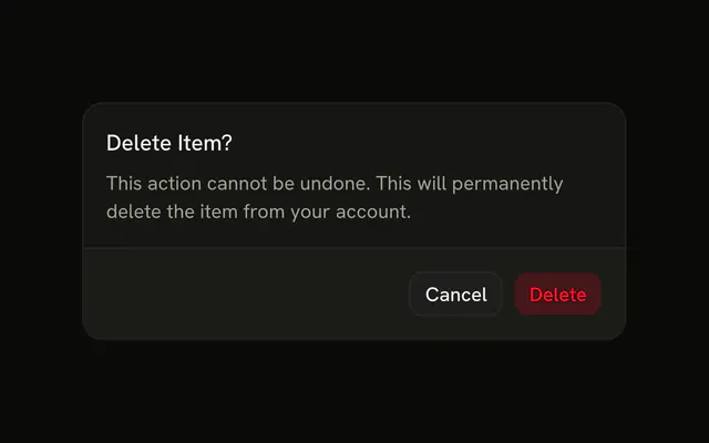
Keep the row quiet so it does not compete with the comment. A delete that cannot be undone should confirm in an Alert Dialog. In Svelte, Ark UI does not run Reply, Edit, Delete, or Report.
Installation
Anatomy
Usage
<div class="flex flex-col gap-4"><ButtonGroup aria-label="Comment actions"><Button size="sm" variant="ghost"><ReplyIcon aria-hidden="true" data-icon="inline-start" />Reply</Button><Button size="sm" variant="ghost"><Edit2Icon aria-hidden="true" data-icon="inline-start" />Edit</Button><Button size="sm" variant="ghost"><Trash2Icon aria-hidden="true" data-icon="inline-start" />Delete</Button><Button size="sm" variant="ghost"><FlagIcon aria-hidden="true" data-icon="inline-start" />Report</Button></ButtonGroup><ButtonGroup aria-label="Comment actions"><Button aria-label="Reply" size="icon-sm" variant="outline"><ReplyIcon aria-hidden="true" /></Button><Button aria-label="Edit" size="icon-sm" variant="outline"><Edit2Icon aria-hidden="true" /></Button><Button aria-label="Delete" size="icon-sm" variant="outline"><Trash2Icon aria-hidden="true" /></Button></ButtonGroup></div>FAQ
Why are the labeled buttons ghost?
A comment can carry these actions in every row of a thread. variant="ghost" shows no border or fill until hover, so the actions stay quiet. The icon-only row uses outline so the small buttons have a visible edge.
What is in each row?
The first group is Reply, Edit, Delete and Report, each with an icon before the label. The second group drops Report and shows Reply, Edit and Delete as icons.
How are the icon-only buttons named?
Each one has an aria-label, Reply, Edit or Delete, and the icon has aria-hidden="true". They use size="icon-sm", a square button.
Do the buttons do anything?
No. They have no click handler. Wire Reply to open your reply field, and Delete to a confirmation such as an Alert Dialog.
API Reference
Button Group
Sets aria-label="Comment actions". The rest is on the Button Group page.
Button
Sets size="sm", variant="ghost", aria-label="Reply", size="icon-sm", variant="outline" and aria-label="Edit". The rest is on the Button page.