shadcn.io is an independent project built on shadcn/ui
Development lists three developer roles, Design lists UI Designer and UX Designer, and Management lists three manager roles. Each heading ends with how many roles it holds.
Use it when the size of a group helps people decide where to look. A heading with no count is a labeled Combobox group. In Svelte, Ark UI does not count the rows. The heading does.
Installation
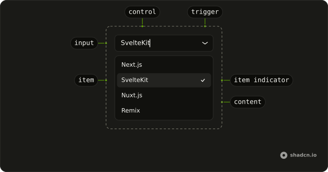
Anatomy
Usage
<Combobox collection={collection} onInputValueChange={handleInputValueChange} onValueChange={handleValueChange} positioning={{ getAnchorElement: () => triggerRef }} selectionBehavior="clear" value={value}><ComboboxTrigger class={cn(
          buttonVariants({ variant: "outline" }),
          "w-[250px] justify-between"
        )} bind:ref={triggerRef}>{#if selected}{selected.label}{:else}{"Select role..."}{/if}</ComboboxTrigger><ComboboxContent><ComboboxInput class="w-full" placeholder="Search role..." showTrigger={false} /><ComboboxEmpty>No role found.</ComboboxEmpty><ComboboxList>{#each groups as [group, items] (group)}<ComboboxGroup><ComboboxGroupLabel class="flex items-center justify-between"><span>{group}</span><span class="text-muted-foreground text-xs">{items.length}</span></ComboboxGroupLabel>{#each items as item (item.value)}<ComboboxItem item={item}>{item.label}</ComboboxItem>{/each}</ComboboxGroup>{/each}</ComboboxList></ComboboxContent></Combobox>
FAQ
How is the count placed in the heading?
The group label is flex items-center justify-between, with the group name in one span and the count in another, text-muted-foreground text-xs.
Where does the number come from?
From the length of the group's items. The list passes each group with the items left after the search, so the count drops as you type.
Which roles are listed?
Development: Frontend, Backend and Fullstack Developer. Design: UI and UX Designer. Management: Product, Project and Engineering Manager.
API Reference
Combobox
Sets collection={collection}, onInputValueChange={handleInputValueChange}, onValueChange={handleValueChange}, positioning, getAnchorElement and cn. The rest is on the Combobox page.