shadcn.io is an independent project built on shadcn/ui
A small outline button shows a question mark. It opens a panel that hugs the words Quick tip, with little padding around them.
Use it for a hint that is only a few words, beside the control it explains. A sentence that should vanish on its own belongs in a Tooltip. In Svelte, Ark UI does not write the tip.
Installation
Anatomy
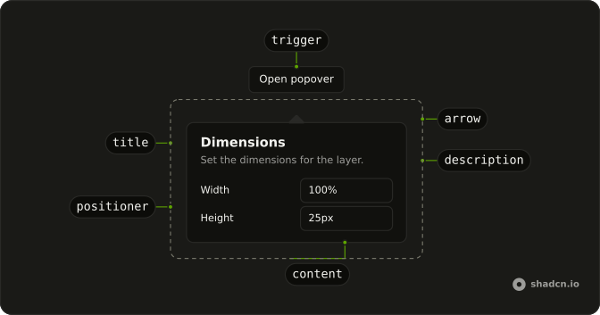
Usage
<Popover><PopoverTrigger>{#snippet asChild(props)}<Button {...props({ "aria-label": "Quick tip" })} size="sm" variant="outline">?</Button>{/snippet}</PopoverTrigger><PopoverContent class="w-auto p-2"><PopoverTitle class="font-normal text-xs">Quick tip</PopoverTitle></PopoverContent></Popover>FAQ
Why is this panel only as wide as its text?
PopoverContent sets w-auto and p-2, so the panel hugs the words Quick tip. PopoverTitle uses font-normal and text-xs, and that title is the only text in the panel.
How does the question-mark button become the trigger?
The trigger is a Button with variant="outline", size="sm", and aria-label="Quick tip". Its visible child is ?. Activating it opens the panel.
asChild is a snippet on PopoverTrigger that renders the button, and PopoverContent is the panel.
Is Quick tip a heading people can see?
Yes. PopoverTitle is the visible text, with font-normal text-xs. The button's aria-label repeats Quick tip, because the button face is only ?.
When is a tooltip a better fit than this panel?
This panel is one short line that stays up until Escape or a click outside. A Tooltip fits a few words on hover or focus. The button here is size="sm".
API Reference
Popover
No extra props in this demo. The rest is on the Popover page.
Button
Sets props, aria-label, Quick, tip, size="sm" and variant="outline". The rest is on the Button page.