shadcn.io is an independent project built on shadcn/ui
Options splits into My Account and Team, each under a label, then a destructive Log out on its own. The labels are headings, not commands.
Use it when one menu mixes account commands and team commands. If the list is long enough to search, use Command. In Svelte, Ark UI does not run Log out.
Installation
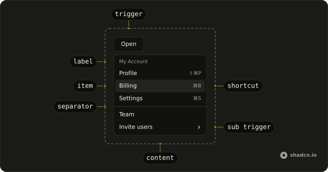
Anatomy
Usage
<DropdownMenu><DropdownMenuTrigger>{#snippet asChild(props)}<Button {...props()} variant="outline">Options<ChevronDownIcon aria-hidden="true" data-icon="inline-end" /></Button>{/snippet}</DropdownMenuTrigger><DropdownMenuContent class="w-56"><DropdownMenuGroup><DropdownMenuLabel>My Account</DropdownMenuLabel><DropdownMenuSeparator /><DropdownMenuItem value="profile"><UserIcon aria-hidden="true" />Profile</DropdownMenuItem><DropdownMenuItem value="billing"><CreditCardIcon aria-hidden="true" />Billing</DropdownMenuItem><DropdownMenuItem value="settings"><SettingsIcon aria-hidden="true" />Settings</DropdownMenuItem></DropdownMenuGroup><DropdownMenuSeparator /><DropdownMenuGroup><DropdownMenuLabel>Team</DropdownMenuLabel><DropdownMenuItem value="team-members"><UsersIcon aria-hidden="true" />Team Members</DropdownMenuItem><DropdownMenuItem value="support"><LifeBuoyIcon aria-hidden="true" />Support</DropdownMenuItem></DropdownMenuGroup><DropdownMenuSeparator /><DropdownMenuItem value="log-out" variant="destructive"><LogOutIcon aria-hidden="true" />Log out</DropdownMenuItem></DropdownMenuContent></DropdownMenu>FAQ
How are My Account and Team split?
Each is a DropdownMenuGroup that starts with its DropdownMenuLabel, with a DropdownMenuSeparator between them. A separator also sits under My Account's label, and another before Log out.
Which icon is on each row?
A user for Profile, a card for Billing, a gear for Settings, people for Team Members, a life buoy for Support and an arrow for Log out, each aria-hidden before the label.
How is Log out marked?
variant="destructive" on its DropdownMenuItem, outside both groups. It colors the row and doesn't confirm anything.
Is My Account a command?
No. A DropdownMenuLabel names its group: it can't be focused or picked, and the arrow keys skip it.
API Reference
Dropdown Menu
Sets value="profile", value="billing", value="settings", value="team-members", value="support" and value="log-out". The rest is on the Dropdown Menu page.
Button
Sets props and variant="outline". The rest is on the Button page.