shadcn.io is an independent project built on shadcn/ui
New lists Document and Folder, then a Media submenu for Image, Video, and Audio, and a Document Type submenu for Text Document, Spreadsheet, Presentation, and Form.
Use it when a few create actions would bury the rest of the menu. If people should type to find a type, use Command. In Svelte, Ark UI opens the submenu and does not create the file.
Installation
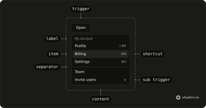
Anatomy
Usage
<DropdownMenu><DropdownMenuTrigger>{#snippet asChild(props)}<Button {...props()} variant="outline"><PlusIcon aria-hidden="true" data-icon="inline-start" />New</Button>{/snippet}</DropdownMenuTrigger><DropdownMenuContent class="w-56"><DropdownMenuItem value="document"><FileTextIcon aria-hidden="true" />Document</DropdownMenuItem><DropdownMenuItem value="folder"><FolderIcon aria-hidden="true" />Folder</DropdownMenuItem><DropdownMenuSeparator /><DropdownMenuSub><DropdownMenuSubTrigger><ImageIcon aria-hidden="true" />Media</DropdownMenuSubTrigger><DropdownMenuSubContent><DropdownMenuItem value="image"><ImageIcon aria-hidden="true" />Image</DropdownMenuItem><DropdownMenuItem value="video"><VideoIcon aria-hidden="true" />Video</DropdownMenuItem><DropdownMenuItem value="audio"><MusicIcon aria-hidden="true" />Audio</DropdownMenuItem></DropdownMenuSubContent></DropdownMenuSub><DropdownMenuSub><DropdownMenuSubTrigger><FileTextIcon aria-hidden="true" />Document Type</DropdownMenuSubTrigger><DropdownMenuSubContent><DropdownMenuItem value="text-document">Text Document</DropdownMenuItem><DropdownMenuItem value="spreadsheet">Spreadsheet</DropdownMenuItem><DropdownMenuItem value="presentation">Presentation</DropdownMenuItem><DropdownMenuItem value="form">Form</DropdownMenuItem></DropdownMenuSubContent></DropdownMenuSub></DropdownMenuContent></DropdownMenu>FAQ
What is in the top menu?
Document and Folder, a separator, then the Media and Document Type submenu triggers. The menu is w-56.
How is a submenu built?
DropdownMenuSub wraps a DropdownMenuSubTrigger, which draws a chevron at its end, and a DropdownMenuSubContent with the rows. It opens beside its trigger on hover or with Arrow Right, and flips to the other side when there's no room.
API Reference
Dropdown Menu
Sets value="document", value="folder", value="image", value="video", value="audio" and value="text-document". The rest is on the Dropdown Menu page.
Button
Sets props and variant="outline". The rest is on the Button page.