shadcn.io is an independent project built on shadcn/ui
A bar at 80 percent, with Almost there! under it. The encouragement is the only visible text.
Put a short note under the bar when you want to cheer the last stretch. Show the number above the bar when people need the exact amount, or a Spinner when you cannot measure it. In Svelte, Ark UI shows only the value you pass.
Installation
Anatomy
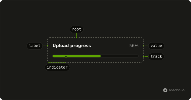
Usage
<div class="flex w-full max-w-md flex-col gap-2"><Progress aria-label="Profile completion" value={80} /><p class="text-muted-foreground text-sm">Almost there!</p></div>FAQ
Why is the message outside Progress?
Children of Progress render before the track, so anything inside it sits above the bar. To put text below, the demo wraps Progress and a p in a column with gap-2.
Is Almost there! the bar's name?
No. The message is ordinary text that follows the bar.
Ark UI puts the progressbar role on the track and names it with the value text, here 80%. The aria-label, Profile completion, sits on the root element.
How do I tie the message to the bar?
The demo leaves them separate.
Keep the message right after the bar in the reading order. Progress renders the track for you, and that track holds the progressbar role, so attributes on Progress don't reach it.
How do I update the 80?
Change value as the work advances. This demo passes a fixed 80.
Always pass value: without one, Ark UI starts the bar at 50.
API Reference
Progress
Sets aria-label="Profile completion" and value={80}. The rest is on the Progress page.