shadcn.io is an independent project built on shadcn/ui
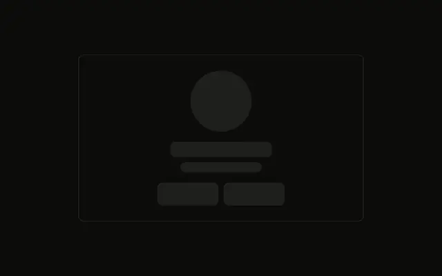
An avatar sits beside two lines for the name, then two lines of bio, then three stats in a row under a top border.
Use it for a directory card that shows counts such as followers. If the profile is missing rather than loading, say so with Empty. In Svelte, Ark UI does not load those counts.
Installation
Anatomy
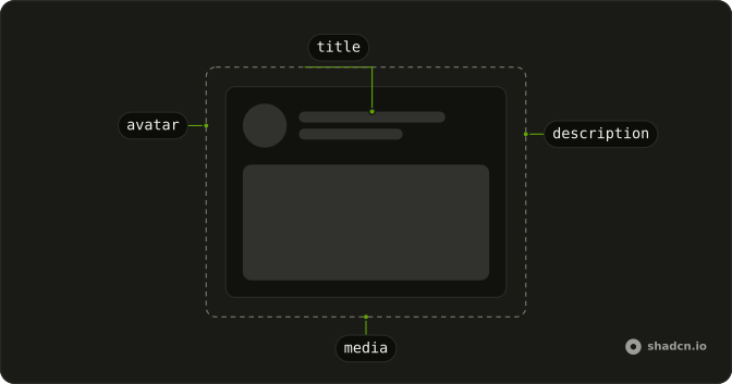
Usage
<div class="flex w-full max-w-sm flex-col gap-4 rounded-md border p-6"><div class="flex items-center gap-4"><Skeleton class="size-16 shrink-0 rounded-full" /><div class="flex flex-1 flex-col gap-2"><Skeleton class="h-5 w-32" /><Skeleton class="h-4 w-24" /></div></div><Skeleton class="h-4 w-full" /><Skeleton class="h-4 w-5/6" /><div class="flex gap-4 border-t pt-2"><div class="flex flex-1 flex-col items-center gap-2"><Skeleton class="h-6 w-12" /><Skeleton class="h-3 w-16" /></div><div class="flex flex-1 flex-col items-center gap-2"><Skeleton class="h-6 w-12" /><Skeleton class="h-3 w-16" /></div><div class="flex flex-1 flex-col items-center gap-2"><Skeleton class="h-6 w-12" /><Skeleton class="h-3 w-16" /></div></div></div>FAQ
What wraps the profile card?
flex w-full max-w-sm flex-col gap-4 rounded-md border p-6. Header, two bio lines, then a stats row.
How is the header built?
flex items-center gap-4 holds a size-16 shrink-0 rounded-full circle and a flex-1 column. The name is h-5 w-32. The line under it is h-4 w-24.
What are the two lines under the header?
h-4 w-full and h-4 w-5/6. The shorter line reads as the end of a short bio.
How are the three stats laid out?
flex gap-4 border-t pt-2. Each stat is flex flex-1 flex-col items-center gap-2, with h-6 w-12 over h-3 w-16.
API Reference
Skeleton
No extra props in this demo. The rest is on the Skeleton page.