shadcn.io is an independent project built on shadcn/ui
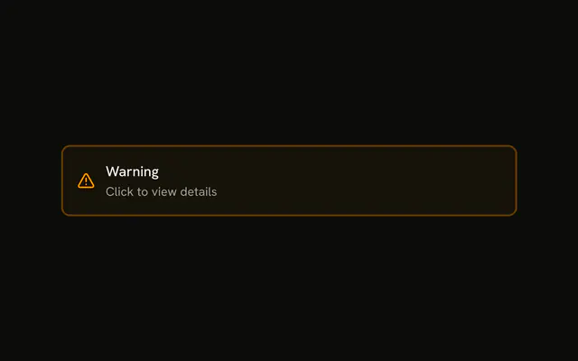
An info-tinted box with an info icon and the title Important Notice. The message opens under a divider in the same color.
Use it for a tip people can skip. If the notice must stay on screen, use an Alert. In Vue, Ark UI does not keep it open after a reload.
Installation
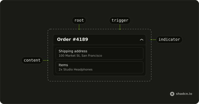
Anatomy
Usage
<Collapsible class="w-full max-w-lg rounded-lg border-2 border-info/32 bg-info/4">
  <CollapsibleTrigger class="flex w-full items-center gap-3 p-4 font-medium">
    <InfoIcon aria-hidden="true" class="size-5 shrink-0 text-info" />Important Notice
  </CollapsibleTrigger>
  <CollapsibleContent class="border-info/32 border-t-2 px-4 py-3 text-muted-foreground text-sm">
    This is an informational message that provides additional context and details when expanded.
  </CollapsibleContent>
</Collapsible>
FAQ
Which classes paint the info box?
Collapsible uses border-2 border-info/32 bg-info/4: a faint tint and a stronger border from the theme's --info color, the same mix as an info Alert. The icon is text-info, so light and dark mode follow the theme.
Does the answer use the same border colors?
Yes. CollapsibleContent has border-t-2 border-info/32, and the message is text-muted-foreground text-sm.
What is inside the trigger?
InfoIcon at size-5 and the Important Notice title, in a flex items-center gap-3 p-4 row that fills the box.
API Reference
Collapsible
No extra props in this demo. The rest is on the Collapsible page.