shadcn.io is an independent project built on shadcn/ui
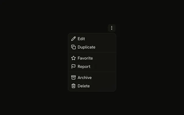
A dots button opens Edit, Duplicate, a Share submenu, Archive, and a destructive Delete. Share holds Email, Twitter, Facebook, and LinkedIn.
Use it on a card when share targets would push the card's own actions out of sight. A right-click list is a Context Menu. In Vue, Ark UI opens Share and does not send it.
Installation
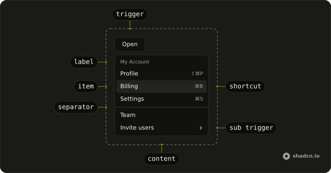
Anatomy
Usage
<DropdownMenu>
  <DropdownMenuTrigger :asChild="true">
    <Button aria-label="Card actions" size="icon-sm" variant="ghost">
      <MoreHorizontalIcon aria-hidden="true" />
    </Button>
  </DropdownMenuTrigger>
  <DropdownMenuContent class="w-48">
    <DropdownMenuItem value="edit">
      <PencilIcon aria-hidden="true" />Edit
    </DropdownMenuItem>
    <DropdownMenuItem value="duplicate">
      <CopyIcon aria-hidden="true" />Duplicate
    </DropdownMenuItem>
    <DropdownMenuSeparator />
    <DropdownMenuSub>
      <DropdownMenuSubTrigger>
        <Share2Icon aria-hidden="true" />Share
      </DropdownMenuSubTrigger>
      <DropdownMenuSubContent>
        <DropdownMenuItem value="email">
          <MailIcon aria-hidden="true" />Email
        </DropdownMenuItem>
        <DropdownMenuItem value="twitter">
          <AtSignIcon aria-hidden="true" />Twitter
        </DropdownMenuItem>
        <DropdownMenuItem value="facebook">
          <ThumbsUpIcon aria-hidden="true" />Facebook
        </DropdownMenuItem>
        <DropdownMenuItem value="linkedin">
          <BriefcaseIcon aria-hidden="true" />LinkedIn
        </DropdownMenuItem>
<!-- The rest of the file is under Installation. -->
FAQ
What opens the card actions?
A ghost Button with size="icon-sm" and aria-label set to Card actions, holding a dots icon that is aria-hidden.
Where does the menu open?
Below the button, lined up with its end edge, and it flips to stay on screen. The menu is w-48.
That is DropdownMenu's default bottom-end placement. Pass positioning with another placement to move it.
What is the order of the rows?
Edit, Duplicate, a separator, the Share submenu, a separator, then Archive and Delete. Each row starts with an icon that is aria-hidden.
API Reference
Dropdown Menu
Sets asChild, value="edit", value="duplicate", value="email", value="twitter" and value="facebook". The rest is on the Dropdown Menu page.
Button
Sets aria-label="Card actions", size="icon-sm" and variant="ghost". The rest is on the Button page.