shadcn.io is an independent project built on shadcn/ui
A context menu opens at the pointer when someone right-clicks an area, or holds a finger on it on a touch screen, and lists the actions for whatever is under it: a file in a grid, a row in a table, a shape on a canvas. Inside that area it takes the place of the browser's own menu.
Nothing on screen says the menu is there, so put the same actions on a visible button too, usually a Dropdown Menu. An app's main commands belong in a Menubar.
Installation
Anatomy
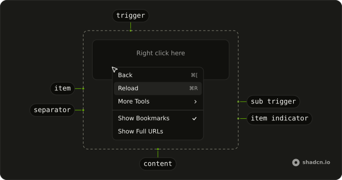
Usage
<script setup lang="ts">
import {
  ContextMenu, ContextMenuContent, ContextMenuItem,
  ContextMenuSeparator, ContextMenuTrigger,
} from "@/components/ui/context-menu";
</script>
Everything inside ContextMenuTrigger is the area that opens the menu. Each ContextMenuItem needs a value, which is how the menu tells your select handler which item was chosen.
<template>
  <ContextMenu>
    <ContextMenuTrigger class="flex h-32 w-full max-w-xs items-center justify-center rounded-xl border border-dashed text-sm">
      Right click here
    </ContextMenuTrigger>
    <ContextMenuContent class="w-48">
      <ContextMenuItem value="back">Back</ContextMenuItem>
      <ContextMenuItem value="reload">Reload</ContextMenuItem>
      <ContextMenuSeparator />
      <ContextMenuItem value="delete" variant="destructive">
        Delete
      </ContextMenuItem>
    </ContextMenuContent>
  </ContextMenu>
</template>
Accessibility
The menu has role="menu" and takes its name from the trigger's text, so give the area words that say what it holds. Focus moves to the menu, the arrow keys move a highlight that aria-activedescendant reports, typing a letter jumps to the next item that starts with it, and checkbox and radio rows report aria-checked. On Ark UI the trigger renders a <button>, so Tab reaches it, and Shift + F10 or the Menu key opens the menu from there on Windows and Linux.
- Space
- Activates/Selects the highlighted item.
- Enter
- Activates/Selects the highlighted item.
- Arrow Down
- Highlights the next item in the menu.
- Arrow Up
- Highlights the previous item in the menu.
- Arrow Right
- When focus is on trigger, opens or closes the submenu depending on reading direction.
- Arrow Left
- When focus is on trigger, opens or closes the submenu depending on reading direction.
- Escape
- Closes the context menu.
- Home
- Highlights the first item in the menu.
- End
- Highlights the last item in the menu.
- Shift+F10
- When focus is on the trigger, opens the menu on Windows and Linux, as the Menu key does.
Demos
Basic
Back, Forward and Reload in one short list, with disabled on Forward so it stays in view but can't be chosen. Start from this for a handful of actions on one object, such as a page or a file, where the whole list reads at a glance. Add groups and separators once it grows.
File list
Four files, each row its own ContextMenu with the row inside ContextMenuTrigger, so Star and Delete act on the file that was right-clicked and nothing has to be read back from the click. Budget 2026.xlsx starts starred, and Delete removes the row. Reach for this shape in a file grid, a table or a list of messages.
Submenu
Copy and Cut sit at the top, and More Tools opens a second panel with Save Page, Create Shortcut and Name Window, then Developer Tools and a destructive Delete. Move the actions people reach for less often into a submenu so the first list stays short. Hovering More Tools opens it, and so do ArrowRight and Enter.
Shortcuts
Back, Forward and Reload end in ⌘[, ⌘] and ⌘R, and Save and Save As below a separator end in ⌘S and ⇧⌘S. ContextMenuShortcut is a styled span that prints the hint and listens for nothing. Bind the keys yourself at the page level, where they work without opening the menu, and show a hint only for a shortcut that exists.
Groups
File and Edit are labeled groups, Cut, Copy and Paste follow in a group with no label, and Delete sits alone at the end, each row with its shortcut. A ContextMenuGroupLabel names a section and can't be chosen, while a ContextMenuSeparator divides groups that need no name. Group a menu once it holds more than one kind of action.
Icons
Copy, Cut and Paste each start with an icon, and Delete has a trash can below a separator. Every icon has aria-hidden, since the label already names the action. Icons pay off on familiar commands that people open the menu for again and again, and add little beside a label nobody would recognize from a picture.
Checkboxes
Show Bookmarks Bar, Show Full URLs and Show Developer Tools are three ContextMenuCheckboxItem rows, with checked read from refs. The demo listens with @checked-change, which the Ark UI checkbox item never emits, so a click closes the menu and the mark doesn't move. Bind v-model:checked on each row for a toggle that sticks.
Radio
People offers Pedro Duarte and Colm Tuite, and Theme offers Light, Dark and System, each in its own ContextMenuRadioGroup. The demo listens with @value-change, which the Ark UI radio group never emits, so a click closes the menu and the mark stays where it was. Bind v-model on each group to hold the chosen value.
Destructive
Edit and Share come first with their icons, then Delete below a separator with variant set to destructive, which colors the row as a warning. The variant changes the color and nothing else, so it asks for no confirmation. When the action can't be undone, open an Alert Dialog from the item, and keep the dangerous row last.
Sides
Four dashed areas, labeled top, right, bottom and left, open the same Back, Forward and Reload list on that side of the pointer, through a placement in positioning on ContextMenu. Without one, the menu opens below and to the right of the pointer, and it flips to the other side when there's no room. Pin a side when the default would cover what people right-clicked.
RTL
Arabic labels on two submenus, two view checkboxes and a people radio group. dir is rtl on ContextMenu, which this file turns into an Arabic locale for every panel, so the text and chevrons turn around, submenus open to the left and ArrowLeft opens them. Use it on Arabic or Hebrew pages.
FAQ
Should I use a Context Menu or a Dropdown Menu?
Use a Context Menu for actions on the thing under the pointer, such as a file in a grid, a row in a table or a shape on a canvas, where a button on every one would crowd the layout. Use a Dropdown Menu when the actions hang off a button people can see.
Nothing on screen tells people a right-click menu exists, so treat it as a shortcut rather than the only way in. Most apps offer the same list both ways: an ellipsis button on the row opens it as a dropdown, and a right-click anywhere on the row opens it at the pointer.
How do I run code when a Context Menu item is chosen?
Listen for @select on ContextMenu: it receives details.value, the value of the chosen item, so one handler can branch on it. Every ContextMenuItem needs a value of its own for this to work. The menu closes after a choice, and setting closeOnSelect to false on ContextMenu, or on one item, keeps it open.
The handler acts on whatever was right-clicked, so it needs to know which row or file that was. Writing one menu per row, inside the row's own markup, puts that row's data in scope.
How do I know which row was right-clicked in a Context Menu?
Give each row its own ContextMenu, with the row inside ContextMenuTrigger, as the File list demo does. The item handlers are then written where that row's data is in scope, so Delete already knows which file to delete and nothing has to be read back from the click.
This doesn't make a long list heavy. Nothing inside a menu is rendered until it opens, so a table of a few hundred rows carries a few hundred triggers and one open menu at a time.
How do I keep the Context Menu open after toggling a checkbox item?
Set closeOnSelect to false on that ContextMenuCheckboxItem, or on ContextMenu for every item. Without it the menu closes after each toggle, as it does in the Checkboxes demo, which is fine for one setting and slow when people change three in a row.
Does the Context Menu open with a long press on a phone?
Yes. Ark UI times the press itself and opens the menu where the finger is after 700 milliseconds, which also works in Safari on iOS, where no contextmenu event fires. Any movement before then cancels it, so a scroll that starts on the area doesn't open the menu.
A long press is even harder to discover than a right-click, so give touch users a visible way to the same actions. The demos swap their Right click here label for Long press here on touch screens.
Can keyboard users open a Context Menu?
Yes. On Ark UI the trigger renders a <button>, so Tab reaches it, and Shift + F10 or the Menu key on Windows and Linux fire the browser's contextmenu event there, which opens the menu. Because the area is a button, it can't hold links or other buttons, so for a row that has them, render the row itself through asChild on ContextMenuTrigger and make it focusable.
Few people know these keys, so keep every action in the menu reachable from a visible control as well.
API Reference
ContextMenu
data-slot="context-menu"
open?boolean
The controlled open state of the menu. Two-way with v-model:open.
defaultOpen?boolean
The initial open state of the menu when rendered. Use when you don't need to control the open state of the menu.
triggerValue?string | null
The controlled trigger value. Two-way with v-model:triggerValue.
- Type
string | null
defaultTriggerValue?string | null
The initial trigger value when rendered. Use when you don't need to control the trigger value.
- Type
string | null
anchorPoint?Point | null
The positioning point for the menu. Can be set by the context menu trigger or the button trigger.
- Type
Point | null
closeOnSelect?boolean
Whether to close the menu when an option is selected.
- Default
true
composite?boolean
Whether the menu is a composed with other composite widgets like a combobox or tabs.
- Default
true
defaultHighlightedValue?string | null
The initial highlighted value of the menu item when rendered. Use when you don't need to control the highlighted value of the menu item.
- Type
string | null
dir?"ltr" | "rtl"
The reading direction. Inherits the nearest DirectionProvider when unset.
- Type
"ltr" | "rtl"
hideMode?"display-none" | "activity"
How to hide content when mounted but not present.
- display-none: HTML hidden attribute. Effects stay alive.
- activity: React 19 <Activity mode="hidden">. Effects pause. Requires React 19+.
- Type
"display-none" | "activity"- Default
"display-none"
highlightedValue?string | null
The controlled highlighted value of the menu item.
- Type
string | null
id?string
The unique identifier of the machine.
ids?object
The ids of the elements in the menu. Useful for composition.
- Type
{ trigger?: string | ((value?: string) → string); contextTrigger?: string | ((value?: string) → string); content?: string; groupLabel?: (id: string) → string; group?: (id: string) → string; positioner?: string; arrow?: string }
immediate?boolean
Whether to synchronize the present change immediately or defer it to the next frame.
lazyMount?boolean
Whether to enable lazy mounting. Ark default: false.
- Default
true
loopFocus?boolean
Whether to loop the keyboard navigation.
- Default
false
navigate?((details: NavigateDetails) → void) | null
Function to navigate to the selected item if it's an anchor element.
- Type
((details: NavigateDetails) → void) | null- Parameters
(details– { value: string; node: HTMLAnchorElement; href: string }- Returns
void) | null
onEnterComplete?VoidFunction
Function called when the animation ends in the open state.
onExitComplete?VoidFunction
Function called when the animation ends in the closed state.
positioning?object
The options used to dynamically position the menu.
- Type
{ restoreStyles?: boolean; applyStyles?: boolean; hideWhenDetached?: boolean; strategy?: "absolute" | "fixed"; placement?: Placement; offset?: { mainAxis?: number; crossAxis?: number; }; gutter?: number; shift?: number; overflowPadding?: number; arrowPadding?: number; flip?: boolean | Placement[]; slide?: boolean; overlap?: boolean; sameWidth?: boolean; fitViewport?: boolean; sizeMiddleware?: boolean; boundary?: (() → Boundary) | Boundary | "clipping-ancestors"; listeners?: boolean | AutoUpdateOptions; onComplete?: (data: ComputePositionReturn) → void; onPositioned?: ((data: { placed: boolean; }) → void); getAnchorElement?: () → HTMLElement | VirtualElement | null; getAnchorRect?: (element: HTMLElement | VirtualElement | null) → AnchorRect | null; updatePosition?: ((data: { updatePosition: () → Promise<void>; floatingElement: HTMLElement | null; }) → void | Promise<void>) }
present?boolean
Whether the node is present (controlled by the user).
skipAnimationOnMount?boolean
Whether to allow the initial presence animation.
- Default
false
typeahead?boolean
Whether the pressing printable characters should trigger typeahead navigation.
- Default
true
unmountOnExit?boolean
Whether to unmount on exit. Ark default: false.
- Default
true
@open-change(details: OpenChangeDetails) → void
Function called when the menu opens or closes.
- Type
(details: OpenChangeDetails) → void- Parameters
details– { open: boolean }- Returns
void
@trigger-value-change(details: TriggerValueChangeDetails) → void
Function called when the trigger value changes.
- Type
(details: TriggerValueChangeDetails) → void- Parameters
details– { value: string | null; triggerElement: HTMLElement | null }- Returns
void
@escape-key-down(event: KeyboardEvent) → void
Function called when the escape key is pressed.
- Parameters
event– { altKey: boolean; charCode: number; ctrlKey: boolean; code: string; getModifierState: (key: string) → boolean; key: string; keyCode: number; locale: string; location: number; metaKey: boolean; repeat: boolean; shiftKey: boolean; which: number }- Returns
void
@focus-outside(event: FocusOutsideEvent) → void
Function called when the focus is moved outside the component.
- Type
(event: FocusOutsideEvent) → void- Parameters
event– FocusOutsideEvent- Returns
void
@highlight-change(details: HighlightChangeDetails) → void
Function called when the highlighted menu item changes.
- Type
(details: HighlightChangeDetails) → void- Parameters
details– { highlightedValue: string | null }- Returns
void
@interact-outside(event: InteractOutsideEvent) → void
Function called when an interaction happens outside the component.
- Type
(event: InteractOutsideEvent) → void- Parameters
event– InteractOutsideEvent- Returns
void
@pointer-down-outside(event: PointerDownOutsideEvent) → void
Function called when the pointer is pressed down outside the component.
- Type
(event: PointerDownOutsideEvent) → void- Parameters
event– PointerDownOutsideEvent- Returns
void
@request-dismiss(event: LayerDismissEvent) → void
Function called when this layer is closed due to a parent layer being closed.
- Type
(event: LayerDismissEvent) → void- Parameters
event– LayerDismissEvent- Returns
void
@select(details: SelectionDetails) → void
Function called when a menu item is selected.
- Type
(details: SelectionDetails) → void- Parameters
details– { value: string }- Returns
void
ContextMenuArrow
<div> data-slot="context-menu-arrow"
asChild?boolean
Use the provided child element as the default rendered element, combining their props and behavior.
class?string
Merged with the part's classes.
--arrow-backgroundstring
Use this variable to style the arrow background.
--arrow-offsetstring
The offset position of the arrow.
--arrow-sizestring
The size of the arrow.
--arrow-size-halfstring
Half the size of the arrow.
ContextMenuArrowTip
<div>
asChild?boolean
Use the provided child element as the default rendered element, combining their props and behavior.
ContextMenuSubContent
<div> data-slot="context-menu-sub-content"
asChild?boolean
Use the provided child element as the default rendered element, combining their props and behavior.
class?string
Merged with the part's classes.
data-has-nested?string
Present when another menu is nested inside it.
data-instant?stringdata-nested?string
Present when it's nested inside another menu.
data-placementstring
The placement of the content.
data-side"top" | "right" | "bottom" | "left"
The side of the trigger that the content is positioned on.
- Type
"top" | "right" | "bottom" | "left"
data-state"open" | "closed"
"open" or "closed".
- Type
"open" | "closed"
--available-heightstring
The height left between the anchor and the viewport's edge.
--layer-indexstring
The index of the dismissable in the layer stack.
--nested-layer-countstring
The number of nested menus.
--transform-originstring
Where the content scales from, on its trigger's side.
ContextMenuTrigger
<button> data-slot="context-menu-trigger"
asChild?boolean
Use the provided child element as the default rendered element, combining their props and behavior.
class?string
Merged with the part's classes.
data-current?string
Present when current.
data-state"open" | "closed"
"open" or "closed".
- Type
"open" | "closed"
data-value?string
The value of the item.
ContextMenuQuickItem
<div> data-slot="context-menu-quick-item"
valuestring
The unique value of the menu item option.
checked?boolean
Whether it's checked.
disabled?boolean
Whether the menu item is disabled.
valueText?string
The textual value of the option. Used in typeahead navigation of the menu. If not provided, the text content of the menu item will be used.
variant?"default" | "destructive"
The visual style.
- Type
"default" | "destructive"- Default
"default"
asChild?boolean
Use the provided child element as the default rendered element, combining their props and behavior.
class?string
Merged with the part's classes.
data-disabled?string
Present when disabled.
data-highlighted?string
Present when highlighted.
data-ownedbystring
Id of the content part.
data-valuestring
The value of the item.
data-valuetextstring
The human-readable value.
data-variant?string
Mirrors variant.
ContextMenuGroup
<div> data-slot="context-menu-group"
heading?string
A label shown above the group's items.
asChild?boolean
Use the provided child element as the default rendered element, combining their props and behavior.
ContextMenuGroupLabel
<div> data-slot="context-menu-group-label"
asChild?boolean
Use the provided child element as the default rendered element, combining their props and behavior.
class?string
Merged with the part's classes.
ContextMenuItemIndicator
<div>
asChild?boolean
Use the provided child element as the default rendered element, combining their props and behavior.
data-disabled?string
Present when disabled.
data-highlighted?string
Present when highlighted.
data-statestring
"checked"
ContextMenuItemText
<div>
asChild?boolean
Use the provided child element as the default rendered element, combining their props and behavior.
data-disabled?string
Present when disabled.
data-highlighted?string
Present when highlighted.
data-statestring
"checked"
ContextMenuContent
<div> data-slot="context-menu-positioner"
asChild?boolean
Use the provided child element as the default rendered element, combining their props and behavior.
class?string
Merged with the part's classes.
data-has-nested?string
Present when the positioner has nested menus.
data-instant?stringdata-nested?string
Present when the positioner is nested within another menu.
--available-heightstring
The available height in viewport.
--available-widthstring
The available width in viewport.
--reference-heightstring
The height of the root.
--reference-widthstring
The width of the reference element.
--transform-originstring
The transform origin for animations.
--xstring
The x position for transform.
--ystring
The y position for transform.
--z-indexstring
The z-index value.
ContextMenuSeparator
<hr> data-slot="context-menu-separator"
asChild?boolean
Use the provided child element as the default rendered element, combining their props and behavior.
class?string
Merged with the part's classes.
ContextMenuSubTrigger
<div> data-slot="context-menu-sub-trigger"
asChild?boolean
Use the provided child element as the default rendered element, combining their props and behavior.
class?string
Merged with the part's classes.
ContextMenuLabel
data-slot="context-menu-label"
asChild?boolean
Use the provided child element as the default rendered element, combining their props and behavior.
ContextMenuItem
<div> data-slot="context-menu-item"
valuestring
The unique value of the menu item option.
checked?boolean
Whether it's checked.
disabled?boolean
Whether the menu item is disabled.
valueText?string
The textual value of the option. Used in typeahead navigation of the menu. If not provided, the text content of the menu item will be used.
variant?"default" | "destructive"
The visual style.
- Type
"default" | "destructive"- Default
"default"
asChild?boolean
Use the provided child element as the default rendered element, combining their props and behavior.
class?string
Merged with the part's classes.
data-disabled?string
Present when disabled.
data-highlighted?string
Present when highlighted.
data-ownedbystring
Id of the content part.
data-valuestring
The value of the item.
data-valuetextstring
The human-readable value.
data-variant?string
Mirrors variant.
ContextMenuCheckboxItem
<div> data-slot="context-menu-checkbox-item"
valuestring
The value of the option.
closeOnSelect?boolean
Whether the menu should be closed when the option is selected.
disabled?boolean
Whether the menu item is disabled.
valueText?string
The textual value of the option. Used in typeahead navigation of the menu. If not provided, the text content of the menu item will be used.
asChild?boolean
Use the provided child element as the default rendered element, combining their props and behavior.
class?string
Merged with the part's classes.
ContextMenuRadioGroup
<div> data-slot="context-menu-radio-group"
heading?string
A label shown above the group's items.
asChild?boolean
Use the provided child element as the default rendered element, combining their props and behavior.
ContextMenuRadioItem
<div> data-slot="context-menu-radio-item"
valuestring
The value of the option.
closeOnSelect?boolean
Whether the menu should be closed when the option is selected.
disabled?boolean
Whether the menu item is disabled.
valueText?string
The textual value of the option. Used in typeahead navigation of the menu. If not provided, the text content of the menu item will be used.
asChild?boolean
Use the provided child element as the default rendered element, combining their props and behavior.
class?string
Merged with the part's classes.
ContextMenuSub
data-slot="context-menu-sub"
open?boolean
The controlled open state of the menu. Two-way with v-model:open.
defaultOpen?boolean
The initial open state of the menu when rendered. Use when you don't need to control the open state of the menu.
triggerValue?string | null
The controlled trigger value. Two-way with v-model:triggerValue.
- Type
string | null
defaultTriggerValue?string | null
The initial trigger value when rendered. Use when you don't need to control the trigger value.
- Type
string | null
anchorPoint?Point | null
The positioning point for the menu. Can be set by the context menu trigger or the button trigger.
- Type
Point | null
closeOnSelect?boolean
Whether to close the menu when an option is selected.
- Default
true
composite?boolean
Whether the menu is a composed with other composite widgets like a combobox or tabs.
- Default
true
defaultHighlightedValue?string | null
The initial highlighted value of the menu item when rendered. Use when you don't need to control the highlighted value of the menu item.
- Type
string | null
dir?"ltr" | "rtl"
The reading direction. Inherits the nearest DirectionProvider when unset.
- Type
"ltr" | "rtl"
hideMode?"display-none" | "activity"
How to hide content when mounted but not present.
- display-none: HTML hidden attribute. Effects stay alive.
- activity: React 19 <Activity mode="hidden">. Effects pause. Requires React 19+.
- Type
"display-none" | "activity"- Default
"display-none"
highlightedValue?string | null
The controlled highlighted value of the menu item.
- Type
string | null
id?string
The unique identifier of the machine.
ids?object
The ids of the elements in the menu. Useful for composition.
- Type
{ trigger?: string | ((value?: string) → string); contextTrigger?: string | ((value?: string) → string); content?: string; groupLabel?: (id: string) → string; group?: (id: string) → string; positioner?: string; arrow?: string }
immediate?boolean
Whether to synchronize the present change immediately or defer it to the next frame.
lazyMount?boolean
Whether to enable lazy mounting.
- Default
false
loopFocus?boolean
Whether to loop the keyboard navigation.
- Default
false
navigate?((details: NavigateDetails) → void) | null
Function to navigate to the selected item if it's an anchor element.
- Type
((details: NavigateDetails) → void) | null- Parameters
(details– { value: string; node: HTMLAnchorElement; href: string }- Returns
void) | null
onEnterComplete?VoidFunction
Function called when the animation ends in the open state.
onExitComplete?VoidFunction
Function called when the animation ends in the closed state.
positioning?object
The options used to dynamically position the menu.
- Type
{ restoreStyles?: boolean; applyStyles?: boolean; hideWhenDetached?: boolean; strategy?: "absolute" | "fixed"; placement?: Placement; offset?: { mainAxis?: number; crossAxis?: number; }; gutter?: number; shift?: number; overflowPadding?: number; arrowPadding?: number; flip?: boolean | Placement[]; slide?: boolean; overlap?: boolean; sameWidth?: boolean; fitViewport?: boolean; sizeMiddleware?: boolean; boundary?: (() → Boundary) | Boundary | "clipping-ancestors"; listeners?: boolean | AutoUpdateOptions; onComplete?: (data: ComputePositionReturn) → void; onPositioned?: ((data: { placed: boolean; }) → void); getAnchorElement?: () → HTMLElement | VirtualElement | null; getAnchorRect?: (element: HTMLElement | VirtualElement | null) → AnchorRect | null; updatePosition?: ((data: { updatePosition: () → Promise<void>; floatingElement: HTMLElement | null; }) → void | Promise<void>) }
present?boolean
Whether the node is present (controlled by the user).
skipAnimationOnMount?boolean
Whether to allow the initial presence animation.
- Default
false
typeahead?boolean
Whether the pressing printable characters should trigger typeahead navigation.
- Default
true
unmountOnExit?boolean
Whether to unmount on exit.
- Default
false
@open-change(details: OpenChangeDetails) → void
Function called when the menu opens or closes.
- Type
(details: OpenChangeDetails) → void- Parameters
details– { open: boolean }- Returns
void
@trigger-value-change(details: TriggerValueChangeDetails) → void
Function called when the trigger value changes.
- Type
(details: TriggerValueChangeDetails) → void- Parameters
details– { value: string | null; triggerElement: HTMLElement | null }- Returns
void
@escape-key-down(event: KeyboardEvent) → void
Function called when the escape key is pressed.
- Parameters
event– { altKey: boolean; charCode: number; ctrlKey: boolean; code: string; getModifierState: (key: string) → boolean; key: string; keyCode: number; locale: string; location: number; metaKey: boolean; repeat: boolean; shiftKey: boolean; which: number }- Returns
void
@focus-outside(event: FocusOutsideEvent) → void
Function called when the focus is moved outside the component.
- Type
(event: FocusOutsideEvent) → void- Parameters
event– FocusOutsideEvent- Returns
void
@highlight-change(details: HighlightChangeDetails) → void
Function called when the highlighted menu item changes.
- Type
(details: HighlightChangeDetails) → void- Parameters
details– { highlightedValue: string | null }- Returns
void
@interact-outside(event: InteractOutsideEvent) → void
Function called when an interaction happens outside the component.
- Type
(event: InteractOutsideEvent) → void- Parameters
event– InteractOutsideEvent- Returns
void
@pointer-down-outside(event: PointerDownOutsideEvent) → void
Function called when the pointer is pressed down outside the component.
- Type
(event: PointerDownOutsideEvent) → void- Parameters
event– PointerDownOutsideEvent- Returns
void
@request-dismiss(event: LayerDismissEvent) → void
Function called when this layer is closed due to a parent layer being closed.
- Type
(event: LayerDismissEvent) → void- Parameters
event– LayerDismissEvent- Returns
void
@select(details: SelectionDetails) → void
Function called when a menu item is selected.
- Type
(details: SelectionDetails) → void- Parameters
details– { value: string }- Returns
void
ContextMenuShortcut
<span> data-slot="context-menu-shortcut"
asChild?boolean
Use the provided child element as the default rendered element, combining their props and behavior.
class?string
Merged with the part's classes.
ContextMenuRootProvider
data-slot="context-menu"
valueobject
What useContextMenu() returns: the state and API, made outside the component to control it.
- Type
{ api: menu.Api<PropTypes>; service: menu.Service }
hideMode?"display-none" | "activity"
How to hide content when mounted but not present.
- display-none: HTML hidden attribute. Effects stay alive.
- activity: React 19 <Activity mode="hidden">. Effects pause. Requires React 19+.
- Type
"display-none" | "activity"- Default
"display-none"
immediate?boolean
Whether to synchronize the present change immediately or defer it to the next frame.
lazyMount?boolean
Whether to enable lazy mounting. Ark default: false.
- Default
true
onEnterComplete?VoidFunction
Function called when the animation ends in the open state.
onExitComplete?VoidFunction
Function called when the animation ends in the closed state.
present?boolean
Whether the node is present (controlled by the user).
skipAnimationOnMount?boolean
Whether to allow the initial presence animation.
- Default
false
unmountOnExit?boolean
Whether to unmount on exit. Ark default: false.
- Default
true