Sheet Examples
29 panels that slide in from a screen edge: detail views, settings, forms, filters and navigation menus. For React on Base UI, React Aria, Ark UI and Radix UI, and for Vue, Svelte and Solid. Each on React, Vue, Svelte and Solid, with Base UI, React Aria, Ark UI or Radix UI on React.
Every sheet example
29 examples.
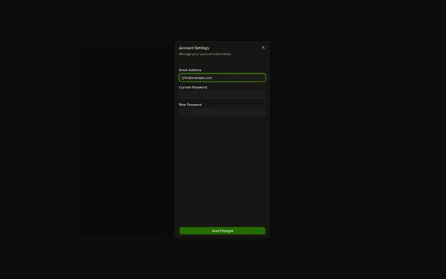
- Account Settings SheetSettingsAn Account Settings button opens a right-side sheet for email, current password, and new password, with Save Changes.
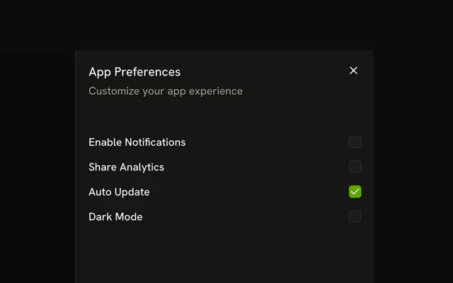
- App Preferences SheetSettingsA Preferences button opens a right-side sheet of four checkboxes. Only Auto Update starts checked.
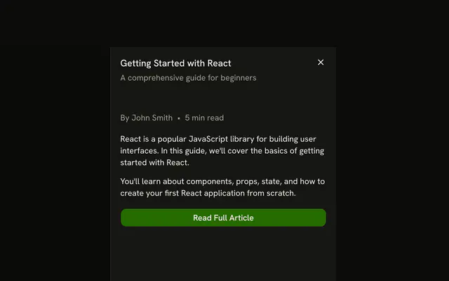
- Article Preview SheetDetailsA Read More button opens a right-side preview of Getting Started with React, with a byline, two paragraphs, and Read Full Article.
- Bottom-Sliding SheetStandardAn Open Sheet button slides a panel up from the bottom, titled Bottom Sheet, with a one-line description and no body.

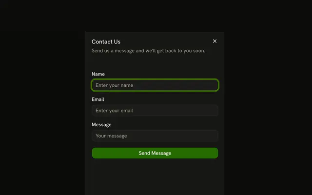
- Contact Form SheetFormA Contact Us button opens a right-side sheet with name, email, and message fields and a Send Message button.
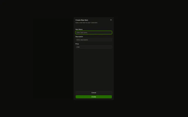
- Create New Item SheetFormA Create New button opens a right-side sheet for an item name, description, and price, with Cancel and Create in the footer.
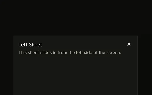
- Left-Sided SheetStandardAn Open Sheet button slides a panel in from the left, titled Left Sheet, with a one-line description and no body.
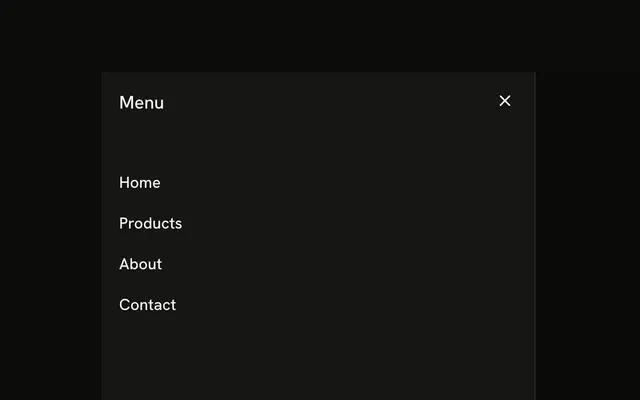
- Mobile Menu SheetNavigationA Menu button opens a left-side sheet titled Menu, with Home, Products, About, and Contact stacked as links.
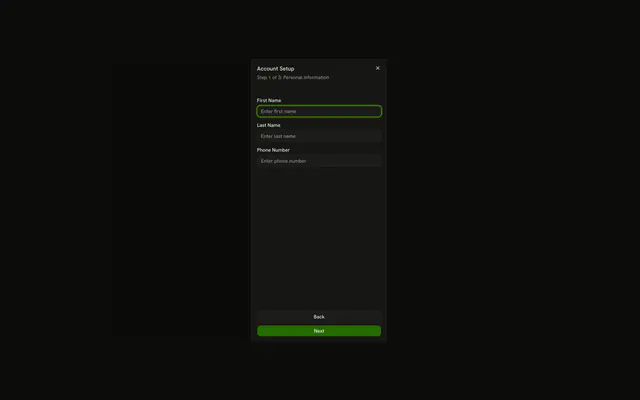
- Multi-Step Form SheetFormA Start Setup button opens Account Setup on step 1 of 3, with first name, last name, phone, Back, and Next.
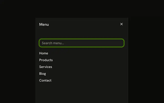
- Navigation with Search SheetNavigationA Menu button opens a left-side sheet with a search field and the links Home, Products, Services, Blog, and Contact.
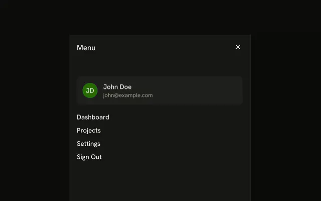
- Navigation with User Profile SheetNavigationA Menu button opens a left-side sheet showing John Doe, his email, and links for Dashboard, Projects, Settings, and Sign Out.
- Nested Navigation Menu SheetNavigationA Menu button opens a left-side sheet with Products and Resources headings, each over three indented links.

Or describe it. With Pro, your AI agent installs the sheet example you describe, on your framework and UI library.
Get ProGalleries
More component examples
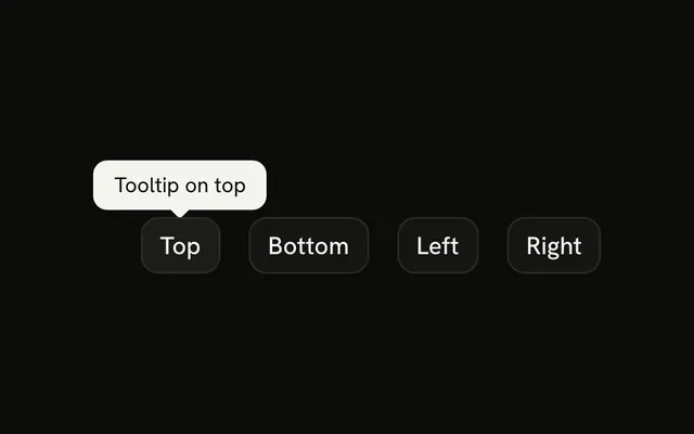
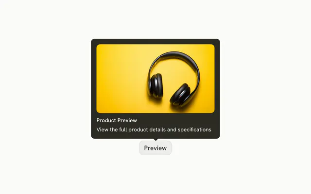
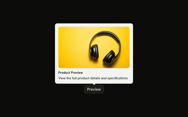
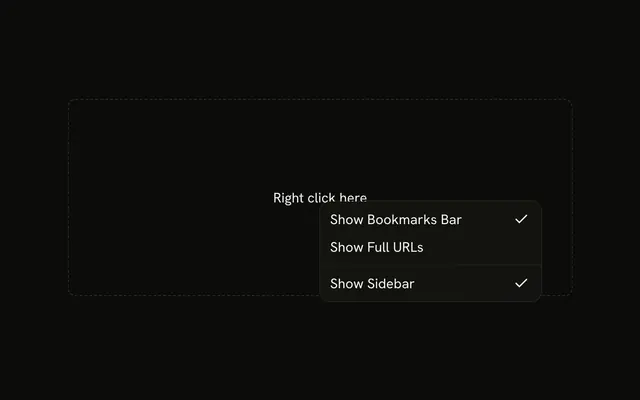
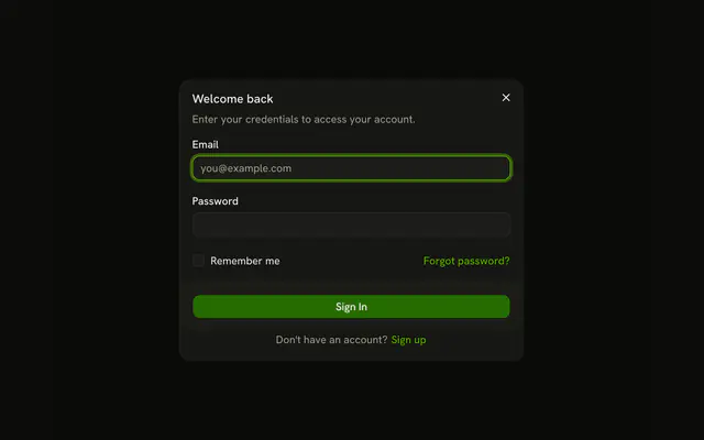
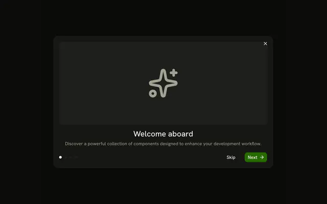
8 related galleries, free: open one for its live examples and their code.








Pricing
Sheet examples MCP, with Pro
Your AI agent installs any of the 1364 examples, and every component, block and icon, with every Pro plan.
4.9/5 out of 5 · 150+ reviewsfrom 150+ founders and developers.
- Secure checkout via Stripe
- Code lives in your repo
- Keep what you've shipped if you cancel
- License terms
FAQ
Frequently asked questions
A sheet is a modal panel that slides in from an edge of the screen: from the right for details and forms, from the left for navigation and filters, from the top or bottom for short content. It traps focus while open, closes on Escape or a click outside, and locks the page's scroll. shadcn.io's Sheet is built on Base UI, React Aria, Ark UI or Radix UI for React, and on Ark UI for Vue, Svelte and Solid. Each example in this gallery is one self-contained file.
Yes. Every sheet example is free to use in personal and commercial projects, with no attribution required. Seeing the code and installing an example takes a free shadcn.io account.
A Sheet slides in from an edge and keeps part of the page in view, which suits detail panels, filters and settings on any screen. A Drawer is the touch-first version: people drag it, often up from the bottom, and it can stop at snap points. A Dialog is centered and suits short confirmations and focused forms. A common responsive pattern renders a Dialog or Sheet on wide screens and a Drawer on phones, with the same content.
Use a sheet for short tasks where the page behind still matters: editing a row, changing filters, reading a detail. Use a page for long flows, content that needs the whole viewport, or anything people should be able to link to. A sheet keeps people where they were; a route takes them somewhere else.
Right for details and forms, left for navigation and filters, bottom for short choices on small screens, top for announcements or a search bar. Set `side` to `top`, `right`, `bottom` or `left` on `SheetContent`; it defaults to right.
`SheetContent` is a flex column. Put `SheetHeader` first, give the body `flex-1 overflow-y-auto` so it scrolls, and end with `SheetFooter`, which stays at the bottom. The header and footer stay in view however long the body gets.
Control the open state: pass `open` to the sheet, keep it in state, and set it to false once the save succeeds. Leave it open on an error so people can fix the fields. For a plain Cancel button, wrap it in `SheetClose`.
Sign in with a free account and run the install command shown on the example's page. The CLI copies the example into your project, along with the Sheet component and anything else it uses that you don't have yet.
Pass a class on `SheetContent` that targets its side, such as `data-[side=right]:sm:max-w-md` or `data-[side=right]:sm:max-w-xl`. Left and right sheets fill the height and cap their width from the `sm` breakpoint. Keep some of the page in view, or the sheet stops reading as a panel over it.
Check the viewport width with a media query and render a Sheet or a Drawer with the same content. Keep the open state outside both so switching between them doesn't lose it.
shadcn.io's Sheet, which lives in your project, on Base UI, React Aria, Ark UI or Radix UI for React, or on Ark UI for Vue, Svelte and Solid. Styling is Tailwind CSS, and icons come from Lucide. Some examples also use other shadcn.io components, such as Field, Tabs or Avatar.
Yes. A sheet follows the modal dialog pattern: focus moves into it on open and stays there, Tab cycles inside, Escape closes it and focus returns to the trigger. `SheetTitle` names the dialog, so every example renders one, visible or visually hidden. The side is visual only and doesn't change any of this.
The Sheet is a client component, since it manages its open state and focus. Render it from a Server Component and pass the data it shows as props. Vue, Svelte and Solid render it like any other component.
4.9 out of 5 from 150+ developers


Every sheet example. One prompt away.
Every sheet example is free with an account. With Pro, your AI agent installs them from a prompt.
Get Pro