shadcn.io is an independent project built on shadcn/ui
Animated Testimonials shows one customer quote at a time. The speaker's photo comes to the front of a tilted stack and their words fade in beside it one by one, with previous and next buttons and an optional autoplay. It fits a landing or pricing page with three to six quotes that each deserve a moment.
For a wall of short reviews, lay Cards out in a grid. For quotes or logos that keep scrolling past, use a Marquee.
Installation
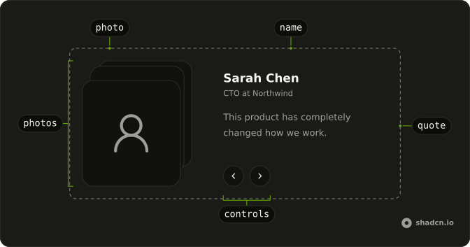
Anatomy
Usage
import {
  AnimatedTestimonials,
} from "@/components/ui/animated-testimonials";<AnimatedTestimonials
autoplay
testimonials={[
{
quote: "The best investment we made this year.",
name: "Emily Watson",
designation: "CEO at Harbor Labs",
src: "/photos/emily.jpg",
},
{
quote: "Setup took an afternoon, and nobody has complained since.",
name: "Priya Raman",
designation: "Founder at Tidepool",
src: "/photos/priya.jpg",
},
]}
/>Accessibility
The root is a section named Testimonials and described as a carousel. The name, the job title and the quote sit in a polite live region, so a screen reader reads each new testimonial as it arrives, and the region goes quiet while autoplay runs. The quote is read whole from a visually hidden copy, never word by word. The front photo's alternative text is the speaker's name, and the photos behind it are hidden. Autoplay pauses while the pointer is over the component or a button has focus, the pause button stops it, and it never starts for people who prefer reduced motion.
- Tab
- Moves focus between the previous and next buttons, and the pause button when autoplay is on.
- Enter
- Presses the focused button.
- Space
- Presses the focused button.
- Arrow Right
- With one of the buttons focused, shows the next testimonial, or the previous one in right-to-left text.
- Arrow Left
- With one of the buttons focused, shows the previous testimonial, or the next one in right-to-left text.
Demos
Manual
Three quotes from a founder, a staff engineer and a head of product, with no autoplay, so the testimonial changes only when someone presses previous or next, or an arrow key while a button has focus. Use it when the quotes run long enough that a timer would cut readers off. The last quote wraps around to the first, so neither button is ever disabled.
Controlled
The demo keeps the place in its own state through value and onValueChange, starting on the second quote, and a line under the component reads it back as Showing 2 of 3. Hold the place yourself when something else on the page follows the quote, such as a company logo or a link to the case study.
Stacked
Three short quotes in a column 24rem wide, where the photos sit above the words because the component itself is narrower than 36rem. The switch follows the container, not the screen, so the component stacks in a sidebar on a wide monitor too. Keep the quotes short in this layout, since a long one pushes the buttons far down.
FAQ
What does each testimonial in Animated Testimonials need?
Four strings: quote, name, designation for the person's role, and src for the photo's URL. Pass the objects in order as testimonials, typed with the exported Testimonial type if you write TypeScript. The name is also the front photo's alternative text, so use the person's real name rather than a handle.
Each photo fills a frame 20rem tall and is cropped from its center, so a square photo with the face near the middle survives both the wide and the stacked layout. Every photo is in the page from the start, stacked behind the front one, so all of them load with it: keep the files small.
How do I make Animated Testimonials play by itself?
Add autoplay, and the component moves on every interval milliseconds, 5000 by default. It pauses while the pointer is over it or one of its buttons has focus, and a pause button beside next stops it until it is pressed again.
Autoplay stays off for visitors who prefer reduced motion, including someone who turns that setting on while the page is open, and they get no pause button, since nothing moves. It stays off with a single testimonial too. Pressing previous or next restarts the countdown, so the next quote never arrives a moment after someone chose one.
How do I control which testimonial shows in React?
Pass value and update it in onValueChange, which receives the new place as a number counting from 0, as the Controlled demo does. The buttons, the arrow keys and autoplay all report through it, and nothing moves until the new value comes back. Use defaultValue instead when you only want to pick the first testimonial and let the component keep its own place.
A value past either end wraps around: 3 in a list of three shows the first testimonial, and -1 shows the last.
How do I turn off the word-by-word reveal in Animated Testimonials?
Remove motion-safe:animate-animated-testimonials-word from the word spans in components/ui/animated-testimonials, and each quote appears whole while its testimonial still fades up. No prop controls the reveal.
As it ships, the quote is split at its spaces and every word plays the same 200ms keyframes, in from a blur and a few pixels below, each 20ms after the one before. A 30-word quote has finished in under a second. People who prefer reduced motion already see every word at once.
Why do the Animated Testimonials photos sit above the quote?
Because the component is narrower than 36rem. Its layout is a container query on the component itself: from 36rem of its own width the photos and the words sit side by side, and below that they stack, as in the Stacked demo.
The screen size doesn't matter, so a wide monitor still shows the stacked layout when the component sits in a narrow column. Give it a wider column, or change the @xl/animated-testimonials: classes in its file to move the switch.
How do I translate the Animated Testimonials labels?
Pass your own aria-label and aria-roledescription to AnimatedTestimonials. Your props come after the component's own, so they replace the Testimonials name and the carousel description.
The button labels, Previous testimonial, Next testimonial, Pause testimonials and Play testimonials, are written into components/ui/animated-testimonials. Translate them there, or turn them into props if one page shows several languages.
Should I use Animated Testimonials, a Marquee or a grid of cards for reviews?
Animated Testimonials suits a handful of longer quotes where the person behind each one matters: one is on screen at a time, with a photo and room to read it. It has no swipe gesture, so on a phone people tap the buttons, and a Carousel is the better fit when swiping matters.
A Marquee suits many short quotes or logos read in passing. A grid of Cards shows every review at once, with no motion, for a page where people scan or compare them.
API Reference
AnimatedTestimonials
<section> data-slot="animated-testimonials"
value?number
The testimonial shown, by its place in testimonials, when you hold it yourself.
defaultValue?number
The testimonial shown first, by its place in testimonials, when you
don't pass value.
- Default
0
onValueChange?(value: number) → void
Called with the new place after the previous or next button, an arrow key or autoplay moves.
- Parameters
value– number- Returns
void
testimonialsTestimonial[]
The testimonials, in order: each with a quote, a name, a role and a photo.
autoplay?boolean
Whether it moves on to the next testimonial by itself. It pauses while the pointer is over it or focus is in it, a button stops it, and it stays off when the reader asked for reduced motion.
- Default
false
interval?number
How long each testimonial stays with autoplay, in milliseconds. @default 5000.
- Default
5000
className?string
Merged with the part's classes.
data-state?string--animated-testimonials-depthstring--animated-testimonials-dirstring--animated-testimonials-tiltstring