shadcn.io is an independent project built on shadcn/ui
An autocomplete is a text field that suggests as people type, where whatever they type is still a valid answer: a search box, a city, a tag. Picking a suggestion fills the field, and ignoring the list leaves their text alone.
When the answer has to be one of the options, use a Combobox. For a short, fixed list with no typing at all, a Select is simpler.
Installation
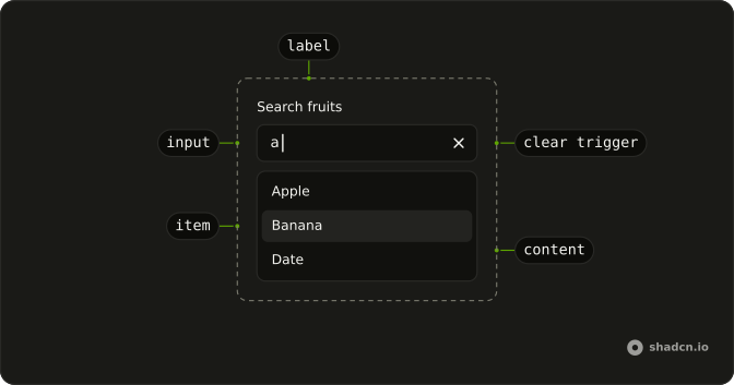
Anatomy
Usage
import { useListCollection } from "@ark-ui/react/collection";
import { useFilter } from "@ark-ui/react/locale";
import {
  Autocomplete, AutocompleteContent, AutocompleteEmpty,
  AutocompleteInput, AutocompleteItem, AutocompleteList,
} from "@/components/ui/autocomplete";
useListCollection holds the suggestions, and calling its filter from onInputValueChange narrows them as people type. The field keeps their text whether or not they pick one.
const initialItems = [
  { label: "Apple", value: "apple" },
  { label: "Banana", value: "banana" },
  { label: "Cherry", value: "cherry" },
  { label: "Date", value: "date" },
];

const AutocompleteDemo = () => {
  const { contains } = useFilter({ sensitivity: "base" });
  const { collection, filter } = useListCollection({
    filter: contains,
    initialItems,
  });

  return (
    <Autocomplete
      collection={collection}
      onInputValueChange={({ inputValue }) => filter(inputValue)}
    >
      <AutocompleteInput aria-label="Search fruits" placeholder="e.g. Apple" />
      <AutocompleteContent>
        <AutocompleteEmpty />
        <AutocompleteList>
          {collection.items.map((item) => (
            <AutocompleteItem item={item} key={item.value}>
              {item.label}
            </AutocompleteItem>
          ))}
        </AutocompleteList>
      </AutocompleteContent>
    </Autocomplete>
  );
};Accessibility
The input has role="combobox" and aria-autocomplete="both", because moving through the suggestions writes each one into the field, and focus stays in the input while aria-activedescendant reports the highlighted one. Naming the field is up to you. Inside a Field, the FieldLabel labels the input on its own, as the preview at the top does, and outside one, give AutocompleteInput an aria-label.
- Arrow Down
- When the list is closed, opens it. In the open list, highlights the next suggestion and writes it into the field, and past the last one, puts back the text you typed.
- Arrow Up
- When the list is closed, opens it. In the open list, highlights the previous suggestion and writes it into the field, and above the first one, puts back the text you typed.
- Home
- In the open list, highlights the first suggestion and writes it into the field.
- End
- In the open list, highlights the last suggestion and writes it into the field.
- Enter
- Picks the highlighted suggestion and closes the list. With nothing highlighted, the typed text stays and the form can submit.
- Escape
- Closes the list and puts back the text you typed.
Demos
Async
A stand-in for a movie API: each keystroke passes the text to useAsyncList, whose load waits 300 milliseconds and returns the titles that contain it. The list shows "Start typing to search." at first, "Searching..." during a request and "No results found." on a miss. Picking a title doesn't search again, because only an input-change reason updates the query.
Autohighlight
inputBehavior set to autohighlight replaces this component's default, so the first match is highlighted as you type and Enter picks it, while the field keeps exactly what you typed. The arrow keys move the highlight without writing suggestions into the field. Use it where the top match is usually right and the text shouldn't change under the cursor.
Context
A size field, Small, Medium or Large, under a line that reads "Selected:" and the picked label, or None before anything is picked. AutocompleteContext hands the live state to that line through a render function, which reads valueAsString. Use it when nearby markup should follow the field and you'd rather not keep a copy of the value yourself.
Controlled
The fruit value lives in your own state, starts as banana, and the line under the field prints it. value is an array even for one choice, so the demo wraps the string going in and keeps the first entry coming out. Typed text that matches nothing never reaches value, which only holds suggestions that were picked.
Creatable
Bug, Feature and Docs to start with. Type a label that isn't there and the list offers "+ Create" with your text, and picking it turns that row into a real option marked "(new)". The demo does it with upsert, update and remove from useListCollection, keyed on a placeholder value. Use it for tags and labels, where the list suggests rather than limits.
Custom object
Three countries stored as objects with a flag, a name and a code. itemToString tells the collection that the name is the text to match and to fill in, and itemToValue that the code is the value to keep. Use this whenever the id you store and the text people read are different fields of a record.
Disabled
disabled on Autocomplete fades the fruit field and stops both typing and opening. Use it when the field waits on an earlier answer or the person can't change it, and say why next to it, since a dead field with only a placeholder looks broken.
Dynamic
The suggestions are built, not looked up: each keystroke makes three email addresses from the text so far, at gmail.com, yahoo.com and shadcn.io, and hands them to the collection's set. The collection starts empty, so there are no suggestions until the first keystroke. Use it when suggestions come from the input itself, such as email domains or the rest of a code.
Group
Nine countries under three headings, North America, Europe and Asia, from groupBy on useListCollection and the heading prop on AutocompleteGroup. Filtering runs across all of them, and a heading shows only while its group has a match. Group suggestions when people think of the category first.
Highlight
Four names, with the typed letters marked inside each suggestion by the Highlight component, which reads the live inputValue from AutocompleteContext and ignores case. A contains match can land mid-word, as "ohn" does in Bob Johnson, and the mark shows why that row is in the list.
Inline
Sea animals filtered with startsWith, so only names that begin with the typed letters stay and a mid-word hit never shows. Press the arrow keys and the highlighted animal is written into the field, the inline completion this component does by default, and Escape puts your text back. Match from the front for names and codes people type from the start.
Invalid
invalid on Autocomplete puts aria-invalid on the input, which turns the field's border red and tells screen readers the value is wrong. The demo shows no message, so pair it with a sentence under the field that says what failed, shown after a submit rather than on first view.
Limit results
Ten US cities with a limit of 5 on useListCollection, so the popup shows at most five matches at a time. The rest are still searched, and typing more letters brings a city that missed the first five into view. Limit a long catalog this way rather than slicing the array before the filter runs.
Links
Three suggestions that are links, GitHub, MDN Web Docs and React, each rendered as an <a> through asChild on AutocompleteItem and opened in a new tab. Enter on one follows its link, and selectionBehavior set to preserve keeps the query in the field instead of swapping in the label. Use links when the suggestions are destinations, not values to store.
Multiple
Six programming languages with multiple set, so every pick is kept, the field clears after each one and the list stays open for the next. The picks show above the field, read from selectedItems in AutocompleteContext, with "None selected" before the first. Use it for skills or tags, where one answer is rarely the whole answer.
Rehydrate
The value starts as C-3PO while the character list is still empty, and the list arrives 800 milliseconds later, the way a saved value often loads before its options. A small child component then calls syncSelectedItems from the autocomplete's context in an effect, once the options are there, so the stored value attaches to its item. Reach for it whenever the value is known before the collection.
Root provider
A Focus input button sits outside the field and focuses it when pressed. useAutocomplete creates the state, AutocompleteRootProvider shares it with the field, and the button calls focus on that same object. Use the provider when a toolbar or a shortcut elsewhere on the page has to drive the field.
Size lg
size set to lg on AutocompleteInput gives the field a fixed h-9 height, with showClear and showTrigger on. In some of this site's styles that is already the default height, so compare it with the fields around it before you use it.
Size md
md is the default, so leaving size off gives the same field, shown here with showClear and showTrigger on. Its height comes from the style rather than a fixed class, which keeps it level with the inputs around it. Use it unless a toolbar or a large search field calls for another size.
Size sm
size set to sm gives the field a fixed h-7 height, with showClear and showTrigger on, for a toolbar, a dialog or a filter row where the default would dominate. Skip it for the main search on a page, where a short field is easy to miss.
With clear button
showClear on AutocompleteInput adds a button that empties the field. It only appears while there's text, which is why it shows here, where the field starts on Apple. It's off by default, so a search can look like a plain text field, and worth adding when people often clear the field to start again.
With field
A country field inside Field, with a FieldLabel, a helper line about shipping estimates and required on the root. Ark UI's Field ties the label and the helper to the input on its own, and its FieldError stays hidden until the field is invalid. A placeholder is no substitute for the label, because it disappears as soon as someone types.
With start icon
An apple icon sits at the start of the field, an InputGroupAddon passed as a child of AutocompleteInput, and it's hidden from screen readers. The placeholder says what to search but goes away once someone types, so aria-label on AutocompleteInput names the field for screen readers.
With trigger
showTrigger adds the chevron button that opens the full list without typing, and with showClear off it's the only extra control. Both are off by default. Turn the trigger on for a short list people also browse, and leave it off for a field that should look like search.
FAQ
What's the difference between an Autocomplete and a Combobox?
An Autocomplete keeps whatever people type and only suggests: the text in the field is the answer, and picking a suggestion fills it in. A Combobox treats the list as the answer and doesn't keep text that matches nothing.
Here the Autocomplete is Ark UI's combobox with allowCustomValue on and inputBehavior set to autocomplete. Use it for a search box, a city or a tag, and a Combobox when the value has to be one of the options.
How do I filter Autocomplete suggestions as the user types in React?
Build the suggestions with useListCollection and a matcher from useFilter, then call the filter it returns with the new text from onInputValueChange and render collection.items. Use contains to match anywhere in the label, as most demos here do, or startsWith to match from the front, as Inline does.
The match runs on each item's label, or on whatever itemToString returns, as in the Custom object demo.
How do I load Autocomplete suggestions from an API?
Use useAsyncList from Ark UI's collection package: pass the new text to its setFilterText, build the collection from its items, and show a loading row while it's loading, as the Async demo does. Its load function receives the text and an abort signal, so a request that a newer keystroke made stale can be dropped.
Update the text only on the input-change reason, or picking a suggestion starts another search.
How do I let users create a new option in the Autocomplete?
The field already keeps text that matches nothing, so a create row is only needed when the new text should join the list. Add one while the text is new, by calling upsert with a placeholder item labeled with that text, and turn it into a real option with update once it's picked, as the Creatable demo does.
Remove the row when the field is empty, and skip it for text that differs from an existing option only in case.
How do I get the typed text from an Autocomplete, or submit it with a form?
The typed text is the input value: read inputValue from onInputValueChange, or control it by passing inputValue yourself. value is separate and holds only suggestions that were picked, as an array, so text that matches nothing never shows up there.
For a form, set name on Autocomplete. Ark UI puts the name on the text input, so the form receives what's in the field.
Why does the Autocomplete change my text when I press the arrow keys?
This component sets inputBehavior to autocomplete, so moving the highlight with the arrow keys writes that suggestion into the field. Your own text comes back when you press Escape or move past the last suggestion.
To stop it, set inputBehavior to autohighlight, which highlights the first match as you type and leaves the text alone, as the Autohighlight demo does. Set it to none for no highlight and no completion at all.
How do I limit the number of Autocomplete suggestions?
Pass limit to useListCollection, such as 5, and the popup shows at most that many matches, as the Limit results demo does. The full list is still searched, so typing more letters reaches anything that missed the cut.
Slicing the array yourself would hide those options from the filter entirely, so let limit do it.
How do I add a clear button or a dropdown arrow to the Autocomplete?
Set showClear or showTrigger on AutocompleteInput, as the With clear button and With trigger demos do. Both are off by default, so the field looks like a plain text input.
The clear button only appears while the field has text, and the chevron opens the whole list without any typing, which helps when people want to browse.
API Reference
Autocomplete
<div> data-slot="autocomplete"
inputValue?string
The controlled value of the combobox's input.
defaultInputValue?string
The initial value of the combobox's input when rendered. Use when you don't need to control the value of the combobox's input.
- Default
""
onInputValueChange?(details: InputValueChangeDetails) → void
Function called when the input's value changes.
- Type
(details: InputValueChangeDetails) → void- Parameters
details– { inputValue: string; reason?: InputValueChangeReason }- Returns
void
open?boolean
The controlled open state of the combobox.
defaultOpen?boolean
The initial open state of the combobox when rendered. Use when you don't need to control the open state of the combobox.
onOpenChange?(details: OpenChangeDetails) → void
Function called when the popup is opened.
- Type
(details: OpenChangeDetails) → void- Parameters
details– { open: boolean; reason?: OpenChangeReason; value: string[] }- Returns
void
value?string[]
The controlled value of the combobox's selected items.
defaultValue?string[]
The initial value of the combobox's selected items when rendered. Use when you don't need to control the value of the combobox's selected items.
- Default
[]
onValueChange?(details: ValueChangeDetails<T>) → void
Function called when a new item is selected.
- Type
(details: ValueChangeDetails<T>) → void- Parameters
details– ValueChangeDetails<T>- Returns
void
collectionListCollection<T>
The collection of items.
- Type
ListCollection<T>
allowCustomValue?boolean
Whether to allow typing custom values in the input.
alwaysSubmitOnEnter?boolean
Whether to always submit on Enter key press, even if popup is open. Useful for single-field autocomplete forms where Enter should submit the form.
- Default
false
autoFocus?boolean
Whether to autofocus the input on mount.
closeOnSelect?boolean
Whether to close the combobox when an item is selected.
composite?boolean
Whether the combobox is a composed with other composite widgets like tabs.
- Default
true
defaultHighlightedValue?string | null
The initial highlighted value of the combobox when rendered. Use when you don't need to control the highlighted value of the combobox.
- Type
string | null
dir?"ltr" | "rtl"
The document's text/writing direction.
- Type
"ltr" | "rtl"- Default
"ltr"
disabled?boolean
Whether the combobox is disabled.
disableLayer?boolean
Whether to disable registering this a dismissable layer.
form?string
The associate form of the combobox.
hideMode?"display-none" | "activity"
How to hide content when mounted but not present.
- display-none: HTML hidden attribute. Effects stay alive.
- activity: React 19 <Activity mode="hidden">. Effects pause. Requires React 19+.
- Type
"display-none" | "activity"- Default
"display-none"
highlightedValue?string | null
The controlled highlighted value of the combobox.
- Type
string | null
id?string
The unique identifier of the machine.
ids?object
The ids of the elements in the combobox. Useful for composition.
- Type
{ root?: string; label?: string; control?: string; input?: string; content?: string; trigger?: string; clearTrigger?: string; item?: (id: string, index?: number) → string; positioner?: string; itemGroup?: (id: string | number) → string; itemGroupLabel?: (id: string | number) → string }
immediate?boolean
Whether to synchronize the present change immediately or defer it to the next frame.
inputBehavior?"autohighlight" | "autocomplete" | "none"
Defines the auto-completion behavior of the combobox.
- autohighlight: The first focused item is highlighted as the user types
- autocomplete: Navigating the listbox with the arrow keys selects the item and the input is updated Ark default: none.
- Type
"autohighlight" | "autocomplete" | "none"- Default
autocomplete
invalid?boolean
Whether the combobox is invalid.
lazyMount?boolean
Whether to enable lazy mounting.
- Default
false
loopFocus?boolean
Whether to loop the keyboard navigation through the items.
- Default
true
multiple?boolean
Whether to allow multiple selection.
**Good to know:** When multiple is true, the selectionBehavior is automatically set to clear.
It is recommended to render the selected items in a separate container.
name?string
The name attribute of the combobox's input. Useful for form submission.
navigate?((details: NavigateDetails) → void) | null
Function to navigate to the selected item.
- Type
((details: NavigateDetails) → void) | null- Parameters
(details– { value: string; node: HTMLAnchorElement; href: string }- Returns
void) | null
onEnterComplete?VoidFunction
Function called when the animation ends in the open state.
onExitComplete?VoidFunction
Function called when the animation ends in the closed state.
onFocusOutside?(event: FocusOutsideEvent) → void
Function called when the focus is moved outside the component.
- Type
(event: FocusOutsideEvent) → void- Parameters
event– FocusOutsideEvent- Returns
void
onHighlightChange?(details: HighlightChangeDetails<T>) → void
Function called when an item is highlighted using the pointer or keyboard navigation.
- Type
(details: HighlightChangeDetails<T>) → void- Parameters
details– HighlightChangeDetails<T>- Returns
void
onInteractOutside?(event: InteractOutsideEvent) → void
Function called when an interaction happens outside the component.
- Type
(event: InteractOutsideEvent) → void- Parameters
event– InteractOutsideEvent- Returns
void
onPointerDownOutside?(event: PointerDownOutsideEvent) → void
Function called when the pointer is pressed down outside the component.
- Type
(event: PointerDownOutsideEvent) → void- Parameters
event– PointerDownOutsideEvent- Returns
void
onSelect?(details: SelectionDetails) → void
Function called when an item is selected.
- Type
(details: SelectionDetails) → void- Parameters
details– { value: string[]; itemValue: string }- Returns
void
openOnChange?boolean | ((details: InputValueChangeDetails) → boolean)
Whether to show the combobox when the input value changes.
- Type
boolean | ((details: InputValueChangeDetails) → boolean)- Default
true
openOnClick?boolean
Whether to open the combobox popup on initial click on the input.
- Default
false
openOnKeyPress?boolean
Whether to open the combobox on arrow key press.
- Default
true
placeholder?string
The placeholder text of the combobox's input.
positioning?object
The positioning options to dynamically position the menu.
- Type
{ restoreStyles?: boolean; applyStyles?: boolean; hideWhenDetached?: boolean; strategy?: "absolute" | "fixed"; placement?: Placement; offset?: { mainAxis?: number; crossAxis?: number; }; gutter?: number; shift?: number; overflowPadding?: number; arrowPadding?: number; flip?: boolean | Placement[]; slide?: boolean; overlap?: boolean; sameWidth?: boolean; fitViewport?: boolean; sizeMiddleware?: boolean; boundary?: (() → Boundary) | Boundary | "clipping-ancestors"; listeners?: boolean | AutoUpdateOptions; onComplete?: (data: ComputePositionReturn) → void; onPositioned?: ((data: { placed: boolean; }) → void); getAnchorElement?: () → HTMLElement | VirtualElement | null; getAnchorRect?: (element: HTMLElement | VirtualElement | null) → AnchorRect | null; updatePosition?: ((data: { updatePosition: () → Promise<void>; floatingElement: HTMLElement | null; }) → void | Promise<void>) }- Default
{ placement: "bottom-start" }
present?boolean
Whether the node is present (controlled by the user).
readOnly?boolean
Whether the combobox is readonly. This puts the combobox in a "non-editable" mode but the user can still interact with it
required?boolean
Whether the combobox is required.
scrollToIndexFn?(details: ScrollToIndexDetails) → void
Function to scroll to a specific index.
- Type
(details: ScrollToIndexDetails) → void- Parameters
details– { index: number; immediate?: boolean; getElement: () → HTMLElement | null }- Returns
void
selectionBehavior?"clear" | "replace" | "preserve"
The behavior of the combobox input when an item is selected
- replace: The selected item string is set as the input value
- clear: The input value is cleared
- preserve: The input value is preserved
- Type
"clear" | "replace" | "preserve"- Default
"replace"
skipAnimationOnMount?boolean
Whether to allow the initial presence animation.
- Default
false
translations?object
Specifies the localized strings that identifies the accessibility elements and their states.
- Type
{ triggerLabel?: string; clearTriggerLabel?: string }
unmountOnExit?boolean
Whether to unmount on exit.
- Default
false
asChild?boolean
Use the provided child element as the default rendered element, combining their props and behavior.
data-invalid?string
Present when invalid.
data-readonly?string
Present when read-only.
AutocompleteControl
data-slot="autocomplete-control"
asChild?boolean
Use the provided child element as the default rendered element, combining their props and behavior.
data-invalid?string
Present when invalid is true.
data-readonly?string
Present when readOnly is true.
AutocompleteInput
data-slot="autocomplete-input"
disabled?boolean
Whether the control is disabled.
- Default
false
showClear?boolean
Whether to show the clear button.
- Default
false
showTrigger?boolean
Whether to show the trigger button. Ark default: true.
- Default
false
asChild?boolean
Use the provided child element as the default rendered element, combining their props and behavior.
data-invalid?string
Present when invalid is true.
data-readonly?string
Present when readOnly is true.
AutocompleteGroupLabel
data-slot="autocomplete-group-label"
asChild?boolean
Use the provided child element as the default rendered element, combining their props and behavior.
data-invalid?string
Present when invalid is true.
data-readonly?string
Present when readOnly is true.
AutocompleteItem
data-slot="autocomplete-item"
itemany
The item to render.
persistFocus?boolean
Whether hovering outside should clear the highlighted state.
showIndicator?boolean
Shows the selected item's check at the row's end, with room kept for it.
- Default
true
asChild?boolean
Use the provided child element as the default rendered element, combining their props and behavior.
data-invalid?string
Present when invalid is true.
data-readonly?string
Present when readOnly is true.
AutocompleteContent
data-slot="autocomplete-content"
asChild?boolean
Use the provided child element as the default rendered element, combining their props and behavior.
data-invalid?string
Present when invalid is true.
data-readonly?string
Present when readOnly is true.
AutocompleteTrigger
data-slot="autocomplete-trigger"
focusable?boolean
Whether the trigger is focusable.
asChild?boolean
Use the provided child element as the default rendered element, combining their props and behavior.
data-invalid?string
Present when invalid is true.
data-readonly?string
Present when readOnly is true.
AutocompleteClear
data-slot="autocomplete-clear"
asChild?boolean
Use the provided child element as the default rendered element, combining their props and behavior.
data-invalid?string
Present when invalid is true.
data-readonly?string
Present when readOnly is true.
AutocompleteGroup
data-slot="autocomplete-group"
heading?string | React.ReactNode
The heading of the group.
- Type
string | React.ReactNode
asChild?boolean
Use the provided child element as the default rendered element, combining their props and behavior.
data-invalid?string
Present when invalid is true.
data-readonly?string
Present when readOnly is true.
AutocompleteEmpty
data-slot="autocomplete-empty"
asChild?boolean
Use the provided child element as the default rendered element, combining their props and behavior.
data-invalid?string
Present when invalid is true.
data-readonly?string
Present when readOnly is true.
AutocompleteList
data-slot="autocomplete-list"
asChild?boolean
Use the provided child element as the default rendered element, combining their props and behavior.
data-invalid?string
Present when invalid is true.
data-readonly?string
Present when readOnly is true.
AutocompleteCollection
data-slot="autocomplete-collection"
asChild?boolean
Use the provided child element as the default rendered element, combining their props and behavior.
data-invalid?string
Present when invalid is true.
data-readonly?string
Present when readOnly is true.
AutocompleteSeparator
data-slot="autocomplete-separator"
orientation?"horizontal" | "vertical"
The orientation of the separator.
- Type
"horizontal" | "vertical"- Default
"horizontal"
asChild?boolean
Use the provided child element as the default rendered element, combining their props and behavior.
data-invalid?string
Present when invalid is true.
data-readonly?string
Present when readOnly is true.
AutocompleteRootProvider
<div> data-slot="autocomplete"
valueUseComboboxReturn<T>
What useAutocomplete() returns: the state and API, made outside the component to control it.
- Type
UseComboboxReturn<T>
hideMode?"display-none" | "activity"
How to hide content when mounted but not present.
- display-none: HTML hidden attribute. Effects stay alive.
- activity: React 19 <Activity mode="hidden">. Effects pause. Requires React 19+.
- Type
"display-none" | "activity"- Default
"display-none"
immediate?boolean
Whether to synchronize the present change immediately or defer it to the next frame.
lazyMount?boolean
Whether to enable lazy mounting.
- Default
false
onEnterComplete?VoidFunction
Function called when the animation ends in the open state.
onExitComplete?VoidFunction
Function called when the animation ends in the closed state.
present?boolean
Whether the node is present (controlled by the user).
skipAnimationOnMount?boolean
Whether to allow the initial presence animation.
- Default
false
unmountOnExit?boolean
Whether to unmount on exit.
- Default
false
asChild?boolean
Use the provided child element as the default rendered element, combining their props and behavior.
data-invalid?string
Present when invalid is true.
data-readonly?string
Present when readOnly is true.