shadcn.io is an independent project built on shadcn/ui
Native Select is the browser's own <select>, given the same border, height and focus ring as your inputs. The open list is the one the browser or the phone draws, so it scrolls, jumps to typed letters and works before your JavaScript has loaded.
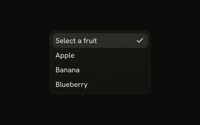
When the open list has to match your design or hold icons and descriptions, use a Select. When people need to type to find an option, use a Combobox.
Installation
Anatomy
Usage
import {
  NativeSelect, NativeSelectOption,
} from "@/components/ui/native-select";
The first option, with an empty value, is the prompt. It shows until someone picks another option.
<NativeSelect>
  <NativeSelectOption value="">Select status</NativeSelectOption>
  <NativeSelectOption value="todo">Todo</NativeSelectOption>
  <NativeSelectOption value="in-progress">In Progress</NativeSelectOption>
  <NativeSelectOption value="done">Done</NativeSelectOption>
  <NativeSelectOption value="cancelled">Cancelled</NativeSelectOption>
</NativeSelect>
Accessibility
Ark UI's Field.Select renders the browser's own <select>, so its role, its keyboard handling and the open list come from the browser, and a phone opens its own picker. Inside a Field it takes the field's id, so FieldLabel labels it, and FieldDescription and FieldError are read as its description, as in the Field demo. Outside a Field, give it an id and point a <label> at it.
Demos
Field
A Department picker in a Field, with a FieldLabel above it and a FieldDescription under it. The field hands its ids to the select, so the label names it and the description is read along with it. Start here for a form, where every select needs a name a screen reader can say.
Groups
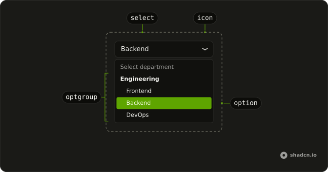
A department picker with a "Select department" prompt and three NativeSelectOptGroup groups, Engineering, Sales and Operations, with three roles each. Each group's label becomes a heading the browser draws in the open list, and the heading itself can't be picked. Group the options once there are enough that people scan them by team.
Disabled
disabled on NativeSelect disables the <select> itself, and the wrapper fades to half opacity with it. The browser skips a disabled select when tabbing and leaves it out of the data a form submits. Use it for a choice that waits on an earlier answer, and keep the field enabled when its value still has to be sent.
Invalid
The select carries aria-invalid, which turns its border red with a soft ring and tells screen readers the value is wrong. The demo sets the attribute by hand, and the invalid prop does the same. Nothing here says what's wrong, so pair it with a message in a Field after a submit fails.
RTL
Arabic status options with dir set to rtl on NativeSelect, which puts it on both the wrapper and the <select>, so the text and the open list read right to left and the chevron moves to the left edge. Set dir on a parent such as the <form> and the field follows it the same way.
FAQ
How do I get and set a Native Select's value in React?
Use it like any <select> in React: pass value and read the new choice from event.target.value in onChange, or pass defaultValue and let the browser hold it. The value is the chosen option's value string. Every prop you pass except className, size and invalid goes straight to the <select>.
How do I add a placeholder to a Native Select?
A <select> has no placeholder attribute, so make the first option the prompt and give it an empty value, as the demos here do with "Select status" and "Select department". It shows until someone picks another option.
Add required to the select and the browser won't submit the form while that empty option is chosen. The prompt is a real option, though, so it also appears in the open list.
Does a Native Select work with forms and form libraries?
Yes, because it is a real <select>. Give it a name and the form submits the chosen option's value, FormData reads it, and required blocks an empty submission with the browser's own message.
Form libraries that register native fields work as they are. React Hook Form's register returns a ref, name, onChange and onBlur that you can spread onto NativeSelect, and the wrapper passes all four to the <select>.
How do I group options in a Native Select?
Wrap each set of options in NativeSelectOptGroup and give it a label, as the Groups demo does with Engineering, Sales and Operations. It renders a native <optgroup>, so the browser draws the label as a heading in the open list, and the heading itself can't be chosen.
Add disabled to a group to disable every option in it at once. Groups can't nest inside each other, so the list stays one level deep.
How do I show a Native Select as invalid?
Set invalid on NativeSelect, which puts aria-invalid on the <select>, or set invalid on the Field around it, which does the same and shows the field's FieldError. Either one turns the border red with a ring and tells screen readers the value is wrong. Inside a Field, the select's aria-describedby already points at that error text while it's showing.
How do I change the size or width of a Native Select?
Set size to sm for a shorter control, or leave the default, md, which default also means. A lg value exists, but no style gives it its own height yet, so it renders like md. Because this prop takes the name, the HTML size attribute that shows several rows at once isn't available.
Width is set on the wrapper. className lands on the wrapper rather than the <select>, and the select fills it, so a width class such as w-full on NativeSelect sizes both.
Can I style the open list of a Native Select?
Only a little. The browser and the operating system draw the open list, so popover classes from Select don't reach it, and a phone shows its own picker instead.
The component gives each NativeSelectOption and NativeSelectOptGroup the Canvas and CanvasText system colors, which follow the page's color scheme, so the list stays readable in dark mode. Icons, descriptions or two-line rows need a Select.
Should I use a Native Select or a Select?
Use a Native Select when the browser's list is good enough: short forms, settings people change on a phone, anything that has to work before JavaScript loads. It's the lightest control for the job, and on a phone it opens the picker people already know.
Use a Select when the open list has to look like the rest of the app or hold icons and descriptions, and a Combobox when the list is long enough that people would rather type.
API Reference
NativeSelect
<div> data-slot="native-select"
invalid?boolean
Whether the select is invalid.
- Default
false
size?"sm" | "md" | "default" | "lg"
The size.
- Type
"sm" | "md" | "default" | "lg"- Default
"md"
asChild?boolean
Use the provided child element as the default rendered element, combining their props and behavior.
className?string
Merged with the part's classes.
data-size?stringNativeSelectOption
<option> data-slot="native-select-option"
asChild?boolean
Use the provided child element as the default rendered element, combining their props and behavior.
className?string
Merged with the part's classes.
NativeSelectOptGroup
<optgroup> data-slot="native-select-optgroup"
asChild?boolean
Use the provided child element as the default rendered element, combining their props and behavior.
className?string
Merged with the part's classes.