shadcn.io is an independent project built on shadcn/ui
A badge is a small rounded label of a word or two, set beside something to say what state it is in, how many there are or what kind it is, such as Paid on an invoice row or Beta next to a feature name. It stays on one line and never takes focus unless you make it a link.
When the message needs a sentence with a cause or a next step, use an Alert. For a filter people switch on and off, use a Toggle.
Installation
Anatomy
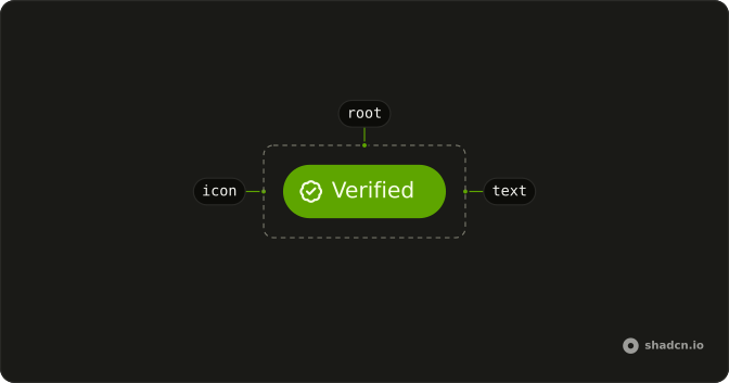
Usage
import { Badge } from "@/components/ui/badge";<Badge variant="secondary">Beta</Badge>Accessibility
Badge renders a span with no role, so a screen reader reads its text in line with whatever surrounds it and gives no hint that it is a badge. Its color doesn't reach a screen reader either. Let the words carry the meaning: Failed rather than a red badge with an icon, 3 unread rather than a bare 3. Mark an icon aria-hidden when the label already says the same thing, as the demos do. Made into a link, the badge is an ordinary link in the tab order, and its own styles draw a focus ring around it.
Demos
Variants
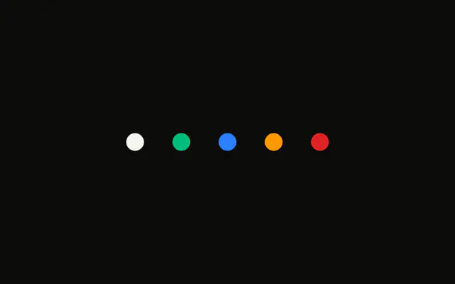
Five of the nine variants in a row: the default in the primary color, secondary on a muted fill, destructive in a red tint, outline with only a border, and ghost with no fill at all. Pick by how loud the label should be beside its neighbors, and keep destructive for something that went wrong. The status colors info, success and warning aren't in this row.
Icon
A secondary Verified badge with a check before the word, and an outline Bookmark badge with its icon after. The icon's place comes from where it sits in the markup, and data-icon set to inline-start or inline-end trims the padding on that side so the badge stays balanced. Both icons are aria-hidden, since the words already say it.
Spinner
Two badges with a Spinner for work still running: a destructive Deleting with the spinner first, and a secondary Generating with it last. The spinner takes data-icon like any other icon, and it carries its own role="status" and the label Loading. Replace the badge with the finished state when the work ends, since a label that spins forever looks stuck.
Link
Open Link is a default badge that renders as an <a> through asChild, with an arrow after the words. Its fill fades a little on hover, which the badge does only when it is a link. Use a badge link to go to another page, such as the listing for a tag. The demo's #link stands in for a real address.
Colors
Five badges colored blue, green, sky, purple and red by classes on each one: a light fill with dark text, and a dark: version of both. That suits a one-off category, such as a team or a project tag, that none of the variants stand for. For a status, use info, success, warning or destructive, which follow your theme.
RTL
Arabic labels in a container with dir set to rtl: the four main variants, then Verified with its check and Bookmark with its icon. The check sits on the right, where the line starts, because the icons follow the reading direction and the badge pads by logical sides. Try translated badges with their real strings, since a translated word can be much longer than the English one.
FAQ
What variants and sizes does the Badge have?
variant takes nine values. default, secondary, outline and ghost run from loudest to quietest, link is plain primary text that underlines on hover, and destructive, info, success and warning are tinted for status. The Variants demo shows the first five.
size is sm, md or lg, with md as the default. sm trims the side padding for a short count and lg is taller with larger text. pill rounds the ends fully whatever your style's corner radius, and at sm or lg, which are never narrower than they are tall, it turns a one-digit count into a circle.
How do I make a Badge a link in React?
Add asChild to Badge and put an <a>, or your router's link, inside it as the only child. The badge's classes and attributes move onto that element, as in the Link demo.
As a link, the badge gets the hover tint that most variants keep for an a, and a focus ring for the keyboard. Keep it for navigation. A control that changes something on the page is a Button.
How do I add an icon to a Badge?
Put the icon inside the badge, before the text or after it, and set its data-icon to inline-start or inline-end to match. Where it appears comes from the markup, and the attribute trims the badge's padding on that side so the icon doesn't look pushed in, as in the Icon demo.
The badge gives any svg that is its direct child a small fixed size and stops it from catching clicks. Mark the icon aria-hidden when the word says the same. A Spinner goes in the same way, for work in progress.
How do I give a Badge a custom color?
Add color classes to it, a light background with dark text and a dark: version of each, as the Colors demo does. The badge merges your classes with its own, so they replace the variant's colors.
Keep the variants for meaning, destructive for an error and success for something done, and use classes for a one-off category like a team. For a color you'll reuse, add a key to badgeVariants in components/ui/badge, which is your code once installed, and pass its name as variant.
How do I show an accessible unread count with a Badge?
Say what is counted, not only the number. A Badge is a plain span, so a bare 3 on an inbox icon is read as a lone number. Write 3 unread in the badge, or keep the number on screen and add the words in a span with the sr-only class.
For a count on an icon button, put the badge inside the button and pin it to a corner with absolute on the badge and relative on the button. Give the button an aria-label that includes the count, such as Inbox, 3 unread, since that label replaces everything inside it for a screen reader.
Should a clickable filter be a Badge or a Button?
Make it a Toggle when it switches on and off, or a Button when it runs an action. A Badge is a span with no role, so it can't take focus, Enter does nothing on it, and a screen reader never calls it a control.
To have a filter look like a badge, give the Toggle small, rounded classes instead. A badge should be interactive only as a link to another page, as the Link demo shows.
Why doesn't my Badge text wrap?
The badge keeps its text on one line and grows to fit it, because it is meant for a word or two. In a flex row it also refuses to shrink, so a long label pushes against the text beside it or out of its container.
Shorten the label, and use an Alert or plain text for anything that reads as a sentence. Next to a long title in a flex row, give the title min-w-0 and truncate, so the title gives way and the badge stays whole.
API Reference
Badge
data-slot="badge"
pill?boolean
Fully rounded corners.
size?"lg" | "md" | "sm"
The size.
- Type
"lg" | "md" | "sm"
variant?"default" | "destructive" | "ghost" | "info" | "link" | "outline" | "secondary" | "success" | "warning"
The visual style.
- Type
"default" | "destructive" | "ghost" | "info" | "link" | "outline" | "secondary" | "success" | "warning"- Default
"default"
asChild?boolean
Merge props onto the child element instead of rendering a host.
- Default
false
className?string
Merged with the part's classes.
data-variant?string
Mirrors variant.