shadcn.io is an independent project built on shadcn/ui
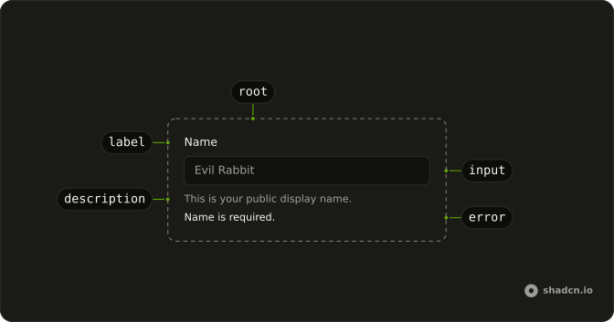
Field lays out one form control with its label, a line of help and an error message, and its other parts arrange many fields into a form: FieldGroup spaces them, FieldSet gathers the ones that answer one question. It works around any control, from an input to a slider. It doesn't validate or hold values, so pair it with your form library.
For one caption beside one control with nothing else around them, a Label is enough.
Installation
Anatomy
Usage
import {
  Field, FieldDescription, FieldLabel,
} from "@/components/ui/field";
import { Input } from "@/components/ui/input";
FieldLabel is a plain label, so its htmlFor must match the control's id.
<Field className="max-w-xs">
  <FieldLabel htmlFor="name">Name</FieldLabel>
  <Input id="name" placeholder="Evil Rabbit" type="text" />
  <FieldDescription>This is your public display name.</FieldDescription>
</Field>
Accessibility
Field is a div with role="group" and adds no keys of its own, so the control inside keeps its usual keyboard. FieldSet renders a <fieldset>, and a screen reader announces its FieldLegend as people move into the group. Link FieldLabel to the control yourself with htmlFor and id. Field names its FieldDescription in the control's aria-describedby, invalid on Field sets aria-invalid on it, and FieldError is an alert, read out when it appears.
Demos
Input
A password field with its rule, at least 8 characters, between the label and the box. Put FieldDescription before the control when people need the constraint before they type, and after it, as the preview at the top of the page does, for a note they can skip. The type is password, so the characters stay masked.
Invalid
An email field holding jordan@example, marked invalid with invalid on Field, which turns the label and the box's border to the destructive color and passes aria-invalid to the input. The FieldError under it says what to fix. Set invalid from your form library's error for the field, and keep the message to the one change people need to make.
Textarea
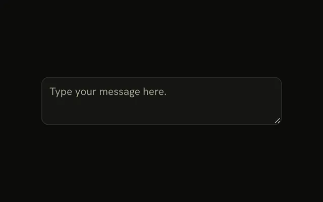
Feedback, as a label over a Textarea with no description, so the placeholder is the only prompt. That's enough for a free-form box whose label says it all. Anything people still need once they start typing, such as a length limit, belongs in a FieldDescription, because the placeholder disappears.
Select
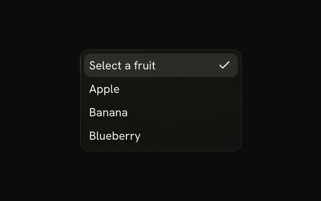
Department, picked from Engineering, Design or Marketing in a Select that shows a placeholder until something is chosen. The label's htmlFor points at the trigger's id. Use a select for a short closed list, and a text input for an answer people make up.
Slider
Volume at 40, with the field's label above a Slider. The Slider also carries an aria-label of Volume, which is the name its thumb announces when it takes focus. Keep that name the same as the visible label, so what a screen reader says matches what people see.
Fieldset
Street and city under one Address legend. FieldSet renders a <fieldset> and FieldLegend its <legend>, so a screen reader says Address as people move into the group, and each input keeps its own label. Use a fieldset when several inputs answer one question, such as an address or a date split into parts.
Checkbox
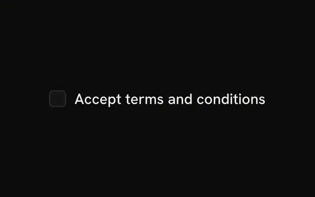
Same as shipping address, checked from the start, with the box and its label in one row through orientation set to horizontal. font-normal keeps the label at body weight, since it reads as the choice rather than a heading. The label's htmlFor matches the checkbox's id, so clicking the text toggles it.
Radio
A Subscription plan question with Monthly and Yearly, one item to each horizontal Field, in a FieldSet whose FieldLegend has variant set to label for smaller text. Each item has its own FieldLabel pointed at its id. Use radios when exactly one answer is allowed.
Switch
Multi-factor authentication, with the label first and the switch after it in one row, the usual shape for a settings list. The label's htmlFor matches the switch's id. When turning it on has a consequence, put a FieldDescription under the label, with both inside a FieldContent.
Choice card
Monthly and Yearly as two bordered cards, where a click anywhere on a card selects its radio. Each FieldLabel wraps a horizontal Field, which the label's styles turn into a card with a border and a tint when checked. FieldTitle gives each card a title styled like a label, since the card is already the label. Keep it to a few options that need room for a price.
Group
Email and Name in one FieldGroup, with a FieldSeparator line between them. FieldGroup gives every field in it the same gap, and the separator marks a break between parts of a form that don't share a legend. Pass the separator a short word as its child, such as or, and it prints it in the middle of the line.
RTL
The public name field in Arabic, inside a wrapper with dir set to rtl. The label, the box and the description start from the right edge, since the field's alignment is logical, with text-start on the description. Check a translated form this way before it ships, because a physical margin you added yourself lands on the wrong side.
Responsive
Name, with its label and a description grouped in FieldContent, then the input. orientation set to responsive stacks the two, then puts them side by side once the FieldGroup around the field is 28rem wide, through a container query on the group rather than the viewport. The demo's group is capped at max-w-lg, 32rem, so it shows a row on a wide screen and stacks on a phone.
FAQ
How do I label a Field in React?
Put a FieldLabel and the control inside Field, give the control an id and set the label's htmlFor to the same value. FieldLabel is a plain <label>, so nothing links them until those match. For a control that isn't a form element, such as a slider, set its aria-label, as the Slider demo does.
FieldTitle looks like a label without being one. Use it for a heading inside a choice card, where the card itself is the label.
How do I put a Field label beside the control?
Set orientation on Field. vertical, the default, stacks the label over the control, horizontal puts them in a row, and responsive stacks them until the FieldGroup around the field is 28rem wide, then uses a row. responsive only switches inside a FieldGroup, because the breakpoint is a container query on that group.
In a row, wrap the label and its description in FieldContent so they stay together beside the control. To put the control first, as in the Checkbox demo, place it first in the markup.
How do I show an error message on a Field?
Set invalid on Field and put the message in a FieldError, as the Invalid demo does. It takes your text as children or a form library's errors array, showing one message as text, several as a list, and a repeated message once. FieldError is an alert, so a screen reader reads it as soon as it appears.
FieldError hides itself while invalid is false, so with invalid always set to true or false it can stay in your markup. Leave invalid off entirely and it shows whenever it has something to show.
How do I use Field with a form library in React?
Field holds no form state. Wire the library to the control as usual, set invalid on Field from the library's error for that field, and show the message in FieldError. Keep a FieldDescription for the hint and FieldError for the failure, since people need both while they fix it.
FieldError takes the library's error objects directly through errors, so a field with several failed rules lists each one.
How do I disable a whole Field or a group of fields?
Set disabled on the control, because Field has no prop for it, and add data-disabled set to true to Field to fade the label. For a whole set, disabled on FieldSet disables the native inputs in it, since the set is a real <fieldset>.
A disabled control's value is left out when the form submits. Make a value people can't change read-only instead when it still has to be sent.
When should I use FieldSet, FieldGroup or FieldSeparator?
Use FieldSet with a FieldLegend when several controls answer one question, such as an address or a choice between plans, because the legend names the whole group for a screen reader. Use FieldGroup to stack any fields with an even gap, with or without a legend.
FieldSeparator draws a line between two parts of a FieldGroup, as the Group demo does. Give it a short word as its child to print in the middle of the line. A FieldGroup inside another one takes a tighter gap.
How do I make a choice card with Field?
Wrap a horizontal Field in a FieldLabel, put a FieldTitle and the radio or checkbox inside, and repeat it for each option, as the Choice card demo does. The label's styles draw the border and tint the card when its control is checked, and a click anywhere on the card selects it. Inside a FieldLabel, Field drops its group role, so the card's text names the radio for a screen reader.
Use FieldTitle rather than another FieldLabel for the card's title, since the card is already the label and a second one would sit inside it. Put a FieldDescription under the title inside a FieldContent for a price or a line of detail.
Does a screen reader read a FieldDescription with its control?
Yes. Field gives each FieldDescription inside it an id and names it in the aria-describedby of each control in the field, after any ids the control lists of its own, so the hint is read when the control takes focus. A description directly under a FieldLegend, outside any Field, isn't linked to a control.
An error works differently: FieldError has role="alert", so a screen reader reads it out on its own as soon as it appears.
API Reference
Field
invalid?boolean
Marks the field invalid, as Ark UI's does: data-invalid on it,
aria-invalid on its control, and its FieldError shown only then.
orientation?"horizontal" | "responsive" | "vertical"
Stacks the label over the control (vertical), puts them side by side
(horizontal), or side by side on wide containers only (responsive).
- Type
"horizontal" | "responsive" | "vertical"- Default
"vertical"
className?string
Merged with the part's classes.
FieldSet
<fieldset> data-slot="field-set"
className?string
Merged with the part's classes.
FieldLegend
<legend> data-slot="field-legend"
variant?"legend" | "label"
The visual style.
- Type
"legend" | "label"- Default
"legend"
className?string
Merged with the part's classes.
data-variant?string
Mirrors variant.
FieldGroup
<div> data-slot="field-group"
className?string
Merged with the part's classes.
FieldContent
<div> data-slot="field-content"
className?string
Merged with the part's classes.
FieldLabel
asChild?boolean
Merge props onto the child element instead of rendering a host.
className?string
Merged with the part's classes.
FieldTitle
<div> data-slot="field-label"
className?string
Merged with the part's classes.
FieldDescription
<p> data-slot="field-description"
className?string
Merged with the part's classes.
FieldSeparator
<div> data-slot="field-separator"
className?string
Merged with the part's classes.
data-content?stringFieldError
<ul> data-slot="field-error"
errors?Array<{ message?: string }>
Errors to show, such as a form library's ({ message } each): one as * text, several as a list, repeats once.
- Type
Array<{ message?: string }>
className?string
Merged with the part's classes.