shadcn.io is an independent project built on shadcn/ui
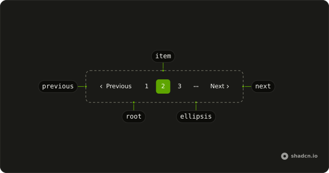
Pagination splits a long list across numbered pages and gives people the controls to move through them: previous and next, the page numbers, and an ellipsis where the run is cut short. When each page is a link, page 12 has an address that can be bookmarked, shared and crawled.
It sits under search results, a Table of orders or a blog archive. For the steps of a single task, such as a checkout, use Steps instead.
Installation
Anatomy
Usage
import {
  Pagination, PaginationContent, PaginationEllipsis, PaginationItem,
  PaginationLink, PaginationNext, PaginationPrevious,
} from "@/components/ui/pagination";
Wrap each control in its own PaginationItem, and mark the page on screen with isActive.
<Pagination>
  <PaginationContent>
    <PaginationItem>
      <PaginationPrevious href="?page=1" />
    </PaginationItem>
    <PaginationItem>
      <PaginationLink href="?page=1">1</PaginationLink>
    </PaginationItem>
    <PaginationItem>
      <PaginationLink href="?page=2" isActive>
        2
      </PaginationLink>
    </PaginationItem>
    <PaginationItem>
      <PaginationLink href="?page=3">3</PaginationLink>
    </PaginationItem>
    <PaginationItem>
      <PaginationEllipsis />
    </PaginationItem>
    <PaginationItem>
      <PaginationNext href="?page=3" />
    </PaginationItem>
  </PaginationContent>
</Pagination>Accessibility
Pagination renders a nav landmark labeled pagination, and each page is a link in the tab order. isActive on a PaginationLink sets aria-current="page", which a screen reader announces, and PaginationEllipsis is hidden from screen readers. With count, Ark UI renders buttons instead: the current one carries aria-current, Previous and Next turn disabled at the ends, their names come from the translations prop, and each ellipsis is read out as More pages.
In a row of links, PaginationPrevious and PaginationNext are named Go to previous page and Go to next page whatever their text says, and below the sm breakpoint, where the words hide, that name is their only label. On a page in another language, pass each a translated aria-label.
Demos
Simple
Five numbered links and nothing else, with page 2 marked by isActive, which outlines it and sets aria-current. A row of numbers suits a short run of five or six pages, where Previous and Next would only add width. Once the pages run past what fits, add Previous, Next and an ellipsis, as the preview at the top does.
Icons only
Previous and Next with no page numbers, beside a Rows per page select set to 25, as in the footer of a data table. Their words hide below the sm breakpoint, leaving only the arrows. Use it when the table already shows which rows are on screen, and keep the numbers when people need to jump far ahead.
RTL
The default row in Arabic, with dir set to rtl on Pagination, Arabic-Indic numerals and Arabic text on Previous and Next. The row starts at the right, and the arrows turn to point the way it reads. Those two are still named Go to previous page and Go to next page, so pass a translated aria-label alongside text.
FAQ
How do I track the current page with the Ark UI Pagination?
Pass count, the total number of items, and Ark UI keeps the page for you. PaginationItems renders the numbered buttons and the ellipses, and Previous and Next disable themselves at the ends. Control it with page and onPageChange, which receives the new page in details.page, and set pageSize when it isn't the default of 10.
How do I use Pagination with my router's Link component in Solid?
Pass asChild on PaginationLink a function that renders your router's A with the props it receives. With count, the numbers are buttons rather than links, so navigate from onPageChange instead, for example by writing the new page into the URL.
How do I show an ellipsis when Pagination has many pages?
With count, Ark UI works it out. siblingCount sets how many pages show on each side of the current one and boundaryCount how many at each end, 1 each by default, and PaginationItems puts a PaginationEllipsis in every gap. On page 10 of 20 that gives 1, an ellipsis, 9, 10, 11, an ellipsis and 20.
Why can I still click Previous on the first page?
Without count, Pagination is a row of links that doesn't know where it stands, so Previous stays live. Pass count and Ark UI disables Previous on the first page and Next on the last.
In a row of links, set aria-disabled to true and tabIndex to -1 on PaginationPrevious while on page 1. The button styles then fade it and ignore clicks, and Tab skips it. Do the same for PaginationNext on the last page, or leave either one out.
How do I show only Previous and Next buttons in Pagination?
Keep PaginationPrevious and PaginationNext and leave the numbered links out, as the Icons only demo does beside a rows-per-page select. Below the sm breakpoint their words hide and only the arrows show.
Without numbers, people can't tell how far along they are, so show the range on screen next to the buttons, such as 26 to 50 of 312.
How do I change or translate the Pagination labels?
Pass text to PaginationPrevious and PaginationNext for the visible words, Previous and Next by default, as the RTL demo does in Arabic. That changes only what is seen. The name a screen reader reads stays Go to previous page and Go to next page until you pass a translated aria-label as well.
The landmark itself is named pagination, so give Pagination a translated aria-label too. With count, the numbered buttons, Previous and Next take their names from the translations prop, and the aria-label you pass still names the landmark.
Should I use Pagination or infinite scroll?
Use pagination when people come back to a place in the list, compare items across pages or need what sits below the list: search results, an admin table, an archive. Each page has its own address, so the back button and a shared link land on the same items.
Infinite scroll suits a feed read once from the top. A Load more button sits between the two, keeping one address while letting people choose when to fetch more.
API Reference
Pagination
<nav>
page?number
The controlled active page.
defaultPage?number
The initial active page when rendered. Use when you don't need to control the active page of the pagination.
- Default
1
onPageChange?(details: PageChangeDetails) → void
Called when the page number is changed.
- Type
(details: PageChangeDetails) → void- Parameters
details– { page: number; pageSize: number }- Returns
void
pageSize?number
The controlled number of data items per page.
defaultPageSize?number
The initial number of data items per page when rendered. Use when you don't need to control the page size of the pagination.
- Default
10
onPageSizeChange?(details: PageSizeChangeDetails) → void
Called when the page size is changed.
- Type
(details: PageSizeChangeDetails) → void- Parameters
details– { pageSize: number }- Returns
void
boundaryCount?number
Number of pages to show at the beginning and end.
- Default
1
count?number
Total number of data items.
dir?"ltr" | "rtl"
The document's text/writing direction.
- Type
"ltr" | "rtl"- Default
"ltr"
getPageUrl?(details: PageUrlDetails) → string
Function to generate href attributes for pagination links.
Only used when type is set to "link".
- Type
(details: PageUrlDetails) → string- Parameters
details– { page: number; pageSize: number }- Returns
string
id?string
The unique identifier of the machine.
ids?object
The ids of the elements in the accordion. Useful for composition.
- Type
{ root?: string; ellipsis?: (index: number) → string; firstTrigger?: string; prevTrigger?: string; nextTrigger?: string; lastTrigger?: string; item?: (page: number) → string }
siblingCount?number
Number of pages to show beside active page.
- Default
1
translations?object
Specifies the localized strings that identifies the accessibility elements and their states.
- Type
{ rootLabel?: string; firstTriggerLabel?: string; prevTriggerLabel?: string; nextTriggerLabel?: string; lastTriggerLabel?: string; itemLabel?: (details: ItemLabelDetails) → string }
type?"button" | "link"
The type of the trigger element.
- Type
"button" | "link"- Default
"button"
asChild?(props: ParentProps) => JSX.Element
Render your own element: a function that gets the part's props to spread on it.
- Type
(props: ParentProps) => JSX.Element
class?string
Merged with the part's classes.
PaginationItem
<li> data-slot="pagination-item"
type?"page"
The item's type: a page.
value?number
The item's value.
asChild?(props: ParentProps) => JSX.Element
Render your own element: a function that gets the part's props to spread on it.
- Type
(props: ParentProps) => JSX.Element
class?string
Merged with the part's classes.
data-indexstring
The index of the item.
data-selected?string
Present when selected.
PaginationEllipsis
<span> data-slot="pagination-ellipsis"
index?number
The ellipsis's position in its list.
- Default
0
asChild?(props: ParentProps) => JSX.Element
Render your own element: a function that gets the part's props to spread on it.
- Type
(props: ParentProps) => JSX.Element
class?string
Merged with the part's classes.
data-index?string
The index of the item.
PaginationPrevious
<button> data-slot="pagination-previous"
isActive?boolean
Marks the link as the current page: outlined, and aria-current="page".
text?string
The button's label, beside its arrow.
- Default
"Previous"
asChild?(props: ParentProps) => JSX.Element
Render your own element: a function that gets the part's props to spread on it.
- Type
(props: ParentProps) => JSX.Element
class?string
Merged with the part's classes.
data-disabled?string
Present when disabled.
PaginationNext
<button> data-slot="pagination-next"
isActive?boolean
Marks the link as the current page: outlined, and aria-current="page".
text?string
The button's label, beside its arrow.
- Default
"Next"
asChild?(props: ParentProps) => JSX.Element
Render your own element: a function that gets the part's props to spread on it.
- Type
(props: ParentProps) => JSX.Element
class?string
Merged with the part's classes.
data-disabled?string
Present when disabled.
PaginationContent
<ul> data-slot="pagination-content"
asChild?(props: ParentProps) => JSX.Element
Render your own element: a function that gets the part's props to spread on it.
- Type
(props: ParentProps) => JSX.Element
class?string
Merged with the part's classes.
PaginationLink
<a> data-slot="pagination-link"
isActive?boolean
Marks the link as the current page: outlined, and aria-current="page".
asChild?(props: ParentProps) => JSX.Element
Render your own element: a function that gets the part's props to spread on it.
- Type
(props: ParentProps) => JSX.Element
class?string
Merged with the part's classes.
data-active?string
Mirrors isActive.
PaginationItems
data-slot="pagination-items"
children(context: UsePaginationContext) → JSX.Element
A function that gets context and returns what it renders.
- Type
(context: UsePaginationContext) → JSX.Element- Parameters
context– { page: number; count: number; pageSize: number; totalPages: number; pages: Pages; previousPage: number | null; nextPage: number | null; pageRange: PageRange; type: "button" | "link"; getPageUrl?: (page: number) → string; slice: <V>(data: V[]) → V[]; setPageSize: (size: number) → void; setPage: (page: number) → void; goToNextPage: VoidFunction; goToPrevPage: VoidFunction; goToFirstPage: VoidFunction; goToLastPage: VoidFunction; getRootProps: () → T["element"]; getEllipsisProps: (props: EllipsisProps) → T["element"]; getItemProps: (props: ItemProps) → T["element"]; getFirstTriggerProps: () → T["element"]; getPrevTriggerProps: () → T["element"]; getNextTriggerProps: () → T["element"]; getLastTriggerProps: () → T["element"] }- Returns
ReactNode
PaginationItemLink
clickEffect?boolean
Apply a click effect to the button.
- Default
true
isLoading?boolean
Show a loading indicator.
- Default
false
page?"previous" | "next" | number
The page number to link to.
- Type
"previous" | "next" | number
pill?boolean
Fully rounded corners.
- Default
false
size?"default" | "icon" | "icon-lg" | "icon-md" | "icon-sm" | "icon-xl" | "icon-xs" | "lg" | "md" | "sm" | "xl" | "xs"
The size.
- Type
"default" | "icon" | "icon-lg" | "icon-md" | "icon-sm" | "icon-xl" | "icon-xs" | "lg" | "md" | "sm" | "xl" | "xs"- Default
"md"
variant?"default" | "destructive" | "ghost" | "link" | "outline" | "secondary"
Ark default: default.
- Type
"default" | "destructive" | "ghost" | "link" | "outline" | "secondary"- Default
outline
asChild?(props: ParentProps) => JSX.Element
Render your own element: a function that gets the part's props to spread on it.
- Type
(props: ParentProps) => JSX.Element
class?string
Merged with the part's classes.
usePagination
page?number
The controlled active page.
defaultPage?number
The initial active page when rendered. Use when you don't need to control the active page of the pagination.
- Default
1
onPageChange?(details: PageChangeDetails) → void
Called when the page number is changed.
- Type
(details: PageChangeDetails) → void- Parameters
details– { page: number; pageSize: number }- Returns
void
pageSize?number
The controlled number of data items per page.
defaultPageSize?number
The initial number of data items per page when rendered. Use when you don't need to control the page size of the pagination.
- Default
10
onPageSizeChange?(details: PageSizeChangeDetails) → void
Called when the page size is changed.
- Type
(details: PageSizeChangeDetails) → void- Parameters
details– { pageSize: number }- Returns
void
boundaryCount?number
Number of pages to show at the beginning and end.
- Default
1
count?number
Total number of data items.
getPageUrl?(details: PageUrlDetails) → string
Function to generate href attributes for pagination links.
Only used when type is set to "link".
- Type
(details: PageUrlDetails) → string- Parameters
details– { page: number; pageSize: number }- Returns
string
id?string
The unique identifier of the machine.
ids?object
The ids of the elements in the accordion. Useful for composition.
- Type
{ root?: string; ellipsis?: (index: number) → string; firstTrigger?: string; prevTrigger?: string; nextTrigger?: string; lastTrigger?: string; item?: (page: number) → string }
siblingCount?number
Number of pages to show beside active page.
- Default
1
translations?object
Specifies the localized strings that identifies the accessibility elements and their states.
- Type
{ rootLabel?: string; firstTriggerLabel?: string; prevTriggerLabel?: string; nextTriggerLabel?: string; lastTriggerLabel?: string; itemLabel?: (details: ItemLabelDetails) → string }
type?"button" | "link"
The type of the trigger element.
- Type
"button" | "link"- Default
"button"