shadcn.io is an independent project built on shadcn/ui
Base UI does not include this primitive, so this page uses the Ark UI component. The visuals match the Ark UI version.
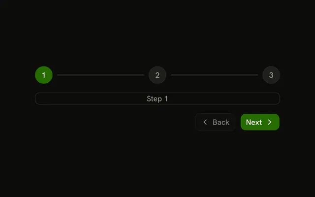
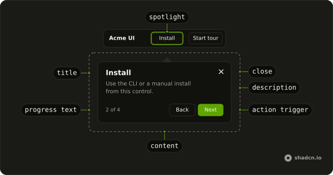
A tour walks people through a page one step at a time, on a first visit, a redesigned screen or a new feature. A typical step dims the page, outlines one element and explains it in a small panel with Back and Next. Base UI has no tour component, so this one is built on Ark UI's, as it is on every base.
For a single hint on one control, use a Tooltip or a Popover. An announcement with nothing to point at belongs in a Dialog.
Installation
Anatomy
Usage
import React from "react";
import { Button } from "@/components/ui/button";
import {
  Tour, TourContent, TourDescription, TourFooter, TourHeader,
  TourNextStep, TourPreviousStep, TourProgressText, type TourStepType,
  TourTitle, TourTrigger,
} from "@/components/ui/tour";
Every step needs its own id, and a target or a type, or Tour throws when it mounts. Tour reads steps once, when it mounts, so later changes to the array never reach it.
const EditorTour = () => {
  const saveRef = React.useRef<HTMLButtonElement>(null);

  const steps = React.useMemo<TourStepType[]>(
    () => [
      {
        actions: [{ action: "next", label: "Start" }],
        description: "Two quick stops before you write your first draft.",
        id: "welcome",
        title: "Welcome to the editor",
        type: "dialog",
      },
      {
        actions: [
          { action: "prev", label: "Back" },
          { action: "dismiss", label: "Done" },
        ],
        description: "Drafts save here. Nothing is published until you say so.",
        id: "save",
        placement: "bottom",
        target: () => saveRef.current,
        title: "Save a draft",
        type: "tooltip",
      },
    ],
    []
  );

  return (
    <Tour steps={steps}>
      <div className="flex gap-2">
        <Button ref={saveRef} variant="outline">
          Save draft
        </Button>
        <TourTrigger asChild>
          <Button>Take the tour</Button>
        </TourTrigger>
      </div>

      <TourContent>
        <TourHeader>
          <TourProgressText />
          <TourTitle />
          <TourDescription />
        </TourHeader>
        <TourFooter>
          <TourPreviousStep />
          <TourNextStep />
        </TourFooter>
      </TourContent>
    </Tour>
  );
};
Accessibility
Each step is an alertdialog named by its title and described by its description, and it's a polite live region, so a screen reader reads a new step as it appears. Focus moves into the step and stays between its buttons and the highlighted element, which keeps the target usable from the keyboard. The buttons that TourActions, TourPreviousStep and TourNextStep draw are named by the labels they show, and the close button in the corner is announced as "close tour". When the tour ends, focus isn't moved back to the button that started it.
- Arrow Right
- Moves to the next step in the tour.
- Arrow Left
- Moves to the previous step in the tour.
- Escape
- Closes the tour.
- Tab
- Moves focus between the step's buttons and the highlighted element.
- Shift+Tab
- Moves focus back through the same buttons and element.
- Enter
- Presses the focused button, such as Next, Back or Close.
- Space
- Presses the focused button, such as Next, Back or Close.
Demos
Async
The second step fetches a GitHub profile in its effect. The intro dialog stays up while the request runs, then update writes the name, public repo count and follower count into the step and show opens it on the profile card. A failed request shows an error the same way, while closing the tour mid-request aborts the fetch and leaves the tour closed.
Custom spacing
Two dialog steps in a TourContent whose --space variable is set to --spacing(2), half its default of --spacing(4). The variable is the panel's padding, and the footer's inset follows it, so the whole panel tightens. Set it at one size, or per breakpoint for a roomier panel on wide screens.
Events
Three boxes, a Start Tour button and an event log under them. onStepChange adds a line with the step's id each time the tour moves, and onStatusChange adds one when it starts and when it ends. Use these callbacks to remember who finished the tour or to count where people leave it.
Keyboard navigation
keyboardNavigation is set, and a line under the button names the keys: the right arrow moves on, the left arrow goes back and Escape closes. Both are on in every tour unless you set keyboardNavigation or closeOnEscape to false on Tour. The arrows respond while focus is in the step panel.
Progress
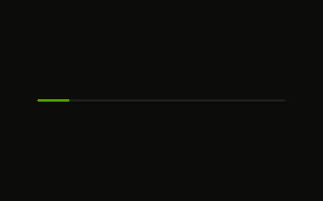
Four tooltip steps with a thin bar along the bottom of the panel, filled to getProgressPercent(): 25, 50, 75, then 100 percent. TourProgressText still prints 1 of 4 above the title. The bar is the demo's own element, reading the tour from useTourContext(), so copy it when a count alone feels too abstract for a longer tour.
Skip
The first two steps offer Skip beside Next, and Skip is an action whose action is dismiss, so it closes the tour from wherever someone is. The last step says Finish and dismisses the same way, with Back beside it. Offer a skip when the walkthrough is optional, so nobody has to sit through it to reach the page.
Step types
Two dialog steps, centered with no target, open and close the tour. Between them, a tooltip step points at the Target Element box, and a floating step set to bottom-end sits in that corner of the window without dimming the page or pointing at anything. Pick the type by what the step is about: the whole product, one control, or a passing note.
Wait for click
Add Item, Edit and Delete each get a step with no Next button. Its effect shows the step, waits with waitForEvent for a click on the highlighted button, then calls next. Use this when the lesson is the click itself, and since focus stays between the step and its target, keyboard users can Tab to the button and press Enter.
Wait for element
Clicking Add Item appends a row, and the next step waits for it: its effect calls waitForElement for an element with data-item set to new and shows the step once the row exists. The previous step stays on screen in the meantime, and if no row appears within five seconds the step calls dismiss. Use this when the next target is created by the step before it.
Wait for input
A short form where the name step moves on once the field holds two characters, and the email step once the value looks like an address. Each listens with waitForEvent for input and checks a predicate, and the terms step outlines the checkbox row until the box is checked. Use it when going on with an empty or invalid value would skip the lesson.
FAQ
How do I build a product tour or onboarding walkthrough in React?
Describe the tour as an array of steps, each with a unique id, a title, a description, a type and the actions its buttons run, and pass it to Tour as steps. Wrap the button that starts it in a TourTrigger, and add a TourContent holding the title, description and buttons, as the Usage section does.
A step of type tooltip also needs a target. To start the tour without a click, on a first visit for example, call handleStart from useTourContext() in a component rendered inside Tour.
How do I highlight a specific element in a Tour step?
Set the step's type to tooltip and give it a target: a function that returns the element, from a ref or a querySelector call. The tour scrolls the element into view, dims the rest of the page around a cut-out, outlines it, and places the panel on the side placement names, which is bottom unless you choose another.
The element stays clickable through the cut-out, and clicking it doesn't close the tour, which is what the Wait for click demo relies on.
What step types does the Tour support?
Four. A dialog step is centered on the page with no target, which suits a welcome or a goodbye. A tooltip step points at its target and outlines it on a dimmed page.
A floating step points at nothing and leaves the page undimmed, as in the Step types demo. Its placement names the corner or edge of the window it sits in, bottom-end unless you choose another, such as top-start or bottom.
The last, wait, shows no panel at all and isn't counted in the progress. Its effect runs until it calls next, which makes it a pause between steps while the page catches up.
How do I wait for the user to click a button before the next Tour step?
Leave out the step's actions and do the waiting in its effect, which receives show, next and the step's target. Call show() to open the step, wait for a click on the target with waitForEvent from Ark UI's tour package, then call next(). Return the cancel function it gives you, so leaving the step removes the listener.
The Wait for click demo does this three times. waitForEvent also takes a predicate, which Wait for input uses to move on only once a field holds a valid value.
How do I load data before showing a Tour step?
Start the request in the step's effect and call show() once it settles. Until then the previous step stays on screen, so nobody stares at an empty panel. Call update() before show() to give the step a title and description built from the response, as the Async demo does with a GitHub profile.
Return a cleanup function that aborts the request, which runs if someone closes the tour or goes to another step before it settles. The abort rejects the request, so return early from the failure path when the request was aborted, because a show() there reopens a tour that was just closed. For any other failure, update the step with its own message and call show(), or it never appears.
How do I let users skip or close the Tour?
Add an action whose action is dismiss to each step, labeled Skip, Done or Finish, as the Skip demo does. An action set to skip closes the tour too, and reports skipped rather than dismissed to onStatusChange.
Escape and a click outside the step and its target close the tour as well. To keep it open until someone picks one of its buttons, set closeOnEscape and closeOnInteractOutside to false on Tour.
How do I know when a Tour step changes or the Tour ends?
Pass onStepChange and onStatusChange to Tour, as the Events demo does. onStepChange reports the step's id, index and progress each time the tour moves, and a start first reports a null id while the previous step is cleared. onStatusChange reports started, completed, dismissed, skipped or not-found.
Save completed or dismissed to remember that someone has seen the tour, and don't start it for them again.
Why does my Tour close instead of showing the next step?
The step's target returned nothing. When a step's element isn't in the page, the tour watches for it for three seconds, then ends with the status not-found rather than pointing at empty space. Check that the ref or selector matches an element that is rendered at that moment, not one inside a closed menu or a route that hasn't loaded.
When the element appears only after something happens, wait for it in the step's effect with waitForElement and call show() once it's there, as the Wait for element demo does. A step with neither a target nor a type, or two steps sharing an id, makes Tour throw as soon as it mounts.
API Reference
Tour
<div> data-slot="tour"
stepsTourStepDetails[]
The steps to display in the tour.
- Default
[]
dir?"ltr" | "rtl"
The document's text/writing direction.
- Type
"ltr" | "rtl"- Default
"ltr"
id?string
The unique identifier of the machine.
ids?object
The ids of the scroll area elements.
- Type
{ root?: string; viewport?: string; content?: string; scrollbar?: string; thumb?: string }
asChild?boolean
Use the provided child element as the default rendered element, combining their props and behavior.
data-overflow-x?string
Present when the content overflows the x-axis.
data-overflow-y?string
Present when the content overflows the y-axis.
--corner-heightstring
The height of the Root.
--corner-widthstring
The width of the Root.
--thumb-heightstring
The height of the slider thumb.
--thumb-widthstring
The width of the slider thumb.
TourContent
<div>
showCloseButton?boolean
Show close button at the top right corner.
- Default
true
asChild?boolean
Use the provided child element as the default rendered element, combining their props and behavior.
className?string
Merged with the part's classes.
data-overflow-x?string
Present when the content overflows the x-axis.
data-overflow-y?string
Present when the content overflows the y-axis.
--spacestringTourTrigger
<button> data-slot="tour-trigger"
asChild?boolean
Use the provided child element as the default rendered element, combining their props and behavior.
data-overflow-x?string
Present when scrollbarXHidden is false.
data-overflow-y?string
Present when scrollbarYHidden is false.
TourActionTrigger
data-slot="tour-action-trigger"
asChild?boolean
Use the provided child element as the default rendered element, combining their props and behavior.
TourOverlay
data-slot="tour-overlay"
asChild?boolean
Use the provided child element as the default rendered element, combining their props and behavior.
className?string
Merged with the part's classes.
TourPositioner
asChild?boolean
Use the provided child element as the default rendered element, combining their props and behavior.
className?string
Merged with the part's classes.
TourBody
data-slot="tour-body"
asChild?boolean
Use the provided child element as the default rendered element, combining their props and behavior.
className?string
Merged with the part's classes.
data-overflow-x?string
Present when scrollbarXHidden is false.
data-overflow-y?string
Present when scrollbarYHidden is false.
TourSpotlight
data-slot="tour-spotlight"
asChild?boolean
Use the provided child element as the default rendered element, combining their props and behavior.
className?string
Merged with the part's classes.
TourHeader
data-slot="tour-header"
asChild?boolean
Use the provided child element as the default rendered element, combining their props and behavior.
data-overflow-x?string
Present when scrollbarXHidden is false.
data-overflow-y?string
Present when scrollbarYHidden is false.
TourTitle
data-slot="tour-title"
asChild?boolean
Use the provided child element as the default rendered element, combining their props and behavior.
className?string
Merged with the part's classes.
TourDescription
data-slot="tour-description"
asChild?boolean
Use the provided child element as the default rendered element, combining their props and behavior.
className?string
Merged with the part's classes.
TourProgressText
data-slot="tour-progress-text"
asChild?boolean
Use the provided child element as the default rendered element, combining their props and behavior.
className?string
Merged with the part's classes.
TourClose
data-slot="tour-close-trigger"
asChild?boolean
Use the provided child element as the default rendered element, combining their props and behavior.
--spacestringTourFooter
asChild?boolean
Use the provided child element as the default rendered element, combining their props and behavior.
className?string
Merged with the part's classes.
TourActions
asChild?boolean
Use the provided child element as the default rendered element, combining their props and behavior.
className?string
Merged with the part's classes.
TourPreviousStep
asChild?boolean
Use the provided child element as the default rendered element, combining their props and behavior.
data-overflow-x?string
Present when scrollbarXHidden is false.
data-overflow-y?string
Present when scrollbarYHidden is false.
TourNextStep
asChild?boolean
Use the provided child element as the default rendered element, combining their props and behavior.
data-overflow-x?string
Present when scrollbarXHidden is false.
data-overflow-y?string
Present when scrollbarYHidden is false.