shadcn.io is an independent project built on shadcn/ui
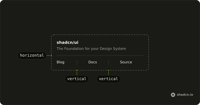
A separator is a one-pixel line in the border color that splits content into parts: a heading block from the paragraph under it, the rows of an order summary, or links sitting on one line. It runs across its container by default and stands upright between items when orientation is vertical.
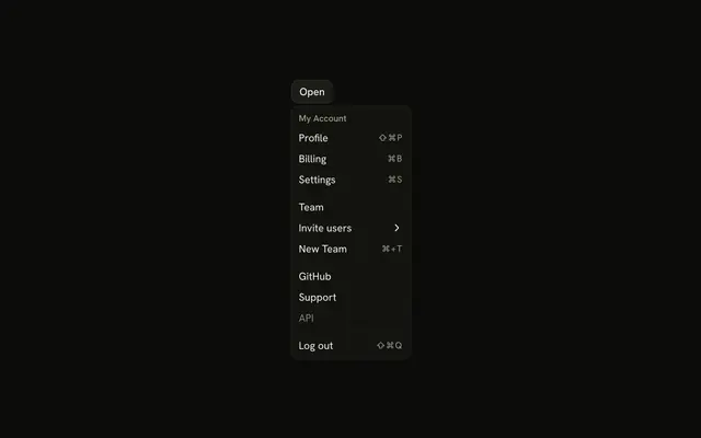
Inside a select or command popup, use that component's own separator part, which carries the popup's spacing. To put "or" on the line between two sign-in options, use FieldSeparator from Field.
Installation
Anatomy
Usage
<script setup lang="ts">
import { Separator } from "@/components/ui/separator";
</script>
<template>
  <div class="flex max-w-sm flex-col gap-4 text-sm">
    <div class="flex flex-col gap-1.5">
      <div class="font-medium leading-none">shadcn/ui</div>
      <div class="text-muted-foreground">
        The Foundation for your Design System
      </div>
    </div>
    <Separator />
    <div>
      A set of beautifully designed components that you can customize, extend,
      and build on.
    </div>
  </div>
</template>
Accessibility
The separator takes no focus and has no keys. The one question it raises is whether a screen reader reports the line.
The line is a div with role="separator" and an aria-orientation that matches orientation, so a screen reader reading through the page reports a separator at that spot. When the line is only decoration, such as between a title and its own subtitle, add aria-hidden="true" and it leaves the accessibility tree.
Demos
Vertical
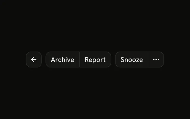
Blog, Docs and Source in one row, with orientation set to vertical on the two separators between them. The row is h-5 tall and each line fills that height. Use upright rules between short links or figures on one line, like a footer or the date and reading time of a post, where a horizontal line would run under the words.
Menu
Settings, Account and Help sit in a row, each a name over a one-line description, with a vertical separator between each pair. The row has no set height, so each separator takes h-auto and stretches to the text beside it. Below md, Help and the separator before it are hidden, so the row never ends on a stray line. Use it for a strip of links in a header.
List
Three rows of names and values, each row its own dl, with a separator after the first and second but not the third. Use lines like these in an order summary or a block of account details, where rows of plain text otherwise run together. Leave the last one out, because a trailing line suggests another row below it.
With text
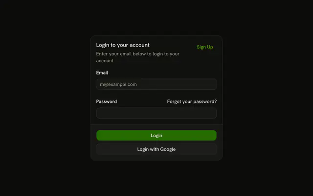
An "or" label centered between two horizontal separators in a flex row, each line with flex-1 so the two share the width beside the word. Both lines carry aria-hidden, since the word already marks the break. Use it between a sign-in form and the social buttons under it, or reach for FieldSeparator from Field, which draws this for you.
RTL
The heading, line and paragraph from the top of the page, with the subtitle and paragraph in Arabic under dir="rtl". The text moves to the right edge, while the line still spans the full width, so the separator itself needs no change. Use this to check a page that ships in Arabic or Hebrew.
FAQ
Why is my vertical Separator not showing?
A vertical separator is an empty element one pixel wide, so its height has to come from around it. Check that orientation is vertical, then give it a height to fill. The style sizes it with h-full, and a percentage height only resolves against a parent whose height is set.
Put it in a flex row with a fixed height, such as flex h-5 items-center in the Vertical demo, or give the separator a height class of its own, such as h-4. In a row whose height comes from its content, h-auto lets the line stretch to that height, as in the Menu demo.
Should a Separator be hidden from screen readers in Ark UI?
Hide it when it only decorates. The separator has role="separator" by default, which a screen reader reports as it reads through the page. That helps between two real sections, but between a heading and its own subtitle it is noise, so add aria-hidden="true" to that one.
Headings already tell a screen reader where a section starts, so a line under a heading rarely needs announcing.
How do I change the color or thickness of a Separator?
The color is a background, bg-border, so a class such as bg-primary on one Separator replaces it. The thickness is a height on a horizontal line and a width on a vertical one, each set under a variant that a plain h-1 doesn't override. Use the same variant on yours: data-horizontal:h-1 makes a horizontal line four pixels thick.
To change every separator in the app, edit those classes in components/ui/separator, which is your code once installed.
How do I put text in the middle of a Separator?
Use FieldSeparator from Field and pass the text as its child. It draws a horizontal separator across the full width and centers your text on top of it, over the page background, which is the usual "or continue with" line between a sign-in form and social buttons.
To build one by hand, put a separator, a short label and a second separator in a flex row, and give both separators flex-1 so they share the space left beside the label, as the With text demo does.
How do I add space above and below a Separator?
The separator has no margin of its own, so the space comes from you. The preview at the top of the page stacks its heading, line and paragraph in a flex column with gap-4, which spaces all three evenly.
When the line sits in normal flow between blocks of text, give it a margin class such as my-4 instead. On a vertical separator, use a horizontal margin like mx-2 or a gap on the row around it.
Should I use a Separator, an hr or a CSS border?
Use a border when the line belongs to an element, like the edge of a card, the bottom of a table row or the rule under a page header. It adds no element and nothing for a screen reader to report.
Use a separator when the line stands between two pieces of content, across or upright, and you want a say in whether a screen reader reports it. A plain hr is fine for a break between paragraphs of prose, where it already means the same thing.
API Reference
Separator
<div> data-slot="separator"
orientation?"horizontal" | "vertical"
The orientation of the separator.
- Type
"horizontal" | "vertical"- Default
"horizontal"
asChild?boolean
Use the provided child element as the default rendered element, combining their props and behavior.
class?string
Merged with the part's classes.
data-orientation?string
Mirrors orientation.