Aesop Design System
Aesop's apothecary e-commerce design system as a DESIGN.md file.
About Aesop DESIGN.md
Curated by Dov AzencotUpdated Source aesop.com
- E-commerce & Retail
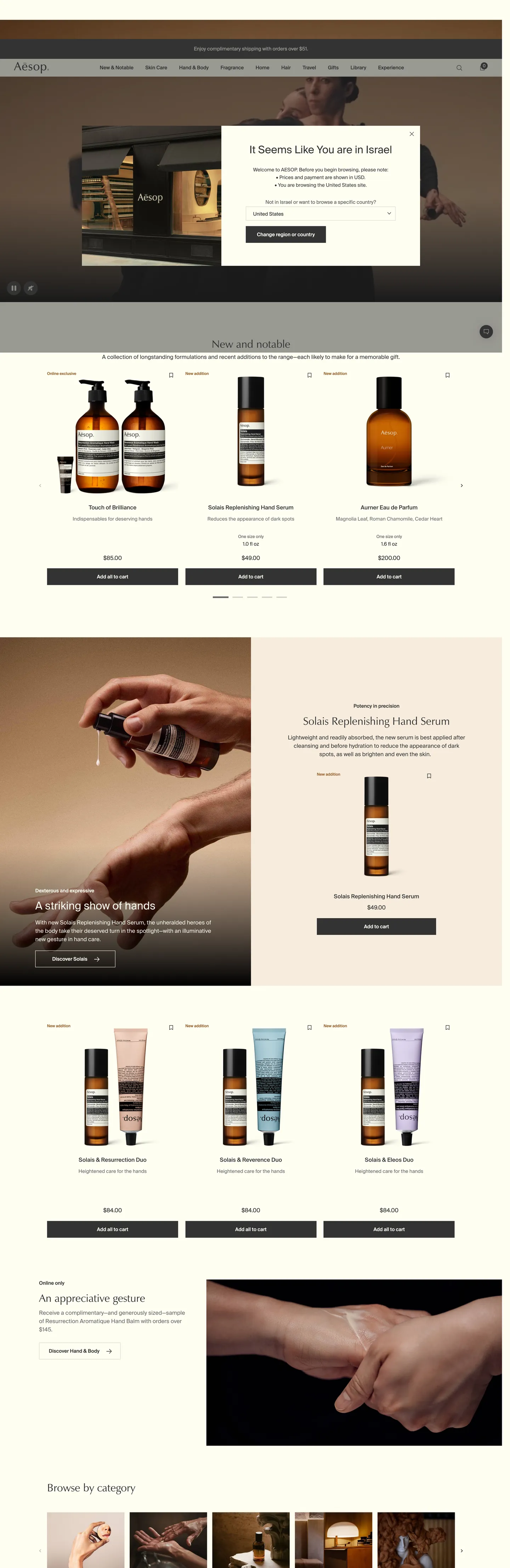
Aesop's storefront is built around one observation: a global skincare brand can sell at luxury price points without using a single drop shadow, gradient, or rounded corner. The canvas is a warm cream (#fffef2) tinted just enough to read as paper, not screen. Ink is a warm graphite (#333333) used 2101 times across text and 1px hairlines — never the pure black that would feel pharmaceutical. Photography handles every moment of brand warmth: amber bottle glass, warm taupe (#f7ecdd) studio walls, terracotta-leather (#945c26) accents in the gift-set tiles. The chrome stays out of the way.
This page packages the storefront into a DESIGN.md file. Inside: 18 color tokens grouped into ink, surface, hairline, and accent layers; 12 type styles built on SuisseIntl grotesque with one Zapf-Humanist serif moment for the "New and notable" headline; a 2-step corner radius (0px almost everywhere, 50% only on avatar dots); a 4px-based spacing scale that pivots at 13px 24px 12px for the signature button, and 18 components covering the top-nav, hero band, product tile, category grid, newsletter input, and footer.
Feed the file to Claude, Cursor, or GitHub Copilot. The agent reproduces Aesop's apothecary discipline — right-angle buttons, hairline borders, cream canvas, SuisseIntl labels — instead of a generic SaaS theme. Reference tokens directly in Tailwind config or CSS variables, audit an existing storefront against this baseline, or use the file as a teaching artifact for what restraint actually looks like when every component is asked to recede.
What makes it distinct
- Zero-radius geometryevery button, input, product tile, and category card sits at 0px corners; only avatar dots use 50%
- Two-typeface systemSuisseIntl grotesque at 14px / 16px for 90% of the page, Zapf-Humanist serif reserved for the single 'New and notable' headline at 31px
- Graphite ink (#333333) over off-cream canvas (#fffef2)2101 ink occurrences against 280 cream, the dominant warm-monochrome contrast
- Terracotta-leather accent (#945c26) appears in just 10 bordersa scarcity move that lets photography carry the brand warmth instead of pigment
- 13px 24px 12px asymmetric button paddingtaller cap-side than baseline, a small typographic correction inherited from print apothecary labels
Live at aesop.com
A snapshot of the brand in production. Hover the frame to scroll the page; click to visit.
 aesop.com
Explore Aesop
Pick what you want to see — mockups, colors, typography, layout, or the full component list.
Brand & Accent
Sparing, CTA-only voltage.
Surface
Page and card backgrounds.
Text
Headlines, body, captions, muted.
Borders & Hairlines
Dividers, outlines, structural rules.
Aesop design system FAQ
Common questions about Aesop's tokens, components, and how to use this DESIGN.md in your project.
Related reading
Specs, directories, and component libraries that pair with this design system.
Browse all design systems
The full directory of DESIGN.md files on shadcn.io, with live mockups for each.
Aesop — official site
The Australian skin, hair, and body care brand's own storefront — the source for this design system.
The DESIGN.md specification
Google Labs' open spec for machine-readable design system files.