AT&T Design System
AT&T's two-blue system: navy #00388f on every CTA, sky-blue hero headlines on white, tight display tracking and 48px pills. For React and AI tools.
- Primary color
- #00388f
- Typeface
- font-bold
- Shape
- Soft
- Base radius
- 8px
- Colors
- 14
- Type tokens
- 12
- Components
- 14
- Spacing values
- 7
About AT&T DESIGN.md
Curated by Dov Azencot, updated May 19, 2026. Source att.com (opens in a new tab).
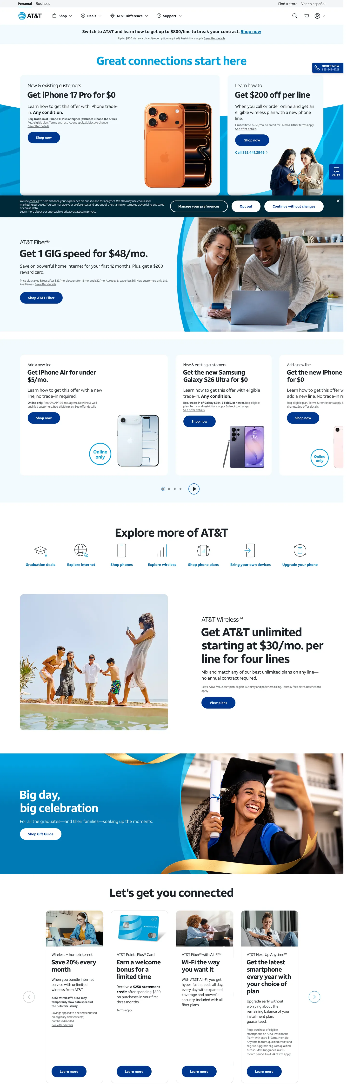
AT&T's marketing site is defined by a two-blue split: deep navy (#00388f) carries the load-bearing brand surface — every primary CTA button, every active state, every "Shop now" pill — while sky blue (#009fdb) handles expressive moments, most notably the hero headline "Great connections start here" rendered at 48px in sky blue on a white ground. The rest of the page is dark charcoal (#1d2329) on white, with hairline-bordered cards and a remarkably sparse use of color for a consumer carrier at this scale. Where Verizon is achromatic with a neon accent and T-Mobile is saturated magenta, AT&T commits to two blues and lets them divide typographic and interactive labor.
This DESIGN.md file captures 14 colors tokens from the system, covering the two-blue primary tier, the charcoal ink ladder (dark charcoal, mid-charcoal, and muted-gray), white canvas and tinted-canvas surfaces, and two shadow tones. Fourteen typography tokens span font-bold and font-regular (AT&T's proprietary families) at sizes from 48px display down to 12px caption, all with the negative letter-spacing AT&T applies at scale. Thirteen components cover the navy pill button, the sky-blue hero heading, hairline-bordered service cards, the deep-dark promotional callout panel, and the white text input with 8px corner radius.
Feed this file to Claude or Cursor and it will reproduce AT&T's disciplined moves: navy-fill pill CTAs instead of colored-canvas heroes, sky-blue reserved for hero headline emphasis only, tight-tracked font-bold at every heading tier, and a card grid that uses 1px cool-gray hairlines for separation without any surface color. The two-blue structure is the system's teaching: color contrast can carry typographic hierarchy without requiring a third accent.
What makes it distinct
5 highlights
- Two-blue systemNavy #00388f carries all primary CTAs while sky blue #009fdb carries hero headline text; no tertiary voltage exists
- Display in navy-on-white, not on a tinted canvasThe hero headline floats sky-blue on a white background, inverting the telco-tinted-hero convention
- 28px pill buttonsThe CTA geometry is fully rounded but at 48px height with 32px horizontal padding, making it more substantial than the typical 36px pill
- Tight negative tracking on boldFont-bold runs at -1.44px tracking at 48px display, -0.78px at 26px sub-headings; the tracking tightens at scale
- Dark-charcoal ink (#1d2329)Not pure black; a slightly blue-tinted near-black that echoes the navy system and softens the page
Live at att.com
AT&T in production, as captured. Scroll the window to see the whole page.
14 colors
AT&T's system runs on #00388f as its primary voltage, used in 2 of 14 components. Type is set in font-bold across 12 tokens from 12px to 48px, weights 400–400. Shape language is soft — components average 14px corner radius, with no sharp interactive edges.
Brand & Accent
Sparing, CTA-only voltage · 3
Surface
Page and card backgrounds · 2
Text
Headlines, body, captions · 5
Borders & Hairlines
Dividers, outlines, rules · 2
Other
Specialty colors · 2
12 type tokens
Set in font-bold across 12 tokens, from 12px to 48px, weights 400–400. Shown in its own stack: where the font isn't installed, the fallback the file names stands in.
- display-xl48px · weight 400 · lh 55.2px · tracking -1.44pxThe quick brown fox jumps over the lazy dog
- display-lg34px · weight 400 · lh 39.1px · tracking -1.02pxThe quick brown fox jumps over the lazy dog
- heading-md26px · weight 400 · lh 29.9px · tracking -0.78pxThe quick brown fox jumps over the lazy dog
- heading-sm20px · weight 400 · lh 23px · tracking -0.6pxThe quick brown fox jumps over the lazy dog
- heading-xs18px · weight 400 · lh 25.2pxThe quick brown fox jumps over the lazy dog
- body-lg18px · weight 400 · lh 25.2pxThe quick brown fox jumps over the lazy dog
- body-md15px · weight 400 · lh 21pxThe quick brown fox jumps over the lazy dog
- body-sm16px · weight 400 · lh 18.4px · tracking -0.48pxThe quick brown fox jumps over the lazy dog
- button-md14px · weight 400 · lh 14pxThe quick brown fox jumps over the lazy dog
- nav-link15px · weight 400 · lh 21pxThe quick brown fox jumps over the lazy dog
- caption12px · weight 400 · lh 16.8pxThe quick brown fox jumps over the lazy dog
- caption-tight12px · weight 400 · lh 14.4px · tracking -0.3pxThe quick brown fox jumps over the lazy dog
Radii and spacing
7 corner radii and 7 spacing values. Shape language: soft, on a 8px base radius.
Radii7
- none0px
- sm4px
- md8px
- lg16px
- xl32px
- pill28px
- full100%
Spacing7
- xs4px
- sm8px
- base16px
- lg24px
- xl32px
- 2xl48px
- 3xl64px
14 components
Each rendered from its tokens (color, type, radius, padding) on AT&T's own canvas.
- Button PrimaryButton Primarybutton-primary
- Button SecondaryButton Secondarybutton-secondary
- Top NavTop Navtop-nav
- Nav LinkNav Linknav-link
- Hero HeadingHero Headinghero-heading
- Hero SectionHero Sectionhero-section
- Section HeadingSection Headingsection-heading
- Body ParagraphBody Paragraphbody-paragraph
- CardCardcard
- Card DarkCard Darkcard-dark
- Category Icon CellCategory Icon Cellcategory-icon-cell
- Type here…Text Inputtext-input
- Legal CaptionLegal Captionlegal-caption
- Platform BadgePlatform Badgeplatform-badge
The system, in use
AT&T's tokens on the kind of product it builds.
Powerful. Personal. Made to last.
Thoughtful design and all-day performance, with everything working together.
Find the right plan
MonthlyYearly- Unlimited talk and text
- 5G access
- 50 GB data
- Unlimited data
- HD streaming
- 30 GB hotspot
- Premium data
- 4K streaming
- International calls
AT&T design system FAQ
AT&T's tokens, its components and how to use this DESIGN.md in your project.
What are the color tokens in the AT&T DESIGN.md?
What is AT&T's primary color hex code?
How do I use AT&T's colors in Tailwind CSS?
What is AT&T's primary brand color?
What is the dark promotional panel color in the AT&T design system?
What fonts does AT&T use?
What is AT&T's type scale?
What can I use if I don't have AT&T's font?
What typeface does AT&T use, and what should I use as a substitute?
Which components does the AT&T DESIGN.md define?
What corner radius and spacing does AT&T use?
What does AT&T's primary button look like?
How does AT&T structure its product card grid?
How do I apply the AT&T design system to a shadcn/ui project?
How do I use the AT&T DESIGN.md with Claude Code or Cursor?
Is the AT&T DESIGN.md free to download?
How was the AT&T DESIGN.md made?
Is the AT&T DESIGN.md official?
Related reading
Specs, directories and component libraries that pair with this design system.
- Browse all design systemsThe full directory of DESIGN.md files on shadcn.io, with live mockups for each.shadcn.io
- AT&T — official siteAT&T's public marketing site — the source of truth for the live tokens captured in this file.att.com (opens in a new tab)
- The DESIGN.md specificationGoogle Labs' open spec for machine-readable design system files — the format this page is built on.github.com (opens in a new tab)
Use AT&T in your project
One machine-readable file. Drop it into Claude Code, Cursor, VS Code or any AI tool that reads DESIGN.md.
Download the DESIGN.md
One machine-readable file: every color, type, radius, spacing, and component token of AT&T.
Feed it to your AI tool
Drop it into Claude, Cursor, or GitHub Copilot. The agent writes React components and Tailwind classes that match AT&T's visual language.
Reference the tokens directly
Or paste the values into your Tailwind config, CSS variables, or component library: every color, size and radius is a quoted, ready-to-copy value.
Read the full DESIGN.md overview, rationale, do’s and don’ts
Overview
AT&T's marketing site runs on a two-blue hierarchy — not a gradient, not a spectrum, but a disciplined split. Two-blue authority: deep navy (#00388f) fills every primary CTA button and active card state while sky blue (#009fdb) carries a single expressive role — the hero headline "Great connections start here" in the above-fold panel. The two blues never compete because they never occupy the same visual layer: navy is always an interactive fill and sky blue is always a display-text accent. Where Verizon runs achromatic with a neon deal badge and T-Mobile saturates the hero canvas in magenta, AT&T positions brand color in the button, not the background.
The display type is defined by tight negative tracking: font-bold at 48px sits at -1.44px letter-spacing, pulling the headline characters close without condensing the individual letterforms. This is the system's typographic fingerprint. Smaller headings scale the tracking back in proportion — 26px at -0.78px, 20px at -0.6px — creating a tracking ladder that reads as a coherent system rather than an arbitrary choice. Inter at weight 700 with matched tracking values is the closest open-source analog.
The page canvas is white, and the card grid uses 1px shadow-cast hairlines (#dcdfe3) for separation — no surface color, no depth tinting. The one exception is the full-bleed dark-navy promotional panel (#002837 background) used for the "Get AT&T unlimited" subscription offer, where white text at large display size creates the page's editorial moment.
Key Characteristics:
- Dark charcoal ink (#1d2329) — not pure black; a slightly blue-tinted near-black with 1348 total occurrences (680 text, 665 border).
- Sky-blue (#009fdb) hero headline — appears 3 times total, all in the above-fold display tier; no other surface uses this value.
- Deep-navy (#00388f) fills all 15 of the captured primary button backgrounds — consistent, no hover-override visible in the captured surface.
- 28px pill radius on all CTAs — fully rounded at the button height but not styled as a 9999px semantic pill.
- Tight negative tracking cascade: -1.44px at 48px → -1.02px at 34px → -0.78px at 26px.
- Two proprietary font families (font-bold, font-regular), both loaded at CSS weight 400.
- 16px border-radius on product and service cards with 1px cool-gray hairline borders.
- Dark-navy deep panel (#002837) used as the sole full-bleed non-white section — 2 background occurrences.
Colors
Brand
- Primary Navy (
{colors.primary}— #00388f): frequency 32. Used as background (15), border (15), text (2). The CTA fill — every "Shop now" pill button, every active-state badge. Wired as a brand-layer color with no CSS custom properties exposed in the captured page. - Primary Dark (
{colors.primary-dark}— #002837): frequency 2. Used as background only — the deep promotional band. A deeper, colder navy distinct from the primary CTA blue. Brand layer. - Sky Accent (
{colors.accent-sky}— #009fdb): frequency 3. Used as text (1), background (1), border (1). The hero headline color and inline-link accent. Brand layer.
Surface
- Canvas (
{colors.canvas}— #ffffff): frequency 95. Used as text (38), background (30), border (25). Page floor, button text, card surfaces. - Surface Tinted (
{colors.surface-tinted}— #f3f4f6): frequency 13, all as background. Light background fills for icon-cell rows and alternate-stripe sections.
Text
- Ink (
{colors.ink}— #1d2329): frequency 1348. Used as text (680), border (665), shadow (3). The dominant text and border color — a dark blue-charcoal rather than pure black. 665 border occurrences means it carries the card-hairline system as well as text. - Ink Soft (
{colors.ink-soft}— #454b52): frequency 120. Used as text (60) and border (60). Secondary running text — body copy within cards and promotional descriptions. - Ink Muted (
{colors.ink-muted}— #686e74): frequency 1 text, 1 border. Form input border color in resting state. - Ink Light (
{colors.ink-light}— #878c94): frequency 2. Caption and secondary metadata text.
Hairline
- Hairline (
{colors.hairline}— #dcdfe3): frequency 7, all as shadow. The card-elevation shadow tone — used as box-shadow rather than border, giving cards a 1px cast appearance without a hard border line. - Hairline Light (
{colors.hairline-light}— #bdc2c7): frequency 1 border. Used on less prominent dividers.
Supporting
- Mid Blue (
{colors.mid-blue}— #0072b2): frequency 85. Used as text (42) and border (43). Link text color for inline body links and icon-category labels. A mid-register blue between the navy CTA and the sky-blue accent. - Link Blue (
{colors.link-blue}— #0057b8): frequency 2. Occasional inline link variant.
Typography
Font Families
AT&T's system loads exactly two proprietary families: font-bold for every heading, sub-heading, button label, nav link, and emphasized body element; font-regular for body copy, legal captions, and secondary text. Both files are loaded at CSS font-weight: 400 — the weight is embedded in the font file itself rather than controlled by the CSS weight property. This is not standard CSS behavior; it means that font-weight: 700 does NOT produce the intended bold on a substituted font. When substituting, use Inter at CSS weight 700 for font-bold contexts and Inter at weight 400 for font-regular.
The negative letter-spacing is the system's defining move. AT&T applies tighter tracking than any other telco brand in this directory — -1.44px at 48px is more aggressive than Cloudflare's -1.4px at 56px.
Hierarchy
| Token | Family | Size | Weight | Tracking | Use |
|---|---|---|---|---|---|
{typography.display-xl} | font-bold | 48px | 400 | -1.44px | Hero h2 ("Great connections start here") |
{typography.display-lg} | font-bold | 34px | 400 | -1.02px | Section h3 display |
{typography.heading-md} | font-bold | 26px | 400 | -0.78px | Card and feature headings |
{typography.heading-sm} | font-bold | 20px | 400 | -0.6px | Sub-section titles |
{typography.heading-xs} | font-bold | 18px | 400 | 0 | Feature-item headings |
{typography.body-lg} | font-regular | 18px | 400 | 0 | Section lead copy |
{typography.body-md} | font-regular | 15px | 400 | 0 | Default running text |
{typography.body-sm} | font-regular | 16px | 400 | -0.48px | Body with controlled tracking |
{typography.button-md} | font-bold | 14px | 400 | 0 | CTA button label |
{typography.nav-link} | font-bold | 15px | 400 | 0 | Top-nav link labels |
{typography.caption} | font-regular | 12px | 400 | 0 | Caption rows |
{typography.caption-tight} | font-regular | 12px | 400 | -0.3px | Legal disclaimer captions |
Substitutes
Use Inter 700 for font-bold contexts (apply negative tracking exactly as specified) and Inter 400 for font-regular. The -1.44px tracking at 48px is the most important single value to preserve.
Layout
- Base unit: 16px dominant (67 occurrences). Secondary values: 8px (14), 24px (13), 32px (5).
- Card padding: 24px internal top, 8px bottom (matching the 24×8px vertical rhythm captured in 31 occurrences of the compound spacing token).
- Hero section: white canvas, full-width headline at 48px sky-blue text, below which a 2-up device-panel carousel fills the horizontal.
- Icon grid ("Explore more of AT&T"): 6-column with 16px-radius circular icon frames and 12px caption beneath each icon.
- Dark promo band: full-bleed dark-navy (#002837) with centered heading at 34px font-bold and a pill CTA in navy.
Elevation
The system uses shadow-cast elevation rather than border-only cards. The 7 occurrences of #dcdfe3 are all as shadow fills — used as box-shadow with small x/y offsets to create a lifted-card appearance. The #25303a shadow (3 occurrences) adds a darker second-layer shadow depth to select promo cards. There are no hard 1px black hairline borders in the AT&T card system; the elevation comes from soft shadow casting, distinguishing it from Verizon's hard-edge card treatment.
Shapes
The radius scale is modest-to-pill with no extreme values between:
{rounded.none}0px — hero section, full-bleed bands.{rounded.sm}4px — smallest UI surfaces (1 occurrence).{rounded.md}8px — form inputs, toggle controls (1 occurrence each).{rounded.lg}16px — product and service cards (22 occurrences), the dominant radius.{rounded.xl}32px — large feature tile (1 occurrence).{rounded.pill}28px — all CTA buttons (22 occurrences), the dominant UI-interactive radius.{rounded.full}100% — avatar circles, icon-frame circles (16 occurrences).
Components
button-primary — Deep-navy (#00388f) fill, white text in font-bold at 14px, 28px-radius pill, 0×32px padding, 48px height. The "Shop now" canonical instance.
button-secondary — White fill, navy text, navy border, same pill geometry. Used for secondary and outline actions alongside primary CTAs.
top-nav — White canvas, charcoal ink text, 64px height, AT&T globe wordmark left-aligned. Contains "TV," "Internet," "Wireless" and account/cart icons right-aligned.
nav-link — Transparent background, ink text in font-bold at 15px / 400, 8×16px padding. No hover fill visible in the captured surface.
hero-heading — Sky-blue (#009fdb) text at font-bold 48px / -1.44px tracking. The one expressive color moment in the marketing chrome — appearing on a white canvas ground, not a tinted canvas.
hero-section — White canvas, 48×32px padding around the centered hero headline + CTA stack.
section-heading — Dark-charcoal ink text at font-bold 26px / -0.78px tracking. Used for "Explore more of AT&T," "Let's get you connected," and other section titles.
body-paragraph — Ink-soft (#454b52) text at font-regular 15px / 0 tracking. Secondary body copy within product sections.
card — White surface, charcoal ink text, 16px corner radius, 1px cool-gray shadow-cast, 24px internal padding. Product and service offering cards.
card-dark — Deep-navy (#002837) fill, white text at font-bold display sizes. The full-bleed unlimited-plan promotional section.
category-icon-cell — Transparent background, icon + caption layout, 16×8px padding. Used in the "Explore more" 6-up icon grid (TV, Internet, Wireless, etc.).
text-input — White surface, charcoal ink text at font-regular 16px / -0.48px, 8px border-radius, 0×24px left/right / 0×16px padding compound, 48px height, 1px ink-muted border.
legal-caption — Ink-soft text at font-regular 12px / -0.3px. Pricing-plan disclaimer text beneath promotional CTAs.
platform-badge — White fill, ink text, 28px-radius pill, 8×16px padding, 1px hairline border. Service-tier label chips (e.g., "AT&T Business").
Do's and Don'ts
Do render the hero headline in sky blue (#009fdb) on a white canvas — not on a navy or tinted-canvas background. The system places the expressive accent color against maximum contrast; rendering it on a colored surface reduces both legibility and brand impact.
Do apply the negative tracking cascade exactly. The -1.44px tracking at 48px is not decorative; it is the system's most specific typographic move. Substituting a less tight value (e.g., -0.5px) at 48px display produces a markedly different visual rhythm.
Do use {colors.mid-blue} (#0072b2) for inline body links. This is distinct from both the navy CTA (#00388f) and the sky-blue accent (#009fdb) — using either of those two for inline links blurs the color hierarchy.
Don't fill any heading or display text with the primary navy (#00388f). The navy is an interactive surface color; placing it on static display text blurs the button-versus-content distinction. Sky blue (#009fdb) is the correct hero-headline accent.
Don't use {colors.ink} (#1d2329) for form input borders. The input resting border is {colors.ink-muted} (#686e74) — using the full-weight charcoal ink on inputs creates too much visual weight against the card-shadow system.
Don't add a third accent color. The two-blue architecture (navy CTA + sky-blue headline) is the system's deliberate constraint. Introducing an orange, green, or red accent in the marketing chrome reads as a sub-brand divergence, not a brand extension.
Don't use {rounded.xl} (32px) on standard product cards. The 16px radius is the card convention; 32px reads as a promo-tile or pill that breaks the grid rhythm. One occurrence at 32px was captured — it belongs to a single featured promotional tile, not to the repeating grid.
Known Gaps
- Hover and focus states: the captured primary button shows only the resting state; hover fill changes and focus-ring dimensions are not exposed on the static marketing page.
- Dark mode: the page is light-only in the captured surface. The
#002837deep-navy band is a dark section within a light page, not a system-wide dark mode. - Carousel pagination: the hero device-panel carousel uses dot-indicators for navigation; the active-dot fill color is not captured in the static extraction.
- Motion: the hero carousel auto-advances; timing curves and transition duration are not captured.
- AT&T Business and FirstNet sub-sites carry their own token sets not present in the consumer marketing surface extraction.
- Icon system: AT&T uses a custom icon font for the category icons (TV, Internet, Wireless, Mobile Security); these are not captured as SVG tokens.
More systems like this
Analogue, Apple, Ferrari and 23 more in Consumer Electronics: each brand's colors, type and components in one file your AI agent builds from.
Build it with Pro
The DESIGN.md files are free. Pro adds 6,000+ blocks, premium templates and the MCP server, so your AI editor builds in your system for you.
4.9/5 out of 5 · 150+ reviewsfrom 150+ founders and developers.
Billing
Billed once a year in USD. Cancel anytime.
- How many people can use the license.
- Client work, SaaS products and anything you charge for.
- Page sections in 56 categories, from heroes and pricing tables to dashboards and settings, on every framework and UI library, in your theme.
- Complete Next.js sites for startups, SaaS, agencies and portfolios, every page designed, ready to ship.
- Your AI agent searches, previews and installs any component, block, icon or DESIGN.md from a prompt: 22 tools in Claude Code, Cursor, VS Code and 35 more clients.
- Buttons with motion and states of their own, from an arrow that slides in to a burst of confetti.
- Typewriters, scrambles, counters and more, for headlines, labels and numbers.
- Animated backgrounds for heroes, sections and cards, from a soft aurora to a flock that flees the cursor. Most are pure CSS.
- WebGPU shaders, from a slow aurora to a black hole, each drawing only while it's on screen.
- One design and one theme on all four: the components, blocks and effects are built for each framework.
- React on Base UI, Radix UI, React Aria or Ark UI: install the version for the library your project already uses. Vue, Svelte and Solid run on Ark UI.
- From a button to a date picker, a color picker or a guided tour: accessible, typed in TypeScript, each with live demos.
- Real-world patterns built from the components, in 53 galleries: forms, tables, menus, dialogs and more.
- Area, bar, line, pie, radar and radial charts on TanStack Charts, on every framework. React also gets the Recharts originals.
- Debounce, local storage, media queries and more: each hook is one typed file you own.
- From 222 libraries, Lucide, Heroicons, Tabler and Material Symbols among them, as SVG or a React component in one command.
- Stripe, Linear, Apple and 497 more: a brand's colors, typography and components in one file your AI agent builds from.
- Restyle every component and block at once: 8 styles, 7 grays, 18 colors and 5 radii, shared as a shadcn preset code.
- Priority requests are answered first.
Individual
For personal projects & open source
$32instead of $49/mo
$389 billed yearly
- Seats: 1 seat
- Commercial use: Personal & open source only
- Blocks: All 6,181 blocks
- Templates: All 14 templates
- MCP server: 38 AI clients
- Animated buttons: All 35 buttons
- Text effects: All 97 effects
- Backgrounds: All 100 backgrounds
- Shaders: All 100 shaders
- Frameworks: React, Vue, Svelte, Solid
- UI libraries: Base UI, Radix, Aria, Ark
- Components: All 174 components
- Examples: All 1,103 examples
- Charts: All 70 charts
- React hooks: All 35 hooks
- Icons: 294k+ icons
- DESIGN.md files: All 500 brands
- Theme builder: 8 styles × 18 colors
- Support: Standard
Team
Most popularFor freelancers, agencies & startups
$66instead of $99/mo
$789 billed yearly · ≈ $13/dev/mo
- Seats: Up to 5 seats
- Commercial use: Included
- Blocks: All 6,181 blocks
- Templates: All 14 templates
- MCP server: 38 AI clients
- Animated buttons: All 35 buttons
- Text effects: All 97 effects
- Backgrounds: All 100 backgrounds
- Shaders: All 100 shaders
- Frameworks: React, Vue, Svelte, Solid
- UI libraries: Base UI, Radix, Aria, Ark
- Components: All 174 components
- Examples: All 1,103 examples
- Charts: All 70 charts
- React hooks: All 35 hooks
- Icons: 294k+ icons
- DESIGN.md files: All 500 brands
- Theme builder: 8 styles × 18 colors
- Support: Priority
Organization
For companies with larger teams
$132instead of $199/mo
$1,589 billed yearly
- Seats: Unlimited seats
- Commercial use: Included
- Blocks: All 6,181 blocks
- Templates: All 14 templates
- MCP server: 38 AI clients
- Animated buttons: All 35 buttons
- Text effects: All 97 effects
- Backgrounds: All 100 backgrounds
- Shaders: All 100 shaders
- Frameworks: React, Vue, Svelte, Solid
- UI libraries: Base UI, Radix, Aria, Ark
- Components: All 174 components
- Examples: All 1,103 examples
- Charts: All 70 charts
- React hooks: All 35 hooks
- Icons: 294k+ icons
- DESIGN.md files: All 500 brands
- Theme builder: 8 styles × 18 colors
- Support: Priority
Billed once a year in USD. Cancel anytime.
Individual
For personal projects & open source
$32instead of $49/mo
$389 billed yearly
- How many people can use the license.Seats: 1 seat
- Client work, SaaS products and anything you charge for.Commercial use: Personal & open source only
- Page sections in 56 categories, from heroes and pricing tables to dashboards and settings, on every framework and UI library, in your theme.Blocks: All 6,181 blocks
- Complete Next.js sites for startups, SaaS, agencies and portfolios, every page designed, ready to ship.Templates: All 14 templates
- Your AI agent searches, previews and installs any component, block, icon or DESIGN.md from a prompt: 22 tools in Claude Code, Cursor, VS Code and 35 more clients.MCP server: 38 AI clients
- Buttons with motion and states of their own, from an arrow that slides in to a burst of confetti.Animated buttons: All 35 buttons
- Typewriters, scrambles, counters and more, for headlines, labels and numbers.Text effects: All 97 effects
- Animated backgrounds for heroes, sections and cards, from a soft aurora to a flock that flees the cursor. Most are pure CSS.Backgrounds: All 100 backgrounds
- WebGPU shaders, from a slow aurora to a black hole, each drawing only while it's on screen.Shaders: All 100 shaders
- One design and one theme on all four: the components, blocks and effects are built for each framework.Frameworks: React, Vue, Svelte, Solid
- React on Base UI, Radix UI, React Aria or Ark UI: install the version for the library your project already uses. Vue, Svelte and Solid run on Ark UI.UI libraries: Base UI, Radix, Aria, Ark
- From a button to a date picker, a color picker or a guided tour: accessible, typed in TypeScript, each with live demos.Components: All 174 components
- Real-world patterns built from the components, in 53 galleries: forms, tables, menus, dialogs and more.Examples: All 1,103 examples
- Area, bar, line, pie, radar and radial charts on TanStack Charts, on every framework. React also gets the Recharts originals.Charts: All 70 charts
- Debounce, local storage, media queries and more: each hook is one typed file you own.React hooks: All 35 hooks
- From 222 libraries, Lucide, Heroicons, Tabler and Material Symbols among them, as SVG or a React component in one command.Icons: 294k+ icons
- Stripe, Linear, Apple and 497 more: a brand's colors, typography and components in one file your AI agent builds from.DESIGN.md files: All 500 brands
- Restyle every component and block at once: 8 styles, 7 grays, 18 colors and 5 radii, shared as a shadcn preset code.Theme builder: 8 styles × 18 colors
- Priority requests are answered first.Support: Standard
Team
Most popularFor freelancers, agencies & startups
$66instead of $99/mo
$789 billed yearly · ≈ $13/dev/mo
Everything in Individual, plus
- How many people can use the license.Seats: Up to 5 seats
- Client work, SaaS products and anything you charge for.Commercial use: Included
- Priority requests are answered first.Support: Priority
Organization
For companies with larger teams
$132instead of $199/mo
$1,589 billed yearly
Everything in Team, plus
- How many people can use the license.Seats: Unlimited seats
- Secure checkout via Stripe
- Code lives in your repo
- Keep what you've shipped if you cancel
- License terms
4.9 out of 5 from 150+ developers


Your system, built for you
Every block, template and icon, installed by your AI agent in your design system. The DESIGN.md files stay free.
- Cancel anytime
- Keep what you've shipped