Coinbase Design System
Coinbase Blue #0052ff on every pill CTA, CoinbaseDisplay at regular weight and white, gray and dark bands. Colors, type and 28 components for React.
- Primary color
- #0052ff
- Typeface
- Coinbase Sans
- Shape
- Soft
- Base radius
- 12px
- Colors
- 22
- Type tokens
- 16
- Components
- 28
- Spacing values
- 9
About Coinbase DESIGN.md
Curated by Dov Azencot, updated May 12, 2026. Source coinbase.com (opens in a new tab).
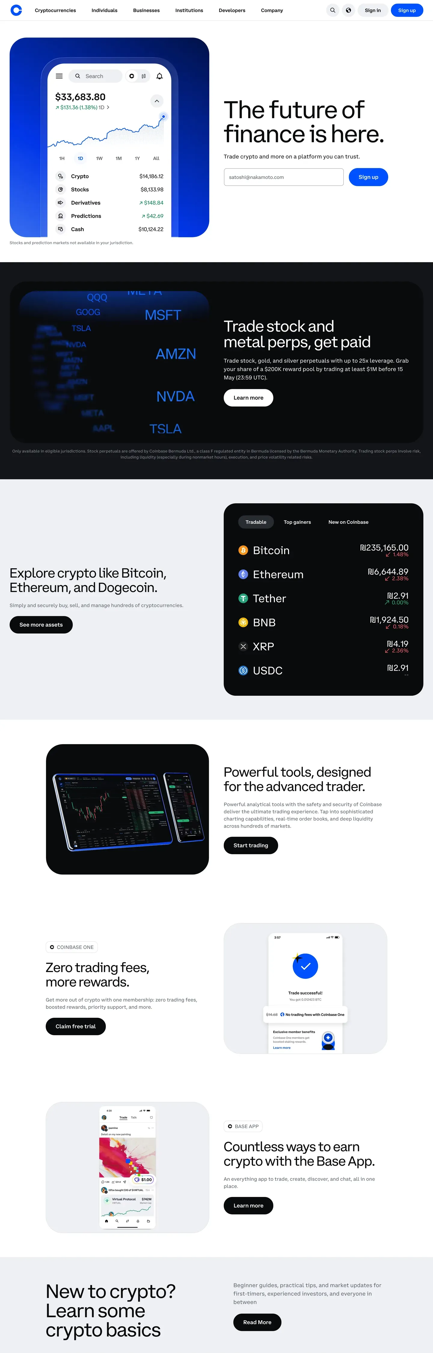
Coinbase's design system is built around one idea: institutional calm. One brand color (Coinbase Blue, #0052ff). One licensed display typeface (CoinbaseDisplay at weight 400, never bold). One pill radius (100px) on every interactive surface. The page rhythm rotates white canvas, soft-gray bands, and full-bleed near-black editorial heroes carrying layered product-UI mockup cards.
This page packages the spec into a single DESIGN.md file. Inside: 22 colors tokens, 17 type styles, 8 corner radii, 9 spacing values, and 28 components — the signature blue pill CTA, the layered dark-hero mockup stack, asset rows with green/red price cells, pricing tiers, search pills, and the entire marketing surface.
Download the file and feed it to Claude, Cursor, or GitHub Copilot. The agent will reproduce the brand's restraint — single accent, modest type weights, pill geometry, CoinbaseMono on every number — instead of a generic fintech theme. Or pull tokens directly into a Tailwind config or CSS variable sheet.
What makes it distinct
5 highlights
- Single accent voltageCoinbase Blue #0052ff carries every primary pill CTA, the wordmark, and inline brand links across all 28 components
- Display weight stays at 400CoinbaseDisplay headlines at 80px sit in regular weight, signaling institutional calm over fintech urgency
- Three-mode page rhythmBright white #ffffff bands rotate with #f7f7f7 gray elevation and full-bleed #0a0b0d dark heroes carrying layered product-UI cards
- Pill geometry everywhereEvery CTA is 100px rounded, every asset glyph is full-circle, every card sits at 24px; sharp corners are absent
- CoinbaseMono on every numberAsset prices and percent changes render in monospace via the 18px / 500 number-display token, never proportional
Live at coinbase.com
Coinbase in production, as captured. Scroll the window to see the whole page.
22 colors
Coinbase's system runs on #0052ff as its primary voltage, used in 3 of 28 components. Type is set in Coinbase Sans across 16 tokens from 12px to 80px, weights 400–700. Shape language is soft — components average 69px corner radius, with no sharp interactive edges.
Brand & Accent
Sparing, CTA-only voltage · 4
Surface
Page and card backgrounds · 6
Text
Headlines, body, captions · 8
Borders & Hairlines
Dividers, outlines, rules · 2
Other
Specialty colors · 2
16 type tokens
Set in Coinbase Sans across 16 tokens, from 12px to 80px, weights 400–700. Shown in its own stack: where the font isn't installed, the fallback the file names stands in.
- display-mega80px · weight 400 · lh 1 · tracking -2pxThe quick brown fox jumps over the lazy dog
- display-xl64px · weight 400 · lh 1 · tracking -1.6pxThe quick brown fox jumps over the lazy dog
- display-lg52px · weight 400 · lh 1 · tracking -1.3pxThe quick brown fox jumps over the lazy dog
- display-md44px · weight 400 · lh 1.09 · tracking -1pxThe quick brown fox jumps over the lazy dog
- display-sm36px · weight 400 · lh 1.11 · tracking -0.5pxThe quick brown fox jumps over the lazy dog
- title-lg32px · weight 400 · lh 1.13 · tracking -0.4pxThe quick brown fox jumps over the lazy dog
- title-md18px · weight 600 · lh 1.33The quick brown fox jumps over the lazy dog
- title-sm16px · weight 600 · lh 1.25The quick brown fox jumps over the lazy dog
- body-md16px · weight 400 · lh 1.5The quick brown fox jumps over the lazy dog
- body-strong16px · weight 700 · lh 1.5The quick brown fox jumps over the lazy dog
- body-sm14px · weight 400 · lh 1.5The quick brown fox jumps over the lazy dog
- caption13px · weight 400 · lh 1.5The quick brown fox jumps over the lazy dog
- caption-strong12px · weight 600 · lh 1.5The quick brown fox jumps over the lazy dog
- number-display18px · weight 500 · lh 1.4The quick brown fox jumps over the lazy dog
- button16px · weight 600 · lh 1.15The quick brown fox jumps over the lazy dog
- nav-link14px · weight 500 · lh 1.4The quick brown fox jumps over the lazy dog
Radii and spacing
8 corner radii and 9 spacing values. Shape language: soft, on a 12px base radius.
Radii8
- none0px
- xs4px
- sm8px
- md12px
- lg16px
- xl24px
- pill100px
- full9999px
Spacing9
- xxs4px
- xs8px
- sm12px
- base16px
- md20px
- lg24px
- xl32px
- xxl48px
- section96px
28 components
Each rendered from its tokens (color, type, radius, padding) on Coinbase's own canvas.
- Top Nav LightTop Nav Lighttop-nav-light
- Top Nav On DarkTop Nav On Darktop-nav-on-dark
- Button PrimaryButton Primarybutton-primary
- Button Primary ActiveButton Primary Activebutton-primary-active
- Button Primary DisabledButton Primary Disabledbutton-primary-disabled
- Button Secondary LightButton Secondary Lightbutton-secondary-light
- Button Secondary DarkButton Secondary Darkbutton-secondary-dark
- Button Outline On DarkButton Outline On Darkbutton-outline-on-dark
- Button Tertiary TextButton Tertiary Textbutton-tertiary-text
- Button Pill CtaButton Pill Ctabutton-pill-cta
- Hero Band DarkHero Band Darkhero-band-dark
- Hero Band LightHero Band Lighthero-band-light
- Product Ui Card DarkProduct Ui Card Darkproduct-ui-card-dark
- Product Ui Card LightProduct Ui Card Lightproduct-ui-card-light
- Feature CardFeature Cardfeature-card
- Asset RowAsset Rowasset-row
- Price Up CellPrice Up Cellprice-up-cell
- Price Down CellPrice Down Cellprice-down-cell
- Pricing Tier CardPricing Tier Cardpricing-tier-card
- Pricing Tier FeaturedPricing Tier Featuredpricing-tier-featured
- Cta Band DarkCta Band Darkcta-band-dark
- Type here…Text Inputtext-input
- Search Input PillSearch Input Pillsearch-input-pill
- Badge PillBadge Pillbadge-pill
- Asset Icon Circularasset-icon-circular
- Footer LightFooter Lightfooter-light
- Footer LinkFooter Linkfooter-link
- Legal BandLegal Bandlegal-band
The system, in use
Coinbase's tokens on the kind of product it builds.
Money that moves as fast as you do
Send, save and spend with an account built for the way you live and work.
Coinbase design system FAQ
Coinbase's tokens, its components and how to use this DESIGN.md in your project.
Coinbase's DESIGN.md has 22 color tokens: primary (#0052ff), primary-active (#003ecc), primary-disabled (#a8b8cc), ink (#0a0b0d), body (#5b616e), body-strong (#0a0b0d) and 16 more. Every value is a quoted hex you can copy.
The color token `primary` is #0052ff, used by 3 components. The surface behind it is `canvas` (#ffffff).
Map the tokens to your CSS variables: `primary` (#0052ff) to `--primary`, `canvas` (#ffffff) to `--background`, `ink` (#0a0b0d) to `--foreground`. shadcn/ui's Tailwind setup maps them to classes such as `bg-primary` and `text-foreground`, so they then use Coinbase's palette.
Coinbase's brand color is Coinbase Blue — #0052ff, a saturated cobalt that carries every primary CTA pill, the wordmark, and inline brand links. The press state darkens to #003ecc and the disabled state fades to #a8b8cc. There is no secondary brand color in the system — trading green (#05b169) and red (#cf202f) are reserved as text-only semantic signals on asset rows, never used as button backgrounds. Most pages are 90% white plus near-black ink with one or two blue moments per band.
Coinbase's DESIGN.md sets its type in Coinbase Sans, Coinbase Display and Coinbase Mono. The first family is the one most tokens use.
16 type tokens, such as `display-mega`, from 12px to 80px, in weights 400 to 700. Each token carries its family, size, weight, line height and letter spacing.
Coinbase Sans is Coinbase's main family and may be proprietary or need its own license. Keep the sizes, weights, line heights and letter spacing from the file and swap the family for an open font of similar proportions, such as a font from Google Fonts, set in `--font-sans`.
The system runs CoinbaseDisplay for hero headlines, CoinbaseSans for body and navigation, CoinbaseIcons for icon glyphs, and CoinbaseMono for tabular numbers. All four are licensed Coinbase typefaces. The documented substitutes: CoinbaseDisplay maps to Inter at weight 400 with letter-spacing -1.5%, CoinbaseSans to Inter at 400/600, and CoinbaseMono to JetBrains Mono or Geist Mono at weight 500. The display/body split is strict — CoinbaseDisplay carries hero headlines only; CoinbaseSans carries everything else.
It signals an institutional brand voice rather than a trading-platform one. The homepage hero h1 at 80px / 400 with -2px letter-spacing reads as editorial calm — closer to Bloomberg or the Financial Times than to a retail trading dashboard. Bolding the display copy would shift the entire brand voice toward fintech urgency, which the rest of the system (single accent color, generous 96px section spacing, no drop-shadow tiers) deliberately avoids. The only typographically loud moment in the spec is numeric data rendered in CoinbaseMono.
28 components, among them `top-nav-light`, `top-nav-on-dark`, `button-primary`, `button-primary-active` and `button-primary-disabled`. Each lists properties such as its background, text color, type token and corner radius as references to the other tokens.
8 corner radii: none (0px), xs (4px), sm (8px), md (12px), lg (16px) and 3 more. 9 spacing values: xxs (4px), xs (8px), sm (12px), base (16px), md (20px) and 4 more. The file reads as soft in shape.
Copy the color and radius tokens into your `globals.css`: Coinbase's `primary` (#0052ff) becomes `--primary`, and `md` (12px) becomes `--radius`. The shadcn/ui components read those variables, so they change with the file.
Download Coinbase's DESIGN.md (or copy it as Markdown) and put it in your project, or paste it into the chat. Then ask Claude Code, Cursor or another agent to build a page "in the style of the Coinbase DESIGN.md": it reads the tokens and writes matching components.
Yes. The file is free to download or copy, with no account, from the buttons at the top and bottom of this page. The raw Markdown is also at `/design/coinbase/raw`.
Coinbase's page describes the look of its public website (www.coinbase.com), curated from what is visible there: the colors, type and components. It is an interpretation.
No. The Coinbase DESIGN.md describes the look of a public website. It is not official, and Coinbase has not endorsed or reviewed it. The name and logo belong to Coinbase.
The hero-band-dark component is the system's most distinctive signature. Background sits at #0a0b0d (deep near-black, same hex as the ink token), with white text and 96px vertical padding. Inside the band, one to three product-ui-card-dark mockups float on a slightly elevated #16181c surface, often stacked at slight rotation to mimic a layered dashboard. The pattern collapses to a single card on mobile. Pair it with a 80px / 400 CoinbaseDisplay headline and two pill CTAs to reproduce the homepage hero faithfully.
Yes — the file is structured to be fed into Claude, Cursor, or any AI tool that reads structured design tokens. The agent will reproduce Coinbase's restraint (single blue, pill geometry, modest display weight, CoinbaseMono on numbers) rather than a generic shadcn theme. Every color, type style, radius, spacing value, and component definition is a quoted token reference you can paste directly into a Tailwind config, CSS variable sheet, or shadcn/ui registry. The pill radius (100px) and full-circle asset icons are the two geometry rules to keep.
Several things, documented in the Known Gaps section. The licensed typefaces (CoinbaseDisplay, CoinbaseSans, CoinbaseMono) need Inter and JetBrains Mono substitutes for non-Coinbase projects. In-product trading surfaces — order book, charts, order forms — live behind login walls and aren't represented; the spec covers marketing pages only. Animation timings are out of scope. Form validation states beyond focus weren't visible on captured surfaces. The accent yellow (#f4b000) appears only inside Bitcoin glyph illustrations and is documented as illustrative-only, never an action color.
Related reading
Specs, directories and component libraries that pair with this design system.
Use Coinbase in your project
One machine-readable file. Drop it into Claude Code, Cursor, VS Code or any AI tool that reads DESIGN.md.
Download the DESIGN.md
One machine-readable file: every color, type, radius, spacing, and component token of Coinbase.
Feed it to your AI tool
Drop it into Claude, Cursor, or GitHub Copilot. The agent writes React components and Tailwind classes that match Coinbase's visual language.
Reference the tokens directly
Or paste the values into your Tailwind config, CSS variables, or component library: every color, size and radius is a quoted, ready-to-copy value.
Read the full DESIGN.md overview, rationale, do’s and don’ts
Overview
Coinbase reads like an institutional financial brand that happens to trade crypto — the marketing surfaces are quiet, white-canvas, editorially-spaced, and almost monochromatic. The single brand voltage is Coinbase Blue ({colors.primary} — #0052ff), used scarcely: every primary CTA pill, the brand wordmark, and inline emphasis links. Beyond that one blue, the system is white canvas + ink + soft gray elevation bands + a deep near-black editorial canvas ({colors.surface-dark} — #0a0b0d) for full-bleed product-mockup heroes.
Type pairs CoinbaseDisplay for hero headlines with CoinbaseSans for body, captions, and navigation. Display sits at weight 400 — not the 700+ typical of trading platforms. The choice signals editorial calm and institutional trust rather than fintech urgency.
The page rhythm rotates three modes: bright white editorial sections, soft-gray elevation bands, and full-bleed dark editorial heroes carrying layered product-UI mockup cards. The dark hero with floating dashboard mockups is the single most distinctive component.
Key Characteristics:
- Single accent color:
{colors.primary}(#0052ff Coinbase Blue) carries every primary CTA, wordmark, and inline brand link. Used scarcely. - Modest display weights — CoinbaseDisplay at weight 400, never 700+.
- Editorial pill geometry: every CTA is
{rounded.pill}(100px), every asset glyph is{rounded.full}, every card is{rounded.xl}(24px). Sharp corners absent. - Full-bleed dark heroes with floating product-UI cards:
{component.hero-band-dark}plus inline{component.product-ui-card-dark}mockups is the brand's strongest signature pattern. - Trading semantics:
{colors.semantic-up}(#05b169) and{colors.semantic-down}(#cf202f) — text color only, never background fills. - 96px section rhythm — generous editorial pacing.
Colors
Brand & Accent
- Coinbase Blue (
{colors.primary}— #0052ff): The single brand color. Every primary CTA pill, the Coinbase wordmark, and inline brand links. - Coinbase Blue Active (
{colors.primary-active}— #003ecc): Press-state darken on the primary pill. - Coinbase Blue Disabled (
{colors.primary-disabled}— #a8b8cc): Faded-blue tint for disabled CTAs. - Accent Yellow (
{colors.accent-yellow}— #f4b000): A small sub-brand accent used very sparingly on Bitcoin/asset glyph fills inside feature cards. Illustrative-only, not an action color.
Surface
- Canvas (
{colors.canvas}— #ffffff): The default page floor. - Surface Soft (
{colors.surface-soft}— #f7f7f7): Subtle alternating band surface. - Surface Strong (
{colors.surface-strong}— #eef0f3): The light-gray fill behind secondary buttons, search pills, asset-icon plates. - Surface Dark (
{colors.surface-dark}— #0a0b0d): Deep near-black canvas for full-bleed dark heroes, CTA bands. Same hex as{colors.ink}— page-floor and text-color share the value. - Surface Dark Elevated (
{colors.surface-dark-elevated}— #16181c): One step lighter, used for floating product-UI mockup cards inside dark heroes.
Hairlines
- Hairline (
{colors.hairline}— #dee1e6): Default 1px divider on white surfaces. - Hairline Soft (
{colors.hairline-soft}— #eef0f3): Lighter divider — same hex as{colors.surface-strong}.
Text
- Ink (
{colors.ink}— #0a0b0d): Display headings, primary nav, body emphasis. - Body (
{colors.body}— #5b616e): Default running-text — slightly cool gray. - Body Strong (
{colors.body-strong}— #0a0b0d): Same as ink, used for stronger emphasis. - Muted (
{colors.muted}— #7c828a): Sub-titles, breadcrumbs, footer secondary. - Muted Soft (
{colors.muted-soft}— #a8acb3): Disabled link text. - On Primary (
{colors.on-primary}— #ffffff): White text on Coinbase Blue CTAs. - On Dark (
{colors.on-dark}— #ffffff): White text on dark heroes. - On Dark Soft (
{colors.on-dark-soft}— #a8acb3): Muted off-white for secondary text on dark.
Trading Semantics
- Semantic Up (
{colors.semantic-up}— #05b169): "Price up" green, text color only. - Semantic Down (
{colors.semantic-down}— #cf202f): "Price down" red, text color only.
Typography
Font Family
The system runs CoinbaseDisplay (display headlines), CoinbaseSans (body, navigation, captions, buttons), CoinbaseIcons (icon font), and CoinbaseMono for tabular numerical data. Fallback stack: -apple-system, system-ui, "Segoe UI", Roboto, Helvetica, Arial, sans-serif.
The display/body split is functional: CoinbaseDisplay carries hero headlines only; CoinbaseSans carries everything else.
Hierarchy
| Token | Size | Weight | Line Height | Letter Spacing | Use |
|---|---|---|---|---|---|
{typography.display-mega} | 80px | 400 | 1.0 | -2px | Homepage hero h1 |
{typography.display-xl} | 64px | 400 | 1.0 | -1.6px | Subsidiary heroes |
{typography.display-lg} | 52px | 400 | 1.0 | -1.3px | Section heads |
{typography.display-md} | 44px | 400 | 1.09 | -1px | CTA-band headlines |
{typography.display-sm} | 36px | 400 | 1.11 | -0.5px | Sub-section heads — CoinbaseSans |
{typography.title-lg} | 32px | 400 | 1.13 | -0.4px | Card group titles |
{typography.title-md} | 18px | 600 | 1.33 | 0 | Component titles, asset row primary |
{typography.title-sm} | 16px | 600 | 1.25 | 0 | List labels |
{typography.body-md} | 16px | 400 | 1.5 | 0 | Default body |
{typography.body-strong} | 16px | 700 | 1.5 | 0 | Emphasized body |
{typography.body-sm} | 14px | 400 | 1.5 | 0 | Footer body |
{typography.caption} | 13px | 400 | 1.5 | 0 | Photo captions |
{typography.caption-strong} | 12px | 600 | 1.5 | 0 | Badge pill labels |
{typography.number-display} | 18px | 500 | 1.4 | 0 | Asset prices, percent changes — CoinbaseMono |
{typography.button} | 16px | 600 | 1.15 | 0 | Standard CTA pill |
{typography.nav-link} | 14px | 500 | 1.4 | 0 | Top-nav menu items |
Principles
- Display weight stays at 400. The single most distinctive typographic choice — signals "calm institutional brand" rather than "trading-platform urgency."
- Negative letter-spacing on display only. Display uses -1px to -2px tracking; body stays at 0.
- CoinbaseMono on every number. Asset prices, percent changes — anything tabular renders in CoinbaseMono.
Note on Font Substitutes
CoinbaseDisplay, CoinbaseSans, and CoinbaseMono are licensed Coinbase typefaces.
- CoinbaseDisplay → Inter at weight 400, letter-spacing -1.5%.
- CoinbaseSans → Inter at weight 400/600.
- CoinbaseMono → JetBrains Mono or Geist Mono at weight 500.
Layout
Spacing System
- Base unit: 4px.
- Tokens:
{spacing.xxs}4px ·{spacing.xs}8px ·{spacing.sm}12px ·{spacing.base}16px ·{spacing.md}20px ·{spacing.lg}24px ·{spacing.xl}32px ·{spacing.xxl}48px ·{spacing.section}96px. - Section padding:
{spacing.section}(96px) for every major editorial band. - Card internal padding:
{spacing.xl}(32px) for feature cards and product-UI mockups.
Grid & Container
- Max content width: ~1200px centered. Hero photography full-bleed.
- Editorial body: Single 12-column grid.
- Feature card grids: 2-up at desktop for hero splits, 3-up for benefit grids.
- Footer: 6-column link list at desktop.
Whitespace Philosophy
Generous editorial pacing — closer to Bloomberg or the Financial Times than to a trading dashboard. 96px between bands; cards inside bands sit 24px apart. Density lives behind login walls, not on marketing.
Elevation & Depth
| Level | Treatment | Use |
|---|---|---|
| Flat | No shadow, no border | 80% of surfaces |
| Hairline border | 1px {colors.hairline} | Feature card outlines on white |
| Soft drop | 0 4px 12px rgba(0, 0, 0, 0.04) | Single shadow tier — hovered cards |
| Photographic | Full-bleed product-UI mockups | Hero depth |
Decorative Depth
- Layered product-UI cards inside dark heroes is the most distinctive decorative pattern — a
{component.product-ui-card-dark}floats above a darker base canvas, often with a second smaller card overlapping at an angle. - Geometric brand illustrations carry illustrative depth where shadows would otherwise.
Shapes
Border Radius Scale
| Token | Value | Use |
|---|---|---|
{rounded.none} | 0px | Reserved (essentially unused) |
{rounded.xs} | 4px | Inline tags |
{rounded.sm} | 8px | Compact rows |
{rounded.md} | 12px | Form inputs |
{rounded.lg} | 16px | Mid-size cards |
{rounded.xl} | 24px | Feature cards, product-UI mockups, pricing tiers |
{rounded.pill} | 100px | All CTA buttons, search pills, badges |
{rounded.full} | 9999px | Asset icon circles, avatars |
Pill for interactive, card-radius (24px) for containers, full circle for icons. Sharp corners absent.
Components
Top Navigation
top-nav-light — Default top nav on white pages. Background {colors.canvas}, text {colors.ink}, height 64px. Layout: Coinbase wordmark left, primary horizontal menu (Cryptocurrencies / Individuals / Businesses / Institutions / Developers / Company), search-icon + globe + Sign In + Sign Up CTAs right.
top-nav-on-dark — Top nav over a dark hero band. Background {colors.surface-dark}, text {colors.on-dark}. Same layout.
Buttons
button-primary — The signature Coinbase Blue pill. Background {colors.primary}, text {colors.on-primary}, type {typography.button} (16px / 600), padding 12px × 20px, height 44px, rounded {rounded.pill} (100px).
button-primary-active — Press state. Background {colors.primary-active}, deeper blue.
button-primary-disabled — Faded blue tint. Background {colors.primary-disabled}. Cursor not-allowed.
button-secondary-light — Soft-gray secondary on white surfaces. Background {colors.surface-strong}, text {colors.ink}, same pill geometry.
button-secondary-dark — Used on dark heroes. Background {colors.surface-dark-elevated}, text {colors.on-dark}, same pill geometry.
button-outline-on-dark — Transparent pill with white outline. Background transparent, text {colors.on-dark}, 1px white border.
button-tertiary-text — Inline text link. Background transparent, text {colors.primary}, type {typography.button}.
button-pill-cta — Larger pill CTA used on the homepage hero ("Get started"). Same Coinbase Blue palette but with 56px height and 16px × 32px padding for a prouder stance.
Hero Bands
hero-band-dark — The signature full-bleed dark hero. Background {colors.surface-dark}, text {colors.on-dark}, full-bleed layered product-UI mockup cards. Display headline left in {typography.display-mega} (80px / 400), subhead in {typography.body-md}, two CTAs.
hero-band-light — White-canvas variant used on Wealth and Explore. Background {colors.canvas}, text {colors.ink}. Same skeleton, light palette.
Cards
product-ui-card-dark — The floating product-UI mockup. Background {colors.surface-dark-elevated}, text {colors.on-dark}, rounded {rounded.xl} (24px), padding 32px. Often shown as 2-3 stacked cards at slight rotation, mimicking a layered dashboard.
product-ui-card-light — Light-canvas variant used on Explore for asset cards. Background {colors.canvas}, text {colors.ink}, same geometry, 1px hairline border.
feature-card — Used in 3-up and 2-up grids. Background {colors.canvas}, text {colors.ink}, type {typography.title-md}, rounded {rounded.xl}, padding 32px.
Trading Surfaces
asset-row — Horizontal row in asset lists (Explore, Wealth). Background transparent, 1px hairline divider. Layout: 32px circular asset icon left, asset name + ticker, price column in {typography.number-display}, 24h change column with {component.price-up-cell} or {component.price-down-cell}.
price-up-cell + price-down-cell — Inline price-change cells. Color only — green or red text in {typography.number-display}, no background fill.
asset-icon-circular — Circular plate behind asset glyphs. Background {colors.surface-strong}, rounded {rounded.full}, 32px diameter.
Pricing
pricing-tier-card — Standard pricing tier on Developer Platform. Background {colors.canvas}, rounded {rounded.xl}, padding 32px, 1px hairline border. Layout: tier name + price + feature checklist + CTA pill.
pricing-tier-featured — The featured tier. Background {colors.surface-dark}, text {colors.on-dark}. Same skeleton, dark palette — visual inversion signals "highlighted choice" without colored ribbons.
Forms
text-input — Standard text input. Background {colors.canvas}, text {colors.ink}, rounded {rounded.md} (12px), padding 14px × 16px, height 48px, 1px hairline border. On focus, border thickens to 2px Coinbase Blue.
search-input-pill — Pill-shaped search bar. Background {colors.surface-strong}, rounded {rounded.pill}, padding 12px × 20px, height 44px.
Tags & Badges
badge-pill — Small uppercase pill used as section labels ("INSTITUTIONAL", "REGULATED"). Background {colors.surface-strong}, text {colors.ink}, type {typography.caption-strong}, rounded {rounded.pill}.
CTA / Footer
cta-band-dark — Pre-footer "Take control of your money" band. Background {colors.surface-dark}, text {colors.on-dark}, vertical padding 96px. Centered headline + two CTAs.
footer-light — Closing white-canvas footer. Background {colors.canvas}, text {colors.body}. 6-column link list.
footer-link — Individual footer link. Background transparent, text {colors.body}.
legal-band — Bottom strip beneath footer columns. All text {colors.muted} at {typography.caption}.
Do's and Don'ts
Do
- Reserve
{colors.primary}(Coinbase Blue) for primary CTAs, wordmark, brand-glyph illustrations, inline accent links. - Set every CTA as
{rounded.pill}(100px); every asset glyph as{rounded.full}. - Keep CoinbaseDisplay headlines at weight 400.
- Use the dark/light band rotation as page rhythm.
- Render every numerical value in CoinbaseMono via
{typography.number-display}. - Pair every dark hero with a layered product-UI mockup card stack.
Don't
- Don't introduce a secondary brand color. Coinbase Blue is the only action color; trading green/red are semantic-only.
- Don't bold display copy — display sits at weight 400; bolding shifts the brand voice.
- Don't add drop shadow tiers — system has one shadow tier.
- Don't use sharp
{rounded.none}(0px) on CTAs. - Don't mix CoinbaseDisplay and CoinbaseSans inside the same headline.
- Don't use trading green/red as a button background.
- Don't extract a CTA color from a third-party widget (cookie consent, OneTrust). The brand's CTA color is what appears on actual product CTAs, not on injected modals.
Responsive Behavior
Breakpoints
| Name | Width | Key Changes |
|---|---|---|
| Mobile | < 640px | Hero h1 80→40px; feature card grid 1-up; asset row stacks; nav collapses to hamburger; layered product-UI cards collapse to single card. |
| Tablet | 640–1024px | Hero h1 64px; feature card grid 2-up; asset rows stay horizontal but compress columns. |
| Desktop | 1024–1280px | Full hero h1 80px; feature card grid 3-up; full asset row layout. |
| Wide | > 1280px | Content caps at 1200px; hero photography full-bleed. |
Touch Targets
- Primary CTA pill at 44px height — at WCAG AAA.
- Larger hero pill (
{component.button-pill-cta}) at 56px — well above AAA. - Asset icon circles at 32px — borderline; padded 8px row creates effective 48px tap zone.
- Search pill at 44px height — at AAA.
Collapsing Strategy
- Top nav switches to hamburger sheet below 768px. Sign Up CTA stays visible.
- Hero h1 steps down: 80 → 64 → 52 → 44 → 36px on smallest screens.
- Layered product-UI mockup cards collapse from 2-3 stacked into a single card on mobile.
- Pricing tier rows: 3-up → 2-up → 1-up.
- Asset rows on mobile stack vertically: ticker line on top, price + change line beneath.
Iteration Guide
- Focus on a single component at a time. Reference YAML keys directly.
- New CTAs default to
{rounded.pill}(100px); new icon plates default to{rounded.full}. Cards use{rounded.xl}. - Variants live as separate entries inside the
components:block. - Use
{token.refs}everywhere — never inline hex. - Hover state never documented. Only Default and Active/Pressed.
- CoinbaseDisplay 400 for display, CoinbaseSans 400/600/700 for body. CoinbaseMono on every number.
- Coinbase Blue stays scarce — one or two blue moments per band.
Known Gaps
- CoinbaseDisplay, CoinbaseSans, CoinbaseMono are licensed; Inter and JetBrains Mono are documented substitutes.
- In-product trading surfaces (order book, charts, order forms) are behind login walls — this document covers marketing only.
- Animation timings out of scope.
- Form validation states beyond focus not visible on captured surfaces.
- Accent yellow appears only inside Bitcoin asset glyph illustrations; documented as illustrative-only.
More systems like this
Afterpay, Barclays, Betterment and 38 more in Fintech & Crypto: each brand's colors, type and components in one file your AI agent builds from.
Build it with Pro
The DESIGN.md files are free. Pro adds 6,000+ blocks, premium templates and the MCP server, so your AI editor builds in your system for you.
4.9/5 out of 5 · 150+ reviewsfrom 150+ founders and developers.
- Secure checkout via Stripe
- Code lives in your repo
- Keep what you've shipped if you cancel
- License terms
4.9 out of 5 from 150+ developers


Your system, built for you
Every block, template and icon, installed by your AI agent in your design system. The DESIGN.md files stay free.
Get Pro