Fenty Beauty Design System
Pure ink on white, no color accent, Brown type in wide uppercase and product photos supplying the color. Fenty Beauty's tokens for React and AI tools.
- Primary color
- #231f20
- Typeface
- Brown
- Shape
- Sharp
- Base radius
- 10px
- Colors
- 10
- Type tokens
- 11
- Components
- 14
- Spacing values
- 8
About Fenty Beauty DESIGN.md
Curated by Dov Azencot, updated May 19, 2026. Source fentybeauty.com (opens in a new tab).
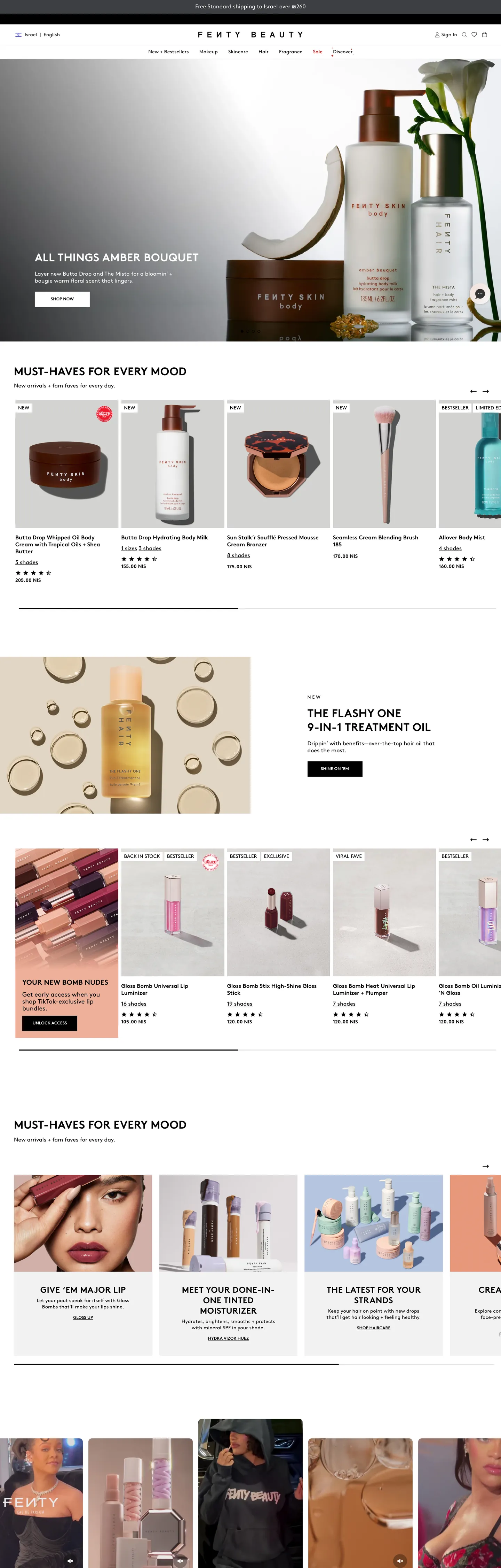
Fenty Beauty's marketing site operates like a fashion magazine that has been handed a product catalog to fill. The hero is a full-bleed editorial photograph — a model bathed in warm amber light, with a 32px weight-700 uppercase Brown headline ("ALL THINGS AMBER BOUQUET") placed bottom-left in white. Below the hero, the page becomes a relentless product grid: 8–12 product tiles per row, with product names, prices, and star ratings running in Brown at 14–16px, all in the same ink-black that carries every other element on the page. There is no accent color. Where Charlotte Tilbury uses its signature red to signal luxury and NARS uses its matte-black packaging as a design system, Fenty Beauty builds visual interest entirely from photography density and uppercase typographic rhythm.
The DESIGN.md file packages the system into a machine-readable spec for React and AI tools. Inside: 10 colors tokens built from a two-tone structural palette — pure black (#000000) as the single ink/border/CTA color, pure white (#ffffff) as canvas and inverse text, a light gray (#d8d8d8) for UI borders, a near-black (#231f20) for text on product photography, and a light surface (#f2f2f2) for input and chip backgrounds. Eleven typography tokens span Brown at weights 300 through 700 — the range is wider than it first appears, with weight 300 appearing at 12px micro-copy and weight 700 at 32px uppercase display. 14 components cover the editorial hero strip, the product-card grid, the uppercase category label, and the newsletter input.
Feed this file to Claude or Cursor and it reproduces Fenty Beauty's specific moves: pure ink-on-white structure, Brown uppercase display at 32px / weight 700, 10px card rounding, dense product-photography grid, and letter-spacing from 0.14px (body) up to 3.9px (category label caps). The system is worth studying for its discipline: a beauty brand that generates intense visual richness from photography alone, without reaching for the coral or gold accents that define most of its category peers. The restraint is the brand statement.
What makes it distinct
5 highlights
- Zero-accent monochromeInk (#000000) is the only brand color; the 2,227-occurrence total makes it the dominant structural element across every surface
- Brown single-family with uppercase display32px weight 700 uppercase is the hero display treatment; every heading, label, and button shares the same family
- Uppercase as brand signalBrown at weight 700 uppercase appears across h1, h2, buttons, and category labels; lowercase and mixed-case appear only in running body text
- Product photography at editorial densityA high-count product grid (8–12 tiles above the fold) gives the page its visual richness without any decorative chrome
- 10px as the dominant radiusCard thumbnails, inputs, and interactive chips use 10px; the scale skips anything above 10px
Live at fentybeauty.com
Fenty Beauty in production, as captured. Scroll the window to see the whole page.
10 colors
Fenty Beauty's system anchors on #231f20 (ink-warm) as its primary color. Type is set in Brown across 11 tokens from 10px to 32px, weights 300–700. Shape language is sharp — components average 1px corner radius, favoring crisp rectangles.
Brand & Accent
Sparing, CTA-only voltage · 1
Surface
Page and card backgrounds · 2
Text
Headlines, body, captions · 5
Borders & Hairlines
Dividers, outlines, rules · 1
Semantic
Status, errors, success, links · 1
11 type tokens
Set in Brown across 11 tokens, from 10px to 32px, weights 300–700. Shown in its own stack: where the font isn't installed, the fallback the file names stands in.
- display-lg32px · weight 700 · lh 40px · tracking 0.32pxThe quick brown fox jumps over the lazy dog
- display-md24px · weight 700 · lh 30px · tracking 0.576pxThe quick brown fox jumps over the lazy dog
- heading-md20px · weight 700 · lh 26px · tracking 0.2pxThe quick brown fox jumps over the lazy dog
- heading-sm18px · weight 700 · lh 24pxThe quick brown fox jumps over the lazy dog
- body-md16px · weight 400 · lh 20pxThe quick brown fox jumps over the lazy dog
- body-sm14px · weight 400 · lh 18px · tracking 0.14pxThe quick brown fox jumps over the lazy dog
- label-heavy14px · weight 700 · lh 18px · tracking 0.14pxThe quick brown fox jumps over the lazy dog
- category-cap13px · weight 400 · lh 20px · tracking 3.9pxThe quick brown fox jumps over the lazy dog
- caption12px · weight 300 · lh 14px · tracking 0.12pxThe quick brown fox jumps over the lazy dog
- caption-heavy12px · weight 700 · lh 16pxThe quick brown fox jumps over the lazy dog
- micro10px · weight 400 · lh 14px · tracking 0.1pxThe quick brown fox jumps over the lazy dog
Radii and spacing
5 corner radii and 8 spacing values. Shape language: sharp, on a 10px base radius.
Radii5
- none0px
- xs2px
- sm5px
- md10px
- full50%
Spacing8
- xs4px
- sm5px
- base8px
- md10px
- lg13px
- xl20px
- 2xl30px
- 3xl40px
14 components
Each rendered from its tokens (color, type, radius, padding) on Fenty Beauty's own canvas.
- Hero SectionHero Sectionhero-section
- Hero HeadingHero Headinghero-heading
- Section HeadingSection Headingsection-heading
- Body ParagraphBody Paragraphbody-paragraph
- Body Paragraph MutedBody Paragraph Mutedbody-paragraph-muted
- Button PrimaryButton Primarybutton-primary
- Button SecondaryButton Secondarybutton-secondary
- Top NavTop Navtop-nav
- Nav LinkNav Linknav-link
- Category LabelCategory Labelcategory-label
- Product CardProduct Cardproduct-card
- Type here…Text Inputtext-input
- Rating StarRating Starrating-star
- FooterFooterfooter
The system, in use
Fenty Beauty's tokens on the kind of product it builds.
New season, new essentials
The latest arrivals, made to wear every day. Free shipping and returns on every order.
Fenty Beauty design system FAQ
Fenty Beauty's tokens, its components and how to use this DESIGN.md in your project.
What are the color tokens in the Fenty Beauty DESIGN.md?
What is Fenty Beauty's primary color hex code?
How do I use Fenty Beauty's colors in Tailwind CSS?
What is Fenty Beauty's primary brand color?
What fonts does Fenty Beauty use?
What is Fenty Beauty's type scale?
What can I use if I don't have Fenty Beauty's font?
What typeface does Fenty Beauty use, and what should I use as a substitute?
Which components does the Fenty Beauty DESIGN.md define?
What corner radius and spacing does Fenty Beauty use?
What corner-radius scale does Fenty Beauty use?
How do I apply the Fenty Beauty design system to a shadcn/ui project?
How do I use the Fenty Beauty DESIGN.md with Claude Code or Cursor?
Is the Fenty Beauty DESIGN.md free to download?
How was the Fenty Beauty DESIGN.md made?
Is the Fenty Beauty DESIGN.md official?
Why does Fenty Beauty use uppercase for so many elements?
Can I use this DESIGN.md to build my own beauty e-commerce product page in the Fenty Beauty design system?
Related reading
Specs, directories and component libraries that pair with this design system.
- Browse all design systemsThe full directory of DESIGN.md files on shadcn.io, with live mockups for each.shadcn.io
- Fenty Beauty — official siteFenty Beauty's public marketing site — the source of truth for the live tokens captured in this file.fentybeauty.com (opens in a new tab)
- The DESIGN.md specificationGoogle Labs' open spec for machine-readable design system files — the format this page is built on.github.com (opens in a new tab)
Use Fenty Beauty in your project
One machine-readable file. Drop it into Claude Code, Cursor, VS Code or any AI tool that reads DESIGN.md.
Download the DESIGN.md
One machine-readable file: every color, type, radius, spacing, and component token of Fenty Beauty.
Feed it to your AI tool
Drop it into Claude, Cursor, or GitHub Copilot. The agent writes React components and Tailwind classes that match Fenty Beauty's visual language.
Reference the tokens directly
Or paste the values into your Tailwind config, CSS variables, or component library: every color, size and radius is a quoted, ready-to-copy value.
Read the full DESIGN.md overview, rationale, do’s and don’ts
Overview
Fenty Beauty's marketing site is a case study in deliberate chromatic subtraction. Photography does the chromatic work: where Charlotte Tilbury builds visual identity around its signature warm red and NARS uses its matte-black packaging as a recurring design motif, Fenty Beauty provides no brand color in the marketing chrome at all — not a blush pink, not a gold, not a signature warm tone. The hero is editorial photography, the grid is editorial photography, and the brand chrome (nav, buttons, headings, borders) runs entirely in pure black on pure white. The system generates intense visual richness from product image density, not from decorative accent elements.
The typographic system is Brown — Lineto's licensed geometric sans — used across every role with uppercase formatting as the primary hierarchy signal. Unlike brands that use bold weight as their display treatment, Fenty uses uppercase. The 32px / weight 700 / 0.32px uppercase is the h1 treatment; the same Brown at 13px / weight 400 / 3.9px letter-spacing becomes the category-strip caption. The span from tight body (0.14px) to widely-tracked label (3.9px) is wider than almost any other brand in the directory. This is the typographic move that the photography alone cannot make.
Key Characteristics:
- Pure ink-on-canvas — no chromatic accent; black (#000000) carries 2,227 element-uses across text, border, and button fills.
- Brown single-family with uppercase display at 32px / weight 700 / 0.32px tracking — the hero and section headings share the same token.
- Category-strip label at 13px / 400 / 3.9px tracking — the most widely-tracked element in the system, used as an editorial section-break device.
- Flat-corner buttons (
{rounded.none}0px) — a deliberate rejection of the softened pill or 4px radius used by most beauty competitors. - Product grid at high density: 8–12 tiles per row, each with product photography, name in Brown 14px, and star rating at 10px.
- 10px radius on cards and interactive chips (13 occurrences); 50% on swatches and avatar chips.
- 13px as the dominant vertical padding (75 occurrences), tighter than the typical 16px baseline.
Colors
Text and Ink
- Ink (
{colors.ink}— #000000): frequency 2,227. Used as text (1,110), border (1,105), background (12). The structural backbone — every nav link, body paragraph, h1, h2, button fill, and product card border runs through this single token. Wired in CSS as--BLACK-COLORand--swiper-theme-color. - Ink Warm (
{colors.ink-warm}— #231f20): frequency 35. Used as text (17), border (17), background (1). A near-black with a very subtle warm undertone — appears on product photography overlays and some body text where the warmth echoes the skin-tone editorial. - Ink Deep (
{colors.ink-deep}— #090a0b): frequency 30. Used as text (15), border (15). A very dark near-black used in secondary text contexts, slightly deeper than the warm variant.
Canvas and Surface
- Canvas (
{colors.canvas}— #ffffff): frequency 274. Used as text (114), border (112), background (48). The page floor and every "inverted" element — nav background, card backgrounds, and the CTA pill on the dark hero. Wired as--WHITE-COLOR. - Surface-1 (
{colors.surface-1}— #f2f2f2): frequency 5. A light neutral used for input background and chip fill states.
Hairlines and Dividers
- Hairline (
{colors.hairline}— #d8d8d8): frequency 53. Used as text (24), border (29). Input field borders, card dividers, and slider track. Wired as--rivo-aw-border-color. - Ink Mid (
{colors.ink-mid}— #666666): frequency 2. Appears as a border-only token — used for secondary dividers.
Semantic
- Error (
{colors.error}— #bd0100): frequency 2. Used as text (1) and border (1). Wired as--rivo-aw-compare-at-price-color— appears on sale/compare-at pricing to indicate a price reduction.
Campaign
- Ink Cool (
{colors.ink-cool}— #3c3f42): frequency 1. Appears as a single background fill — likely a campaign-specific dark surface. - Brand Warm (
{colors.brand-warm}— #4a2a28): frequency 1. One background occurrence, classified as brand-layer. A warm dark chocolate — probably from a product editorial or campaign image bleeding into the surface. Not a recurring accent.
Typography
Font Family
The system runs Brown by Lineto as its exclusive typeface — a geometric sans with rounded counters and proportions closer to Futura than to Helvetica. Brown is a licensed commercial font. Every surface — display, heading, body, button, caption, micro-copy — uses the same family; hierarchy is created through weight (300 → 400 → 700) and text-transform (none → uppercase). There is no second typeface and no serif accent.
Hierarchy
| Token | Size | Weight | Line Height | Letter Spacing | Transform | Use |
|---|---|---|---|---|---|---|
{typography.display-lg} | 32px | 700 | 40px | 0.32px | uppercase | Hero h1, section h2 leads |
{typography.display-md} | 24px | 700 | 30px | 0.576px | uppercase | Sub-section display ("MUST-HAVES FOR EVERY MOOD") |
{typography.heading-md} | 20px | 700 | 26px | 0.2px | uppercase | h3 section headers |
{typography.heading-sm} | 18px | 700 | 24px | 0 | uppercase | h4 product-category headers |
{typography.body-md} | 16px | 400 | 20px | 0 | none | Default running text, nav links |
{typography.body-sm} | 14px | 400 | 18px | 0.14px | none | Product name labels, card captions |
{typography.label-heavy} | 14px | 700 | 18px | 0.14px | uppercase | Button labels, filter tags |
{typography.category-cap} | 13px | 400 | 20px | 3.9px | uppercase | Widely-tracked editorial section labels |
{typography.caption} | 12px | 300 | 14px | 0.12px | none | Legal fine print, subscription terms |
{typography.caption-heavy} | 12px | 700 | 16px | 0 | uppercase | Small uppercase labels |
{typography.micro} | 10px | 400 | 14px | 0.1px | none | Star ratings, review counts |
Principles
Uppercase is the system's hierarchy device, not bold weight alone. The 3.9px letter-spacing on the 13px category-cap is the most extreme tracking in the system — a deliberate editorial move borrowed from print magazine design, where widely-spaced small-caps serve as section dividers. Weight 300 appears only at the 12px micro-copy tier; weight 700 appears across every heading and button label. Body at weight 400 and 16px is the resting voice.
Note on Font Substitutes
Brown is a Lineto commercial font, not freely available. The closest open-source substitute is Inter at the same weights and uppercase settings. For the wider-tracked editorial labels, any geometric sans at 3.9px letter-spacing will read close. Note that Brown's rounder counters at large uppercase sizes are distinctive — any square-counter substitute (Neue Haas Grotesk, Aktiv Grotesk) will read slightly more austere.
Layout
Spacing System
- Base unit: the extracted spacing shows 13px as the dominant single value (75 occurrences), followed by 10px (36 occurrences) and 5px (31 occurrences). The system is built on tight spacing typical of product-dense e-commerce grids.
- Tokens:
{spacing.xs}4px ·{spacing.sm}5px ·{spacing.base}8px ·{spacing.md}10px ·{spacing.lg}13px ·{spacing.xl}20px ·{spacing.2xl}30px ·{spacing.3xl}40px. - Product card padding:
{spacing.md}(10px) as the dominant card internal gap. - Section vertical rhythm: 20–30px between product rows; section leads use 30px top padding.
Grid & Container
- Hero: full-bleed editorial photograph, 100% viewport width, bottom-left text overlay.
- Product grid (above fold): 4-column product tile grid at desktop — each tile carries product photography + name + rating + price. The grid density is the defining layout characteristic.
- Feature editorial strips: alternating full-bleed photography with text overlays (the "THE FLASHY ONE — 9-IN-1 TREATMENT OIL" format) sit between product grids, breaking the catalog rhythm with editorial emphasis.
- Newsletter strip: full-width dark band with centered text input + submit.
Rhythm
The page alternates between product-catalog density (4-column grid, tight 13px gaps) and editorial emphasis strips (full-bleed photography, large display headline). The catalog grid is the dominant mode; the editorial strips function as visual pauses.
Elevation
The system uses no shadow tier on any marketing surface. Product cards rest on the white canvas with no border at rest — only a hairline divider between rows. There is no hover-shadow or focus-shadow on cards. The system communicates hierarchy through grid position, image size, and uppercase typography weight, not through layered elevation.
Shapes
The radius scale is small-step with circles for swatches:
{rounded.none}0px — buttons, input fields, hero section edges. Flat geometry is the primary form for interactive elements.{rounded.xs}2px — very small UI chips and indicators.{rounded.sm}5px — secondary chips and input states.{rounded.md}10px — product thumbnails, interactive chips (13 occurrences). The dominant radius for content surfaces.{rounded.full}50% — swatch circles and avatar chips (10 occurrences).
The flat-corner button (0px radius) is the most brand-specific shape choice — most beauty competitors use rounded or pill CTAs.
Components
hero-section — Full-bleed product photography, pure black surface behind the text overlay, no padding (the photo bleeds edge-to-edge). The display headline sits bottom-left in white uppercase Brown.
hero-heading — White {colors.canvas} text, {typography.display-lg} (32px / 700 / uppercase / 0.32px tracking). Applied to the editorial headline in the hero photography overlay.
section-heading — Ink {colors.ink} text, same {typography.display-lg} token in black. Used for "MUST-HAVES FOR EVERY MOOD," "THE FLASHY ONE 9-IN-1 TREATMENT OIL" section leads.
body-paragraph — Default ink body text at {typography.body-md} (16px / 400).
body-paragraph-muted — Mid-gray {colors.ink-mid} for secondary body copy and filter labels.
button-primary — Pure black {colors.ink} fill, white text, {rounded.none} 0px radius, 13×20px padding, 44px height. No rounding — the flat rectangle is the deliberate shape choice for all primary CTAs.
button-secondary — White {colors.canvas} fill, ink text, 1px ink border, {rounded.none} 0px. Used for "View All" and secondary category actions.
top-nav — White canvas background, ink text, 56px height, 1px bottom hairline {colors.hairline}. Houses the FENTY BEAUTY wordmark center, category links (Bestsellers, Makeup, Skin, etc.) spreading left and right, and cart/search icons flush right.
nav-link — Transparent fill, ink text, {typography.body-md} (16px / 400). No horizontal padding at rest; hover reveals a 1px bottom underline.
category-label — Transparent fill, ink text, {typography.category-cap} (13px / 400 / uppercase / 3.9px tracking). The editorial section-break label above product grid bands.
product-card — White canvas, ink text, {rounded.md} 10px radius, 10px internal padding. Houses the product thumbnail, Brown 14px product name, star rating at 10px, and price label. No card border at rest.
text-input — White canvas, ink text, {rounded.none} 0px radius (flat), 38px height, 1px hairline border. Used in the newsletter signup strip.
rating-star — Transparent, ink text, {typography.micro} (10px / 400). Star icons and review-count label below each product card.
footer — Pure black canvas, white text, {typography.caption} (12px / 300), 30×20px padding. Holds legal copy, newsletter sign-up terms, and footer navigation.
Do's and Don'ts
Do use {rounded.none} 0px on all primary and secondary buttons. The flat rectangle is the brand's most distinctive interactive surface decision; rounding to 4px or more reads like a competitor's component library.
Do apply {typography.category-cap} (13px / 400 / uppercase / 3.9px tracking) for editorial section-break labels between product grids. The 3.9px tracking is the system's signature spacing move — tighter tracking at the same size reads like a different brand entirely.
Do let the product photography drive all chromatic decisions. Every warm amber, coral lip, and golden serum visible on the page comes from product imagery. Introducing a brand color into the nav or button fills would compete with the editorial photography palette.
Do maintain uppercase on every heading and button label. Brown at weight 700 with uppercase is the system's hierarchy signal — the same Brown in sentence-case reads as body copy, not as a heading.
Don't use {colors.brand-warm} (#4a2a28) as a recurring brand accent. It appears once in the captured page as a single background fill — likely a campaign surface from the amber-bouquet editorial, not a structural token. Using it in buttons or nav would introduce a warmth that the system deliberately avoids.
Don't use a shadow on product cards at rest or on hover. The system has zero shadow on the product grid; adding a drop-shadow would make the cards feel heavy and e-commerce-generic rather than editorial.
Don't apply the {typography.category-cap} 3.9px tracking to body paragraphs or product-name labels. The wide tracking is a section-break device only; applied to running text at 16px it becomes unreadable, and applied to product names at 14px it breaks the catalog-grid rhythm.
Don't introduce a pill or 8px-rounded button variant. The system has no rounding above {rounded.md} 10px on any interactive surface — and that 10px appears only on cards and chips, never on buttons. A pill button reads as a beauty-competitor aesthetic (Charlotte Tilbury, Glossier) not Fenty's editorial directness.
Known Gaps
- Dark mode: the captured marketing surface is light-only (white canvas, black hero photography). No dark-mode CSS variable set is exposed in the extracted surface.
- Hover and focus states: no hover states were captured in the static extraction. Product card hover behavior and nav-link hover underlines are inferred from CSS variables (
--hover-transition-duration,--hover-transition-timing) but not documented as token values. - Form input states:
{component.text-input}captures resting state only; error, focus, and success states are not visible in the captured marketing surface. - Mobile layout: the captured surface is desktop (1440px). The mobile layout likely collapses the 4-column product grid to 2 columns; the nav becomes a hamburger drawer.
- Loyalty and rewards surface: the Rivo loyalty-widget CSS variables (
--rivo-aw-*) declare a separate design system with its own dark navy toast colors, steel-blue border tones, and slate-gray secondary font colors that do not appear in the main marketing chrome. - Swatches system: the color/shade swatch picker for foundation and lip products likely has a richer token set than what's visible on the homepage; the 50% radius circles captured here are avatar/indicator swatches, not the full shade-selector component.
More systems like this
adidas, Alo Yoga, Arc'teryx and 83 more in E-commerce & Retail: each brand's colors, type and components in one file your AI agent builds from.
Build it with Pro
The DESIGN.md files are free. Pro adds 6,000+ blocks, premium templates and the MCP server, so your AI editor builds in your system for you.
4.9/5 out of 5 · 150+ reviewsfrom 150+ founders and developers.
- Secure checkout via Stripe
- Code lives in your repo
- Keep what you've shipped if you cancel
- License terms
4.9 out of 5 from 150+ developers


Your system, built for you
Every block, template and icon, installed by your AI agent in your design system. The DESIGN.md files stay free.
- Cancel anytime
- Keep what you've shipped