The Home Depot Design System
One orange for CTAs, badges and focus rings, near-black ink on white and a Helvetica Neue stack. The Home Depot's tokens for React and AI tools.
- Primary color
- #f96302
- Typeface
- helvetica-neue-75-bold
- Shape
- Mixed
- Base radius
- 8px
- Colors
- 12
- Type tokens
- 14
- Components
- 19
- Spacing values
- 8
About The Home Depot DESIGN.md
Curated by Dov Azencot, updated May 19, 2026. Source homedepot.com (opens in a new tab).
The Home Depot's homepage runs on a single saturated brand orange and a layered Helvetica Neue stack. The orange (#f96302) is the system voltage — it fills the primary "Skip Listing" CTA, strokes the small sale icons in the deal carousel, fills the focus ring on every form input, and carries the "$25 Garden Center Power Equipment" badge text and the deal-percentage chip text. It never appears as a canvas color or as a large surface fill. Everywhere else, the page sits on near-black ink (#202020) over a flat white floor with cream-grey product-card surfaces, and the orange enters one element at a time. Where Lowe's commits to its own saturated blue across both chrome and surfaces and Menards leans on dense unfiltered scarlet, The Home Depot keeps the orange small, scoped, and reserved for the moments that need to read as "shop now" or "save."
The DESIGN.md file packages the system into a machine-readable spec. Inside: 12 colors tokens drawn from the 421 Storefront UI custom properties exposed on `:root` — a brand orange voltage, a meadow-green savings color (#0d864c), a structural near-black ink (#202020), three tiers of grey, plus the mustard-yellow focus voltage (#ebb821) and a single decorative yellow (#fed458) for the garden-banner card. 14 typography tokens running three Helvetica Neue cuts: helvetica-neue-55-roman for body, helvetica-neue-75-bold for heading and button labels, helvetica-neue-77-bold-cn for the largest "FREE TOOL" promotional displays at 36px / 0.9px tracking. 6 corner-radius tokens centered on a 12px product-card radius with full pills for primary CTAs. 8 spacing values on an 8px base. 19 components definitions covering the orange CTA pill, the white search input, the deal-percentage chip, the green free-delivery badge, the meadow stock label, the category-tile rail, the photo-card promo grid, and the standard catalogue inventory.
Feed this file to an AI coding tool and it reproduces The Home Depot's specific moves: scoped orange voltage that never fills a canvas, layered Helvetica Neue stack with a condensed-bold cut for the promotional shout, 12px product-card radius with 9999px pills only on primary CTAs, and the meadow-green savings color held entirely separate from the brand orange. The tokens resolve without invention — every hex, font name, radius, and spacing value is a quoted scalar you can paste into Tailwind config or CSS variables. The one move worth borrowing only if your retail brand has earned the orange-equals-utility association: treating the brand color as a precision instrument rather than a canvas. Most retailers paint the brand color across surfaces; The Home Depot deploys it like a tool.
What makes it distinct
5 highlights
- Single-voltage orange#f96302 does CTA fill, focus rings, sale-icon stroke, and badge text, and never appears as a canvas color
- Helvetica Neue layered stackThree named cuts (55-roman / 75-bold / 77-bold-cn) carry body, heading, and promotional display tiers
- Storefront UI tokens421 CSS custom properties exposed on :root, including the full sui-palette and named semantic tokens
- Meadow green for savings#0d864c carries 122 occurrences as the secondary semantic color, used exclusively for in-stock and free-delivery messaging
- 12px radius dominant87 occurrences of 12px rounding on product cards and promo blocks, with 9999px pills reserved for primary CTAs
Live at homedepot.com
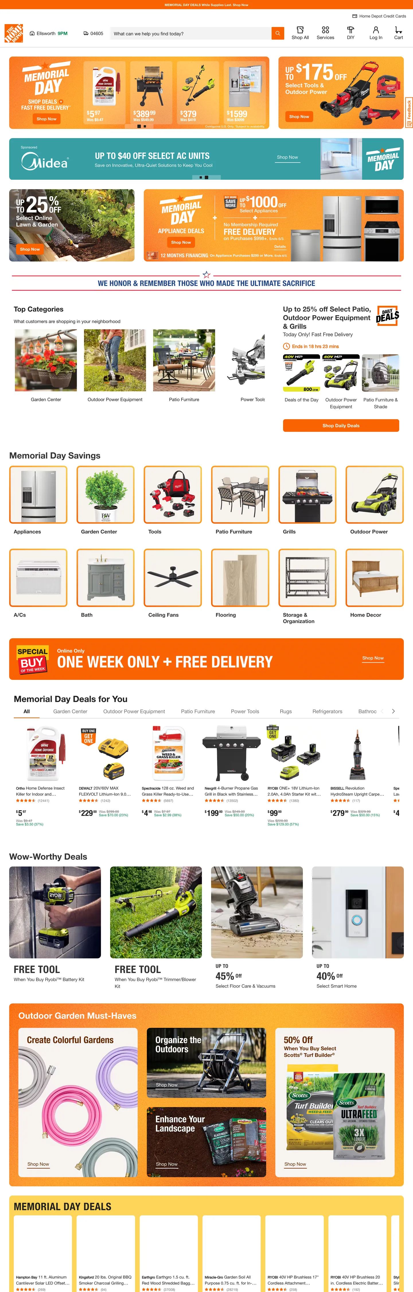
The Home Depot in production, as captured. Scroll the window to see the whole page.
12 colors
The Home Depot's system runs on #f96302 as its primary voltage, used in 4 of 19 components. Type is set in helvetica-neue-75-bold across 14 tokens from 12px to 36px, weights 400–700. Shape language is mixed across 19 components, blending pills, soft rounds, and squarer corners.
Brand & Accent
Sparing, CTA-only voltage · 1
Surface
Page and card backgrounds · 3
Text
Headlines, body, captions · 3
Borders & Hairlines
Dividers, outlines, rules · 1
Other
Specialty colors · 4
14 type tokens
Set in helvetica-neue-75-bold across 14 tokens, from 12px to 36px, weights 400–700. Shown in its own stack: where the font isn't installed, the fallback the file names stands in.
- display-xl36px · weight 400 · lh 45px · tracking 0.9pxThe quick brown fox jumps over the lazy dog
- display-md28px · weight 400 · lh 28pxThe quick brown fox jumps over the lazy dog
- heading-lg30px · weight 400 · lh 37.5pxThe quick brown fox jumps over the lazy dog
- heading-md24px · weight 400 · lh 30pxThe quick brown fox jumps over the lazy dog
- heading-sm18px · weight 400 · lh 22.5pxThe quick brown fox jumps over the lazy dog
- display-sm-cn18px · weight 400 · lh 22.5px · tracking 0.45pxThe quick brown fox jumps over the lazy dog
- body-lg16px · weight 400 · lh 24pxThe quick brown fox jumps over the lazy dog
- body-md14px · weight 400 · lh 21pxThe quick brown fox jumps over the lazy dog
- body-sm14px · weight 400 · lh 21pxThe quick brown fox jumps over the lazy dog
- body-xs12px · weight 400 · lh 13.8pxThe quick brown fox jumps over the lazy dog
- label-bold12px · weight 700 · lh 15pxThe quick brown fox jumps over the lazy dog
- caption12px · weight 400 · lh 15pxThe quick brown fox jumps over the lazy dog
- button-md16px · weight 400 · lh 24pxThe quick brown fox jumps over the lazy dog
- nav-link18px · weight 400 · lh 22.5pxThe quick brown fox jumps over the lazy dog
Radii and spacing
6 corner radii and 8 spacing values. Shape language: mixed, on a 8px base radius.
Radii6
- none0px
- xs2px
- sm4px
- md8px
- lg12px
- full9999px
Spacing8
- xs2px
- sm4px
- base8px
- md12px
- lg16px
- xl24px
- 2xl32px
- 3xl48px
19 components
Each rendered from its tokens (color, type, radius, padding) on The Home Depot's own canvas.
- Utility BarUtility Barutility-bar
- Top NavTop Navtop-nav
- Nav LinkNav Linknav-link
- Search InputSearch Inputsearch-input
- Hero HeadingHero Headinghero-heading
- Section HeadingSection Headingsection-heading
- Body ParagraphBody Paragraphbody-paragraph
- Body Paragraph MutedBody Paragraph Mutedbody-paragraph-muted
- Button PrimaryButton Primarybutton-primary
- Button Primary PillButton Primary Pillbutton-primary-pill
- Button SecondaryButton Secondarybutton-secondary
- Category ChipCategory Chipcategory-chip
- Free Tool BadgeFree Tool Badgefree-tool-badge
- Sale Percent ChipSale Percent Chipsale-percent-chip
- Savings LabelSavings Labelsavings-label
- CardCardcard
- Category Photo CardCategory Photo Cardcategory-photo-card
- Type here…Text Inputtext-input
- Email CtaEmail Ctaemail-cta
The system, in use
The Home Depot's tokens on the kind of product it builds.
New season, new essentials
The latest arrivals, made to wear every day. Free shipping and returns on every order.
The Home Depot design system FAQ
The Home Depot's tokens, its components and how to use this DESIGN.md in your project.
What are the color tokens in the The Home Depot DESIGN.md?
What is The Home Depot's primary color hex code?
How do I use The Home Depot's colors in Tailwind CSS?
What is The Home Depot's primary brand color?
What fonts does The Home Depot use?
What is The Home Depot's type scale?
What can I use if I don't have The Home Depot's font?
What typefaces does The Home Depot use, and what should I use as substitutes?
Which components does the The Home Depot DESIGN.md define?
What corner radius and spacing does The Home Depot use?
What corner-radius scale does The Home Depot use?
How do I apply the The Home Depot design system to a shadcn/ui project?
How do I use the The Home Depot DESIGN.md with Claude Code or Cursor?
Is the The Home Depot DESIGN.md free to download?
How was the The Home Depot DESIGN.md made?
Is the The Home Depot DESIGN.md official?
Why does The Home Depot have a green if the brand is orange?
Why does The Home Depot expose so many CSS custom properties?
Can I use this DESIGN.md to build my own retail marketing site in the The Home Depot design system?
Related reading
Specs, directories and component libraries that pair with this design system.
- Browse all design systemsThe full directory of DESIGN.md files on shadcn.io, with live mockups for each.shadcn.io
- The Home Depot — official siteThe Home Depot's public marketing site — the source of truth for the live tokens captured in this file.homedepot.com (opens in a new tab)
- The DESIGN.md specificationGoogle Labs' open spec for machine-readable design system files — the format this page is built on.github.com (opens in a new tab)
Use The Home Depot in your project
One machine-readable file. Drop it into Claude Code, Cursor, VS Code or any AI tool that reads DESIGN.md.
Download the DESIGN.md
One machine-readable file: every color, type, radius, spacing, and component token of The Home Depot.
Feed it to your AI tool
Drop it into Claude, Cursor, or GitHub Copilot. The agent writes React components and Tailwind classes that match The Home Depot's visual language.
Reference the tokens directly
Or paste the values into your Tailwind config, CSS variables, or component library: every color, size and radius is a quoted, ready-to-copy value.
Read the full DESIGN.md overview, rationale, do’s and don’ts
Overview
The Home Depot's homepage runs the brand color as a precision instrument rather than a canvas. Voltage as tool: the saturated brand orange ({colors.primary} — #f96302) fills the primary "Skip Listing" CTA, strokes the small sale icons on the deal carousel, fills the focus ring on every form input, carries the "$25 Garden Center Power Equipment" badge text, and renders the deal-percentage chip text. It never appears as a canvas color, never as a large surface fill, never bleeds across the chrome. Where Lowe's commits its blue to both chrome and surface alike and Menards floods the page with unfiltered scarlet, The Home Depot keeps the orange small, scoped, and deployed one element at a time — utility-grade voltage rather than retail decoration.
The structural ink is near-black {colors.ink} (#202020), wired as --sui-palette-text-primary and rendering 2419 times — 1234 as text, 1179 as border. Body paragraphs, h3 product titles, nav links, and inventory pricing all sit at this exact value. The page never reaches for pure black; even shadows and the most-emphasized text stop at #202020. The white canvas ({colors.canvas} — #ffffff) appears 150 times — 111 as background, 18 as text reversed on the orange CTA. Surfaces between the canvas and ink walk a three-tier neutral grey ladder ({colors.surface-subtle} → {colors.surface-1} → {colors.hairline-strong} → {colors.muted} → {colors.ink-soft}) before settling on the ink color.
Layered Helvetica Neue stack at three cuts: helvetica-neue-55-roman carries body paragraphs and dense inventory text; helvetica-neue-75-bold handles every heading and button label; helvetica-neue-77-bold-cn (the condensed-bold cut) surfaces only at the 36px / 0.9px-tracking promotional display tier ("FREE TOOL," "BUY MORE, SAVE MORE"). The condensed-bold cut is the in-page promotional shout — used 4 times on the captured page, all on the same campaign card pattern. The pairing of body roman + heading bold + display bold-condensed is the editorial-utility signature; most retailers ship a single Helvetica weight ladder, and the condensed cut is what gives The Home Depot the warehouse-banner reading.
Key Characteristics:
- Single scoped voltage
{colors.primary}(#f96302) — 136 occurrences, 64 as text, 65 as border, 7 as background. Wired as--sui-palette-thd-brand,--sui-palette-background-brand,--sui-palette-text-brand, plus a chain of button-and-focus aliases. - Meadow-green savings color
{colors.meadow}(#0d864c) — 122 occurrences, 61 as text, 61 as border. Wired as--sui-palette-text-success. The single semantic color that does the "savings" and "in stock" jobs without ever sharing a component with the brand orange. - Layered Helvetica Neue stack — helvetica-neue-55-roman for body, helvetica-neue-75-bold for heading, helvetica-neue-77-bold-cn (condensed-bold) for the promotional display tier.
- Storefront UI design system — 421 CSS custom properties exposed on
:root, the most-comprehensive token surface in the retail category. The DESIGN.md captures the 12 colors that actually render on the homepage. - Mustard focus voltage
{colors.focus-yellow}(#fed458) — 2 occurrences as background, used only on the "Outdoor Garden Made Easy" home-banner card. Wired into the deeper mustard #ebb821 as--sui-palette-button-background-focusand--sui-palette-input-border-focus. - 12px dominant content radius — 87 occurrences of
{rounded.lg}12px on product cards, photo tiles, promo blocks, and the search input. - 9999px pill — 44 occurrences on primary action surfaces and category chips, reserved for the most-tappable elements on the page.
- Cool blue focus ring
{colors.focus-ring}(#3b82f6) — Tailwind's default--tw-ring-color. Appears 3 times as shadow only; never as text or border. - 8px base spacing unit with major tokens at 16 / 24 / 32px. The system has no 6 / 10 / 14px intermediate.
- Skip-listing pattern — the primary CTA is labeled "Skip Listing" on the captured product carousel, reflecting the dense-catalogue retail use case rather than the marketing-tour pattern.
Colors
Brand
- The Home Depot Orange (
{colors.primary}— #f96302): frequency 136 — 64 as text, 65 as border, 7 as background. The single brand voltage — fills the primary CTA pill, strokes sale icons, carries badge text on photo banners, and acts as the focus-ring origin. Wired in CSS as--sui-palette-thd-brand,--sui-palette-background-brand,--sui-palette-button-background-primary,--sui-palette-text-brand,--sui-palette-svg-fill-brand,--sui-palette-brand-400, and 5 other aliases. Never used as a canvas color.
Semantic
- Meadow Green (
{colors.meadow}— #0d864c): frequency 122 — 61 as text, 61 as border. The savings and availability semantic — used on "Free delivery" badges, "In stock" labels, and percent-off chips on deal carousels. Wired as--sui-palette-text-success,--sui-palette-svg-fill-success-strong,--sui-palette-status-success-500,--sui-palette-meadow-500,--sui-palette-border-success-strong, and--sui-palette-border-success-strongest. Never shares a component with the brand orange. - Focus Yellow (
{colors.focus-yellow}— #fed458): frequency 2 as background. Used only on the "Outdoor Garden Made Easy" home-banner card as the decorative panel fill. Wired as--sui-palette-mustard-100. The deeper mustard #ebb821 in the token chain (declared as--sui-palette-button-background-focus) is the focus-state voltage but does not render on the captured surface. - Focus Ring (
{colors.focus-ring}— #3b82f6): frequency 3 as shadow only. The Tailwind-default ring color wired as--tw-ring-color, rendering asrgb(59 130 246 / .5)on focusable surfaces. The only blue in the system.
Text
- Ink (
{colors.ink}— #202020): frequency 2419 — 1234 as text, 1179 as border, 6 as background. The dominant text color across body, h3 product titles, nav, and inventory pricing. Wired as--sui-palette-text-primary,--sui-palette-gray-900,--sui-palette-neutral-900,--sui-palette-text-dark, and--sui-palette-svg-dark. The page never reaches for pure black. - Ink Soft (
{colors.ink-soft}— #333333): frequency 1286 — 645 as text, 641 as border. The h2 section-heading and promotional-display text color. Wired as--sui-palette-gray-800,--sui-palette-neutral-800. - Muted (
{colors.muted}— #757575): frequency 216 — 100 as text, 116 as border. Secondary metadata, "View more" links, footer category sub-labels. Wired as--sui-palette-text-subtle,--sui-palette-gray-500,--sui-palette-input-border-primary.
Surface
- Canvas (
{colors.canvas}— #ffffff): frequency 150 — 111 as background, 18 as text (reversed on the orange CTA), 18 as border, 3 as shadow. Wired as--sui-palette-white,--sui-palette-neutral-0,--sui-palette-background-primary,--sui-palette-svg-light, and--sui-palette-text-light. - Surface-1 (
{colors.surface-1}— #e0e0e0): frequency 128, all as background. The product-photo backplate color and the category-tile fill. A faintly-darker grey near-duplicate clusters into this representative tone, wired as--sui-palette-gray-100and--sui-palette-neutral-100. - Surface Subtle (
{colors.surface-subtle}— #f3f3f3): frequency 3 as background. The lightest grey on the page — used as the "Outdoor Garden Made Easy" pale-cream card surface. Wired as--sui-palette-gray-50,--sui-palette-neutral-50,--sui-palette-background-subtle,--sui-palette-background-inactive,--sui-palette-button-background-inactive-primary. - Hairline Strong (
{colors.hairline-strong}— #bfbfbf): frequency 85 — 22 as text, 63 as border. The card-divider tone and the search-input outline. Wired as--sui-palette-gray-200,--sui-palette-neutral-200,--sui-palette-input-border-inactive,--sui-palette-outline-primary.
Shadow
- Shadow (
{colors.shadow}— #000000): frequency 18 — 16 as shadow, 1 as text, 1 as border. The neutral shadow ink used at low opacity on elevated cards and dropdown halos. Wired as--sui-palette-black.
Typography
Font Families
The system runs a layered Helvetica Neue stack with three named cuts. helvetica-neue-55-roman carries body paragraphs at 16px / 400, spans at 12-14px / 400, and most dense inventory text. helvetica-neue-75-bold handles every heading (h2 at 30px, h3 at 24px, h5 at 18px) and every button label. helvetica-neue-77-bold-cn — the condensed-bold cut — surfaces only at the 36px / 0.9px-tracking promotional display tier ("FREE TOOL," "BUY MORE, SAVE MORE"). The fallback stack on each cut walks ui-sans-serif, system-ui, sans-serif, "Apple Color Emoji".
The three-cut layering is the typographic signature. Most retailers ship a single Helvetica weight ladder; The Home Depot exposes the named cuts directly in font-family declarations and reserves the condensed-bold cut for the campaign-display tier exclusively. The result reads as warehouse banner — the bold-condensed type is the same family the brand uses on physical store signage.
Hierarchy
| Token | Size | Weight | Line Height | Letter Spacing | Use |
|---|---|---|---|---|---|
{typography.display-xl} | 36px | 400 | 45px | 0.9px | Promotional display ("FREE TOOL," "BUY MORE, SAVE MORE") — condensed-bold cut |
{typography.display-md} | 28px | 400 | 28px | 0 | Sale-percentage callouts ("Up to 40% OFF Select Patio") — condensed-bold cut |
{typography.heading-lg} | 30px | 400 | 37.5px | 0 | h2 section heads ("Memorial Day Savings") — bold cut |
{typography.heading-md} | 24px | 400 | 30px | 0 | h3 sub-section titles — bold cut |
{typography.heading-sm} | 18px | 400 | 22.5px | 0 | h5 photo-card titles, button labels — bold cut |
{typography.display-sm-cn} | 18px | 400 | 22.5px | 0.45px | Mid-size condensed promo callouts |
{typography.body-lg} | 16px | 400 | 24px | 0 | Default running text, paragraph body |
{typography.body-md} | 14px | 400 | 21px | 0 | Default body in helvetica-neue base stack |
{typography.body-sm} | 14px | 400 | 21px | 0 | Default body in 55-roman cut |
{typography.body-xs} | 12px | 400 | 13.8px | 0 | Utility-bar text, button labels in compact contexts |
{typography.label-bold} | 12px | 700 | 15px | 0 | Bold tiny labels — savings chips, status badges |
{typography.caption} | 12px | 400 | 15px | 0 | Caption rows, "While supplies last" disclaimers |
{typography.button-md} | 16px | 400 | 24px | 0 | Primary and secondary button labels — bold cut |
{typography.nav-link} | 18px | 400 | 22.5px | 0 | Top-nav category labels — bold cut |
Principles
Weight is always declared as 400 because the family name carries the weight semantic (helvetica-neue-55-roman is regular, helvetica-neue-75-bold is bold, helvetica-neue-77-bold-cn is bold-condensed). The CSS font-weight property stays at 400 throughout. The promotional display tier sits at 36px / 0.9px-tracking — the tightest tracking on the page after the secondary 18px condensed (0.45px). Body paragraphs sit at 16px / 24px line-height (1.5x); heading line-heights run at 1.25x; promotional displays run at 1.0-1.25x. The system tightens vertical rhythm as type scales up.
Note on Font Substitutes
Helvetica Neue is a licensed family. The closest open-source substitute for all three cuts is Inter — Inter Variable at weight 400 substitutes for 55-roman, Inter at weight 700 substitutes for 75-bold, and Inter at weight 700 with a condensed scale approximates 77-bold-cn (true condensed-bold is rare in open-source). Roboto Condensed or Barlow Condensed at weight 700 are closer matches for the 77-bold-cn cut at the 36px display tier; Bebas Neue is a single-weight alternative that reads close to the warehouse-banner feel.
Layout
Spacing System
- Base unit: 8px — the dominant token, 103 occurrences in the captured page.
- Tokens:
{spacing.xs}2px ·{spacing.sm}4px ·{spacing.base}8px ·{spacing.md}12px ·{spacing.lg}16px ·{spacing.xl}24px ·{spacing.2xl}32px ·{spacing.3xl}48px. - Utility-bar padding: 4x16 on the slim orange band above the main nav (24px tall).
- Top-nav padding: 12x24 on the main white nav band (72px tall).
- Card internal padding:
{spacing.lg}(16px) on product cards and photo-card promo tiles. - Promo block padding:
{spacing.xl}(24px) on the larger "Memorial Day Savings" campaign card.
Grid & Container
- Page max-width: ~1280px — desktop-first with edge-to-edge promotional cards above the fold.
- Utility bar: full-bleed orange strip carrying delivery zip-code, store-locator, and lists/account links. 24px tall.
- Top nav: full-bleed white band with logomark left, search center, and account/cart cluster right. 72px tall.
- Above-fold deal carousel: 4-up product cards on
{colors.canvas}surface with the brand orange "OFFER ENDS IN..." countdown above. - Memorial Day grid: 6-up category-photo cards in a single row, each
{rounded.lg}12px corner radius. - Mid-page promo cards: 2-up split between a saturated orange "BUY MORE, SAVE MORE" card and a saturated yellow "BUNDLE DEAL" card. The two are the only large brand-orange and brand-yellow surfaces.
- Category photo grid: 3-up rows of "Outdoor Garden Made Easy" style cards with photography backplates.
Rhythm
The page is structured as utility bar → nav → deal carousel → savings campaign → daily deals → category showcase → footer. The vertical chrome before any product carousel is ~96px (utility bar + nav). Below, each section runs ~280-450px tall with a {spacing.2xl} (32px) gap. The savings campaign card is the densest visual moment on the page — it stacks a 36px condensed-bold headline, a 24px sub-headline, and a 4-up product grid on a single white card. Everywhere else the page alternates dense and generous rhythm, with the dense bands always carrying the largest brand-orange voltage and the generous bands carrying photo-led category showcases.
Shapes
The radius scale is content + pill.
{rounded.xs}2px — small metadata chips (9 occurrences).{rounded.sm}4px — tiny chips and inline badges (16 occurrences).{rounded.md}8px — the primary action button (25 occurrences). Note this is smaller than the dominant card radius — the CTA is deliberately tighter than the surrounding cards.{rounded.lg}12px — the dominant content radius (87 occurrences). Product cards, photo tiles, promo blocks, search input.{rounded.full}9999px — pill CTAs and category chips (44 occurrences). The most-tappable surfaces on the page.- There is no 16 / 20 / 24px middle radius tier — the system steps from 12px content directly to 9999px pill.
The CTA at 8px and the card at 12px is a deliberate gap. The smaller button radius signals "tappable action" against the larger card radius signaling "content surface" — the customer's eye lands on the tighter geometry first.
Elevation
The system has a light shadow tier, scoped to elevated promotional cards and dropdown menus.
- Flat (no shadow): nav, utility bar, body bands, photo-card grids, footer — 95% of surfaces.
- Card shadow: the "Memorial Day Savings" campaign block and the promotional carousel cards carry a soft
{colors.shadow}(#000000) at low opacity, 16-20px blur, no offset. Wired as--tw-shadowand--tw-shadow-colored. - Dropdown shadow: the account / cart hover menus carry a sharper black-at-opacity shadow with 4-8px blur.
- Focus ring: focusable inputs render a
{colors.focus-ring}(#3b82f6) at 50% opacity, 0 spread. Tailwind default.
The shadow scope is narrow. Most cards lift from the canvas by {colors.surface-1} borders rather than shadow halos; the elevated treatment is reserved for the campaign blocks and the dropdown surfaces.
Components
utility-bar — The slim brand-orange {colors.primary} strip above the main nav, 24px tall, 4x16 padding. Holds delivery-zip-code, store-locator pin, and account/lists cluster in {typography.body-xs} white. The largest brand-orange surface on the page; the only place the orange functions as a canvas fill.
top-nav — White {colors.canvas} surface, 72px tall, 12x24 padding. Logomark left (the orange THD square), search center, account/cart cluster right.
nav-link — Transparent fill, {colors.ink} text in {typography.nav-link} (helvetica-neue-75-bold cut, 18px). Category hover labels in the secondary nav row.
search-input — White {colors.canvas} fill, {colors.hairline-strong} 1px border, {rounded.lg} 12px radius, 12px padding, 44px tall. Sits at the center of the nav band with a magnifying-glass icon button on the right.
hero-heading — {colors.ink-soft} (#333333) text, {typography.display-xl} (36px / 0.9px-tracking, helvetica-neue-77-bold-cn cut). "FREE TOOL," "BUY MORE, SAVE MORE" — the condensed-bold promotional display.
section-heading — {colors.ink-soft} text, {typography.heading-lg} (30px / 400, bold cut). "Memorial Day Savings," "Move Worthy Deals."
body-paragraph — Default {colors.ink} running text at {typography.body-lg} (16px / 400, roman cut). The workhorse copy style.
body-paragraph-muted — {colors.muted} variant at {typography.body-md} for caption and secondary copy.
button-primary — Brand-orange {colors.primary} fill, white text, {rounded.md} 8px radius (tighter than the card radius), 0x16 padding, 44px tall, {typography.button-md} bold-cut label. "Skip Listing" on the carousel, "Shop Now" on campaign cards.
button-primary-pill — Same orange fill and dimensions, but with {rounded.full} 9999px radius. Used on emphasis CTAs in the home-banner cards ("Get the deal").
button-secondary — White fill, ink text, 1px ink border, {rounded.md} 8px radius, 44px tall. Used for secondary actions adjacent to a primary CTA.
category-chip — White fill, ink text, 1px {colors.hairline-strong} border, {rounded.full} 9999px radius, 8x16 padding, 36px tall. The inline category-tab strip ("New · Trending · Top Deals · Brand").
free-tool-badge — Transparent background, {colors.ink-soft} text at {typography.display-xl} (the 36px condensed-bold cut). "FREE TOOL" stacked above a product photo — the system's brand-display moment without a colored fill.
sale-percent-chip — Transparent background, {colors.primary} text at {typography.display-md} (28px condensed-bold). "20% OFF," "40% OFF" inline percent-off callouts.
savings-label — {colors.meadow} (#0d864c) text at {typography.label-bold} (12px / 700). "FREE DELIVERY," "IN STOCK," "$15 SAVINGS" — the green semantic that never overlaps the brand orange.
card — White {colors.canvas} fill, {colors.surface-1} 1px border, {rounded.lg} 12px radius, 16px padding. The default product-card surface.
category-photo-card — Pale-cream {colors.surface-subtle} (#f3f3f3) fill, ink text, {rounded.lg} 12px radius, 16px padding. The "Outdoor Garden Made Easy" home-banner pattern. The decorative {colors.focus-yellow} (#fed458) appears as accent inside this card.
text-input — White fill, ink text, 1px {colors.muted} bottom border (not a full outline), no border-radius, 12px padding, 44px tall. The email-signup form input — distinct from the search input in that it uses a bottom-rule underline rather than a full outlined pill.
email-cta — The footer email-signup CTA pill. White fill on the orange utility bar surface, {typography.label-bold} text, {rounded.full} 9999px radius, 8x16 padding.
Do's and Don'ts
Do treat {colors.primary} (#f96302) as a precision tool. The orange does CTA fill, focus rings, sale-icon stroke, and badge text — never canvas, never large surface fills. Painting the orange across a page section breaks the "voltage for action" reading the system depends on.
Do use {colors.meadow} (#0d864c) only for savings and availability messaging. "Free delivery," "In stock," and percent-off chips are green; everything else stays on the orange or ink palette. Mixing the green into a primary CTA destroys the semantic split.
Do reserve helvetica-neue-77-bold-cn (the condensed-bold cut) for the 36px promotional display tier. Running condensed-bold at smaller sizes (14-20px) cheapens the warehouse-banner reading and clutters the chrome.
Do match the system's 8px button radius and 12px card radius. The CTA-tighter-than-card geometry is the visual signal that the button is a discrete action against the surrounding content surface. Matching them (both 8px or both 12px) softens the contrast.
Don't use {colors.surface-1} (#e0e0e0) as a text color or border. It is a background-only token (128 of 128 occurrences are background fills). For borders use {colors.hairline-strong} (#bfbfbf); for text use {colors.muted} (#757575) or {colors.ink}.
Don't stack the orange CTA on a brand-orange surface. The button-on-utility-bar pattern uses white CTA on orange; the button-on-canvas pattern uses orange CTA on white. The two never invert. An orange-on-orange CTA disappears into the band.
Don't introduce a 16 / 20 / 24px middle radius tier. The system steps from 12px content to 9999px pill. Adding a middle softens the tap-affordance signal and makes the page read as a generic SaaS commerce template.
Don't apply the brand orange to body text below 16px. The orange functions as badge-and-link voltage at 12-14px label sizes and as CTA-fill at 16px+ button sizes. Using it as a paragraph color creates an unread "construction-cone" effect and overwhelms the workhorse ink palette.
Known Gaps
- Hover and focus states: documented for resting states only. The 421 SUI palette tokens declare
--sui-palette-button-background-hover-primary,--sui-palette-button-border-hover, and a hover chain for every interactive surface, but the captured page renders no hover state. - Dark mode: the captured page is light-only. No dark-mode tokens render on the marketing surface; the SUI palette declares neutral-950 and inverse roles but they do not appear.
- Form input error states: the captured forms carry resting states. Error / validation styling lives in checkout and tool-rental flows and is not represented here.
- Authenticated chrome: the captured surface is unauthenticated. The Pro Xtra and authenticated homepages expose surface tokens (loyalty badges, B2B pricing chips) that are not represented.
- Sub-brand chrome: Pro Xtra, Tool Rental, Home Depot Design Center, and Workshops sub-surfaces share the parent SUI palette but expose distinct component sets not captured by this file.
- Mobile breakpoints: the captured surface is desktop-only at 1280px. The radius scale, the utility-bar pattern, and the deal-carousel layout all collapse differently on mobile.
- Motion: the deal carousel auto-advances with a chevron control, and the home-banner cards rotate on a longer interval. The spec captures end-state values only; easing curves, dwell timing, and rotation intervals live in the live page runtime.
- Storefront UI palette breadth: The Home Depot's SUI design system exposes 421 CSS custom properties covering tradewind teal, terracota red, tangerine, mustard, and meadow color families. The DESIGN.md captures the 12 colors that actually render on the homepage; the remaining ~30 named colors appear on product detail pages and sub-surfaces.
More systems like this
adidas, Alo Yoga, Arc'teryx and 83 more in E-commerce & Retail: each brand's colors, type and components in one file your AI agent builds from.
Build it with Pro
The DESIGN.md files are free. Pro adds 6,000+ blocks, premium templates and the MCP server, so your AI editor builds in your system for you.
4.9/5 out of 5 · 150+ reviewsfrom 150+ founders and developers.
Billing
Billed once a year in USD. Cancel anytime.
- How many people can use the license.
- Client work, SaaS products and anything you charge for.
- Page sections in 56 categories, from heroes and pricing tables to dashboards and settings, on every framework and UI library, in your theme.
- Complete Next.js sites for startups, SaaS, agencies and portfolios, every page designed, ready to ship.
- Your AI agent searches, previews and installs any component, block, icon or DESIGN.md from a prompt: 22 tools in Claude Code, Cursor, VS Code and 35 more clients.
- Buttons with motion and states of their own, from an arrow that slides in to a burst of confetti.
- Typewriters, scrambles, counters and more, for headlines, labels and numbers.
- Animated backgrounds for heroes, sections and cards, from a soft aurora to a flock that flees the cursor. Most are pure CSS.
- WebGPU shaders, from a slow aurora to a black hole, each drawing only while it's on screen.
- One design and one theme on all four: the components, blocks and effects are built for each framework.
- React on Base UI, Radix UI, React Aria or Ark UI: install the version for the library your project already uses. Vue, Svelte and Solid run on Ark UI.
- From a button to a date picker, a color picker or a guided tour: accessible, typed in TypeScript, each with live demos.
- Real-world patterns built from the components, in 53 galleries: forms, tables, menus, dialogs and more.
- Area, bar, line, pie, radar and radial charts on TanStack Charts, on every framework. React also gets the Recharts originals.
- Debounce, local storage, media queries and more: each hook is one typed file you own.
- From 222 libraries, Lucide, Heroicons, Tabler and Material Symbols among them, as SVG or a React component in one command.
- Stripe, Linear, Apple and 497 more: a brand's colors, typography and components in one file your AI agent builds from.
- Restyle every component and block at once: 8 styles, 7 grays, 18 colors and 5 radii, shared as a shadcn preset code.
- Priority requests are answered first.
Individual
For personal projects & open source
$32instead of $49/mo
$389 billed yearly
- Seats: 1 seat
- Commercial use: Personal & open source only
- Blocks: All 6,181 blocks
- Templates: All 14 templates
- MCP server: 38 AI clients
- Animated buttons: All 35 buttons
- Text effects: All 97 effects
- Backgrounds: All 100 backgrounds
- Shaders: All 100 shaders
- Frameworks: React, Vue, Svelte, Solid
- UI libraries: Base UI, Radix, Aria, Ark
- Components: All 174 components
- Examples: All 1,103 examples
- Charts: All 70 charts
- React hooks: All 35 hooks
- Icons: 294k+ icons
- DESIGN.md files: All 500 brands
- Theme builder: 8 styles × 18 colors
- Support: Standard
Team
Most popularFor freelancers, agencies & startups
$66instead of $99/mo
$789 billed yearly · ≈ $13/dev/mo
- Seats: Up to 5 seats
- Commercial use: Included
- Blocks: All 6,181 blocks
- Templates: All 14 templates
- MCP server: 38 AI clients
- Animated buttons: All 35 buttons
- Text effects: All 97 effects
- Backgrounds: All 100 backgrounds
- Shaders: All 100 shaders
- Frameworks: React, Vue, Svelte, Solid
- UI libraries: Base UI, Radix, Aria, Ark
- Components: All 174 components
- Examples: All 1,103 examples
- Charts: All 70 charts
- React hooks: All 35 hooks
- Icons: 294k+ icons
- DESIGN.md files: All 500 brands
- Theme builder: 8 styles × 18 colors
- Support: Priority
Organization
For companies with larger teams
$132instead of $199/mo
$1,589 billed yearly
- Seats: Unlimited seats
- Commercial use: Included
- Blocks: All 6,181 blocks
- Templates: All 14 templates
- MCP server: 38 AI clients
- Animated buttons: All 35 buttons
- Text effects: All 97 effects
- Backgrounds: All 100 backgrounds
- Shaders: All 100 shaders
- Frameworks: React, Vue, Svelte, Solid
- UI libraries: Base UI, Radix, Aria, Ark
- Components: All 174 components
- Examples: All 1,103 examples
- Charts: All 70 charts
- React hooks: All 35 hooks
- Icons: 294k+ icons
- DESIGN.md files: All 500 brands
- Theme builder: 8 styles × 18 colors
- Support: Priority
Billed once a year in USD. Cancel anytime.
Individual
For personal projects & open source
$32instead of $49/mo
$389 billed yearly
- How many people can use the license.Seats: 1 seat
- Client work, SaaS products and anything you charge for.Commercial use: Personal & open source only
- Page sections in 56 categories, from heroes and pricing tables to dashboards and settings, on every framework and UI library, in your theme.Blocks: All 6,181 blocks
- Complete Next.js sites for startups, SaaS, agencies and portfolios, every page designed, ready to ship.Templates: All 14 templates
- Your AI agent searches, previews and installs any component, block, icon or DESIGN.md from a prompt: 22 tools in Claude Code, Cursor, VS Code and 35 more clients.MCP server: 38 AI clients
- Buttons with motion and states of their own, from an arrow that slides in to a burst of confetti.Animated buttons: All 35 buttons
- Typewriters, scrambles, counters and more, for headlines, labels and numbers.Text effects: All 97 effects
- Animated backgrounds for heroes, sections and cards, from a soft aurora to a flock that flees the cursor. Most are pure CSS.Backgrounds: All 100 backgrounds
- WebGPU shaders, from a slow aurora to a black hole, each drawing only while it's on screen.Shaders: All 100 shaders
- One design and one theme on all four: the components, blocks and effects are built for each framework.Frameworks: React, Vue, Svelte, Solid
- React on Base UI, Radix UI, React Aria or Ark UI: install the version for the library your project already uses. Vue, Svelte and Solid run on Ark UI.UI libraries: Base UI, Radix, Aria, Ark
- From a button to a date picker, a color picker or a guided tour: accessible, typed in TypeScript, each with live demos.Components: All 174 components
- Real-world patterns built from the components, in 53 galleries: forms, tables, menus, dialogs and more.Examples: All 1,103 examples
- Area, bar, line, pie, radar and radial charts on TanStack Charts, on every framework. React also gets the Recharts originals.Charts: All 70 charts
- Debounce, local storage, media queries and more: each hook is one typed file you own.React hooks: All 35 hooks
- From 222 libraries, Lucide, Heroicons, Tabler and Material Symbols among them, as SVG or a React component in one command.Icons: 294k+ icons
- Stripe, Linear, Apple and 497 more: a brand's colors, typography and components in one file your AI agent builds from.DESIGN.md files: All 500 brands
- Restyle every component and block at once: 8 styles, 7 grays, 18 colors and 5 radii, shared as a shadcn preset code.Theme builder: 8 styles × 18 colors
- Priority requests are answered first.Support: Standard
Team
Most popularFor freelancers, agencies & startups
$66instead of $99/mo
$789 billed yearly · ≈ $13/dev/mo
Everything in Individual, plus
- How many people can use the license.Seats: Up to 5 seats
- Client work, SaaS products and anything you charge for.Commercial use: Included
- Priority requests are answered first.Support: Priority
Organization
For companies with larger teams
$132instead of $199/mo
$1,589 billed yearly
Everything in Team, plus
- How many people can use the license.Seats: Unlimited seats
- Secure checkout via Stripe
- Code lives in your repo
- Keep what you've shipped if you cancel
- License terms
4.9 out of 5 from 150+ developers


Your system, built for you
Every block, template and icon, installed by your AI agent in your design system. The DESIGN.md files stay free.
- Cancel anytime
- Keep what you've shipped