IKEA Design System
Swedish-flag yellow held in reserve, Noto IKEA in every tier, 8px corners and room-photo tiles on warm cream. IKEA's homepage for React and AI tools.
- Primary color
- #ffdb00
- Typeface
- Noto IKEA
- Shape
- Mixed
- Base radius
- 8px
- Colors
- 13
- Type tokens
- 10
- Components
- 15
- Spacing values
- 7
About IKEA DESIGN.md
Curated by Dov Azencot, updated May 18, 2026. Source ikea.com (opens in a new tab).
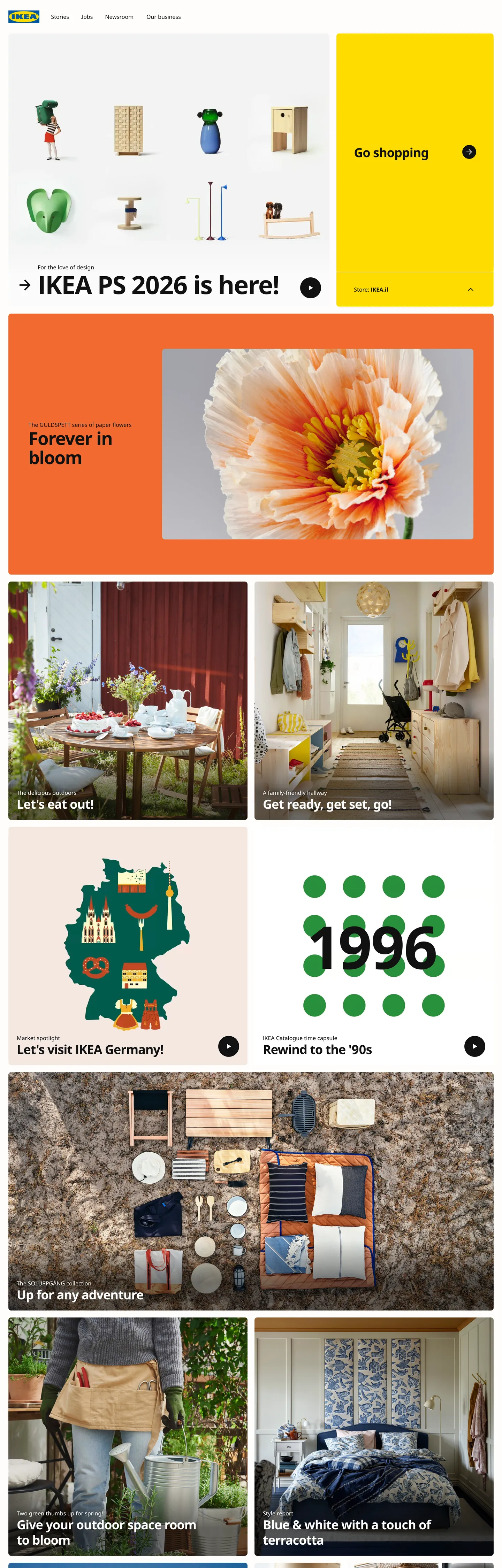
IKEA's marketing site does something the global furniture-retail category mostly avoids: it gives the brand voltage to a single tile in the upper right and lets the rest of the page be photography. The "Go shopping" panel sits as a flat block of Swedish-flag yellow #ffdb00 against a 4-column photo grid of vases and homewares on its left, with a beside-it salmon-orange "Forever in bloom" inspiration block carrying a poppy macro photo. Below the fold the page becomes a tiled gallery of furnished rooms — a dining table set for a meal, a moving-day vignette, a designer-stories illustration, a "Rewind to the '90s" archive moment with green pegs arranged as a calendar — each carrying a handwritten-feel caption overlay at 14px / weight 700 inside an 8px rounded card. Where West Elm leans on muted neutrals and a single accent green, and where Wayfair pours volume into a busy SKU-driven hero grid, IKEA holds the yellow back and lets the room photography do the warmth.
The DESIGN.md file packages the homepage into a machine-readable spec for React and AI tools. Inside: 13 colors tokens drawn from the brand-tier (Swedish yellow, light-yellow #fff094, salmon orange #f26a2f, pale blue #c4dee8) plus a structural tier of warm cream canvas #fffefb, near-black ink #111111, a 60%-grey hairline tone #818181, and the historic IKEA-blue #0058a3 wired as `--color-ikea-blue`. Eleven typography tokens span Noto IKEA from 14px nav links to a 72px feature display, with -1.84px tracking at the top tier. The radius scale is binary: 8px on every card and tile (frequency 46), 50% on the round play-icon buttons inside video tiles. Spacing centers on 16px and 24px as dominant modules.
Feed this file to Claude or Cursor and it will reproduce IKEA's specific moves: held-in-reserve yellow on a single CTA tile, warm-cream canvas that softens the saturated voltage, Noto IKEA across every tier with the -1.84px display tracking that gives the largest headlines their editorial signature, 8px rounded cards as the universal content container, and room-photography-led tile design where the caption sits on the photo at 51px / 700 with a handwritten-feel asterisk arrow as the pointer. The token references resolve cleanly — `{colors.ikea-yellow}` for the voltage, `{colors.canvas}` for the cream, `{typography.display-xl}` for the 72px feature — so the AI never has to invent a value. Treat it as a reference rather than a clone target: the disciplined move worth borrowing is the single-tile voltage placement, which only works when you have warm photography this strong to carry the rest of the page.
What makes it distinct
5 highlights
- Held-in-reserve yellowThe Swedish-flag yellow #ffdb00 appears only on the 'Go shopping' tile and the IKEA logo, never as a body fill or button color across the rest of the page
- Noto IKEA across every tierThe proprietary humanist sans does 14-72px display, body, nav, and button work, with -1.84px tracking on the largest display
- Room-photography tilesEvery content card is a furnished-room photo with a handwritten-feel caption overlay, never a stock product shot or a flat illustration
- 8px corner radius default46 occurrences, the dominant rounding on cards and tiles; pills only on the round 'play' icon buttons inside video tiles
- Warm cream canvasThe page floor renders as #fffefb (declared as --color-background), not pure white, a quiet warmth that softens the saturated yellow voltage
Live at ikea.com
IKEA in production, as captured. Scroll the window to see the whole page.
13 colors
IKEA's system runs on #ffdb00 as its primary voltage, used in 2 of 15 components. Type is set in Noto IKEA across 10 tokens from 14px to 72px, weights 400–700. Shape language is mixed across 15 components, blending pills, soft rounds, and squarer corners.
Brand & Accent
Sparing, CTA-only voltage · 4
Surface
Page and card backgrounds · 2
Text
Headlines, body, captions · 5
Borders & Hairlines
Dividers, outlines, rules · 1
Other
Specialty colors · 1
10 type tokens
Set in Noto IKEA across 10 tokens, from 14px to 72px, weights 400–700. Shown in its own stack: where the font isn't installed, the fallback the file names stands in.
- display-xl72px · weight 700 · lh 77.76px · tracking -1.84pxThe quick brown fox jumps over the lazy dog
- display-lg51px · weight 700 · lh 55.08px · tracking -1.48pxThe quick brown fox jumps over the lazy dog
- display-md36px · weight 700 · lh 43.2px · tracking -0.96pxThe quick brown fox jumps over the lazy dog
- heading-md20px · weight 400 · lh 32.4pxThe quick brown fox jumps over the lazy dog
- heading-sm16px · weight 700 · lh 22.4pxThe quick brown fox jumps over the lazy dog
- body-md16px · weight 400 · lh 25.92pxThe quick brown fox jumps over the lazy dog
- body-base16px · weight 400 · lh 16pxThe quick brown fox jumps over the lazy dog
- body-sm14px · weight 400 · lh 21.98pxThe quick brown fox jumps over the lazy dog
- nav-link16px · weight 400 · lh 16pxThe quick brown fox jumps over the lazy dog
- button-md14px · weight 400 · lh 16pxThe quick brown fox jumps over the lazy dog
Radii and spacing
4 corner radii and 7 spacing values. Shape language: mixed, on a 8px base radius.
Radii4
- none0px
- xs2px
- md8px
- full9999px
Spacing7
- xs8px
- sm10px
- md12px
- base16px
- lg20px
- xl21px
- 2xl24px
15 components
Each rendered from its tokens (color, type, radius, padding) on IKEA's own canvas.
- Button PrimaryButton Primarybutton-primary
- Button SecondaryButton Secondarybutton-secondary
- Top NavTop Navtop-nav
- Nav LinkNav Linknav-link
- Hero HeadingHero Headinghero-heading
- Section HeadingSection Headingsection-heading
- Card TitleCard Titlecard-title
- Body ParagraphBody Paragraphbody-paragraph
- Body Paragraph MutedBody Paragraph Mutedbody-paragraph-muted
- CardCardcard
- Card PhotoCard Photocard-photo
- Card YellowCard Yellowcard-yellow
- Card WarmCard Warmcard-warm
- Play ButtonPlay Buttonplay-button
- Type here…Text Inputtext-input
The system, in use
IKEA's tokens on the kind of product it builds.
New season, new essentials
The latest arrivals, made to wear every day. Free shipping and returns on every order.
IKEA design system FAQ
IKEA's tokens, its components and how to use this DESIGN.md in your project.
What are the color tokens in the IKEA DESIGN.md?
What is IKEA's primary color hex code?
How do I use IKEA's colors in Tailwind CSS?
What is IKEA's primary brand color?
What fonts does IKEA use?
What is IKEA's type scale?
What can I use if I don't have IKEA's font?
What typeface does IKEA use, and what should I use as a substitute?
Which components does the IKEA DESIGN.md define?
What corner radius and spacing does IKEA use?
What corner-radius and spacing scale does IKEA use?
How do I apply the IKEA design system to a shadcn/ui project?
How do I use the IKEA DESIGN.md with Claude Code or Cursor?
Is the IKEA DESIGN.md free to download?
How was the IKEA DESIGN.md made?
Is the IKEA DESIGN.md official?
Why is IKEA's white canvas not actually white?
Why is every IKEA tile a furnished-room photo instead of a product shot?
Can I use this DESIGN.md to build my own home-goods retail marketing site in the IKEA design system?
Related reading
Specs, directories and component libraries that pair with this design system.
- Browse all design systemsThe full directory of DESIGN.md files on shadcn.io, with live mockups for each.shadcn.io
- IKEA — official siteIKEA's public marketing site — the source of truth for the live tokens captured in this file.ikea.com (opens in a new tab)
- The DESIGN.md specificationGoogle Labs' open spec for machine-readable design system files — the format this page is built on.github.com (opens in a new tab)
Use IKEA in your project
One machine-readable file. Drop it into Claude Code, Cursor, VS Code or any AI tool that reads DESIGN.md.
Download the DESIGN.md
One machine-readable file: every color, type, radius, spacing, and component token of IKEA.
Feed it to your AI tool
Drop it into Claude, Cursor, or GitHub Copilot. The agent writes React components and Tailwind classes that match IKEA's visual language.
Reference the tokens directly
Or paste the values into your Tailwind config, CSS variables, or component library: every color, size and radius is a quoted, ready-to-copy value.
Read the full DESIGN.md overview, rationale, do’s and don’ts
Overview
IKEA's marketing site does something the global furniture-retail category mostly avoids. Held-in-reserve voltage. The Swedish-flag yellow ({colors.primary} — #ffdb00) appears on the homepage exactly 4 times as a background fill — all of them concentrated on the "Go shopping" tile in the upper right and on the IKEA wordmark itself — and nowhere else as a body fill or button color across the entire captured page. Where West Elm leans on muted neutrals and a single accent green, and where Wayfair pours volume into a busy SKU-driven hero grid, IKEA holds the yellow back and lets the room photography do the warmth. Beside the yellow CTA sits a single salmon-orange "Forever in bloom" inspiration block ({colors.accent-warm} — #f26a2f), the only other chromatic surface on the page; the rest is warm-cream canvas and room photography.
The system's photography discipline reinforces the move. Every content card below the fold is a furnished room — a dining table set for a meal, a moving-day vignette with cardboard boxes and a "Get ready, get set, go!" caption, a "Rewind to the '90s" archive moment with green pegs arranged as a calendar reading "1996", an illustration of Germany as a face for "Let's visit IKEA Germany", a designer's outdoor-space vignette — each carrying a handwritten-feel caption overlay at {typography.display-lg} (51px / 700) inside an {rounded.md} 8px rounded card. Product-only shots are reserved for the category grid below the fold; the homepage chrome is editorial. This is closer to the Magnolia or Kinfolk magazine treatment than to the typical retail SKU grid.
The shape vocabulary is binary: 8px or full circle. There are exactly two radii on the captured surface: {rounded.md} 8px on every content card and tile (frequency 46), and {rounded.full} 50% on the round play-icon buttons that sit inside the video and inspiration tiles (frequency 6). There is no 4px / 12px / 16px / 24px middle tier. The 8px corner is just round enough to feel softer than a print-magazine layout but tight enough that the photography remains the focus.
Key Characteristics:
- Held-in-reserve
{colors.primary}(Swedish-flag yellow) on a single "Go shopping" tile in the upper right — never a button fill, body text color, or card surface elsewhere on the page. - Warm cream canvas (
{colors.canvas}— #fffefb) softens the saturated yellow voltage; pure white ({colors.surface-1}— #ffffff) is reserved for specific card surfaces and the navigation overlay. - Noto IKEA (a proprietary humanist sans built on Noto Sans) across every tier with -1.84px tracking on the 72px feature display and -1.48px tracking on the 51px h2.
- Room-photography-led tiles with handwritten-feel caption overlays at 51px / 700; product-only shots reserved for the below-fold category grid.
- 8px corner radius on every card and tile (frequency 46) — the dominant rounding; 50% on the round play-icon buttons (frequency 6).
- IKEA-blue (
{colors.ikea-blue}— #0058a3) declared as--color-ikea-bluebut absent from the captured homepage — it lives on in-store wayfinding signs and the historical brand logo. - Pale-blue (
{colors.accent-cool}— #c4dee8) and salmon orange ({colors.accent-warm}— #f26a2f) each appear once as feature-tile fills, never recurring elsewhere. - 16px / 24px dominant spacing modules with a 20px grid-gap on desktop (
--grid-gap: 1.25rem).
Colors
Brand
- Swedish Yellow (
{colors.primary}— #ffdb00): frequency 4, all background fills. The single brand voltage — used on the "Go shopping" tile in the upper right and on the IKEA wordmark / logo lockup. Wired in CSS as--color-ikea-yellowwith hover variant--color-ikea-yellow-hover#ffe53a. Never a button fill below the fold, never a body text color. - Yellow Light (
{colors.primary-light}— #fff094): frequency 1 background. Wired as--color-ikea-yellow-light. A warm pastel yellow used as a single tile surface — reserved for promotional moments where the full saturation would feel too loud. - IKEA Blue (
{colors.ikea-blue}— #0058a3): frequency 0 on the captured surface. Wired as--color-ikea-blueand--confirm-onetrust. The historical brand color (in-store wayfinding, building signage) — declared in the CSS but not rendered in the current homepage chrome.
Accent
- Warm Salmon (
{colors.accent-warm}— #f26a2f): frequency 1 background. The "Forever in bloom" inspirational tile fill — the only chromatic surface on the page besides the brand yellow. A single editorial moment of warmth. - Pale Blue (
{colors.accent-cool}— #c4dee8): frequency 1 background. Used once as a feature-tile fill — likely a seasonal promotional block.
Surface
- Canvas (
{colors.canvas}— #fffefb): the page floor. A warm cream with a slight yellow undertone, wired as--color-background,--color-off-white,--background-color, and--breadcrumbs-background. Distinct from pure white; the difference is small enough that most viewers won't read it as a separate color, but it is consistent across the entire system. - Surface-1 (
{colors.surface-1}— #ffffff): pure white. Reserved for the--color-lighttoken and applied to specific overlay surfaces (the navigation dropdown panels, the round play-icon button fill).
Text
- Ink (
{colors.ink}— #111111): frequency 527 — the dominant text color (262 as text, 260 as border, 5 as background). Wired as--color-text-darker,--text-color,--breadcrumbs-text-color. Used across every headline, body paragraph, nav link, and caption overlay on the captured surface. Near-black with a hint of warmth — never absolute black. - Ink Soft (
{colors.ink-soft}— #484848): frequency 0 captured, declared as--color-grey-dim. The secondary text tone for long-form body copy where ink would feel too heavy. - Ink Muted (
{colors.ink-muted}— #818181): frequency 4. Used as text (2) and border (2). A 60%-grey reserved for tertiary captions and the search-input placeholder. - Ink Muted Soft (
{colors.ink-muted-soft}— #999999): frequency 0 captured, declared as--color-grey-dark. A second muted tone used inside dropdown menus and disabled states.
Hairline
- Hairline (
{colors.hairline}— #dadada): frequency 1, declared as--color-greyand--border-onetrust. The light-grey border tone used on form inputs and the cookie-consent dialog edges.
Link
- Link Blue (
{colors.link}— #0000ee): frequency 22 (11 as text, 11 as border). Default browser-blue used on inline text links in the footer and on legal-disclaimer pages — not a brand-defined link color but the system default that IKEA does not override.
Typography
Font Family
The system runs Noto IKEA — a proprietary humanist sans built on the open-source Noto Sans family — for every display, heading, body, button, and nav surface. The CSS declares it as --ikea-font: "Noto IKEA", "Noto Sans", Roboto, "Open Sans", system-ui, sans-serif, with Noto Sans as the immediate open-source fallback and Roboto / Open Sans as subsequent safety nets.
There is no second display family, no serif tier, no monospace anywhere on the captured surface. One humanist sans does every job, and the proportions read warm — slightly more open than Inter, with a less mechanical feel than Roboto.
Hierarchy
| Token | Size | Weight | Line Height | Letter Spacing | Use |
|---|---|---|---|---|---|
{typography.display-xl} | 72px | 700 | 77.76px | -1.84px | Feature display — "Forever in bloom" / largest seasonal moments |
{typography.display-lg} | 51px | 700 | 55.08px | -1.48px | Standard h2 — "Designer stories", tile caption overlays |
{typography.display-md} | 36px | 700 | 43.2px | -0.96px | Section headings — category tile titles, "IKEA PS 2026 is here!" |
{typography.heading-md} | 20px | 400 | 32.4px | 0 | Sub-section leads, mid-tier nav labels |
{typography.heading-sm} | 16px | 700 | 22.4px | 0 | Card titles, emphasis labels |
{typography.body-md} | 16px | 400 | 25.92px | 0 | Default running text, paragraph body |
{typography.body-base} | 16px | 400 | 16px | 0 | Tight-line body — inside the "Go shopping" button label |
{typography.body-sm} | 14px | 400 | 21.98px | 0 | Caption rows, metadata strips |
{typography.nav-link} | 16px | 400 | 16px | 0 | Top-nav link labels |
{typography.button-md} | 14px | 400 | 16px | 0 | Button labels, "Go shopping" CTA |
Principles
Display weight stays at 700 across every display tier. The 72px feature display with -1.84px tracking is the editorial-magazine treatment — confidence through tracking, not through a yet-heavier weight. Body and nav sit at weight 400; weight 700 is the system's emphasis treatment, used for display, card titles, and card-overlay captions alike. There is no semibold 500 or medium 600 tier between them.
The 51px h2 with -1.48px tracking is the page's most-used display moment — it carries the "Designer stories", "Forever in bloom" pull-quote overlay, and every furnished-room tile's caption. Bumping to the 72px tier is reserved for the largest seasonal feature blocks.
Note on Font Substitutes
Noto IKEA is a licensed proprietary family. Noto Sans (Google's open-source family, the family Noto IKEA is built on) is the direct substitute — the metrics transfer cleanly at every tier. Inter at the same weights also works; adjust display tracking to match the -1.84px / -1.48px / -0.96px IKEA values. The system fallback stack (Noto Sans, Roboto, Open Sans, system-ui, sans-serif) is already what the CSS declares.
Layout
Spacing System
- Base unit: 16px is the dominant module (frequency 19 in captured spacing values), with 24px as the secondary step (frequency 17) and 20px as the grid-gap (frequency 11).
- Tokens:
{spacing.xs}8px ·{spacing.sm}10px ·{spacing.md}12px ·{spacing.base}16px ·{spacing.lg}20px ·{spacing.xl}21px ·{spacing.2xl}24px. - Grid gap: 20px on desktop (
--grid-gap: 1.25rem), 16px on mobile (--grid-gap-mobile: 1rem). - Card padding: 60×92×108×60px on the large editorial tiles ("Forever in bloom", "Go shopping") — a generous asymmetric padding that gives the caption overlay room to breathe in the lower-left.
- Section spacing: ~140px between the hero strip and the first row of furnished-room tiles below it (
140px 24px 0px).
Grid & Container
- Max content width: ~1440px on desktop (
--container-max-width: 90rem), with 1.5rem horizontal padding. - Hero block: 4-column homeware photo grid on the left paired with a 1-column "Go shopping" yellow tile on the right, beside a 1-column "Forever in bloom" salmon tile.
- Below-fold tile grid: 2-column at desktop, alternating photo-with-caption tiles ("Let's eat out!", "Get ready, get set, go!", "Let's visit IKEA Germany", "Rewind to the '90s", "Up for any adventure", "Give your outdoor space room to bloom", "Blue & white with a touch of terracotta").
- Navigation: 96px height (
--navigation-height: 6rem), with mega-dropdown panels that occupy the full viewport width below the nav strip.
Rhythm
The page alternates between chromatic-anchor tiles (the yellow "Go shopping" block, the salmon "Forever in bloom" block) and room-photography tiles that occupy the rest of the grid. The chromatic anchors sit only in the hero strip; below the fold the page becomes pure photography. This rhythm — color anchor at the top, photography body, color recedes — is the structural device. There is no atmospheric gradient between bands; every section terminates on the same cream canvas.
Elevation
The system has essentially no shadow tier. The captured page has 0 declared shadow values across cards, tiles, and buttons. Depth comes from photography contrast and from the 8px rounded corner that separates each tile from its neighbors — there is no card-lift halo, no dropdown shadow, no modal scrim captured.
- Flat (no shadow): hero strip, below-fold tile grid, footer band — 100% of surfaces.
- Tonal lift: the yellow
{colors.primary}and salmon{colors.accent-warm}tiles lift off the cream canvas by saturation alone — the chromatic contrast does the elevation work. - Hairline outlines:
{colors.hairline}(#dadada) marks the form input and cookie-consent dialog edges at 1px. There is no second hairline tone on the captured surface.
Shapes
The radius scale is binary: 8px or full circle.
{rounded.none}0px — the implicit default for the page floor, the navigation bar, and the wordmark area.{rounded.xs}2px — declared as--content-border-radius: .125rembut rare in the captured render.{rounded.md}8px — frequency 46. The universal default for cards, tiles, photo-overlay containers, search inputs, and the cookie-consent dialog. Declared as--box-border-radius: .5remand--radius: .5rem.{rounded.full}50% / 9999px — frequency 6. Reserved for the round play-icon buttons inside video and inspiration tiles, and for the round account-avatar in the navigation.
There is no 4px / 6px / 12px / 16px / 24px middle tier. The system is deliberately binary — most surfaces are 8px, and the two exceptions (page floor at 0, round buttons at 50%) carry their own clear semantic role.
Components
button-primary — The "Go shopping" tile in the upper right of the hero. Yellow {colors.primary} fill, near-black {colors.ink} text, 0px radius (the tile itself uses 8px corner but the captured "primaryButton" extracts as 0px on the inner label area), 16×50px padding, 100px height. Label uses {typography.button-md} (14px / 400). The single brand-voltage CTA on the homepage.
button-secondary — Cream {colors.canvas} fill, ink text, 1px ink border, {rounded.full} pill, 12×24px padding, 44px height. Used for non-primary actions in the broader site ("Sign in", "Find a store"); the captured surface does not render this directly but the inverse pairing is the standard IKEA secondary chrome.
top-nav — Cream {colors.canvas} surface, 96px height, 16px horizontal padding. Houses the IKEA wordmark flush left, the main-category links (Products / Rooms / Stories / Stores), and the right-aligned cluster (Search / Sign in / Favorites / Bag). No bottom hairline rule captured on the home view.
nav-link — Transparent background, near-black {colors.ink} text in {typography.nav-link} (16px / 400), 16px padding, 54px height. No rounded background on hover captured.
hero-heading — Near-black {colors.ink} text on the cream canvas, {typography.display-xl} (72px / 700) with -1.84px tracking. Reserved for the largest seasonal feature display (the "Forever in bloom" pull-quote overlay sits at 51px / 700 — the 72px tier is for the most prominent moments only).
section-heading — Near-black text at {typography.display-lg} (51px / 700) with -1.48px tracking. The page's most-used display moment — "Designer stories", tile caption overlays, and section dividers all sit at this tier.
card-title — Near-black text at {typography.display-md} (36px / 700) with -0.96px tracking. Used for category-tile titles and the "IKEA PS 2026 is here!" launch announcement.
body-paragraph — Default near-black text at {typography.body-md} (16px / 400 / 25.92px line-height). The workhorse paragraph style — used for tile body copy and explanatory text.
body-paragraph-muted — {colors.ink-soft} (#484848) variant at {typography.body-sm} (14px / 400). Used for caption rows and footer category sub-labels.
card — Cream or white surface, near-black text, {rounded.md} 8px radius, 16px internal padding. The default content card — holds breadcrumb chips and dropdown items.
card-photo — White surface, full-bleed photography, {rounded.md} 8px radius, 0px padding (the room photo fills the tile edge-to-edge). Holds a handwritten-feel caption overlay in the lower-left corner at {typography.display-lg} (51px / 700). The default homepage tile — used 8 times below the fold.
card-yellow — Swedish-yellow {colors.primary} fill, near-black text, {rounded.md} 8px radius, 60×92×108×60px asymmetric padding. The "Go shopping" tile — the single chromatic anchor in the upper right of the hero.
card-warm — Salmon-orange {colors.accent-warm} fill, near-black text, {rounded.md} 8px radius, 60×92×108×60px padding. The "Forever in bloom" inspiration tile beside the yellow CTA — the only other chromatic surface on the page.
play-button — Cream / white circular fill, ink text, {rounded.full} 50% radius, 12px padding, 60px height (--video-btn-width: 3.75rem). Sits inside video and inspiration tiles as the round play-icon button — one of only two surfaces using the full-circle radius.
text-input — Cream surface, ink text, {colors.hairline} 1px border, {rounded.md} 8px radius, 12×16px padding, 48px height. The search-input field in the top-nav and the form fields below the fold all use this resting state.
Do's and Don'ts
Do hold {colors.primary} (Swedish yellow) to a single hero tile. The system's signature move is the held-in-reserve voltage — yellow appears 4 times on the captured page, all concentrated on the "Go shopping" CTA and the wordmark. Painting a button below the fold yellow, or using yellow for any body fill, breaks the chromatic anchor and dilutes the brand voltage.
Do use {colors.canvas} (#fffefb) — never pure #ffffff — for any page-floor or canvas surface that sits beside the brand yellow. The cream warmth softens the saturated yellow voltage; switching to pure white makes the chromatic anchor read as harsh rather than as warm-editorial.
Do let room photography carry every tile below the fold. The system has no flat-illustration tile, no SKU-grid card, no stock-photo content surface — every below-fold tile is a furnished room with a handwritten-feel caption overlay at 51px / 700. Substituting product-only shots breaks the editorial principle that makes the homepage feel like a magazine spread rather than a retail catalog.
Do use {rounded.md} (8px) on every content card and tile. The system has frequency 46 on this single radius — adding a 12 / 16 / 24px middle tier softens the binary scale and makes the page lose the editorial-magazine feel.
Don't use IKEA-blue ({colors.ikea-blue} — #0058a3) in the marketing chrome. The blue is declared as --color-ikea-blue but lives on in-store wayfinding signs and the historical brand logo — it has frequency 0 on the captured homepage. Using it on a web button or text link reads as a chromatic accent rather than as a brand voltage, and conflicts with the yellow-as-only-voltage discipline.
Don't add a yellow-button below the fold. The captured surface has zero buttons with the brand-yellow fill below the hero strip — secondary CTAs use {colors.canvas} with an ink border and a pill {rounded.full} radius. Spreading the yellow throughout the page destroys the chromatic-anchor rhythm.
Don't introduce a tinted shadow or card-lift halo. The system has zero captured shadow values — depth comes from the 8px rounded corner and from the saturation contrast of the chromatic tiles against the cream canvas. Adding even a subtle 4-pixel shadow turns the editorial chrome into a typical SaaS dashboard surface.
Don't render display headlines at any weight other than 700. The system sits at weight 700 with the negative tracking (-1.84px / -1.48px / -0.96px) doing the editorial work. Bumping to weight 800 / 900 or dropping to 500 / 600 breaks the typographic signature; the tracking is the load-bearing detail, not the weight.
Known Gaps
- Product detail pages: the captured chrome is the homepage. Product detail surfaces (the SKU page, the size-and-color picker, the room-builder, the assembly-instruction viewer) introduce a fully-rounded product-color swatch and a 4-column variant chip grid that are not represented here.
- Checkout and bag flows: the bag, address-entry, payment-form, and order-confirmation surfaces carry their own form-field hairline tone and a sticky-CTA at the bottom of the viewport that are not exposed on the homepage.
- In-store wayfinding: IKEA's in-store signs use the historical IKEA-blue
{colors.ikea-blue}heavily, paired with the Swedish yellow on directional arrows and category headers. The current web chrome does not render this pairing and the spec captures only the web tier. - Catalog and email templates: IKEA's printed catalog and the email-marketing templates carry a richer typographic ladder and use a 4-column photography grid that is not represented here. The print system runs Noto IKEA at larger display sizes (96px / 128px feature displays).
- Hover and focus states: documented for resting states only; the full state matrix (hover lift, focus ring, active press, disabled tint) is not exposed on the captured surface.
- Motion: the homepage tiles carry hover-zoom photography effects and an autoplay carousel on the largest feature tile; the spec captures end-state values only. Easing curves and stagger timing live in the live component implementation.
- Mega-navigation: the captured surface shows the closed nav state only. The full mega-dropdown panels (Products / Rooms / Stories category trees) carry their own column-grid and hover-state styling not represented here.
More systems like this
adidas, Alo Yoga, Arc'teryx and 83 more in E-commerce & Retail: each brand's colors, type and components in one file your AI agent builds from.
Build it with Pro
The DESIGN.md files are free. Pro adds 6,000+ blocks, premium templates and the MCP server, so your AI editor builds in your system for you.
4.9/5 out of 5 · 150+ reviewsfrom 150+ founders and developers.
Billing
Billed once a year in USD. Cancel anytime.
- How many people can use the license.
- Client work, SaaS products and anything you charge for.
- Page sections in 56 categories, from heroes and pricing tables to dashboards and settings, on every framework and UI library, in your theme.
- Complete Next.js sites for startups, SaaS, agencies and portfolios, every page designed, ready to ship.
- Your AI agent searches, previews and installs any component, block, icon or DESIGN.md from a prompt: 22 tools in Claude Code, Cursor, VS Code and 35 more clients.
- Buttons with motion and states of their own, from an arrow that slides in to a burst of confetti.
- Typewriters, scrambles, counters and more, for headlines, labels and numbers.
- Animated backgrounds for heroes, sections and cards, from a soft aurora to a flock that flees the cursor. Most are pure CSS.
- WebGPU shaders, from a slow aurora to a black hole, each drawing only while it's on screen.
- One design and one theme on all four: the components, blocks and effects are built for each framework.
- React on Base UI, Radix UI, React Aria or Ark UI: install the version for the library your project already uses. Vue, Svelte and Solid run on Ark UI.
- From a button to a date picker, a color picker or a guided tour: accessible, typed in TypeScript, each with live demos.
- Real-world patterns built from the components, in 53 galleries: forms, tables, menus, dialogs and more.
- Area, bar, line, pie, radar and radial charts on TanStack Charts, on every framework. React also gets the Recharts originals.
- Debounce, local storage, media queries and more: each hook is one typed file you own.
- From 222 libraries, Lucide, Heroicons, Tabler and Material Symbols among them, as SVG or a React component in one command.
- Stripe, Linear, Apple and 497 more: a brand's colors, typography and components in one file your AI agent builds from.
- Restyle every component and block at once: 8 styles, 7 grays, 18 colors and 5 radii, shared as a shadcn preset code.
- Priority requests are answered first.
Individual
For personal projects & open source
$32instead of $49/mo
$389 billed yearly
- Seats: 1 seat
- Commercial use: Personal & open source only
- Blocks: All 6,181 blocks
- Templates: All 14 templates
- MCP server: 38 AI clients
- Animated buttons: All 35 buttons
- Text effects: All 97 effects
- Backgrounds: All 100 backgrounds
- Shaders: All 100 shaders
- Frameworks: React, Vue, Svelte, Solid
- UI libraries: Base UI, Radix, Aria, Ark
- Components: All 174 components
- Examples: All 1,103 examples
- Charts: All 70 charts
- React hooks: All 35 hooks
- Icons: 294k+ icons
- DESIGN.md files: All 500 brands
- Theme builder: 8 styles × 18 colors
- Support: Standard
Team
Most popularFor freelancers, agencies & startups
$66instead of $99/mo
$789 billed yearly · ≈ $13/dev/mo
- Seats: Up to 5 seats
- Commercial use: Included
- Blocks: All 6,181 blocks
- Templates: All 14 templates
- MCP server: 38 AI clients
- Animated buttons: All 35 buttons
- Text effects: All 97 effects
- Backgrounds: All 100 backgrounds
- Shaders: All 100 shaders
- Frameworks: React, Vue, Svelte, Solid
- UI libraries: Base UI, Radix, Aria, Ark
- Components: All 174 components
- Examples: All 1,103 examples
- Charts: All 70 charts
- React hooks: All 35 hooks
- Icons: 294k+ icons
- DESIGN.md files: All 500 brands
- Theme builder: 8 styles × 18 colors
- Support: Priority
Organization
For companies with larger teams
$132instead of $199/mo
$1,589 billed yearly
- Seats: Unlimited seats
- Commercial use: Included
- Blocks: All 6,181 blocks
- Templates: All 14 templates
- MCP server: 38 AI clients
- Animated buttons: All 35 buttons
- Text effects: All 97 effects
- Backgrounds: All 100 backgrounds
- Shaders: All 100 shaders
- Frameworks: React, Vue, Svelte, Solid
- UI libraries: Base UI, Radix, Aria, Ark
- Components: All 174 components
- Examples: All 1,103 examples
- Charts: All 70 charts
- React hooks: All 35 hooks
- Icons: 294k+ icons
- DESIGN.md files: All 500 brands
- Theme builder: 8 styles × 18 colors
- Support: Priority
Billed once a year in USD. Cancel anytime.
Individual
For personal projects & open source
$32instead of $49/mo
$389 billed yearly
- How many people can use the license.Seats: 1 seat
- Client work, SaaS products and anything you charge for.Commercial use: Personal & open source only
- Page sections in 56 categories, from heroes and pricing tables to dashboards and settings, on every framework and UI library, in your theme.Blocks: All 6,181 blocks
- Complete Next.js sites for startups, SaaS, agencies and portfolios, every page designed, ready to ship.Templates: All 14 templates
- Your AI agent searches, previews and installs any component, block, icon or DESIGN.md from a prompt: 22 tools in Claude Code, Cursor, VS Code and 35 more clients.MCP server: 38 AI clients
- Buttons with motion and states of their own, from an arrow that slides in to a burst of confetti.Animated buttons: All 35 buttons
- Typewriters, scrambles, counters and more, for headlines, labels and numbers.Text effects: All 97 effects
- Animated backgrounds for heroes, sections and cards, from a soft aurora to a flock that flees the cursor. Most are pure CSS.Backgrounds: All 100 backgrounds
- WebGPU shaders, from a slow aurora to a black hole, each drawing only while it's on screen.Shaders: All 100 shaders
- One design and one theme on all four: the components, blocks and effects are built for each framework.Frameworks: React, Vue, Svelte, Solid
- React on Base UI, Radix UI, React Aria or Ark UI: install the version for the library your project already uses. Vue, Svelte and Solid run on Ark UI.UI libraries: Base UI, Radix, Aria, Ark
- From a button to a date picker, a color picker or a guided tour: accessible, typed in TypeScript, each with live demos.Components: All 174 components
- Real-world patterns built from the components, in 53 galleries: forms, tables, menus, dialogs and more.Examples: All 1,103 examples
- Area, bar, line, pie, radar and radial charts on TanStack Charts, on every framework. React also gets the Recharts originals.Charts: All 70 charts
- Debounce, local storage, media queries and more: each hook is one typed file you own.React hooks: All 35 hooks
- From 222 libraries, Lucide, Heroicons, Tabler and Material Symbols among them, as SVG or a React component in one command.Icons: 294k+ icons
- Stripe, Linear, Apple and 497 more: a brand's colors, typography and components in one file your AI agent builds from.DESIGN.md files: All 500 brands
- Restyle every component and block at once: 8 styles, 7 grays, 18 colors and 5 radii, shared as a shadcn preset code.Theme builder: 8 styles × 18 colors
- Priority requests are answered first.Support: Standard
Team
Most popularFor freelancers, agencies & startups
$66instead of $99/mo
$789 billed yearly · ≈ $13/dev/mo
Everything in Individual, plus
- How many people can use the license.Seats: Up to 5 seats
- Client work, SaaS products and anything you charge for.Commercial use: Included
- Priority requests are answered first.Support: Priority
Organization
For companies with larger teams
$132instead of $199/mo
$1,589 billed yearly
Everything in Team, plus
- How many people can use the license.Seats: Unlimited seats
- Secure checkout via Stripe
- Code lives in your repo
- Keep what you've shipped if you cancel
- License terms
4.9 out of 5 from 150+ developers


Your system, built for you
Every block, template and icon, installed by your AI agent in your design system. The DESIGN.md files stay free.
- Cancel anytime
- Keep what you've shipped