Make your AI a shadcn expert

JACQUEMUS Design System

JACQUEMUS's design system as a DESIGN.md file: binary black-on-white palette, Futura PTT geometric sans at 18px with wide letter-spacing, zero decoration.

About JACQUEMUS DESIGN.md

Curated by Dov AzencotUpdated Source jacquemus.com

  • E-commerce & Retail

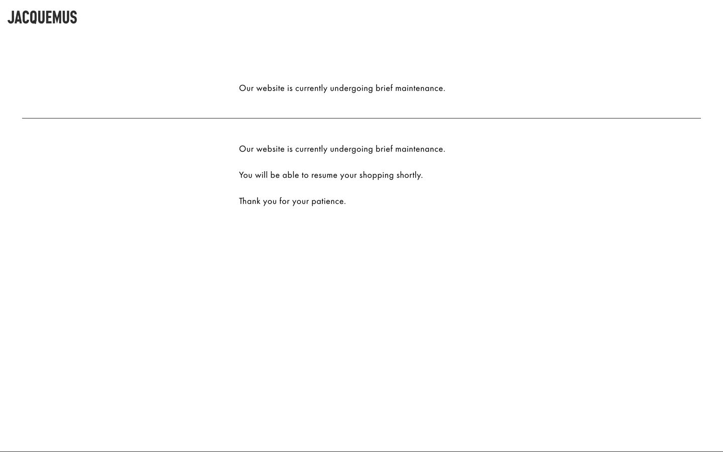
JACQUEMUS's marketing site, captured during a brief maintenance window, reveals the typographic skeleton that holds the brand together when photography is stripped away. The page is two colors — black and white — and one typeface: Futura PTT, a geometric sans at weight 400 with 0.56px letter-spacing rendered at 18px. The all-caps wordmark "JACQUEMUS" at the top-left is the single most dominant element on the screen; beneath it, a full-width 1px hairline rule, then centered body text announcing the maintenance. Where other fashion brands deploy photography-first or gradient-rich pages, JACQUEMUS's skeleton reads as the brand's own kind of confidence — the typeface alone is expected to carry the weight.

The DESIGN.md file packages what can be machine-read from the captured surface into a spec for React and AI tools. Inside: 4 color tokens across a pure black-and-white binary palette; 8 typography tokens all running Futura PTT at a single weight and size with variations mapped to semantic roles; a flat 0px radius on every element; 7 spacing tokens on a standard scale; and 12 component definitions covering the wordmark, hairline rule, body paragraph, and maintenance-state layout. The extraction ran against a maintenance page — a condition that exposes the design's bones with unusual clarity.

Feed this file to Claude or Cursor and it will reproduce JACQUEMUS's typographic register: Futura PTT in all-caps at the wordmark tier, tracking-widened at 0.56px for body text, black on white without exception. The system's value as a reference is the clarity of its restraint — one typeface, one weight, two colors, one structural rule. For a development team building a fashion-adjacent landing page that needs typographic authority without photography, this skeleton is the starting point.

What makes it distinct

  1. Binary palettepure ink black on white, no accent, no grey tier, no color of any kind in the chrome
  2. Futura PTT at a single size18px / 400 with 0.56px tracking carries the wordmark, body, and navigation; the typeface is the entire system
  3. Wordmark as primary UI elementJACQUEMUS in all-caps Futura PTT renders larger and bolder than any other screen element, acting as both logo and page anchor
  4. Hairline rule as sole spatial devicea full-width 1px black line is the only structural divider in the system
  5. Typography-first identityJacquemus relies on Futura PTT's geometric authority to hold the page when photography is absent

Live at jacquemus.com

A snapshot of the brand in production. Hover the frame to scroll the page; click to visit.

Screenshot of JACQUEMUS's website at jacquemus.comjacquemus.com

Explore JACQUEMUS

Pick what you want to see — mockups, colors, typography, layout, or the full component list.

Surface

Page and card backgrounds.

Text

Headlines, body, captions, muted.

Borders & Hairlines

Dividers, outlines, structural rules.

JACQUEMUS design system FAQ

Common questions about JACQUEMUS's tokens, components, and how to use this DESIGN.md in your project.

Specs, directories, and component libraries that pair with this design system.

Use JACQUEMUS in your project

One machine-readable file. Drop it into Claude, Cursor, or any AI tool that reads DESIGN.md.

Download DESIGN.md