Kraken Design System
Kraken's design system as a DESIGN.md file.
About Kraken DESIGN.md
Curated by Dov AzencotUpdated Source kraken.com
- Fintech & Crypto
- Banking & Payments
Kraken's design system is built around two ideas: trust through restraint, and a single owned color. Kraken Purple ("#7132f5") is the brand voltage — it drives every primary CTA, every text link, and the outlined-button stroke at "#5741d8". The remainder of the page is white "#ffffff" canvas, near-black "#101114" ink, and a cool blue-gray neutral ladder running through "#686b82", "#9497a9", and a "#dedee5" hairline. There is no second accent color. Green "#149e61" exists only for positive/success badges, scoped to trading contexts where green has a precise meaning.
This DESIGN.md packages the full Kraken visual contract into one machine-readable file. Inside: the three-step purple scale, a cool-gray neutral set, a green semantic pair, a dual-family typography stack (Kraken-Brand for display at 48/36/28px in 700 weight with negative tracking, Kraken-Product for UI body/buttons/captions at 16/14/12/7px), 5 button variants, 2 badge styles, 15 spacing tokens (1–25px), and 8 radius tokens. The file follows the Google Labs DESIGN.md spec — drop it into Claude, Cursor, or Copilot and the model writes React that matches Kraken's voice instead of a generic exchange template.
Two details earn the system its identity. First, the 12px radius ceiling on buttons — rounded enough to feel approachable, never pill-shaped, which is the fintech tell that separates Kraken from consumer brands like Stripe Press or Linear. Second, the whisper-level elevation: a single shadow at "rgba(0,0,0,0.03) 0px 4px 24px" floats white buttons, and a 1px "rgba(16,24,40,0.04)" micro tier handles everything else. Crypto exchanges live and die on perceived trust; Kraken builds that trust by refusing to over-design.
What makes it distinct
- Single brand voltageKraken Purple (#7132f5) drives CTAs and links, with #5741d8 and #5b1ecf as outlined and deep variants
- Dual proprietary typeKraken-Brand at 700 weight handles display, Kraken-Product (IBM Plex Sans fallback) handles UI
- 12px is the radius ceilingbuttons stay rounded but never pill, a deliberate fintech tell separating Kraken from consumer brands
- Whisper-level elevationone subtle shadow at rgba(0,0,0,0.03) 0px 4px 24px and a 1px micro tier, nothing more
- Green #149e61 at 16% opacity carries positive states; semantic color is reserved for trading data, never decoration
Live at kraken.com
A snapshot of the brand in production. Hover the frame to scroll the page; click to visit.
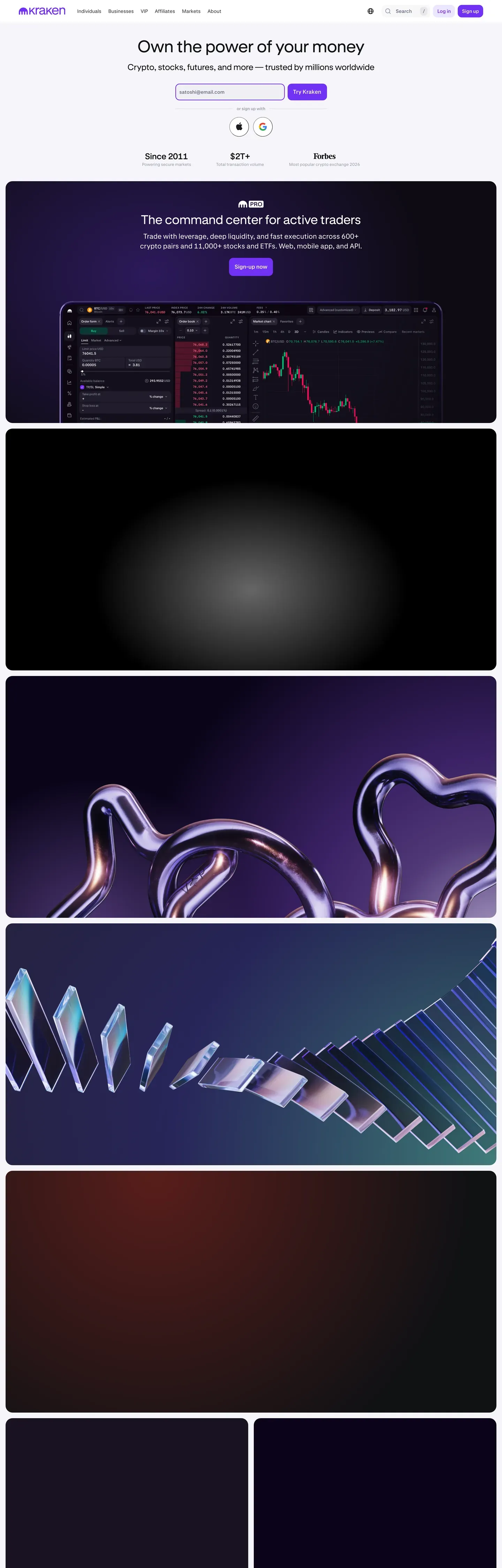 kraken.com
Explore Kraken
Pick what you want to see — mockups, colors, typography, layout, or the full component list.
Brand & Accent
Sparing, CTA-only voltage.
Surface
Page and card backgrounds.
Text
Headlines, body, captions, muted.
Borders & Hairlines
Dividers, outlines, structural rules.
Semantic
Status, errors, success, inline links.
Other
Specialty colors.
Kraken design system FAQ
Common questions about Kraken's tokens, components, and how to use this DESIGN.md in your project.
Related reading
Specs, directories, and component libraries that pair with this design system.
Browse all design systems
The full directory of DESIGN.md files on shadcn.io, with live mockups for each.
Kraken.com
Kraken's live exchange — the source surface this DESIGN.md was extracted from.
The DESIGN.md specification
Google Labs' open spec for machine-readable design system files — the format this page is built on.