Lululemon Design System
Lululemon's design system as a DESIGN.md file.
About Lululemon DESIGN.md
Curated by Dov AzencotUpdated Source shop.lululemon.com
- E-commerce & Retail
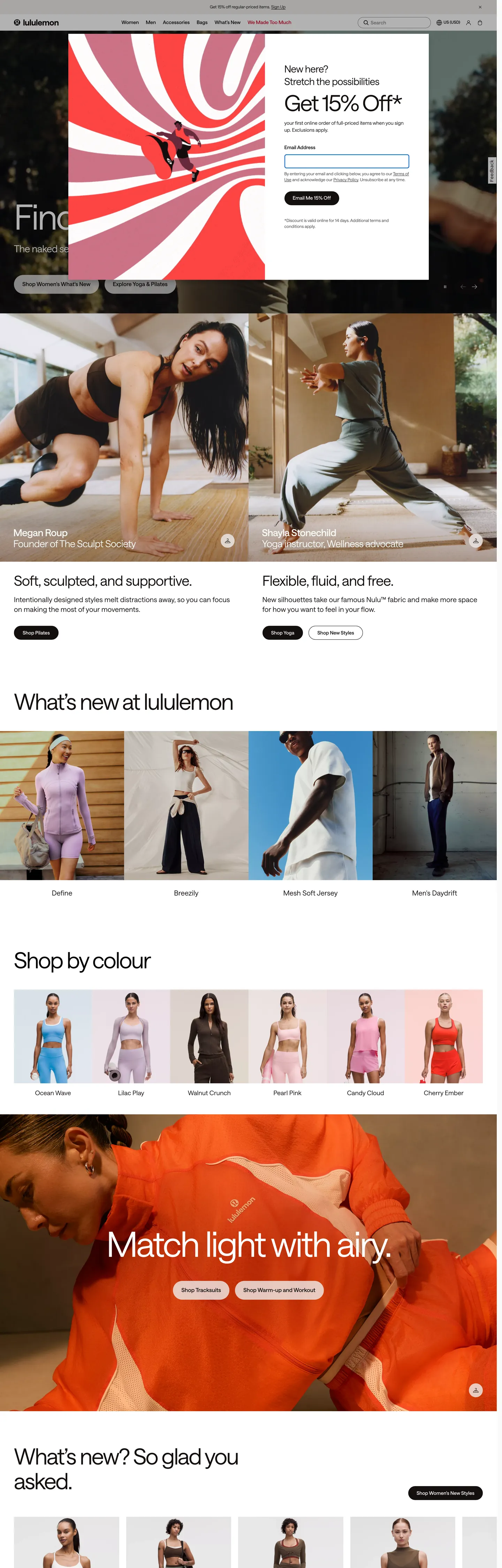
Lululemon's storefront reads like a printed yoga catalog rendered for the browser, with the chrome holding back while the photography carries every chromatic moment. The canvas is pure `#ffffff`, and the workhorse text colour is a warm off-black `#140f0f` rather than the pharmaceutical pure black you'd expect from an athletic brand — the warmer ink holds against skin tones in product imagery without going clinical. Where Nike screams in 96px Futura uppercase and Everlane whispers in 12px Maison Neue caps, Lululemon settles between them at 100px Saans on a single variable-weight axis (380 and 570), confident enough to skip bold weights entirely. The signature Lululemon red (`#c8102e`) is mapped in CSS variables under `--lll-color-border-accent` and `--lll-color-text-error`, but the extracted page renders it only twice — the brand uses it as a semantic accent voltage, not a chrome colour.
This page packages the storefront into a DESIGN.md file written to the Google Labs open specification. Inside: 21 colour tokens grouped into ink, surface, hairline, semantic, and a six-entry secondary palette (sequoia, wilderness, espresso, daydream, mossy, rosewood) reserved for editorial tiles; 11 Saans typography roles ranging from a 100px hero through a 12px utility caption; a 5-step radius vocabulary anchored on 48px pills and 50% circles with a 6px input outlier; an 8-step spacing scale extracted from the `--zest-spacing-*` CSS variable cascade running 2px through 96px; and 24 component entries covering the announcement bar, the primary nav, the welcome modal, the hero overlay, the editorial 2-up, the colour swatch strip, the newsletter capture, the product tile, and the campaign tile. The site exposes 351 `:root` custom properties under twin `--lll-*` and `--zest-*` token cascades, which is how the chrome stays mechanical while the editorial palette stays expressive.
Feed the file to Claude, Cursor, or GitHub Copilot and the agent reproduces Lululemon's specific restraint — the 48px-radius pill CTA at 54px height with weight 570, the warm `#140f0f` ink, the bone-toned `#efeeec` disabled-surface, the Saans-only typographic ladder — rather than a generic activewear template with heavy 700+ display weights and saturated brand fills. Reference tokens directly when you want one specific value: `{colors.ink}` resolves to `#140f0f`, `{rounded.pill}` to 48px, `{typography.display-xl}` to Saans 100px at weight 380, and `{colors.accent-red}` to `#c8102e`. The reason this system rewards study is that most athletic-apparel sites equate brand voltage with chromatic loudness — Lululemon proves the opposite, holding its signature red almost entirely off the chrome and letting weight 380 Saans carry the brand's whole personality.
What makes it distinct
- Variable-axis Saans at weights 380 and 570the brand never reaches weight 600+; confidence by typographic moderation
- Brand red as scoped voltage`#c8102e` (`--lll-color-border-accent`) carries only 2 occurrences across the chrome, reserved for error states and accent borders
- Off-black ink, never pure`#140f0f` runs as text and borders 322 times while `#000000` lives mainly in default button fills (text 545, border 544)
- Pill CTA at 48px radiusprimary button measures 54px tall with 24px horizontal padding and weight 570 caps; the only other radius is 50% for icon swatches and circular avatars
- Two coexisting palettesa load-bearing greyscale chrome plus a six-token secondary editorial palette (`sequoia`, `wilderness`, `espresso`, `daydream`, `mossy`, `rosewood`) reserved for campaign tiles, never for buttons
Live at shop.lululemon.com
A snapshot of the brand in production. Hover the frame to scroll the page; click to visit.
 shop.lululemon.com
Explore Lululemon
Pick what you want to see — mockups, colors, typography, layout, or the full component list.
Brand & Accent
Sparing, CTA-only voltage.
Surface
Page and card backgrounds.
Text
Headlines, body, captions, muted.
Borders & Hairlines
Dividers, outlines, structural rules.
Semantic
Status, errors, success, inline links.
Other
Specialty colors.
Lululemon design system FAQ
Common questions about Lululemon's tokens, components, and how to use this DESIGN.md in your project.
Related reading
Specs, directories, and component libraries that pair with this design system.
Browse all design systems
The full directory of DESIGN.md files on shadcn.io, with live mockups for each.
Lululemon — official site
The Lululemon storefront this DESIGN.md was extracted from on 2026-05-13.
The DESIGN.md specification
Google Labs' open spec for machine-readable design system files — the format this page is built on.