Nubank Design System
Nubank's marketing system as a DESIGN.md file.
About Nubank DESIGN.md
Curated by Dov AzencotUpdated Source nubank.com.br
- Banking & Payments
- Fintech & Crypto
Nubank's marketing site does something almost no other LATAM neobank does: it gives the brand voltage almost no real estate above the fold. The hero is a full-bleed lifestyle photograph — a barista standing at the counter of an espresso bar — with the headline "Seja qual for o seu problema, o Nubank tem uma solução" in 56px graphikMedium white type floating over the image, and a deep violet pill CTA tucked into the lower-left corner. Where Revolut paints its hero in flat brand black and Monzo runs Hot Coral as a wallpaper colour, Nubank treats its violet as a scarce signal — held back for the CTA, the link, the brand logo, and very little else. The photograph carries the warmth; the violet carries the action.
The DESIGN.md file packages the system into a machine-readable spec for React tooling. Inside: 14 color tokens drawn from the brand-core violet ramp (10/20/30 lavenders up through 80/90 plums) plus the structural ink-and-offWhite tier, organized around the single voltage at violet 60; 11 typography tokens running Graphik in two weights (regular 400 / medium 500) across display, heading, body, button, and label tiers; 4 radius tokens with a 999px pill at the top of the scale; an 8 px base spacing scale that snaps to 24 px for card padding and 64 px for desktop card margins; and 18 component definitions covering the violet CTA pill, the photo-overlay hero, the rounded card grids, the segmented control, and the dark testimonial card.
Feed this file to Claude or Cursor and it reproduces Nubank's specific moves: photography-on-canvas instead of a colored hero, a single violet reserved for CTA pills and links, pure black ink for type rather than the slightly-blue near-black that Wise and Mercury use, Graphik at modest 400-500 weights, and 999px pill geometry across every action. The one move worth borrowing only if you have warm customer photography to lean on: the willingness to let the brand color completely recede above the fold. Most fintech brands need the voltage doing the structural work; Nubank trusts the photograph to do it instead.
What makes it distinct
- Voltage held in reservedeep violet #820ad1 appears just 67 times in the captured page, almost entirely on CTA pills and link text, never as a background wash
- Photography-first herothe above-fold is a full-bleed lifestyle photograph of a barista, with white display type floating over it rather than a colored canvas
- Graphik at modest weightsdisplay sits at 48-56px in weight 500, body at 16-18px in weight 400, no 700+ tier anywhere on the marketing surface
- 999px pill geometryevery CTA, every chip, every category tab carries the maximum-radius pill; the 24px and 32px card radii sit beneath it as the only other rounding values
- Black ink, not charcoalbody and headline text use pure #000000 on the offWhite canvas, the maximum-contrast move that lets photography carry color while type stays monochrome
Live at nubank.com.br
A snapshot of the brand in production. Hover the frame to scroll the page; click to visit.
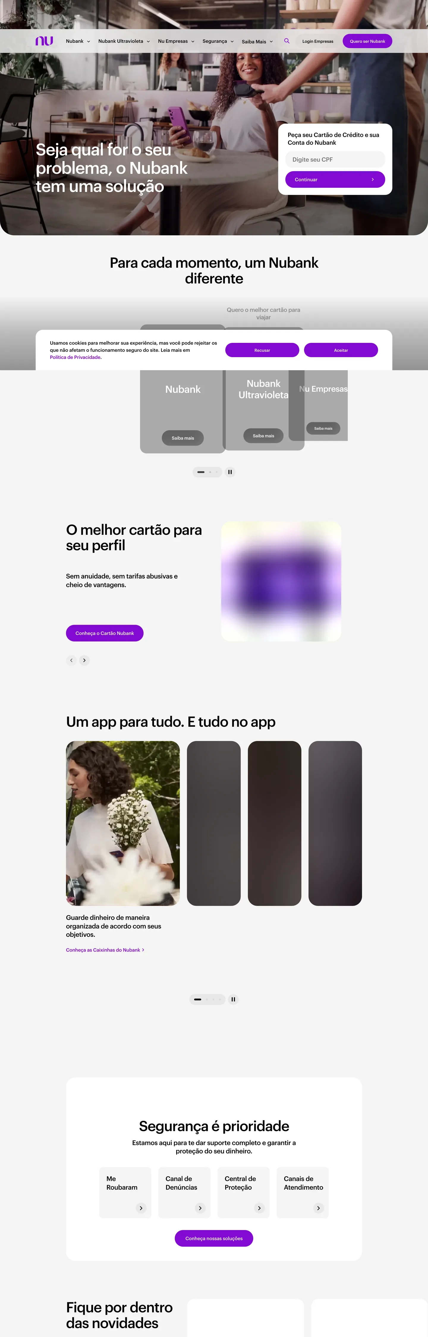 nubank.com.br
Explore Nubank
Pick what you want to see — mockups, colors, typography, layout, or the full component list.
Brand & Accent
Sparing, CTA-only voltage.
Surface
Page and card backgrounds.
Text
Headlines, body, captions, muted.
Borders & Hairlines
Dividers, outlines, structural rules.
Other
Specialty colors.
Nubank design system FAQ
Common questions about Nubank's tokens, components, and how to use this DESIGN.md in your project.
Related reading
Specs, directories, and component libraries that pair with this design system.
Browse all design systems
The full directory of DESIGN.md files on shadcn.io, with live mockups for each.
Nubank — official site
Nubank's public marketing site — the source of truth for the live tokens captured in this file.
The DESIGN.md specification
Google Labs' open spec for machine-readable design system files — the format this page is built on.