On Design System
On's storefront as a DESIGN.md file.
About On DESIGN.md
Curated by Dov AzencotUpdated Source on.com
- E-commerce & Retail
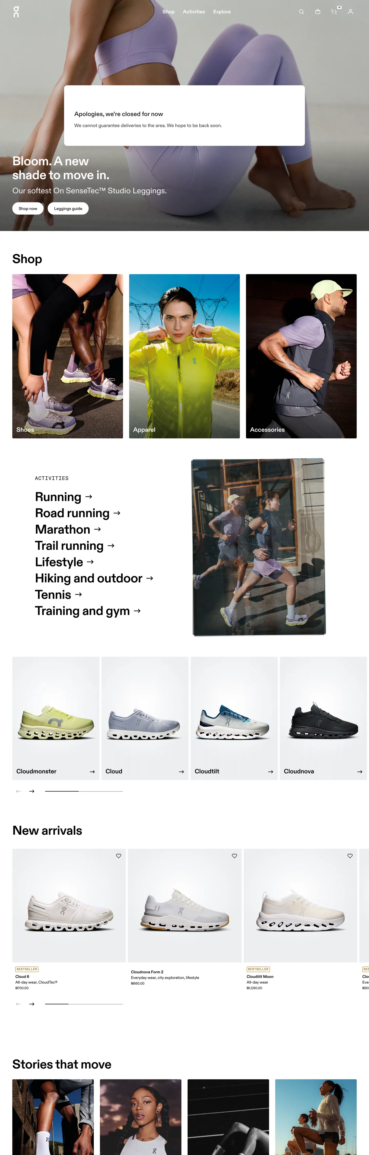
On's storefront reads like a Swiss product brochure compiled for the browser. The chrome is reductive to the point of being almost stubborn — ink `#000000` carries 906 occurrences across the captured page (420 as text, 417 as hairline border, 46 inside gradient overlays, plus 18 as shadow), while the canvas runs pure `#ffffff` at 323. Where most performance-running brands inject saturated voltage — neon yellow, signal orange, electric green — to telegraph athletic energy, On withholds entirely. The only chromatic note in the entire chrome is the unstyled hyperlink: bright `#0000ee` reaches 190 occurrences as both text and border, used on the vertical activity list ("Running →", "Road running →", "Marathon →", "Trail running →"), and the visited-link brown `#995c00` reaches 32. These are not brand colors. They are the browser's defaults, surfaced deliberately as a brutalist signal that On trusts the photograph and the type to do every other job.
This page packages the storefront into a DESIGN.md file written to the Google Labs open spec. Inside: 19 color tokens grouped into ink, canvas, link, status, and graded-neutral layers; 12 typography roles built around a proprietary On sans display tier at 49.584px / weight 700 with `-0.49584px` letter-spacing, paired with On Semi Mono at 12px uppercase tracked `0.72px` for category caps; a 6-step radius vocabulary anchored on the observed `4px` (24 hits) with a `40px` pill reserved for chips; a 9-step spacing scale extracted from the `8px` (69 hits) and `24px` (26 hits) rhythm; and 17 component entries covering the top nav, the hero portrait with overlay heading, the activity list with right-pointing arrow glyphs, the 4-up product card grid, the swatch picker, the editorial "Stories that move" tile, and the inverted newsletter footer.
Feed the file to Claude, Cursor, or GitHub Copilot and the agent reproduces On's reductive chrome — the heroic h1/h2 parity at 49.584px, the hyperlink-blue activity list, the 4px-cornered product cards on `#ffffff`, the inverted black newsletter input — rather than inventing a generic athletic-template with neon accents and saturated badges. Reference tokens directly when you want one specific value: `{colors.ink}` resolves to `#000000`, `{typography.display-h1}` to On sans 49.584px / 700 / `-0.49584px`, `{colors.link}` to `#0000ee`, and `{rounded.pill}` to 40px. The reason this system rewards study is that most running brands chase velocity through chromatic noise, while On chases it through typographic parity — every section header and every hero shares the same 49.584px ceiling, and the photograph carries the rest.
What makes it distinct
- Hyperlink-blue as accentOn uses the browser-default `#0000ee` (190 occurrences as text and border) for category list items, never restyling it to a brand voltage
- Heroic h1/h2 paritydisplay sits at 49.584px / 700 with `-0.49584px` tracking, and the section h2 ('Shop') uses the identical size, not a downscaled tier
- Two-typeface splitproprietary On sans for body and display, On Semi Mono for 12px uppercase category captions with `0.72px` tracking
- 4px-base radius vocabulary24 occurrences of `4px` corners against 8 occurrences of `3px` and 4 of `40px` pill, with a hard `0px` on every photographic tile
- Footer newsletter inverts the canvassingle `#000000` input with `#666666` placeholder, 64px height, no border, sitting under the otherwise white-canvas chrome
Live at on.com
A snapshot of the brand in production. Hover the frame to scroll the page; click to visit.
 on.com
Explore On
Pick what you want to see — mockups, colors, typography, layout, or the full component list.
Surface
Page and card backgrounds.
Text
Headlines, body, captions, muted.
Borders & Hairlines
Dividers, outlines, structural rules.
Semantic
Status, errors, success, inline links.
Other
Specialty colors.
On design system FAQ
Common questions about On's tokens, components, and how to use this DESIGN.md in your project.
Related reading
Specs, directories, and component libraries that pair with this design system.
Browse all design systems
The full directory of DESIGN.md files on shadcn.io, with live mockups for each.
On — official site
The On storefront this DESIGN.md was extracted from on 2026-05-13.
The DESIGN.md specification
Google Labs' open spec for machine-readable design system files — the format this page is built on.