Pinterest Design System
Pinterest's design system as a DESIGN.md file.
About Pinterest DESIGN.md
Curated by Dov AzencotUpdated Source pinterest.com
- Social & Community
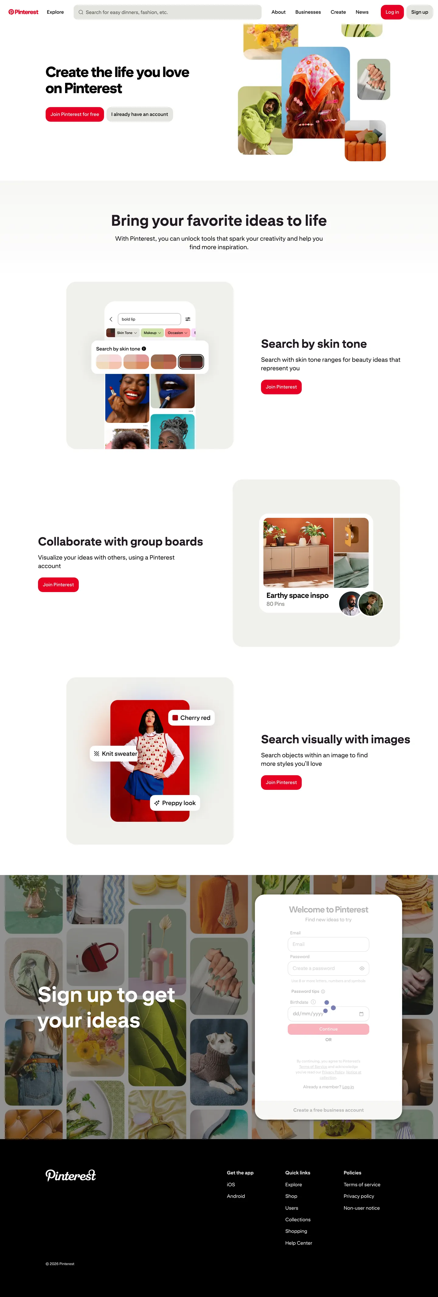
Pinterest's marketing system is the discipline of getting out of the photograph's way. The chrome runs a warm-cream neutral palette — #fbfbf9 page wash, #f6f6f3 card surface, true #ffffff canvas — with Pin Sans typography in tight negative-tracked display sizes, and a single saturated Pinterest Red (#e60023) reserved exclusively for the Sign-up CTA, the active-tab indicator, and the brand wordmark. The home page alternates two surface modes: hero/CTA chrome with 70px display headlines and alternating left/right feature cards, then a column-based masonry pin grid where each tile is a 16px-radius card at its natural aspect ratio with 8px gutters between columns.
This page packages all of that into a single DESIGN.md file written to the Google Labs open specification. Inside: 28 color tokens grouped into brand, surface, text, semantic, and editorial-accent buckets; 14 Pin Sans typography roles from 70px display-xl down to 12px caption-sm; five border-radius values where only three see active use (16px, 32px, pill); a nine-step 8px-based spacing scale; and 25 components covering buttons, filter chips, search bar, pin cards, modal, primary nav, and footer. Each component declares its background, text color, typography, radius, and padding by referencing tokens — every value resolves back to a quoted hex or pixel literal.
Feed the file to Claude, Cursor, or GitHub Copilot and the agent reproduces Pinterest's restraint — the single red accent, the warm-cream surfaces, the masonry pin grid, the two-radius shape vocabulary — rather than inventing a generic photography theme. Reference tokens directly in Tailwind config or CSS variables when you want one specific value. The system is worth studying because it commits hard to one rule most photo-led brands hedge on: type and chrome serve the imagery, never compete with it.
What makes it distinct
- Single-accent voltagePinterest Red #e60023 reserved for Sign-up CTAs, active tabs, and the wordmark, never decorative
- Two-radius shape system16px on every button and pin card, 32px on modals and large pins, nothing in between
- Steep type jump70px Pin Sans display drops directly to 16px body with no intermediate tier on the home hero
- Masonry pin grid at 8px guttersimagery effectively touches across columns, the tightest grid in mainstream marketing
- Warm-cream chrome#f6f6f3 card surface and #fbfbf9 page wash recede behind photography without competing
Live at pinterest.com
A snapshot of the brand in production. Hover the frame to scroll the page; click to visit.
 pinterest.com
Explore Pinterest
Pick what you want to see — mockups, colors, typography, layout, or the full component list.
Brand & Accent
Sparing, CTA-only voltage.
Surface
Page and card backgrounds.
Text
Headlines, body, captions, muted.
Borders & Hairlines
Dividers, outlines, structural rules.
Semantic
Status, errors, success, inline links.
Other
Specialty colors.
Pinterest design system FAQ
Common questions about Pinterest's tokens, components, and how to use this DESIGN.md in your project.
Related reading
Specs, directories, and component libraries that pair with this design system.
The DESIGN.md specification
Google Labs' open spec for machine-readable design system files — the format this page is built on.
Browse all design systems
The full directory of DESIGN.md files on shadcn.io, with live mockups for each.
React blocks for shadcn/ui
Production-ready hero, pricing, CTA, and dashboard sections built with the same Tailwind + shadcn primitives.