PUMA Design System
PUMA's storefront as a DESIGN.md: near-black #191919 buttons, bold FFDINforPuma type and tracked uppercase nav labels, for React and AI coding tools.
- Primary color
- #676d75
- Typeface
- FFDINforPuma
- Shape
- Sharp
- Base radius
- 8px
- Colors
- 6
- Type tokens
- 12
- Components
- 16
- Spacing values
- 7
About PUMA DESIGN.md
Curated by Dov Azencot, updated May 19, 2026. Source us.puma.com (opens in a new tab).
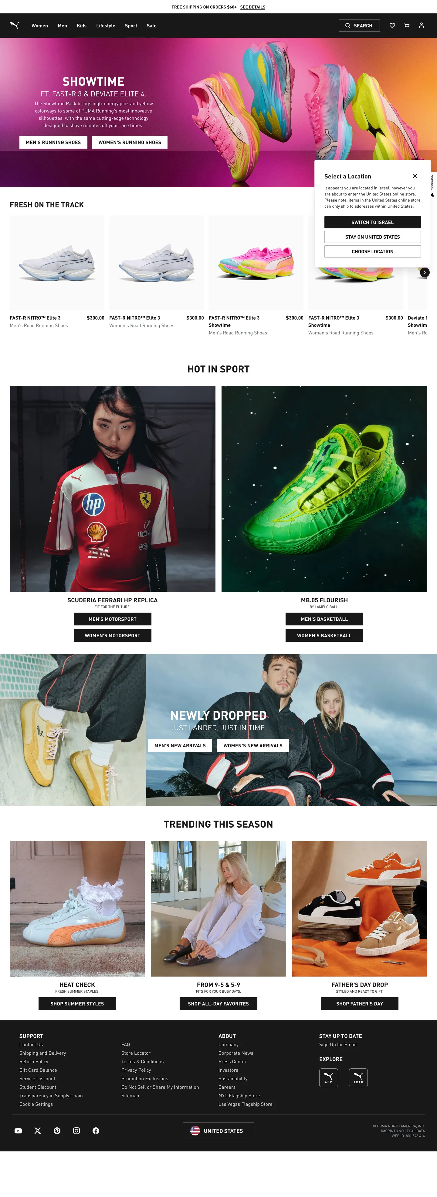
PUMA's US storefront is a study in photographic delegation — the brand trusts product photography to carry every chromatic responsibility and keeps every CSS-rendered surface in a two-tone near-black and white. The hero heading "SHOWTIME" runs in white at 40px FFDINforPuma weight 700 over a gradient-banner that is itself a product composition (shoes in warm orange, pink, and electric blue tones). Scroll past the hero and every section is white canvas with near-black type, light gray hairline borders, and images doing all the emotive work. Where Nike uses a thick white-on-black type treatment with occasional volt yellow accents, and Adidas leans on a blue-threaded nav, PUMA keeps the chrome down to a binary and lets the product photography generate the brand personality per-season.
The DESIGN.md file captures the system into a machine-readable spec for React and AI tools. Inside: 6 colors tokens covering the near-black ink and button surface, the white canvas, two gray mids for secondary text and hairlines, and pure black for shadow and hard-border moments; 12 typography tokens running FFDINforPuma from 40px hero h1 through 12px captions — the only two-axis variation being size and weight (400 for body, 700 for headings and CTA labels), with uppercase tracking appearing on navigation links and category headers; 5 radius tokens anchored at 2px; 7 spacing values on a 4px/8px base; and 16 components definitions covering the primary button, ghost button, top nav, hero heading, product card, and category-tab strip.
Feed this file to Claude or Cursor and it will reproduce PUMA's specific moves: near-black fill primary buttons with 2px radius instead of the pill or 8px rounding that most sportswear e-commerce defaults to, all-caps uppercase nav links with 0.32px tracking, and white canvas sections where the only non-neutral element is a product image. The most transferable lesson from this system is the discipline of zero brand-chrome color — it means the palette never clashes with seasonal product colorways, which in sportswear change every six to eight weeks.
What makes it distinct
5 highlights
- Photography-voltage systemBrand color is absent from the chrome; every chromatic moment on the page comes from product images, not CSS fills
- FFDINforPuma at condensed weight 700The custom DIN variant drives every heading tier, with uppercase + 0.32px tracking on nav links and category labels as the sole typographic accent
- 2px default radiusButtons, inputs, and cards all sit at 2px, placing PUMA closer to sharp-edge fashion brands (Zara, Supreme) than to the pill-first Nike or Adidas
- Absolute binary paletteNear-black (#191919) and white (#ffffff) carry 339 of the 416 total color occurrences; mid-gray hairlines handle the rest
- Product-only colorThe hero gradient is generated by product imagery (shoes in orange-pink-blue tones); the page chrome contributes zero chromatic pixels
Live at us.puma.com
PUMA in production, as captured. Scroll the window to see the whole page.
6 colors
PUMA's system anchors on #676d75 (ink-secondary) as its primary color. Type is set in FFDINforPuma across 12 tokens from 12px to 40px, weights 400–700. Shape language is sharp — components average 2px corner radius, favoring crisp rectangles.
Surface
Page and card backgrounds · 1
Text
Headlines, body, captions · 3
Borders & Hairlines
Dividers, outlines, rules · 1
Other
Specialty colors · 1
12 type tokens
Set in FFDINforPuma across 12 tokens, from 12px to 40px, weights 400–700. Shown in its own stack: where the font isn't installed, the fallback the file names stands in.
- display-xl40px · weight 700 · lh 44pxThe quick brown fox jumps over the lazy dog
- display-lg32px · weight 700 · lh 36pxThe quick brown fox jumps over the lazy dog
- heading-md24px · weight 700 · lh 32pxThe quick brown fox jumps over the lazy dog
- heading-sm20px · weight 700 · lh 28pxThe quick brown fox jumps over the lazy dog
- label-uppercase16px · weight 700 · lh 24px · tracking 0.32pxThe quick brown fox jumps over the lazy dog
- label-section18px · weight 700 · lh 24pxThe quick brown fox jumps over the lazy dog
- body-lg24px · weight 400 · lh 32pxThe quick brown fox jumps over the lazy dog
- body-md16px · weight 400 · lh 24pxThe quick brown fox jumps over the lazy dog
- body-sm14px · weight 700 · lh 20pxThe quick brown fox jumps over the lazy dog
- caption12px · weight 400 · lh 16pxThe quick brown fox jumps over the lazy dog
- button-md16px · weight 400 · lh 24pxThe quick brown fox jumps over the lazy dog
- nav-link16px · weight 700 · lh 24px · tracking 0.32pxThe quick brown fox jumps over the lazy dog
Radii and spacing
5 corner radii and 7 spacing values. Shape language: sharp, on a 8px base radius.
Radii5
- none0px
- xs2px
- sm4px
- md8px
- full9999px
Spacing7
- xs4px
- sm8px
- md16px
- lg20px
- xl32px
- 2xl40px
- 3xl64px
16 components
Each rendered from its tokens (color, type, radius, padding) on PUMA's own canvas.
- Button PrimaryButton Primarybutton-primary
- Button Primary HoverButton Primary Hoverbutton-primary-hover
- Button SecondaryButton Secondarybutton-secondary
- Top NavTop Navtop-nav
- Nav LinkNav Linknav-link
- Hero HeadingHero Headinghero-heading
- Section HeadingSection Headingsection-heading
- Body ParagraphBody Paragraphbody-paragraph
- Body Paragraph MutedBody Paragraph Mutedbody-paragraph-muted
- CardCardcard
- Product LabelProduct Labelproduct-label
- Category ChipCategory Chipcategory-chip
- Type here…Text Inputtext-input
- FooterFooterfooter
- Promo BannerPromo Bannerpromo-banner
- Section LabelSection Labelsection-label
The system, in use
PUMA's tokens on the kind of product it builds.
New season, new essentials
The latest arrivals, made to wear every day. Free shipping and returns on every order.
PUMA design system FAQ
PUMA's tokens, its components and how to use this DESIGN.md in your project.
What are the color tokens in the PUMA DESIGN.md?
What is PUMA's primary color hex code?
How do I use PUMA's colors in Tailwind CSS?
What is PUMA's primary brand color?
What fonts does PUMA use?
What is PUMA's type scale?
What can I use if I don't have PUMA's font?
What typeface does PUMA use and what should I substitute?
Which components does the PUMA DESIGN.md define?
What corner radius and spacing does PUMA use?
What corner-radius philosophy does PUMA use?
How do I apply the PUMA design system to a shadcn/ui project?
How do I use the PUMA DESIGN.md with Claude Code or Cursor?
Is the PUMA DESIGN.md free to download?
How was the PUMA DESIGN.md made?
Is the PUMA DESIGN.md official?
How does PUMA structure its type hierarchy?
Can I use this DESIGN.md to build a sportswear e-commerce site in the PUMA design system?
Related reading
Specs, directories and component libraries that pair with this design system.
- Browse all design systemsThe full directory of DESIGN.md files on shadcn.io, with live mockups for each.shadcn.io
- PUMA — official sitePUMA's public US storefront — the source of truth for the live tokens captured in this file.us.puma.com (opens in a new tab)
- The DESIGN.md specificationGoogle Labs' open spec for machine-readable design system files — the format this page is built on.github.com (opens in a new tab)
Use PUMA in your project
One machine-readable file. Drop it into Claude Code, Cursor, VS Code or any AI tool that reads DESIGN.md.
Download the DESIGN.md
One machine-readable file: every color, type, radius, spacing, and component token of PUMA.
Feed it to your AI tool
Drop it into Claude, Cursor, or GitHub Copilot. The agent writes React components and Tailwind classes that match PUMA's visual language.
Reference the tokens directly
Or paste the values into your Tailwind config, CSS variables, or component library: every color, size and radius is a quoted, ready-to-copy value.
Read the full DESIGN.md overview, rationale, do’s and don’ts
Overview
PUMA's US storefront operates on a rule that almost no other sportswear brand follows consistently. Photography-voltage system. The page chrome is a strict two-tone — near-black (#191919) and white (#ffffff) — and every chromatic moment on the page comes from product imagery, not a CSS fill. The hero band "SHOWTIME" sets a 40px FFDINforPuma headline in white over a product-generated gradient of orange, pink, and electric blue shoe photography. Below the fold every section returns to white canvas with near-black type. Where Nike punctuates with volt yellow and Adidas threads blue through its nav, PUMA keeps the system at zero brand-color, delegating hue entirely to whatever product colorway the current campaign features.
Sharp-edge precision. The radius scale is nearly flat: 2px on buttons and inputs, 14px on the select dropdown, no rounding at all on cards and editorial image panels. This places PUMA with sharp-edge fashion brands (Zara, Supreme) rather than with the pill-first sportswear convention (Gymshark's rounded surfaces, New Balance's 8px default). The condensed DIN geometry of FFDINforPuma reinforces the same signal: tight, angular, sport-utility rather than friendly-consumer.
The typography system uses uppercase text-transform with 0.32px letter-spacing as its sole accent tool. Nav links, category section headers, and the promo-announcement strip all sit at 16px / 700 / uppercase / 0.32px tracking. Below that tier, body copy drops to 16px / 400 with no transform. This two-register system — uppercase authority versus lowercase legibility — carries all typographic hierarchy without any secondary typeface.
Key Characteristics:
- Near-black (#191919) carries 193 text occurrences and fills every primary button; pure white covers 87 text and 23 background occurrences — together these two colors represent the entire brand surface.
- Light-gray hairline (#e5e7eb) handles 341 of all border occurrences — card dividers, input outlines, and separator rules are all the same single border tone.
- FFDINforPuma (custom DIN condensed) drives every typographic tier — no secondary family, no serif tier.
- Uppercase transform + 0.32px tracking is the nav link and category-header treatment; body and headings keep default case.
- 2px default radius — the smallest non-zero radius in the active system, sharper than Nike (4px), Adidas (4px), or New Balance (8px).
- No brand-color token at all — the CSS variable set exposes Tailwind ring utilities but no primary/accent custom property.
- No shadow layer — zero shadow occurrences across the entire captured page.
Colors
Surface
- Ink (
{colors.ink}— #191919): frequency 225. Used as text (193), background (16), border (16). The near-black that carries every primary-button fill and all heading text. Not pure black — the slight lift keeps headlines from feeling heavy-printed on white. - Canvas (
{colors.canvas}— #ffffff): frequency 114. Used as text (87), background (23), border (4). Pure white page floor and the color of reversed text inside the dark hero. The merged cluster includes a near-white card surface variant that rounds to the same representative token. - Shadow (
{colors.shadow}— #000000): frequency 19. Used as text (10), border (7), shadow (2). Appears on a small set of hard-edge UI elements — the PUMA logo mark, a few pure-black borders on modal overlays — and as shadow ink on the two shadow occurrences.
Text
- Ink Muted (
{colors.ink-muted}— #a1a8af): frequency 13. Used as text (9), border (4). The mid-gray for secondary labels — size ranges, availability notices, and metadata beneath product cards. - Ink Secondary (
{colors.ink-secondary}— #676d75): frequency 9. Used as text (6), gradient (1). Secondary body copy and the single gradient occurrence on the footer gradient separator. Slightly darker and more neutral than ink-muted.
Hairline
- Hairline (
{colors.hairline}— #e5e7eb): frequency 416. Used as text (74), background (1), border (341). The dominant color by total occurrences — 341 of these are border fills on card dividers, input outlines, and section separators. The merged cluster groups several near-identical light-gray values from different UI contexts, all collapsed to this single representative mid-gray.
Typography
Font Family
The system runs FFDINforPuma across every tier — a custom commissioned variant of DIN Engschrift, the German condensed geometric sans-serif originally designed for signage and engineering drawings. Fallbacks walk to Inter, then the system-ui stack. There is no secondary display family, no serif tier, and no monospace voice.
Hierarchy
| Token | Size | Weight | Transform | Line Height | Use |
|---|---|---|---|---|---|
{typography.display-xl} | 40px | 700 | none | 44px | Hero h1 ("SHOWTIME", seasonal campaign headlines) |
{typography.display-lg} | 32px | 700 | none | 36px | Sub-section h3/h4 headers |
{typography.heading-md} | 24px | 700 | none | 32px | Section h2 ("FRESH ON THE TRACK") |
{typography.heading-sm} | 20px | 700 | none | 28px | Product-category intros, h1/h2 alternate tier |
{typography.label-uppercase} | 16px | 700 | uppercase | 24px | Nav links, CTA labels ("SHOP NOW") |
{typography.label-section} | 18px | 700 | uppercase | 24px | Section-category headers |
{typography.body-lg} | 24px | 400 | none | 32px | Lead paragraph beneath hero |
{typography.body-md} | 16px | 400 | none | 24px | Default running text and button labels |
{typography.body-sm} | 14px | 700 | none | 20px | Product name labels above price |
{typography.caption} | 12px | 400 | none | 16px | Price metadata, availability text |
{typography.button-md} | 16px | 400 | none | 24px | Primary and secondary button text |
{typography.nav-link} | 16px | 700 | uppercase | 24px | Top-nav primary links, 0.32px tracking |
Principles
Weight 700 is the authority tier — everything that commands action (headings, buttons, nav labels) sits there. Weight 400 is the legibility tier — body, caption, running text. There is no 500 or 600 intermediate; the binary weight split is as sharp as the binary color split. Uppercase transform with 0.32px tracking is the system's only typographic accent; applied to nav and category labels, it reads as sport-catalog directness without needing a secondary typeface.
Note on Font Substitutes
FFDINforPuma is proprietary. DIN Condensed (available in many design tools) at weight 700 is the closest substitute. Barlow Condensed at 700 transfers well for the sport-utility feel. Avoid Inter or Roboto — they lack the condensed geometry that makes the system feel athletic rather than generic.
Layout
Spacing System
- Base unit: 4px with 8px as the dominant single-value gap.
- Tokens:
{spacing.xs}4px ·{spacing.sm}8px ·{spacing.md}16px ·{spacing.lg}20px ·{spacing.xl}32px ·{spacing.2xl}40px ·{spacing.3xl}64px. - Button padding: 8x20px — the most-captured shorthand (11 occurrences), used across all primary CTAs.
- Nav items: 0x16px horizontal padding, creating a flush left-to-edge nav strip.
- Section vertical rhythm: ~40px between major product-grid sections; 64px for the above-fold hero band.
Grid & Container
- Max content width: ~1440px at desktop. Product grids run at 4-column wide, collapsing to 2-column on tablet and 1-column on mobile.
- Hero block: full-bleed image composition stretching edge-to-edge, with the heading and CTA stack floating at center-left.
- Product card grid: uniform cards with hairline borders, equal aspect-ratio image panels, product name / price beneath.
Rhythm
The page alternates between a full-bleed campaign hero (white text on product image), an editorial product grid (white canvas, dark type), and a secondary campaign callout (dark canvas, reversed white type). The rhythm is campaign → catalog → campaign rather than a continuous single-surface scroll.
Elevation
PUMA's captured marketing surface has zero shadows. The two shadow-colored entries in the extraction (#000000, shadow: 2) map to form overlays and dropdown menus, not to any card or button elevation. Product cards use hairline borders ({colors.hairline}) to define edges rather than drop-shadow depth. The system is entirely flat — consistent with a fashion-retail convention where shadow adds visual weight that competes with product photography.
Shapes
The radius scale is deliberately sharp, anchored at 2px:
{rounded.none}0px — editorial image tiles and banner panels, square to the edge.{rounded.xs}2px — the default for buttons ({component.button-primary}), form inputs ({component.text-input}), and product cards. Ten occurrences; the dominant active radius.{rounded.sm}4px — minor accent radius for small badge elements.{rounded.md}8px — used on the select-country dropdown and modal overlays (14px also appears but maps to sm in the scale).{rounded.full}9999px — category-chip pills and quantity-badge circles. Ten occurrences at the pill extreme.
The 2px radius is the identity-defining choice. Unlike Nike (4px rounded buttons), Gymshark (8px), or New Balance (8px cards), PUMA plants its buttons at 2px — angular enough to read as engineered sport-precision, soft enough to avoid the clinical harshness of pure 0px.
Components
button-primary — Near-black {colors.ink} (#191919) fill, white text, {rounded.xs} 2px radius, 8×20px padding, 40px height. Appears as "SHOP NOW," "ADD TO BAG," and campaign CTAs. The single most-captured component on the page.
button-primary-hover — Flips to pure {colors.shadow} (#000000) — one shade darker than the ink fill. A minimal hover state that stays within the brand's binary palette.
button-secondary — White fill, near-black text and border, 2px radius, same dimensions as the primary. Used for secondary actions like "FIND A STORE" and "VIEW ALL."
top-nav — Near-black {colors.ink} surface, 48px height, 0×16px horizontal padding. Holds the PUMA leaping-cat wordmark on the left, product navigation links (Men, Women, Kids, Sale, Sport) in the center at {typography.nav-link} (uppercase, 700, 0.32px tracking), and the account / search / bag icons on the right.
nav-link — Transparent background, white text at {typography.nav-link} — uppercase, 700, 0.32px tracking. The uppercase treatment is the system's most distinctive typographic move.
hero-heading — White text on the transparent hero overlay, {typography.display-xl} (40px / 700). Appears over full-bleed product photography — "SHOWTIME" is the canonical instance.
section-heading — Near-black ink text at {typography.heading-md} (24px / 700), 16px bottom padding. Used for "FRESH ON THE TRACK," "HOT IN SPORT," "TRENDING THIS SEASON."
body-paragraph — Default ink text at {typography.body-md} for supporting copy beneath headings.
body-paragraph-muted — Muted {colors.ink-muted} at {typography.caption} for secondary metadata beneath product cards (size ranges, availability).
card — White canvas fill, 1px hairline border, {rounded.xs} 2px radius, 8px internal padding. Wraps product image + label + price. Zero shadow; the hairline defines the edge.
product-label — Transparent, near-black, {typography.body-sm} (14px / 700). Product name above the price.
category-chip — Light-gray {colors.hairline} fill, near-black text, full-pill {rounded.full} rounding, 4×24px padding, 28px height. Used for "Men," "Women," "Running," and other filter chips.
text-input — White fill, ink text, 1px hairline border, {rounded.xs} 2px radius, 8×20px padding, 40px height. Same 2px sharpness as the button family.
footer — Near-black {colors.ink} surface, white text at {typography.caption}, 40×16px padding. Houses the multi-column PUMA link tree, social icons, and legal disclaimers.
promo-banner — Near-black fill, white text at {typography.label-uppercase} (uppercase, 0.32px tracking). The thin announcement strip pinned above the top-nav on pages with active promotions.
section-label — Transparent, near-black, {typography.label-uppercase} (uppercase, 700, 0.32px tracking). Used above product grids to announce the section category without a fill background.
Do's and Don'ts
Do use {colors.ink} (#191919) — not pure {colors.shadow} (#000000) — as the default button fill and heading color. The near-black sits at L=21 in OKLCH rather than L=0; the small lift matters for on-screen legibility and distinguishes the brand surface from hard-printed black.
Do apply uppercase text-transform with 0.32px letter-spacing to any navigation label, CTA button, or category-section header. This two-axis treatment (uppercase + tracking) is the system's sole typographic accent; omitting either axis reads as generic.
Do keep product cards at zero shadow and a single {colors.hairline} border. Any added shadow depth competes visually with the product photography that carries all the chromatic weight on the page.
Do treat photography as the brand's color system. Seasonal product campaigns change the dominant hue on the page (orange for one drop, electric blue for the next) without ever touching a CSS variable — this is the architecture's strongest structural feature.
Don't round primary buttons beyond {rounded.xs} (2px). A developer familiar with Nike's 4px or Gymshark's rounded surfaces would instinctively add 4–8px. At 4px+ the button reads as a different brand. At 2px it reads as PUMA.
Don't introduce a mid-weight (500 or 600) into the type scale. FFDINforPuma's published weights are 400 and 700; the binary weight split is load-bearing. A 500-weight heading would read as a rendering artifact, not a design choice, and there is no licensed mid-weight available.
Don't use {colors.hairline} (#e5e7eb) as a text color — it is a border-and-background-only token (341 of 416 occurrences are borders, 74 are text only on inactive secondary labels). For any body copy, use {colors.ink} or {colors.ink-muted}.
Don't add a brand-accent color to the CSS for seasonal campaigns. The architecture's entire bet is that the photography changes and the chrome does not. Adding a CSS accent hex that changes per-season breaks the system's color-delegation rule and requires coordinated developer work for every product drop.
Known Gaps
- Dark mode: the captured surface is light-only. A dark canvas does appear inside the hero band and the top-nav, but is implemented as a hardcoded ink fill rather than a CSS color-scheme toggle; true dark-mode tokens are not exposed.
- Product-color swatches: the color picker on individual product pages exposes brand colorways (PUMA Red, Ferrari Yellow, etc.) as swatch chips, none of which are represented in this token set — they are image-rendered rather than CSS-declared.
- Focus and error states:
{component.text-input}captures the resting state only. Focus-ring color, error-border color, and disabled-opacity are not visible in the captured marketing surface. - Motion and hover on product cards: product cards show a secondary colorway image on hover, but the transition timing and easing are not captured in the extraction.
- Mobile-specific tokens: the desktop captures show 4-column grids and 1440px max-width; mobile equivalents (2-column card grids, collapsed nav, hamburger menu) carry different padding and size values not represented here.
- Promo-header gradient: the hero banner gradient is generated by product photography composition, not a CSS gradient declaration — the token system cannot represent the seasonal color of the hero section.
More systems like this
adidas, Alo Yoga, Arc'teryx and 83 more in E-commerce & Retail: each brand's colors, type and components in one file your AI agent builds from.
Build it with Pro
The DESIGN.md files are free. Pro adds 6,000+ blocks, premium templates and the MCP server, so your AI editor builds in your system for you.
4.9/5 out of 5 · 150+ reviewsfrom 150+ founders and developers.
- Secure checkout via Stripe
- Code lives in your repo
- Keep what you've shipped if you cancel
- License terms
4.9 out of 5 from 150+ developers


Your system, built for you
Every block, template and icon, installed by your AI agent in your design system. The DESIGN.md files stay free.
- Cancel anytime
- Keep what you've shipped